I am not the best when it comes to articulating my ideas verbally. I am a visual person. When asked what I mean when talking about my work I instinctively reach for a pencil and piece of paper. Although this is something that people think I may need to work on, as a designer isn’t it a good thing that my key way of unscrambling the ideas in my mind is best achieved visually. A picture paints a thousand words. I could be the most articulate person in the world, but there is still not guarantee that it will create the same conclusion in another's, especially a client, mind. This is another key reason why I have been working on my modelling and cad skills. Surely, a 3D image or object will be worth more words than a 2D one?
With the below questionnaire did help somewhat. Having specific questions that I can focus my mind on gives me the framework to improve on my communication. This is a working document and I will try to update and amend throughout the rest of the year.
AMENDMENT 1
WHAT AM I PLANNING TO DO?
As a continuation from the table I designed from the Pecha Kucha presentations, I created a collection. Part of this collection is an extension of my summer work and the other from the Gestamkunstwerk bowl work I produced. The idea behind this is to create an initial collection that can be developed as my debut as a furniture designer maker. The hope is that I will set up my own furniture design business. Having this initial collection will allow me to make my initial mark as a designer.
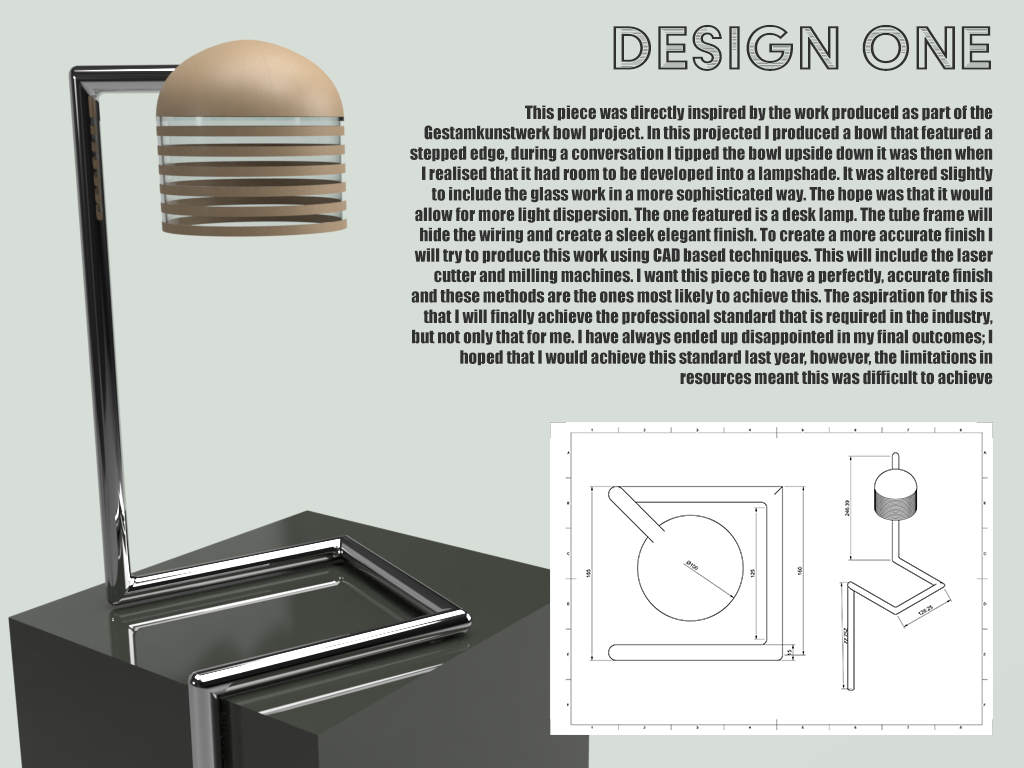
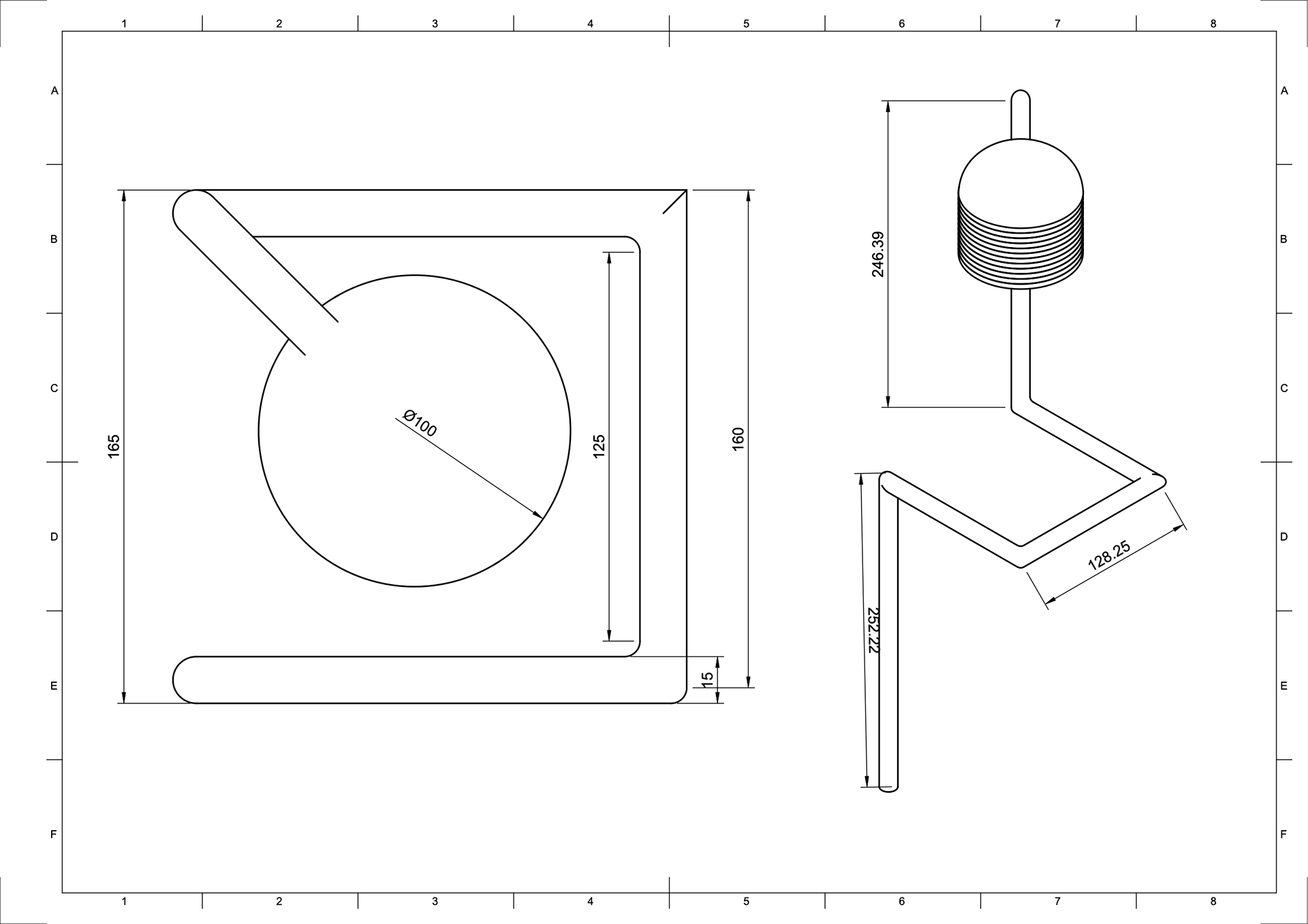
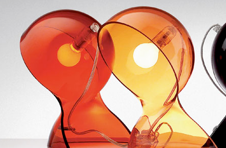
DESIGN 1
A sleek design that features a combination of wood, glass, and metal. The shade of the lamp is reminiscent of honey drippers with a combination of materials that will produce shadows to create a textured movement across surfaces. The metal stand not only acts as a support for the shade but also is for cable management. By having such a system, it will keep the piece elegant with clean lines. This will work well in any room as a functional yet decorative piece.
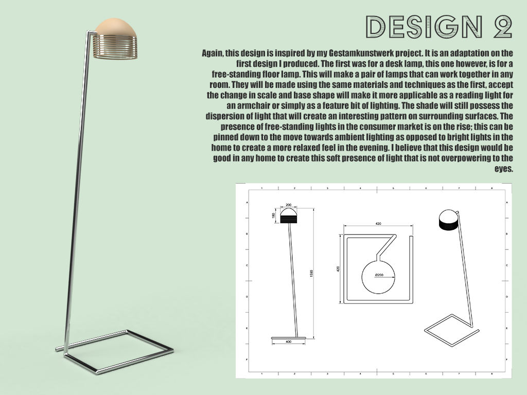
DESIGN 2
Similar to the desk lamp this free-standing lamp uses the same concept of shadow and light manipulation to create an ambience of relaxation. In contrast this piece scaled up to allow for different applications such as a reading light next to an armchair or to generally create a sense of ease and respite after a long day.
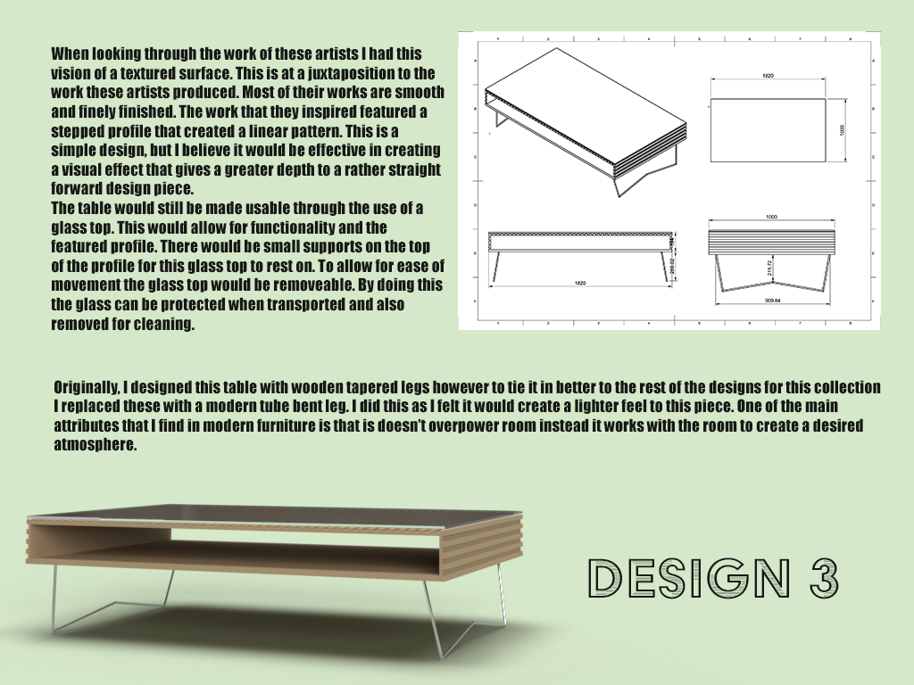
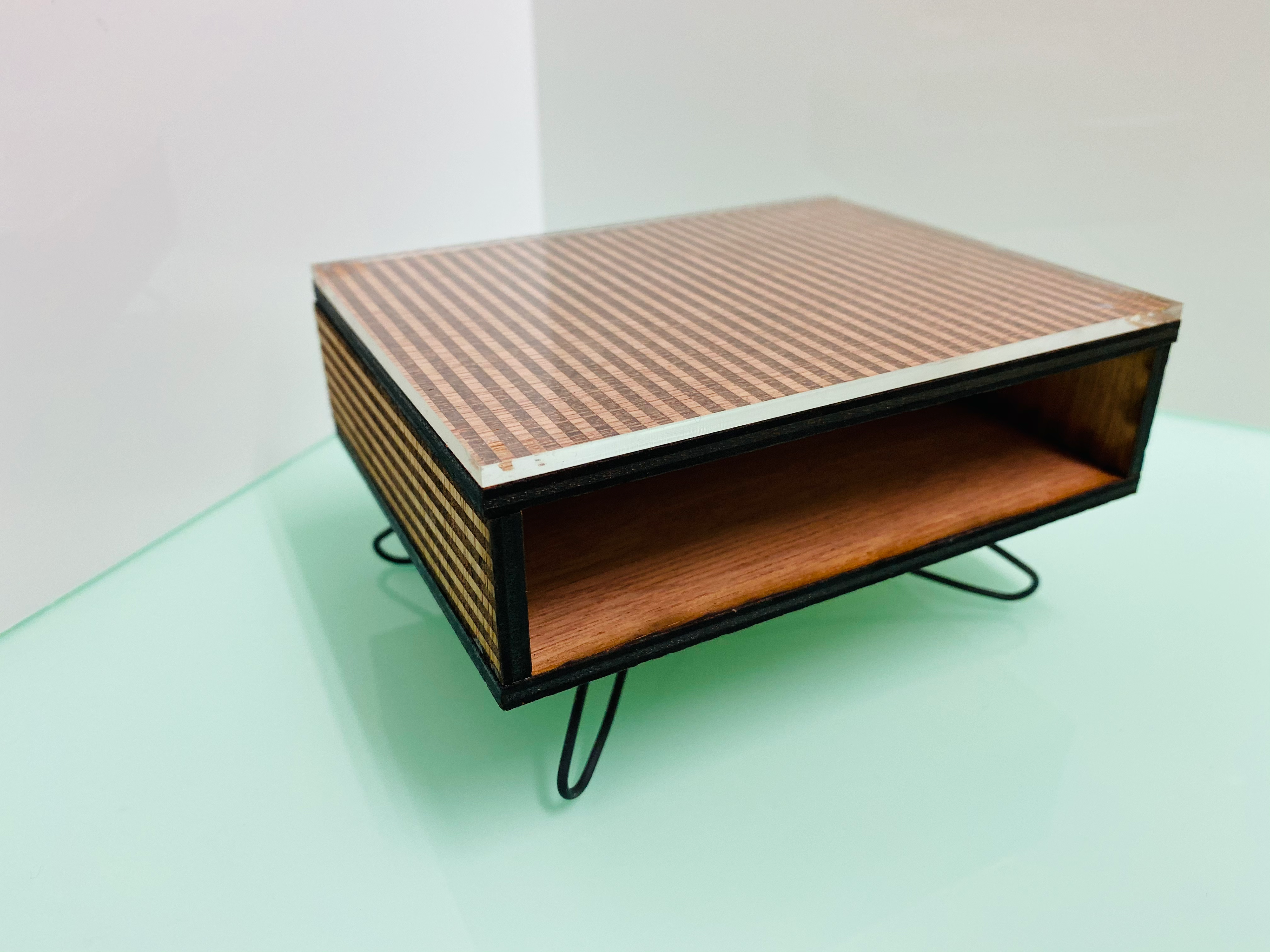
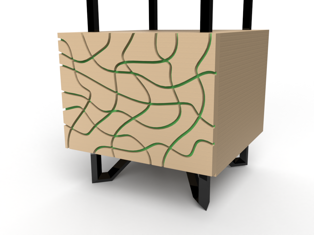
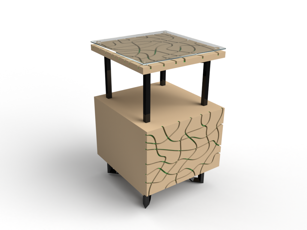
DESIGN 3
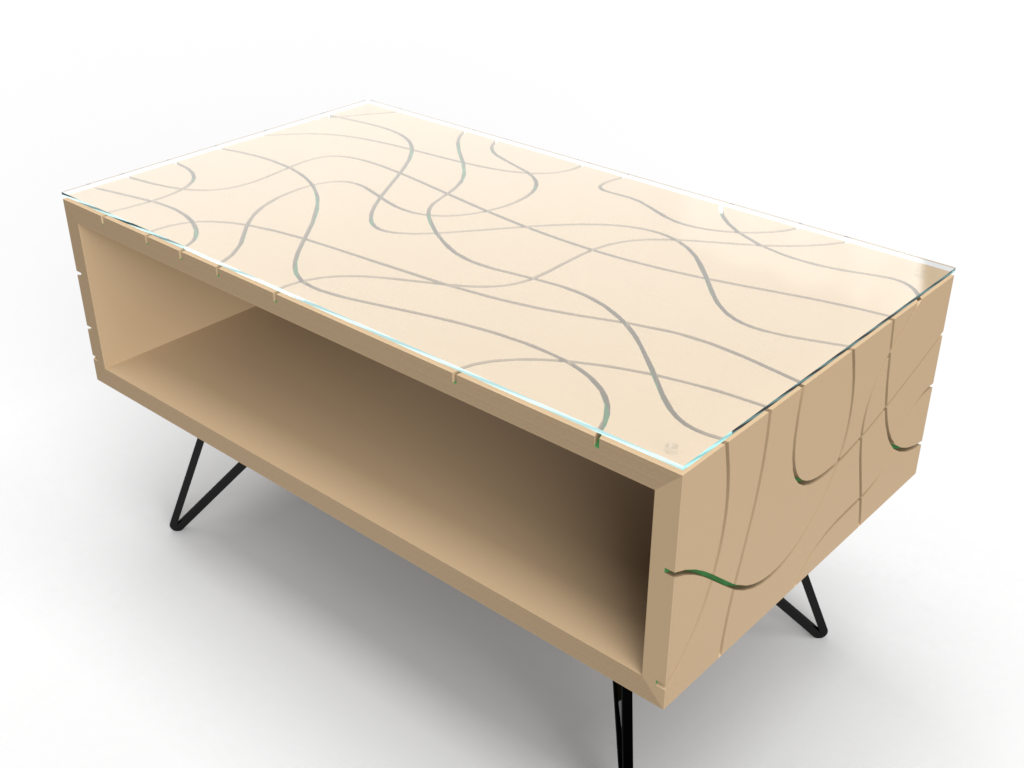
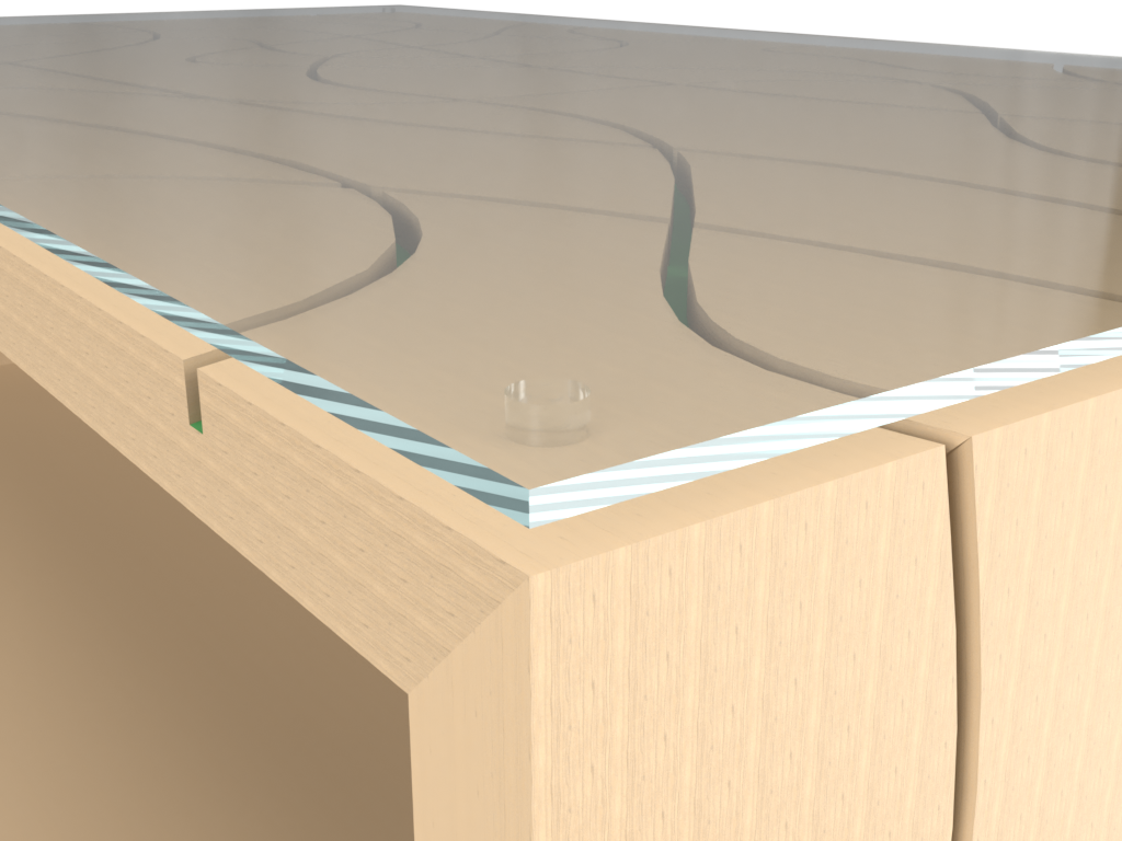
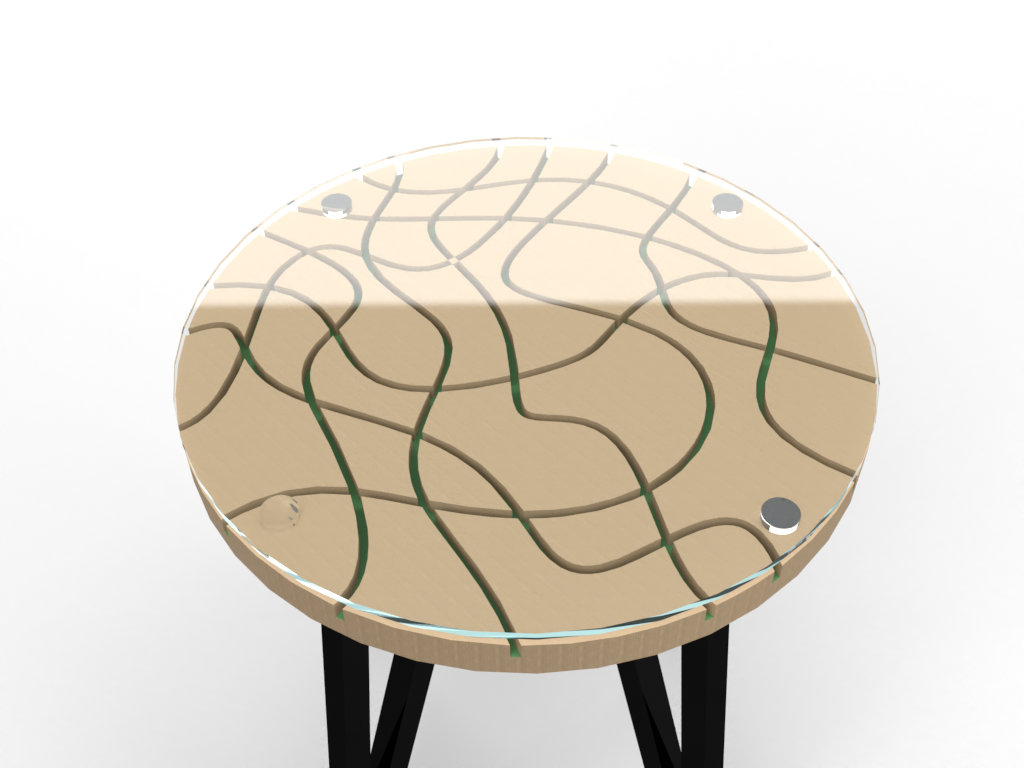
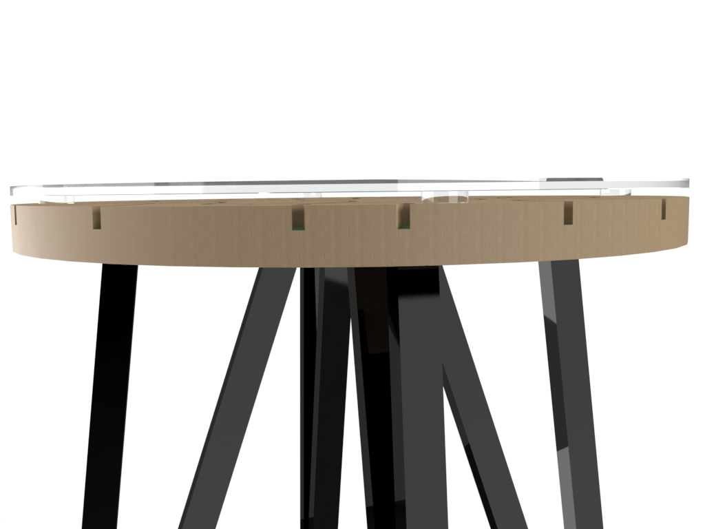
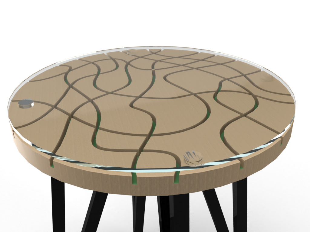
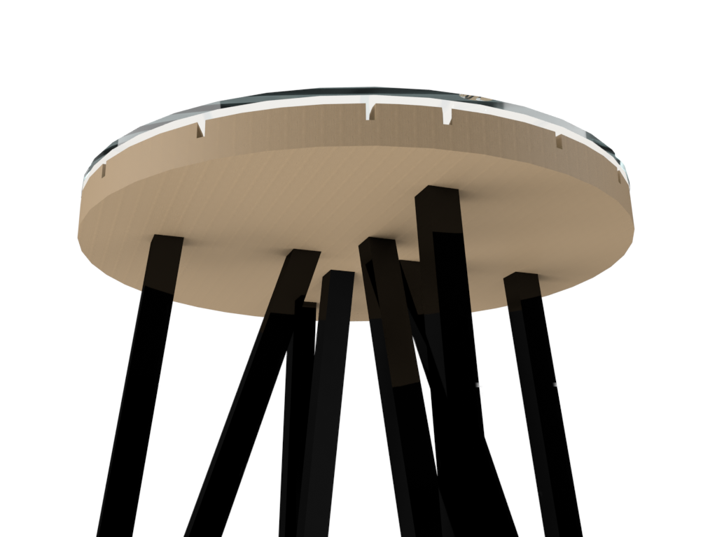
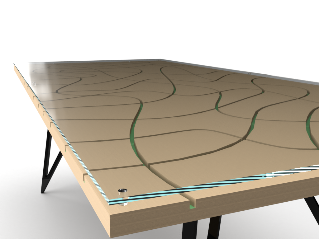
Along a similar concept of shadow and light distortion. This coffee table would be a light feeling piece for a lounge or reception room. The channels in the face of the wood will create a greater sense of depth than any average table. The table also features a glass top that not only can be removed for cleaning and transportation but will also refract light to highlight the channels whilst making anything placed upon it seem to float. There is also storage underneath the top of the table to decrease the presence of clutter that accumulates in everyday life. This is a piece for someone looking for more than just a simple coffee table, this is for someone who wants a centre for social and domestic interaction.

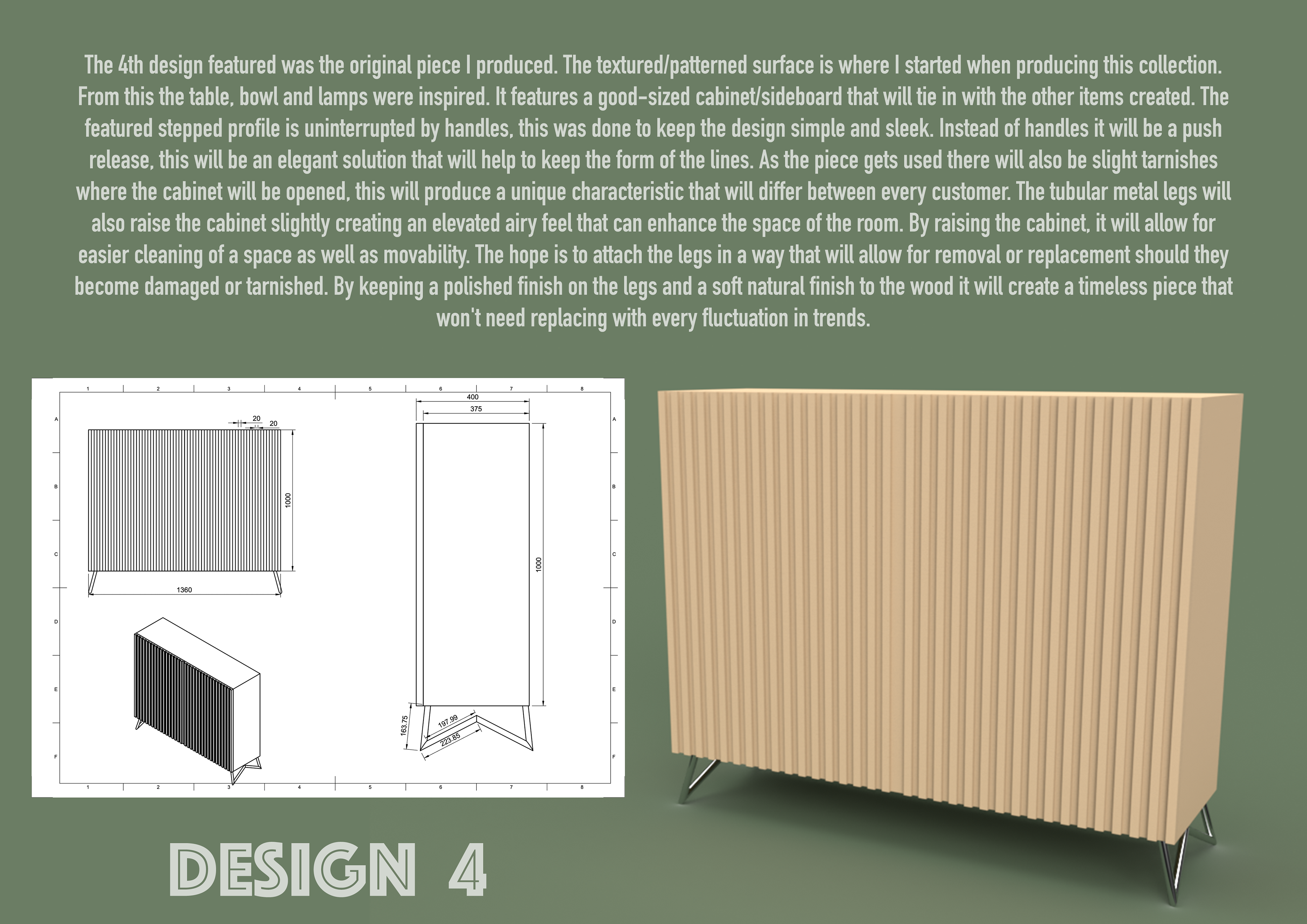
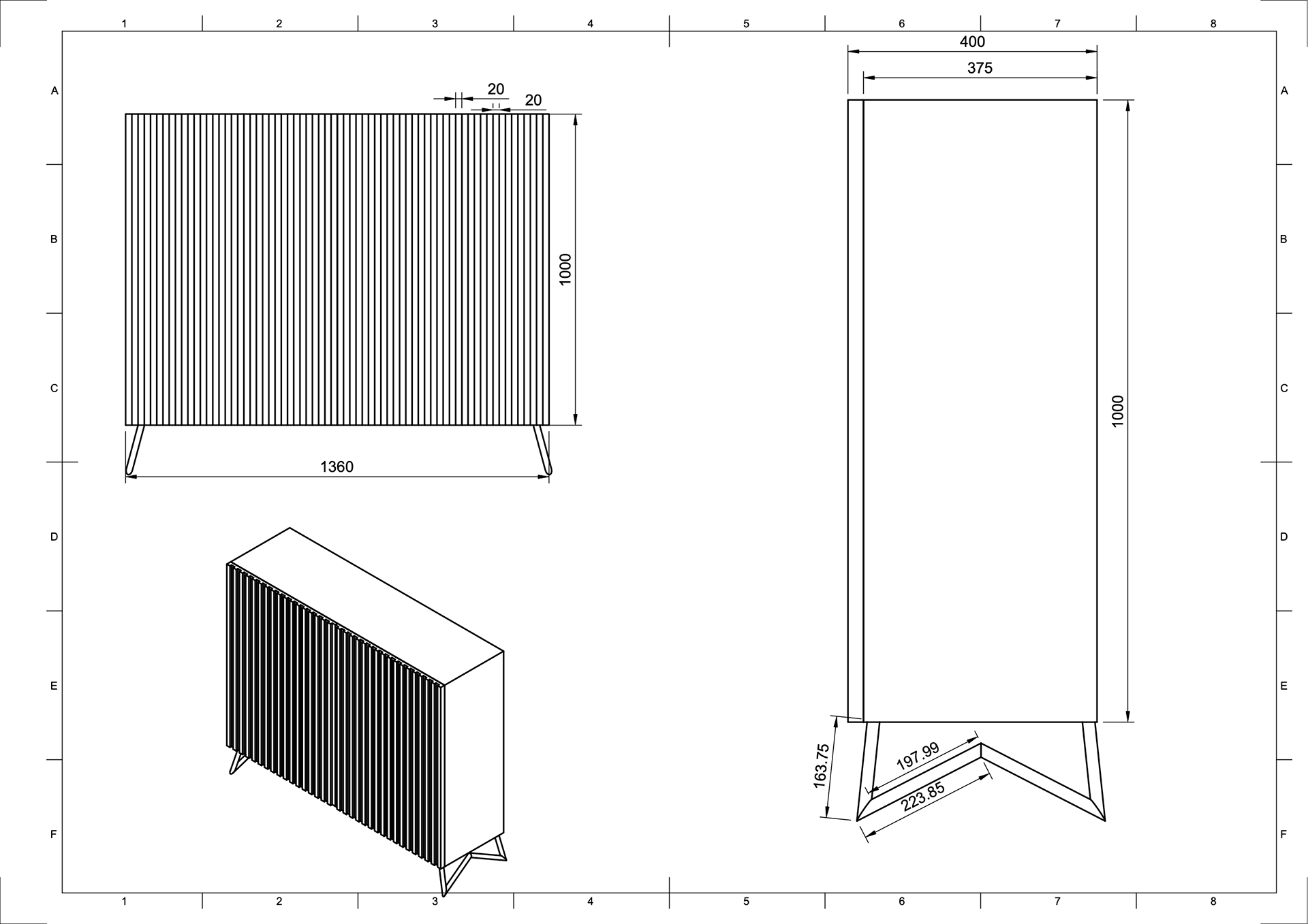
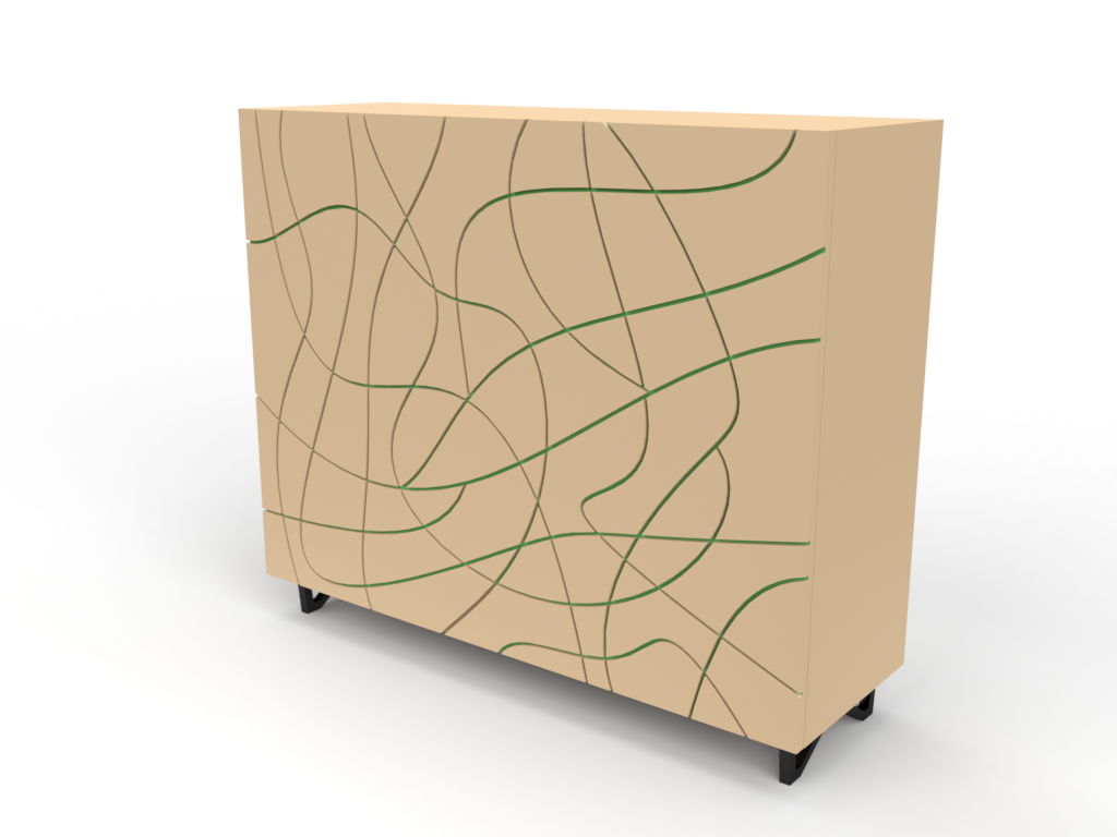
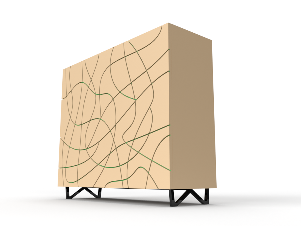
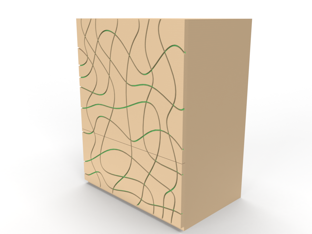
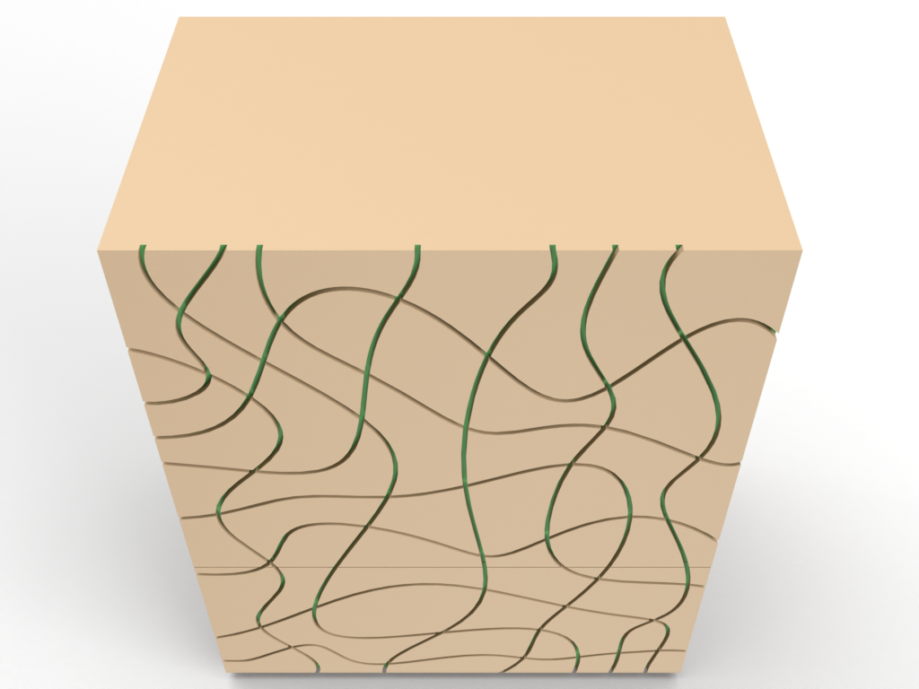
DESIGN 4
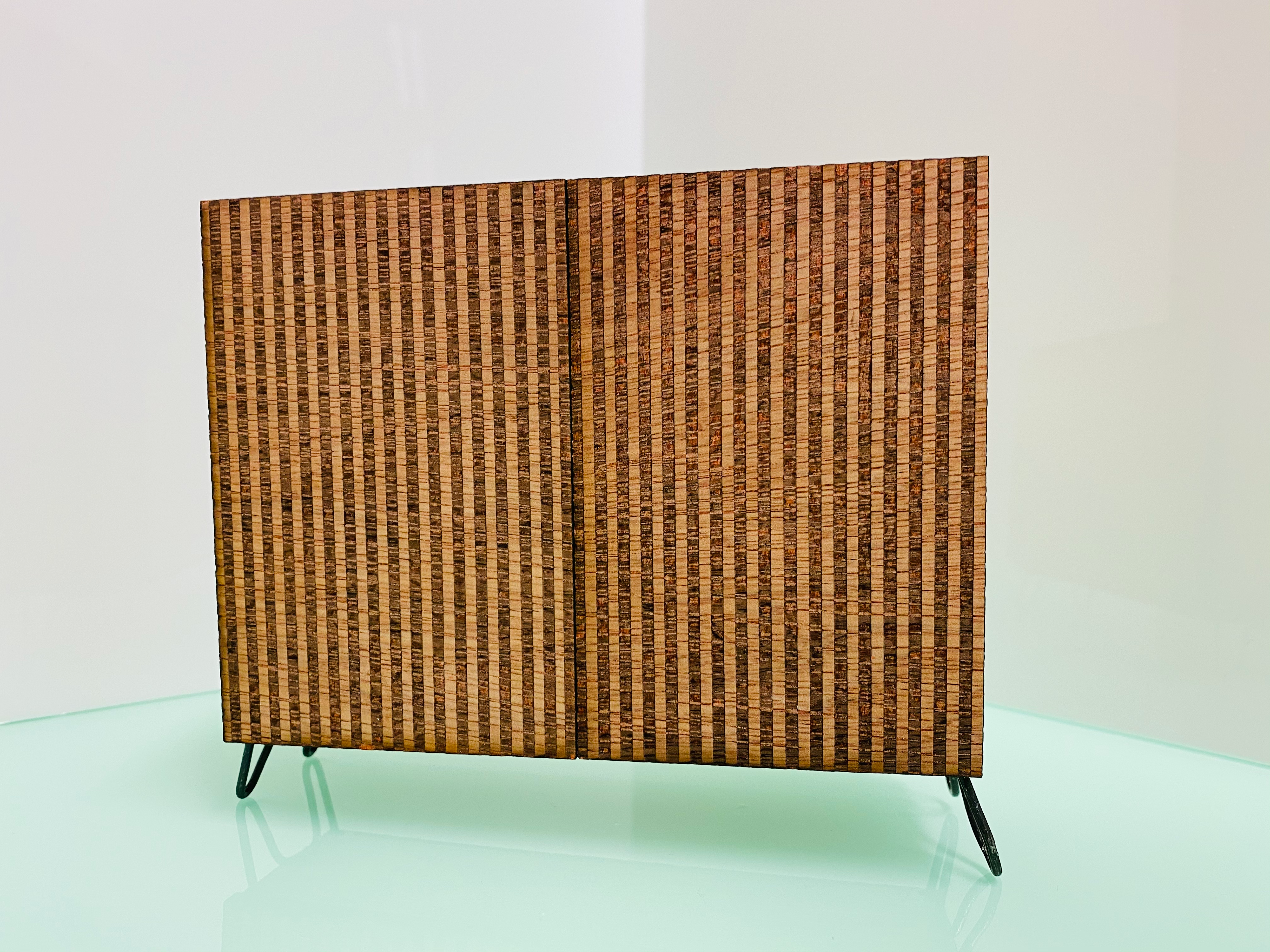
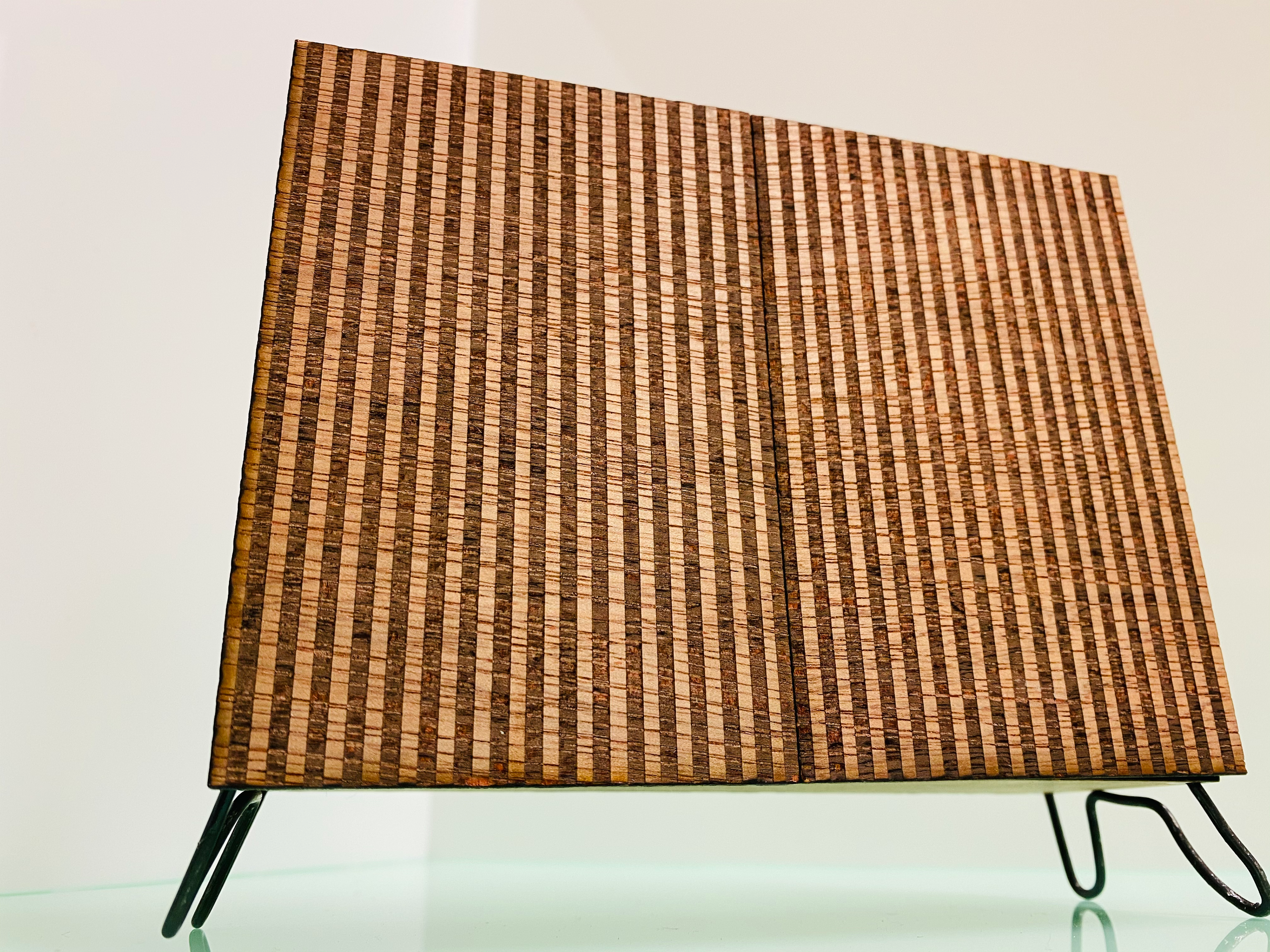
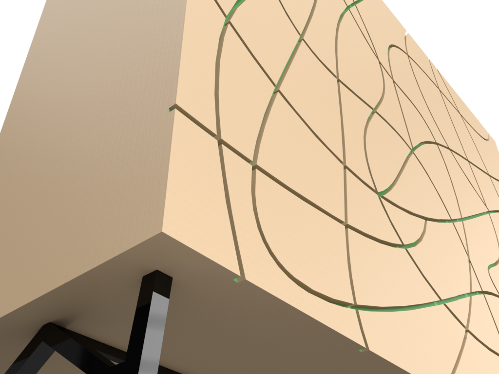
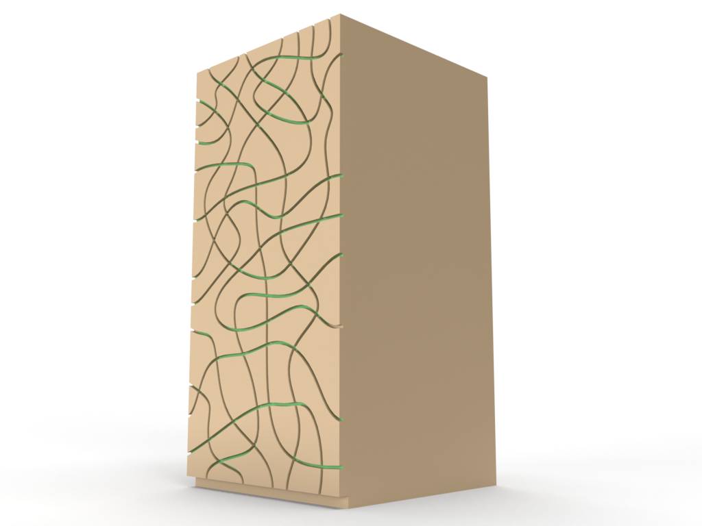
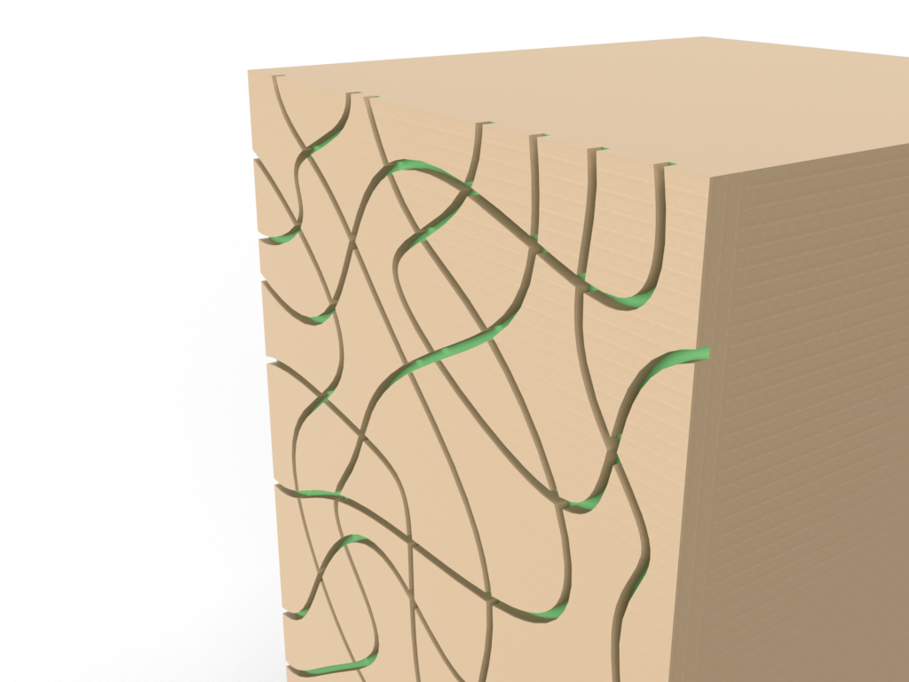
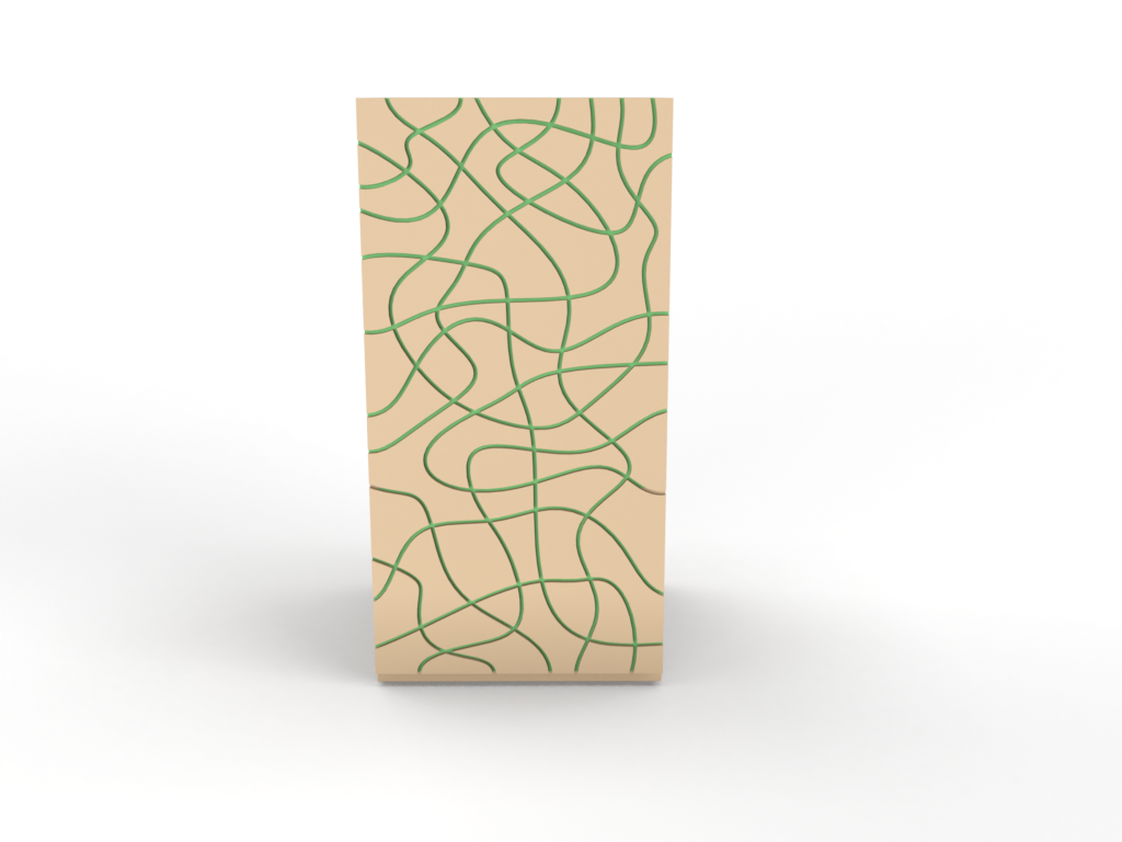
An accompaniment to this collection is this sideboard cabinet. It is rather difficult to find a collection that has such an adaptable characteristic. For this piece the channels are taken to form the doors of the cabinet. There are no handles on these doors, this is to allow the clean lines of these channels to be maintained. They will feature a push release to compensate for the lack of handles. Not only is this good as cosmetic feature but also to increase the craftsmanship level.
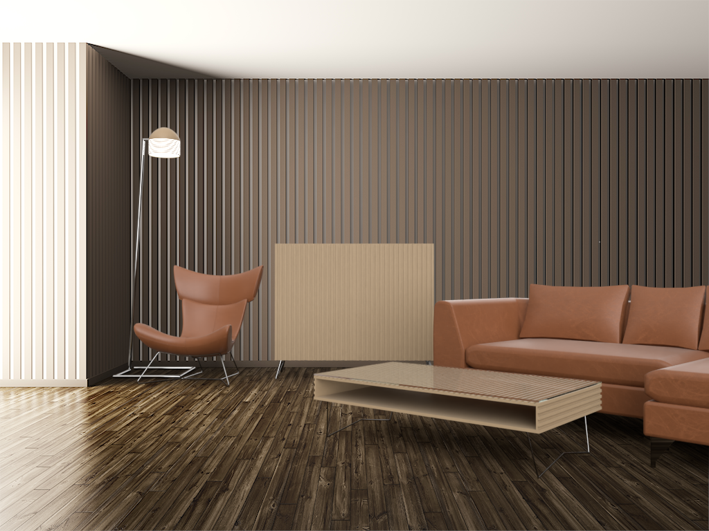
ENVIRONMENT VISUALISATION
To help show case this work I created a digital environment to simulate a living area. It shows how the pieces can work together in harmony. It provokes a modern finish that is on trend with current interior stylings. The article that was used to inspire this work is Virtual Decorex 2020: Trend Analysis (Pierre-Davis, 2020). The article speaks of geometric qualities and spherical lighting. These are present in the designs at certain levels.
https://www-wgsn-com.ezproxy.cardiffmet.ac.uk/li/article/89451#page5
This rendering was created using adobe dimensions. This software uses a vast collection of textures, materials, and stock shapes to allow you to create stunning renderings in a simple manner. I found this the most user-friendly software so far. As shown below it harmonises the lights of the environment with the textures you insert. By using the match perspective features I created this visual to a high standard.
MODEL MAKING
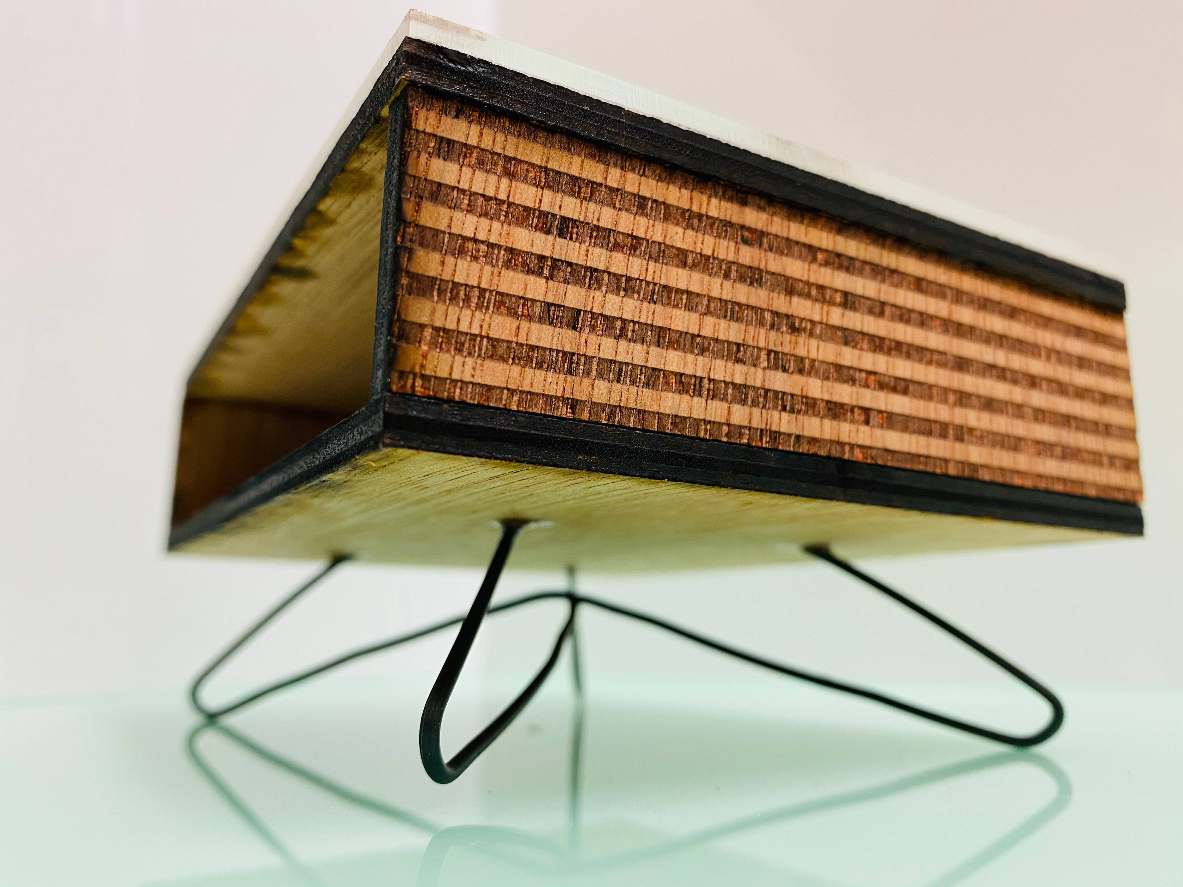
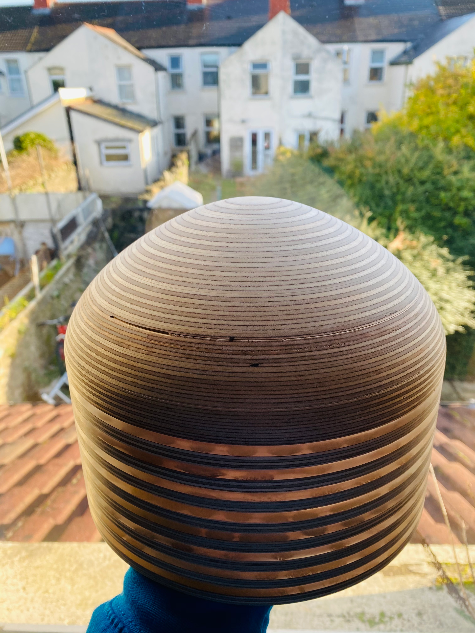
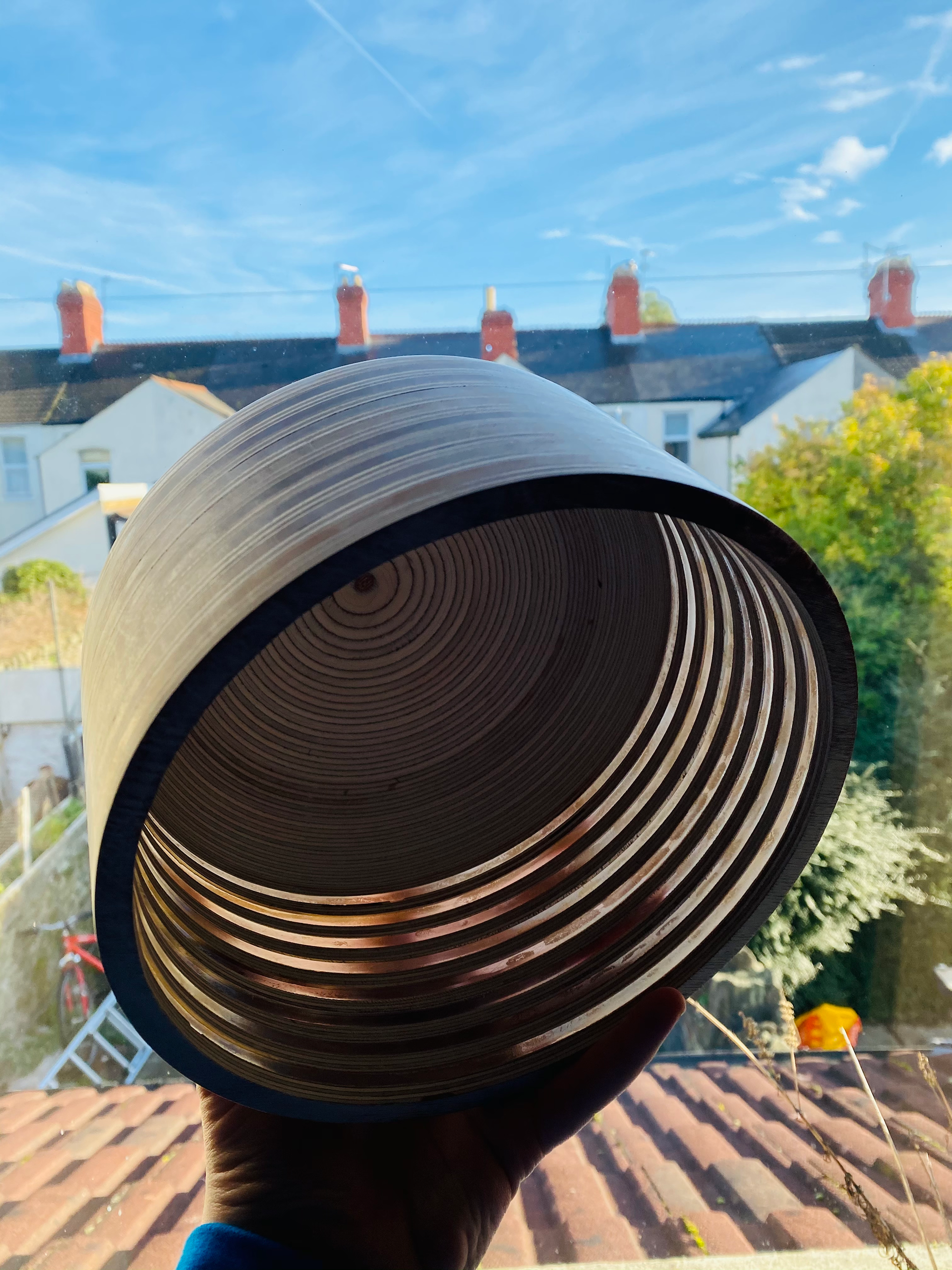
As a further extension of this communication of my designs I created a series of models. Two are made to a scale of 1:10 and were produced using the laser cutter. The third is actually full sized and may be used as part of the final outcome due to the size and standard that it can be finished to.
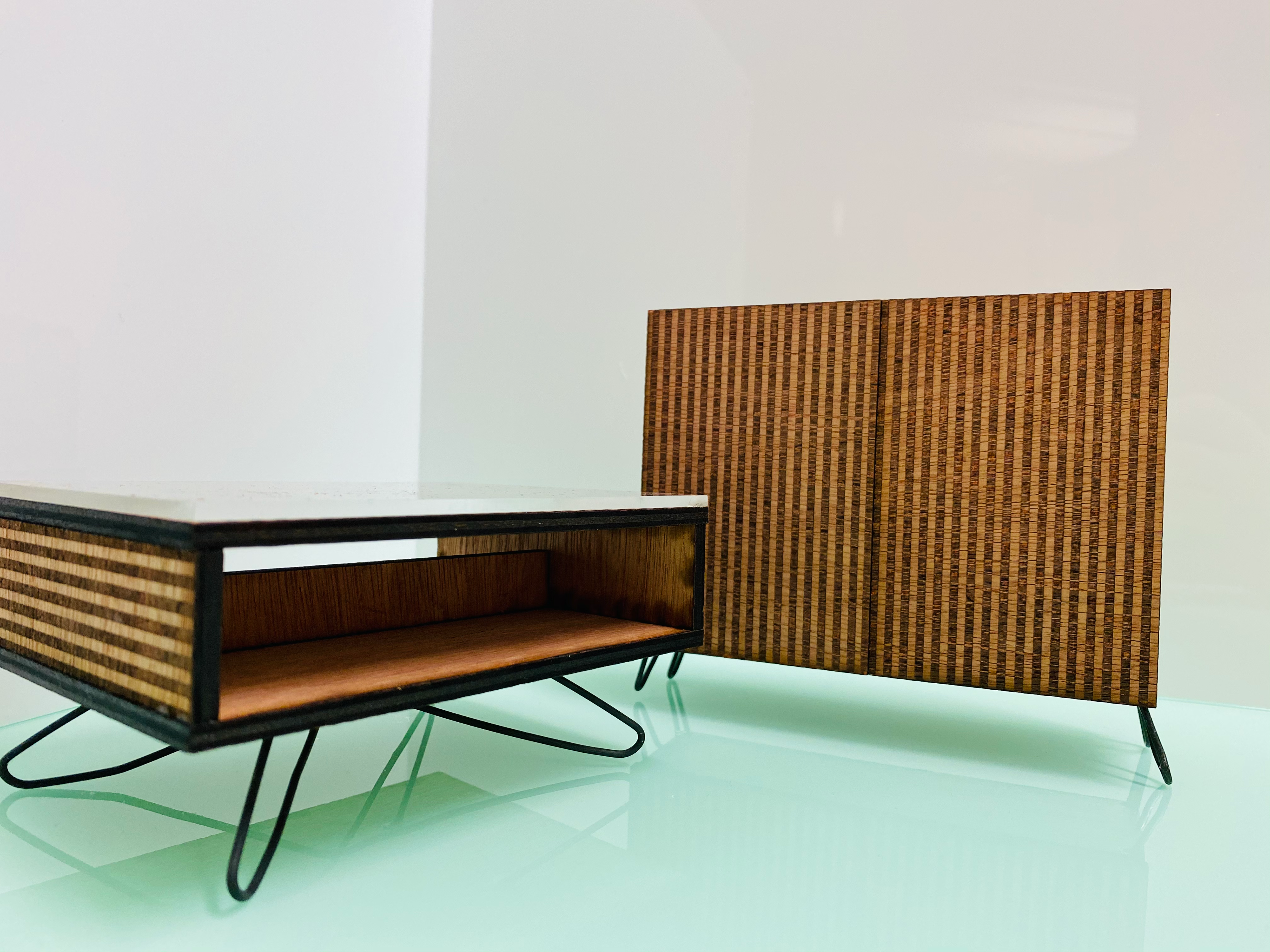
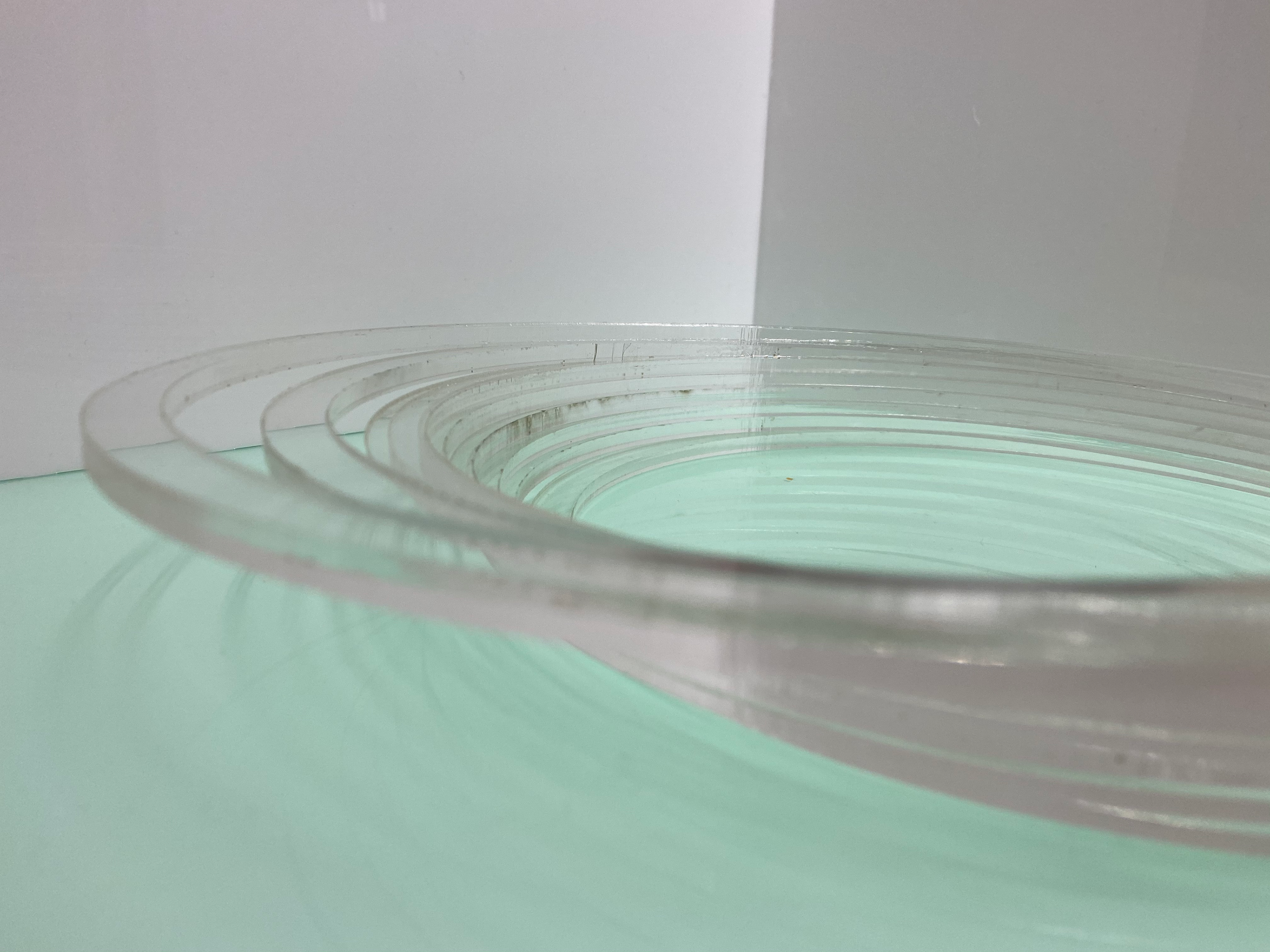
The first model is the coffee table. It features the elements of the table and is a strong representation of my design. The ridges are represented by the engraved lines as well as having the glass top shown by clear acrylic the scale could've been larger upon reflection however, I still believe that the 1:10 is suitable at this stage. When creating this model, I changed the legs on the design. I feel that this is a better fit for this design that I couldn’t see until I played with the wire.
The cabinet model shows how the profile will look with the lack of handles. I choose to go with the push release as opposed to handles so that I can maintain the exterior lines, it will also add to the simple elegance of the work. It was point out to me that the piece is a bit of an oxymoron. The unit has a heavy solidness to it, yet the legs have a light playfulness. This was not criticism but an observation on the aesthetics of the piece. I rather like this classification of the piece.
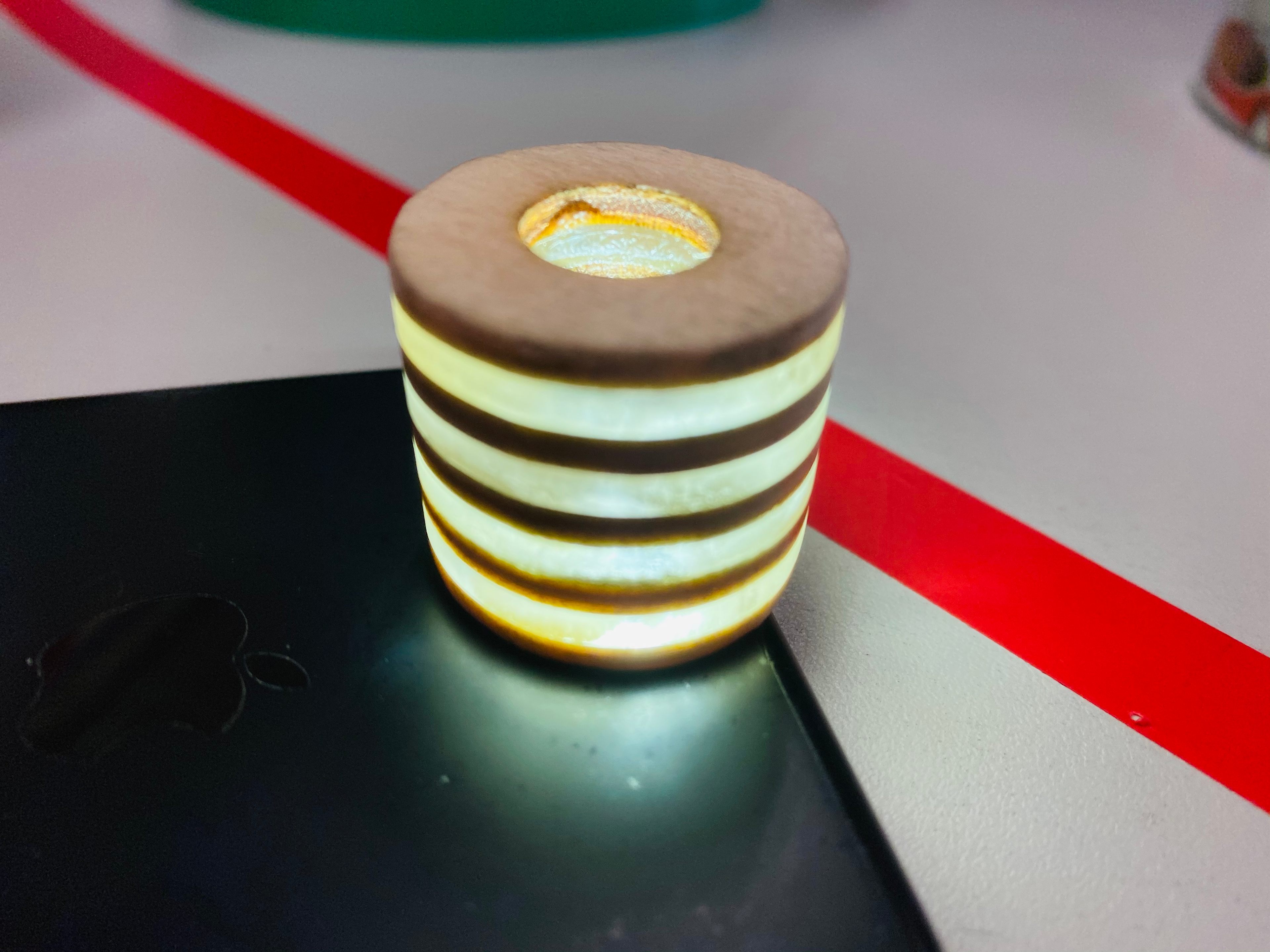
As I started looking at the ins and outs of the lamp shade design, I made a miniature model that could fit on a phone torch. This was to see how the light would move around the design as well as how I could finish it. In the past when I've worked with clear materials there is always a possibility that once you start sanding you won't be able to get the same level of clarity. It was suggested to me that I should use superglue. As it is a plastic based product it will first fill in the small abrasions that cause the cloudiness but then provide a clear shine finish. This sample was done using this method and shows that it works will with the acrylic and plywood.
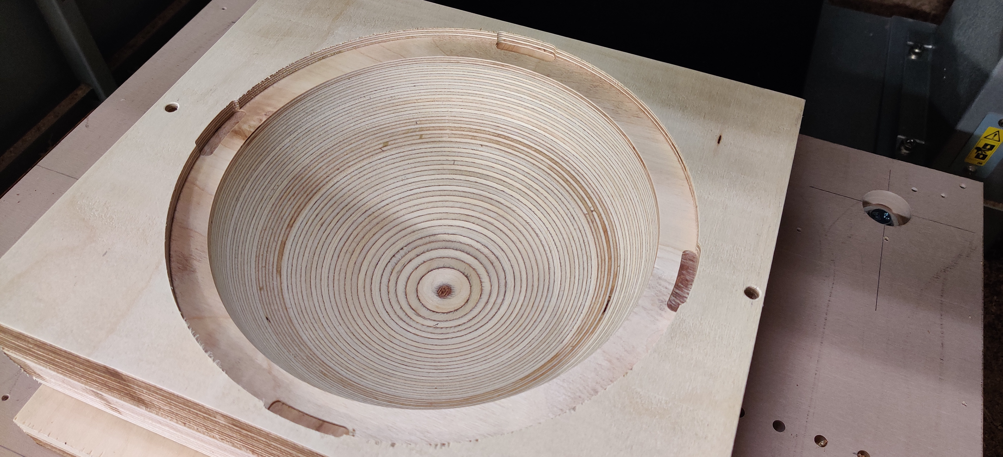
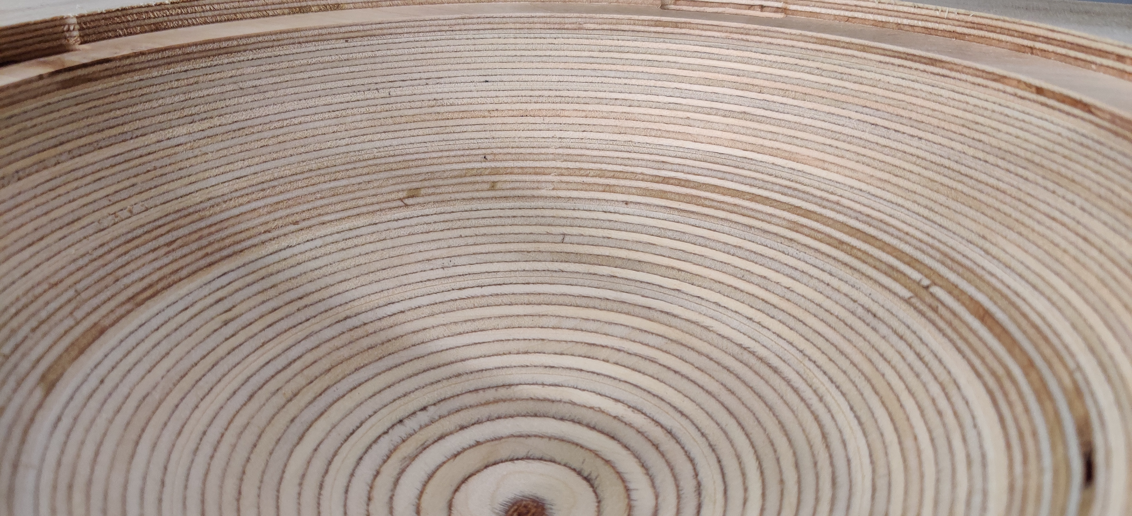
STAGES OF MAKING
CNC- used to make the dome shape and plywood rings.
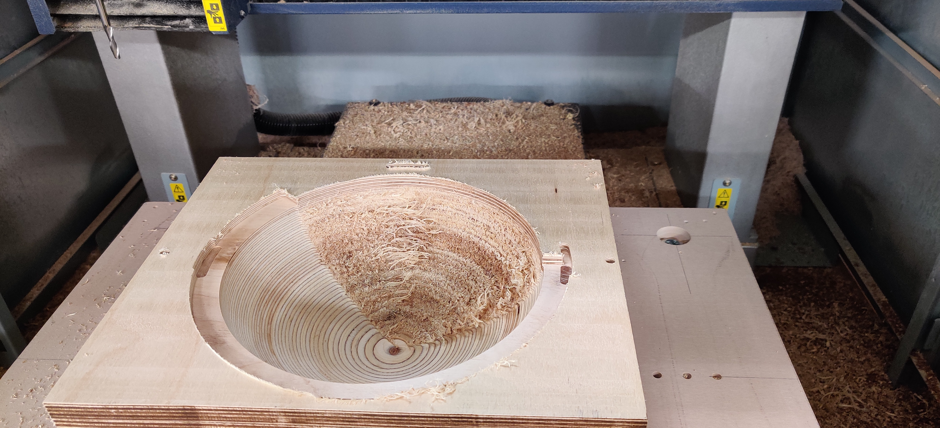

Laser Cutter- to cut the acrylic rings.
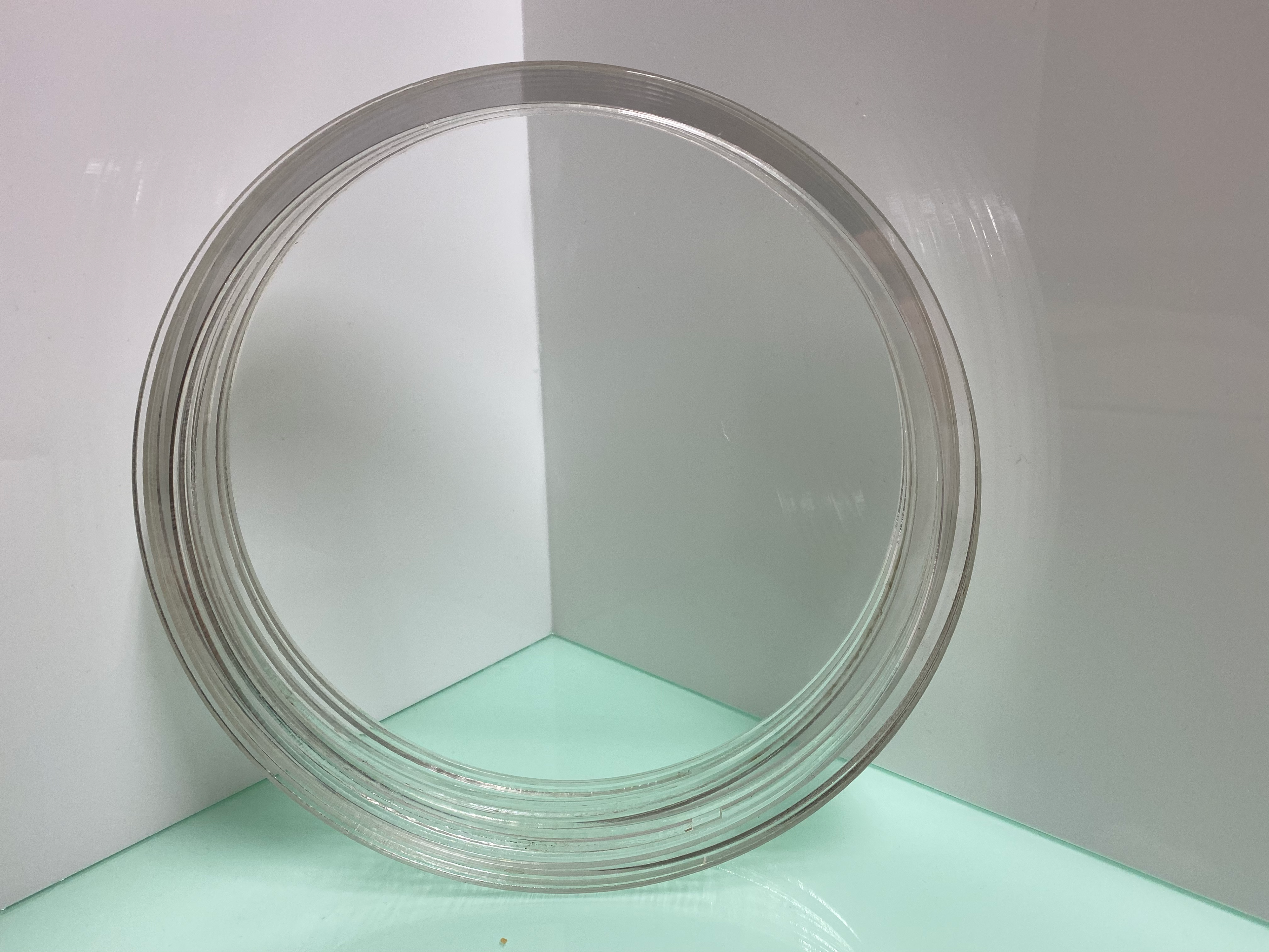
Forming and Sanding- glued and sanded to 400 grit, intention to go up to 1000+ grit.
STATEMENT OF INTENT
It is my intention to see these designs through to the end. They will form part of my business hopes as an initial collection. I will look at different finishes and scaling, as well as the potential of developing the designs to make them more unique and desirable. By having the basis of the designs thought out it means that the construction should happen at a good pace with allowance for further experimentation. Even though I have set out with rather a lot to do I believe that it should all be achievable to high standard.
There are a few items other than the designs that I will need to carry through. These include a catalogue of the designs as well as a development of my branding as a designer maker. This is something that is also being considered as part of my dissertation and so I believe that it is something that I should embrace and put out there before I finish on the maker course. This will include a developing social media presence as well as tradition business cards and adverts.
The hope is that this combination of design work and developing identity will create a strong professional presence and understanding that will allow me to continue to evolve as a designer maker and reach out into the market post-graduation. This is will also be enhanced by my hopes of studying a MA in Creative Enterprise and Innovation at Cardiff Met, this is a course that will allow me to develop but with a strong foundation of knowledge into the world of not only design but how I can use it to make a living.
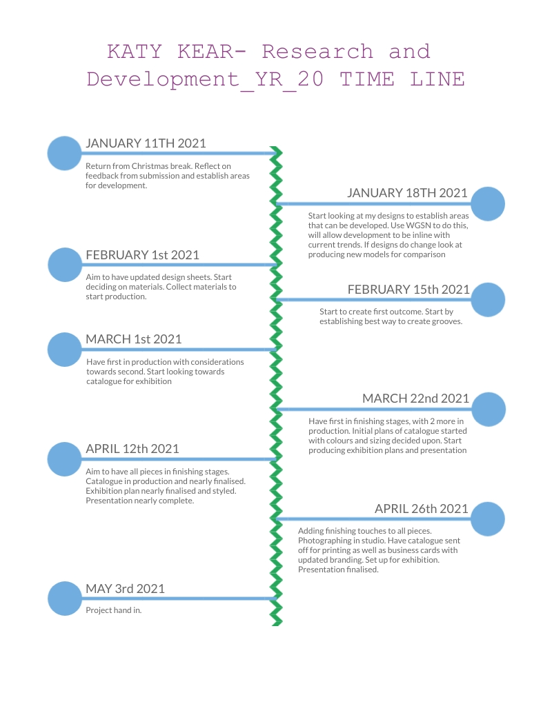
TIMELINE
AMENDMENT 2
TERM 2
Further Research
After I took some time away from my designs, I was not too sure on them anymore. Time away from the work is a great way to see if the designs applied to me and the market. As this is a new year there are new trend forecasts and accompanying analysis. In the past I have found looking at what well known furniture companies have produced as way of market research, however this time I want to make sure that I am not doing something that can be found everywhere. And so, I need to look towards future season trends. I didn’t want to completely walk away from my designs, merely adapt them to be more applicable to future consumer intrigue.
WGSN Reports
I looked through several newly released forecasts from WGSN. The trends in these reports are for 2021-2022 seasons. There were a few that caught my attention:
Forecast Trends 2022: Furniture and Lighting (Allyson Rees10.15.20)
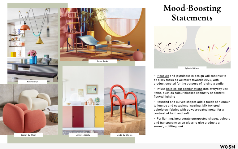
Mood Boosting Statements- This action point explores how colour is going to be desired in new designs. Given the last year’s gloom this is unsurprising. Colour is known to influence mood and temperament. Bright bold colours will promote positive affirmations on anyone. During the pandemic there were increased reports of depression and anxiety. It is a small thing to add a little bit of colour to a design, but if it can help someone in need then it is beyond important.
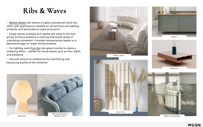
Ribs and Waves- More of a tactile or form element for this point. Personally, I love tactile surfaces; being able to run my hand across a surface and free the rise and fall is almost therapeutic. The report states this is a reason these patterns are coming to the forefront of 2022 design. Waves promote a gentle sense of movement that is calming and centring. Water has always been considered a relaxing substance; a presence in meditation practices affirms this.
Furniture and Lighting: Colour, Material, and Finish (WGSN Lifestyle & Interiors 10.01.20)
Bright Pops- Graphic pop culture resurfaces in this report. Colour blocking is a great way to make a statement and atmosphere in an environment. The article also recommends combing patterns with profile to create something exciting and playful. A “pop” of colour is something that entails a small colour palette, a combination of classical utilitarian colours with a singular striking colour.

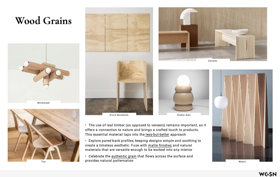
Wood Grains- Wood has always been material that connects us back to nature. The smell and the feel transport you a lazy summer afternoon or a cosy evening in front of a fire. Really wood brings a handcrafted touch to products that you don’t get with veneers. By keeping lines and edges simple items keep a classic timeless aesthetic. Minimal finishing will allow grains to shine through.
Rees, A., 2020. Furniture & Lighting: Forecast Trends 2022. WGSN, [online] Available at: <https://www-wgsn-com.ezproxy.cardiffmet.ac.uk/li/reports?filters=%7B%22categories%22%3A%5B%22715%22%5D%7D> [Accessed 30 March 2021].
Lifestyle and Interiors, W., 2021. Furniture & Lighting: Colour, Material & Finish. WGSN, [online] Available at: <https://www-wgsn-com.ezproxy.cardiffmet.ac.uk/li/reports?filters=%7B%22categories%22%3A%5B%22715%22%5D%7D> [Accessed 30 March 2021].
WHAT DID I TAKE AWAY FROM THIS?
The current pandemic has taken a toll on everyone. Lockdowns and restrictions on how many people you can see has led to everyone missing their loved ones and feel anxious about leaving their homes. This causes people to reach a low in their mood. Colour is a great way to brighten any room and consequently someone's mood.
Different tones, shades, and hues of colour affect all moods differently. The effect of these aspects will all depend on how the colours are being used. A response to colours is something that is deep-rooted in biological conditioning and cultural imprinting. By exploring which colours do what to human mood and centring.
RED
As a colour red can make you feel passionate and energised. This colour is often associated with romance and love. It is the warmest and most dynamic colour group, in certain situation it promotes conflicting emotions, ‘seeing red’, the colour is also associated with anger and aggression. Recommended use as an accent colour as it can be overwhelming in large quantities.
ORANGE
An enthusiastic and energising colour promoting vitality and happiness. A secondary colour made from red and yellow, it has a warm tone that shows movement and commanding attention. Aggressive yet balanced, exciting but inviting and friendly. Used in industry to promote sales and product subscription.
YELLOW
Happy and spontaneous. This is a colour that is greatly associated with positive emotions. It is a high energy colour which can make the observer feel optimistic and cheerful. However, yellow is a highly reflective colour and can be aggressive on the eye. This colour should be used sparingly. It is a great accent colour that is effective at catching attention.
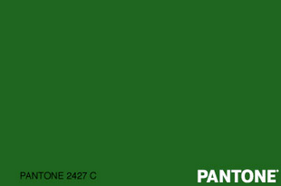
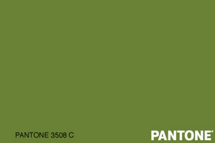
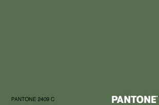
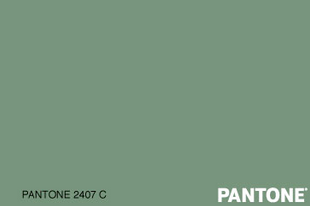
GREEN
The colour green has associations of growth, it leaves you feeling optimistic and refreshed. Green is one of the calmest colours that is easy on the eyes and should be used to promote relaxation and balance. A combination of warm and cool primary colours it uses the energy of yellow with the clarity of blue to depict growth, security, and creativity. In industry practice it is often used to show a ‘green’ ethos and friendly practice.
BLUE
Safety and calmness, these are the connotations of this colour. Just seeing this colour can cause the body to produce calming hormones. A favoured colour of the corporate world it has a professional finish, yet overuse can make something cold and disengaging. Different shades can have different effects as well, baby blue is associated with new beginnings, yet mid tones are often associated with social medias such as Facebook and Twitter.
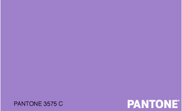
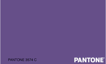
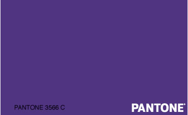
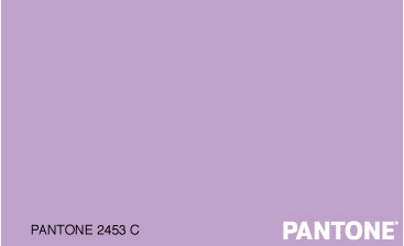
PURPLE
Colour most often used to promote creativity. Historically a royal colour with adoption into mystery and wealth. Lavender shades can be used to soothe those under stress- mostly likely a developed cause of the scent of the flower. Purple can make something seem luxurious and desirable and so if often used in beauty products for this purpose.
PINK
A playful and romantic colour that is often associated with love and freshness. One of the most feminine colours; it has ideals of tenderness and sensitivity. Its essence is cute, sweet, and charming. As a result of these traits the colour is often used in young girls' items such as a clothes and toys.
BROWN
Grounding colour, that brings us all back to earth to recentre. Stable in connotation with warm tones, it is friendly, practical, and dependable. It also represents the old fashioned and well established. As things age, they may start to turn brown, this is where this association can be derived from.
BLACK
High-end and sophisticated, with classic tones and serious nature. Strong and powerful with connotations of mystery as well as death and mourning. Another good accent colour, mostly used for outlining in graphics work, as well as sleek, high-end, professional branding.
WHITE
Signifies clean minimalism and simplicity. A large use of white has a bright fresh effect that creates the popular minimalist style; white acts as a blank canvas that allows creativity to flourish. White has a great cultural importance, it signifies virginity, purity, and innocence. The colour is notably used in bridal gowns and baby clothes. The colour of all colours it is the most usable and adaptable due to its neutral tones
GREY
Serious and trending. There has been a surge in the colour grey over the last 5 years. It is considered mature and responsible, formal and dependable. Yet on the flip to this it can be conservative, dull, conventional, with a lack of personality. As a base colour it works well to make accents pop, yet an overuse will create something that is monotonous.
The reliance on colour is not the same for everyone, culture and personality all have an effect on how they are received. No matter how individuals relate to colours though they still have an effect on people's emotions and how they consequently act. During this time of crisis, when people’s anxieties are so high from worry and uncertainty, they need a calm relaxing environment. This rules out bright, over stimulating colours such as yellow and red, which will increase a person's heart rate. People need positive colours that are lacing in negative connotations such as cold and dark, this reduces the possibility of using certain shades of blue, and all shades of black and grey. Brown is too close to the colour of the material. Considering these traits, I believe the best colours for the collection will be certain shades of blue, as well as green and purple.
Gremillion, A., 2020. How Color Impacts Emotions and Behaviors. [online] 99designs. Available at: <https://99designs.co.uk/blog/tips/how-color-impacts-emotions-and-behaviors/> [Accessed 15 February 2021].
To explore which colours would be best for this I explore the colour database of WGSN to see which colours are considered desirable and trending; this will add to the possibility of consumer interest:
Shades of Green
Green is a colour that is mostly associated with nature and tranquillity. If I was to use this in my work, I believe it would give the subtle hint of escapism that so many have wanted to achieve.

Shades of Purple
A royal colour yet a creative vibe. Whilst it does have its place in stress free practices, purple has been adopted by the beauty industry to make it a hue of vanity.
Shades of Blue
In a small amount I believe that I could avoid the sense of corporate coolness and social media blackhole, allowing the sense of safety and calm to shine on.


There are benefits and downfalls to all these colours, however, they are the ones that speak the most of mindfulness and mood boosting. I believe that I will go with the colour green however over the others. The alternative connotations of the other colours are those that are negative and potentially draining on wellbeing. Corporate policies, unrealistic social media and beauty standards have overrun these colours and corrupted their meaning. Shades of green are the few that link us back to nature through its use in environmental campaigns and its standout beauty in a sea of grey make it the perfect accent choice.
HOW ELSE CAN THE PIECE BE USED TO PROMOTE CLARITY AND IMPROVE MOOD?
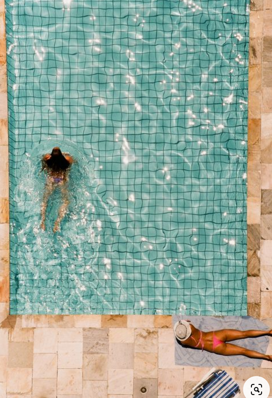
As we are unable to resume life as normal, there are a lot of things that people are missing from their routine. For me what I really want to do is go for a swim. It’s a little thing yet helps with not only physical but mental health. As a natural element water is one of the most important; it covers the majority of thins planet and makes up 75% of us.
When it comes to calm and tranquillity, there are few things that promote wellbeing more than nature. Nature has had a significant presence in meditation and wellbeing for millennia. In this time of turmoil many people have return to nature and found peace in the rush of leaves and trickle of water. For some however this peace isn't easy to access. Swimming is a way that many connect to this specific natural element.
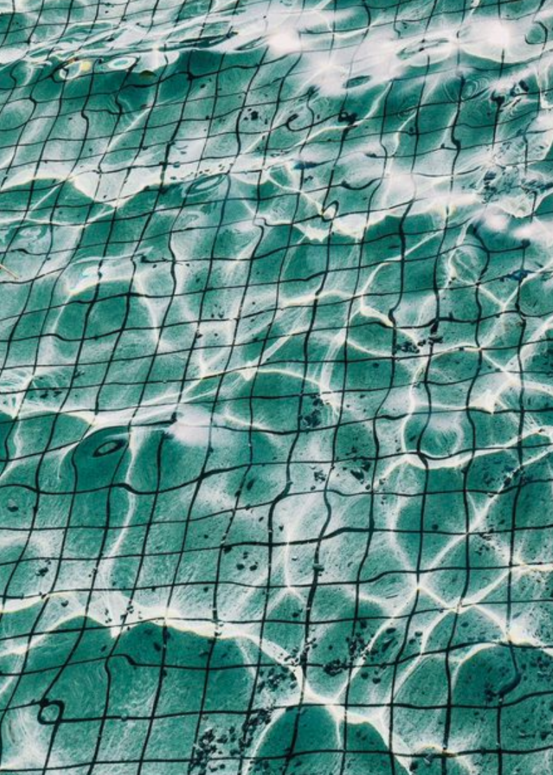
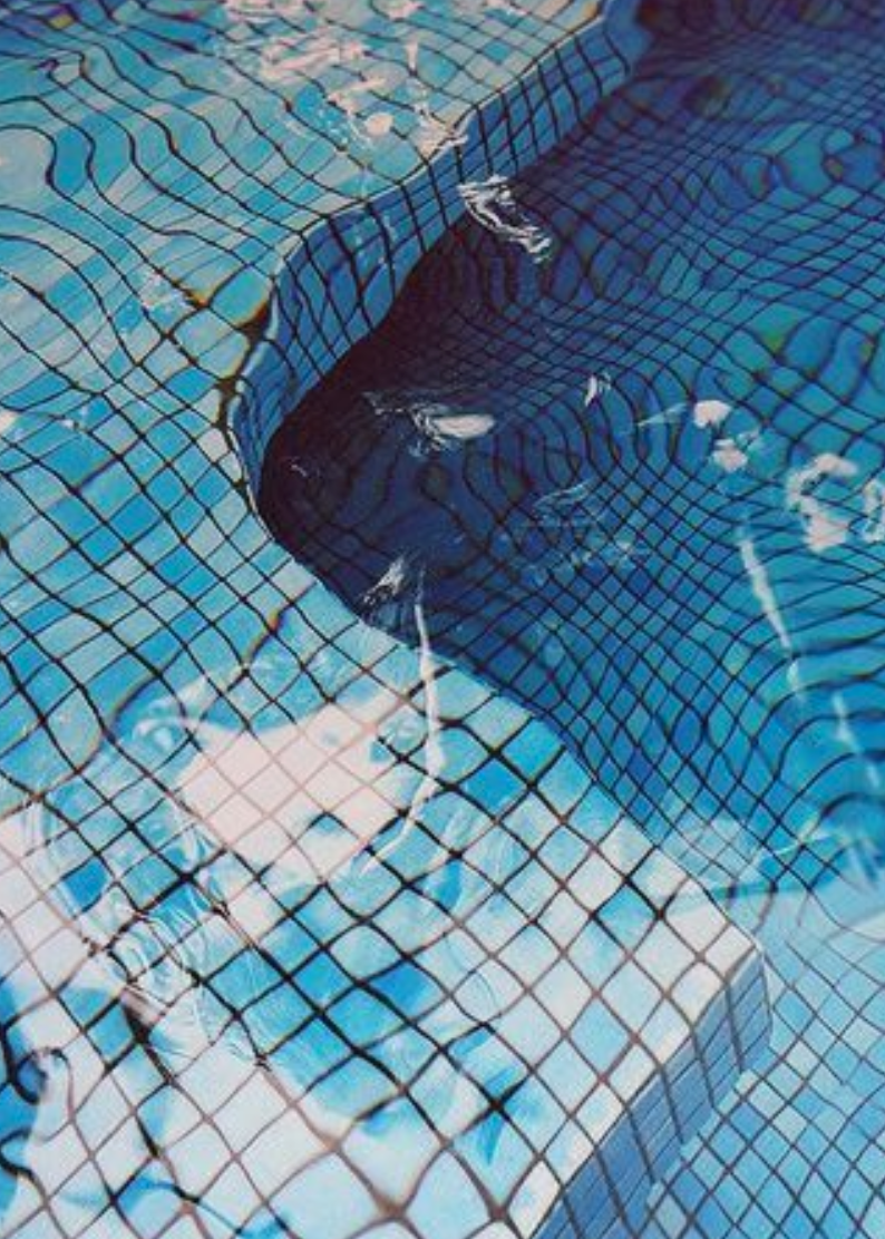
For me I know what visual effects at a swimming pool promote a sense of calm and relaxation. Many pools are tiled, this combined with the rippling of gently moving water, creates a soothing display that will ease the mind into a state of serenity. Something that is hugely needed for most.
IMAGE REFERENCES
What are the benefits of water?
There are many physical and psychological benefits to water. Evolution shows that we descended from the sea. The aquatic base of our diet from back them can be attributed to the growth of our brains and later evolution. We as a species remained situated around water whether that be for diet, supplies, real estate, or tourism. Water has not only become a practical resource but a desirable location, especially for the Great British Holiday. Many Brits transcend to national and international coastal locations for their escapes, it has been this way for decades. Phyiscally for human's water helps hydration, reduce muscle tension and keeps skin moisturized, yet for many they generally rely on the mental benefits of the element.
When people are by the sea there are many elements that affect mood and wellbeing. The science behind it is minerals and negative ions in sea air reduces stress by increasing oxygen to the brain as well as improved alertness and mental energy. Tryptamine, serotonin, and melatonin are preserved in salt water, all if which aid in easing depression, improving sleep, and overall boosting of positive well-being. These are only the measurable, physical benefits on mentality, however, there are more.
We never stop hearing, sound is a constant, a result of our environment. When we believe there is no sound, we still hear a ringing in our ears. The relation of water and sound is of running water, splashing, and ocean waves. Water is considered to be a form of white noise due to the symphony of pitches and tones. This is one of the reasons that water has such a strong presence in meditation. It allows for a detachment from reality which helps with the mental healing that so many seek.
Brown, N., 2017. Blue Mind: The Health Benefits of Being by the Water. [online] https://www.fix.com/blog/benefits-of-being-near-water/. Available at: <https://www.fix.com/blog/benefits-of-being-near-water/> [Accessed 28 March 2021].
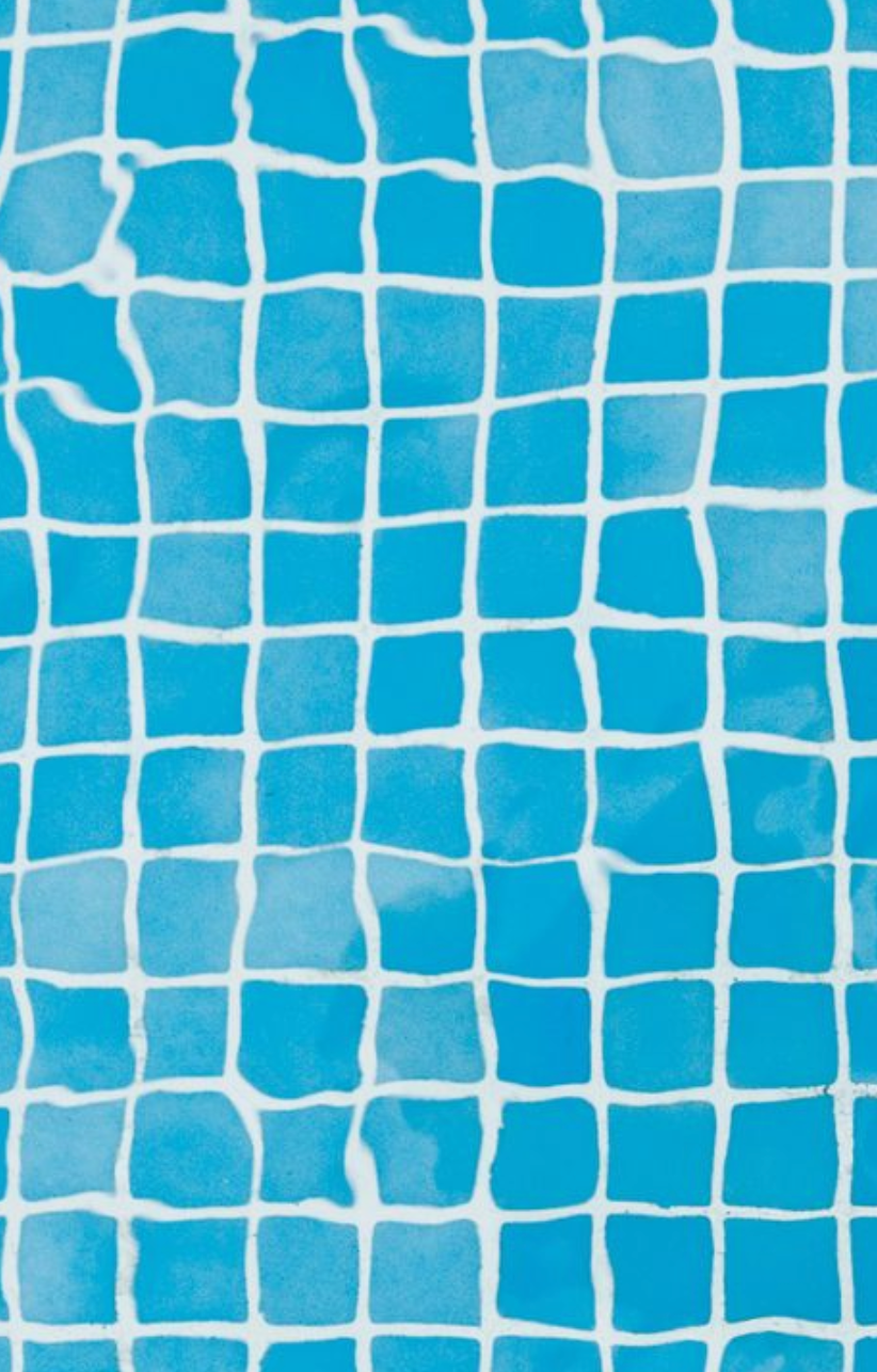
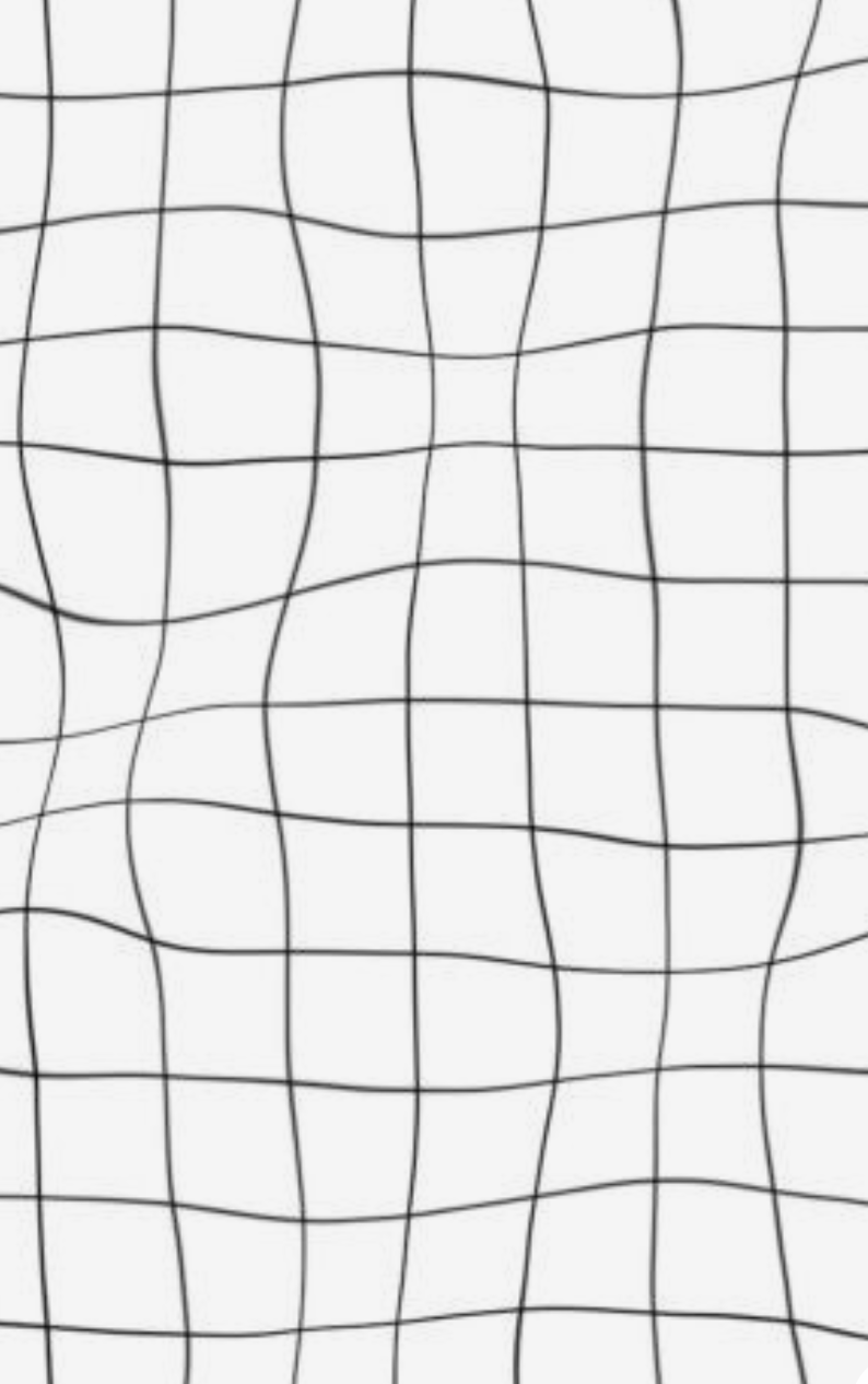
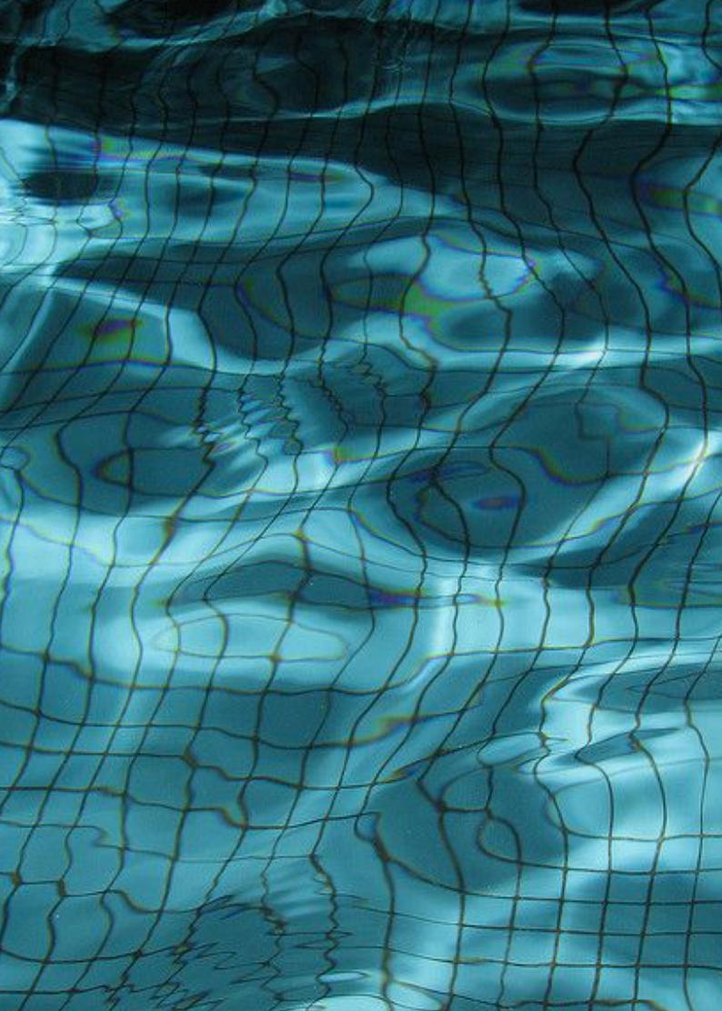
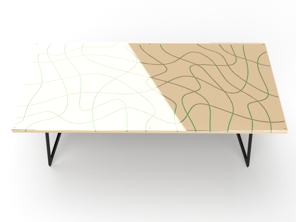
"TILE" EXPLORATION
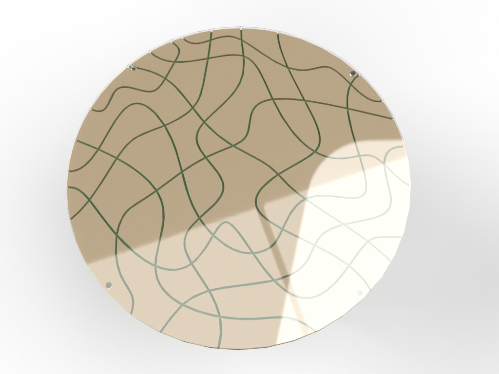
The results of the slow-motion videos are conclusive that the lines are made dynamic by the introduction of water. The water produces a pattern that is organic- the opposite of its original state. If I could introduce this energetic yet calming shift, it would create a recognisable yet trend setting pattern that would work for many environments.
WHO ELSE DREW INSPIRATION FROM WATER?
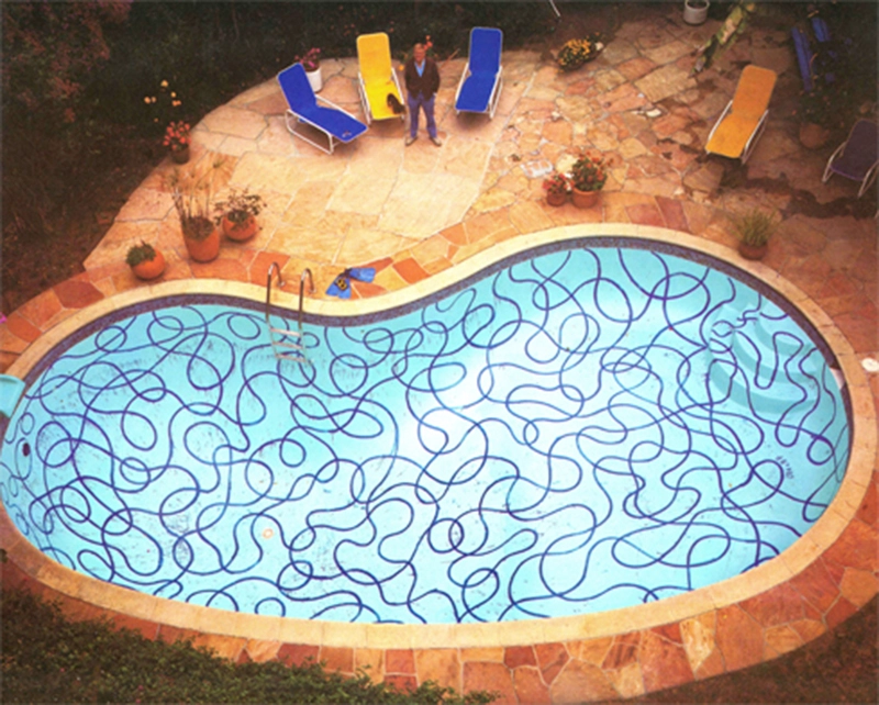
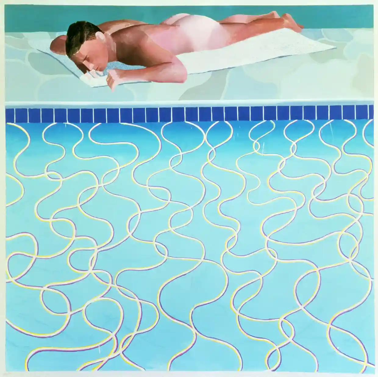
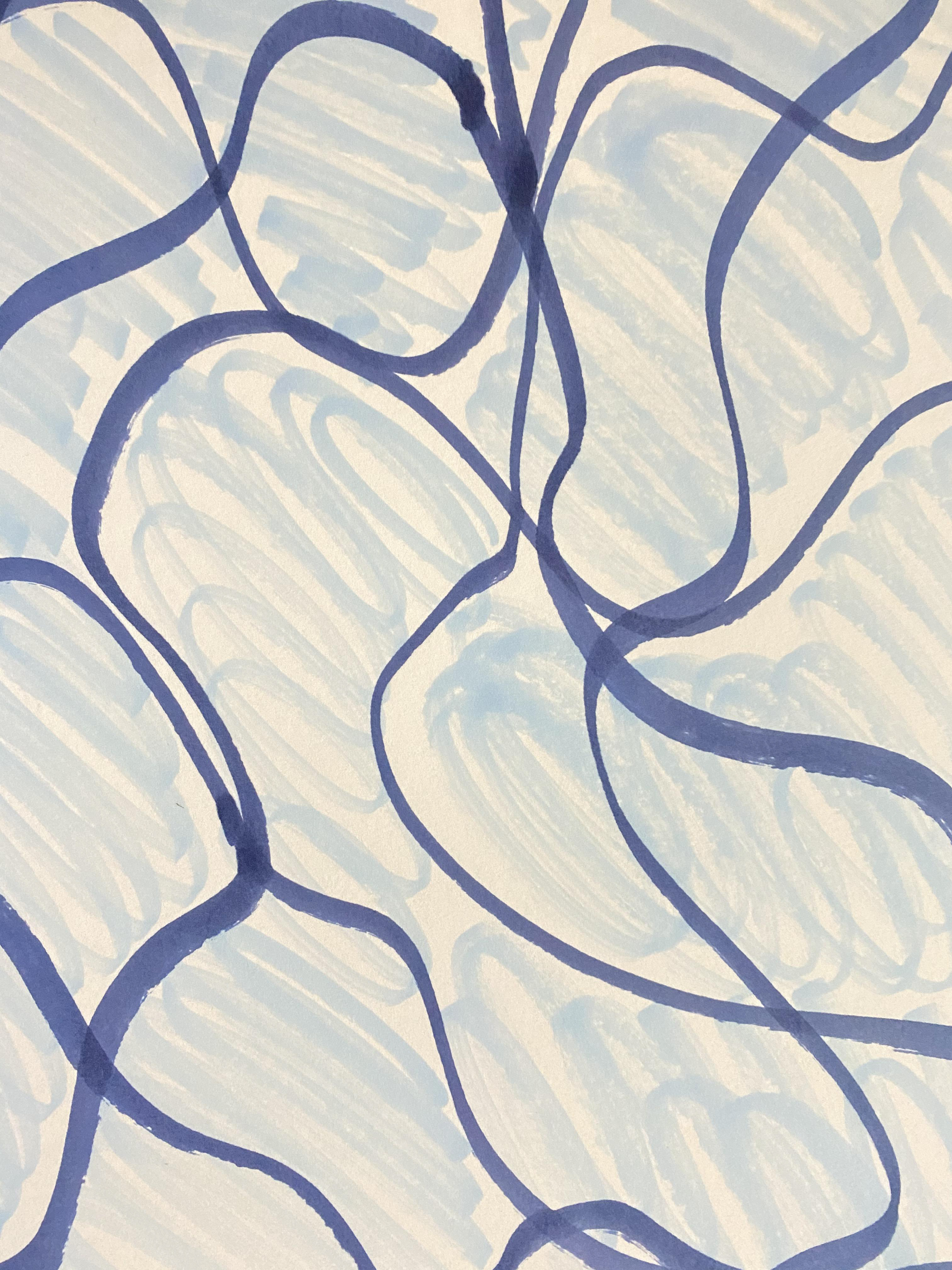
There is one contemporary designer that has an association with pools and patterns. David Hockney was the Yorkshireman that exposed LA aqua culture to the masses. Although his original pull to this muse was the male form, he soon discovered that it was the challenge of capturing the curves, ripples, and highlights that truly enticed him. He once described his interested as “a formal problem to represent water, to describe water, because it can be anything. It can be any colour and it has no set visual description”(Sperling, 2017). His ingenuity at capturing the different elements of water such as surface and light resulted in unique patterns even for the pop art era.
Below are examples of some of his pool paintings that caught my attention. The way that he encapsulates the dynamic movements of water in a way that is bold and energetic. When I look at this pattern, I get the same sense of relaxation and calm that is created by actual water. When you look at the rippling surface of water the combination of refraction and light playing off the surface, it creates blocks of serenity that warp into organic shapes. Trying to decide how these shapes are going to change is never ending.
Sperling, M., 2017. The pull of Hockney’s pool paintings | Apollo Magazine. [online] Apollo Magazine. Available at: <https://www.apollo-magazine.com/david-hockney-pool-paintings/> [Accessed 28 March 2021].

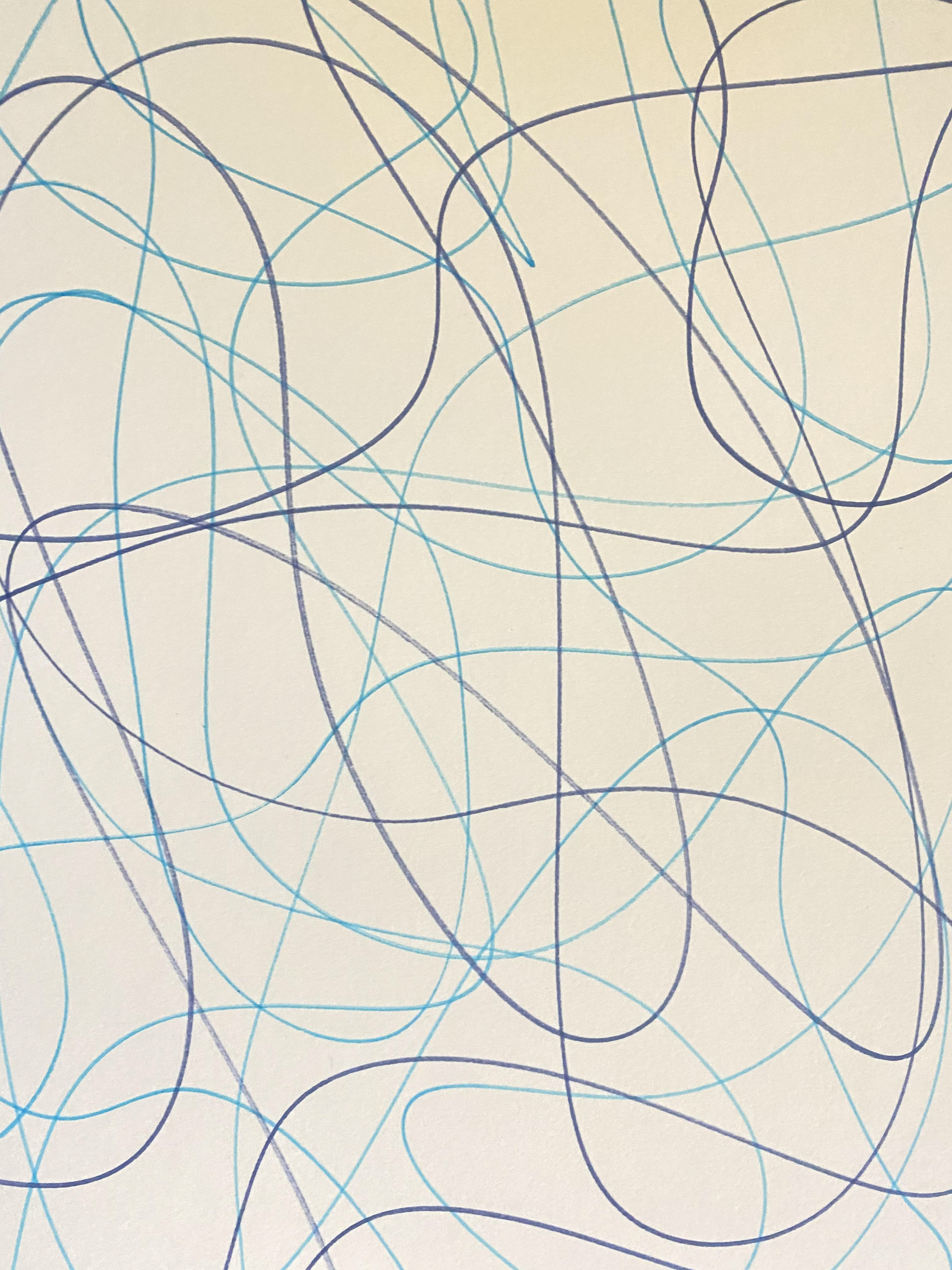
HOCKNEY PATTERN EXPERIMENTS
To explore the bold dynamic strokes that Hockney uses, I did a few quick sketches using his colour palette as a way to explore the movements of mark making that helped to create the bold shapes and lines that create the dynamic style that caught the attention of so many:


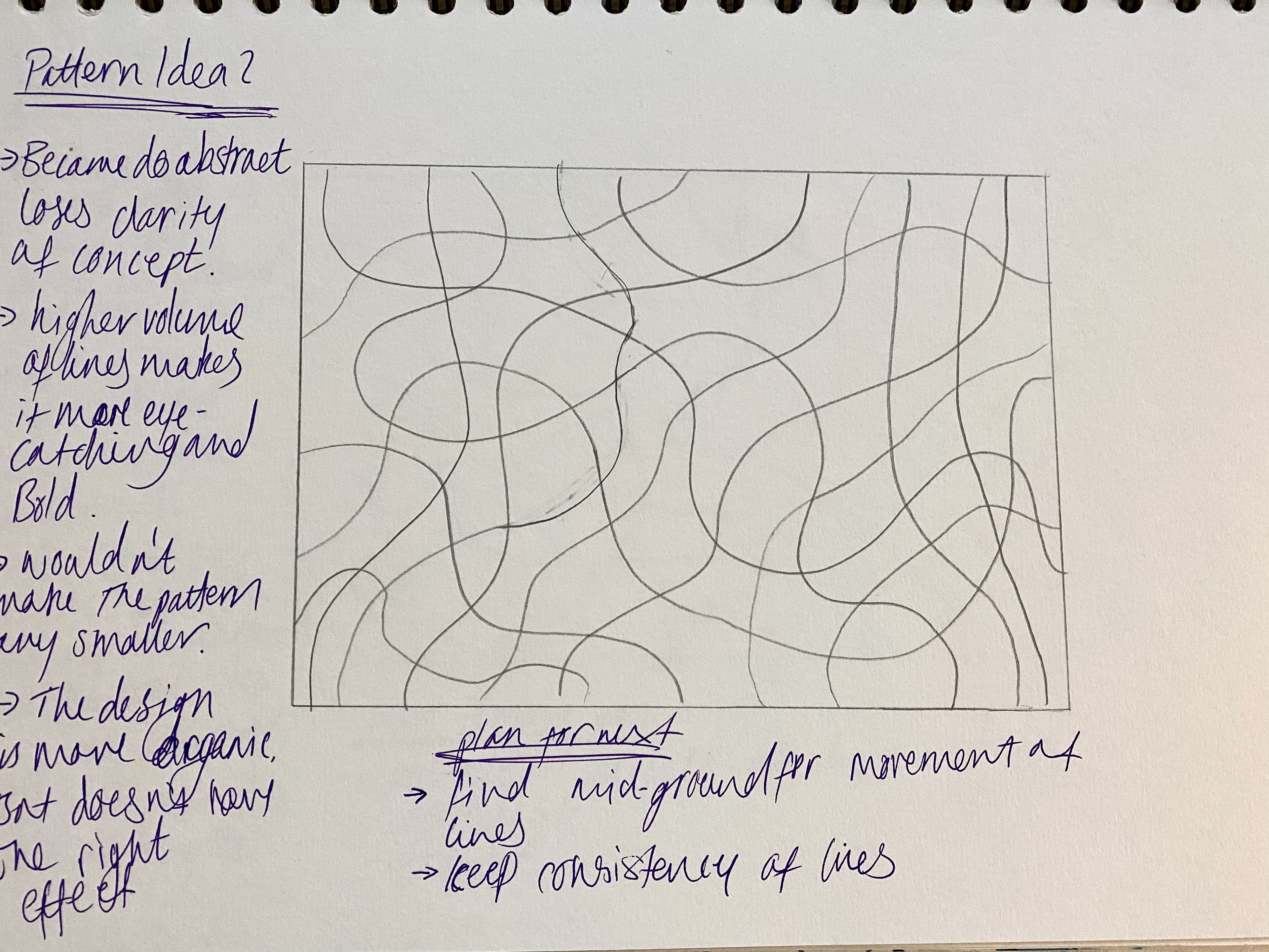
PATTERN REFINEMENT
From these drawings I work to try to combine the realism from the videos and the expression of the sketches. There are specific notes about the pros and cons of each pattern on the images as well as aims for the next.
This is a general style for the pattern. Each piece will have a slight differentiation to the surface pattern to reflect the nature of water behaviour and uniqueness.

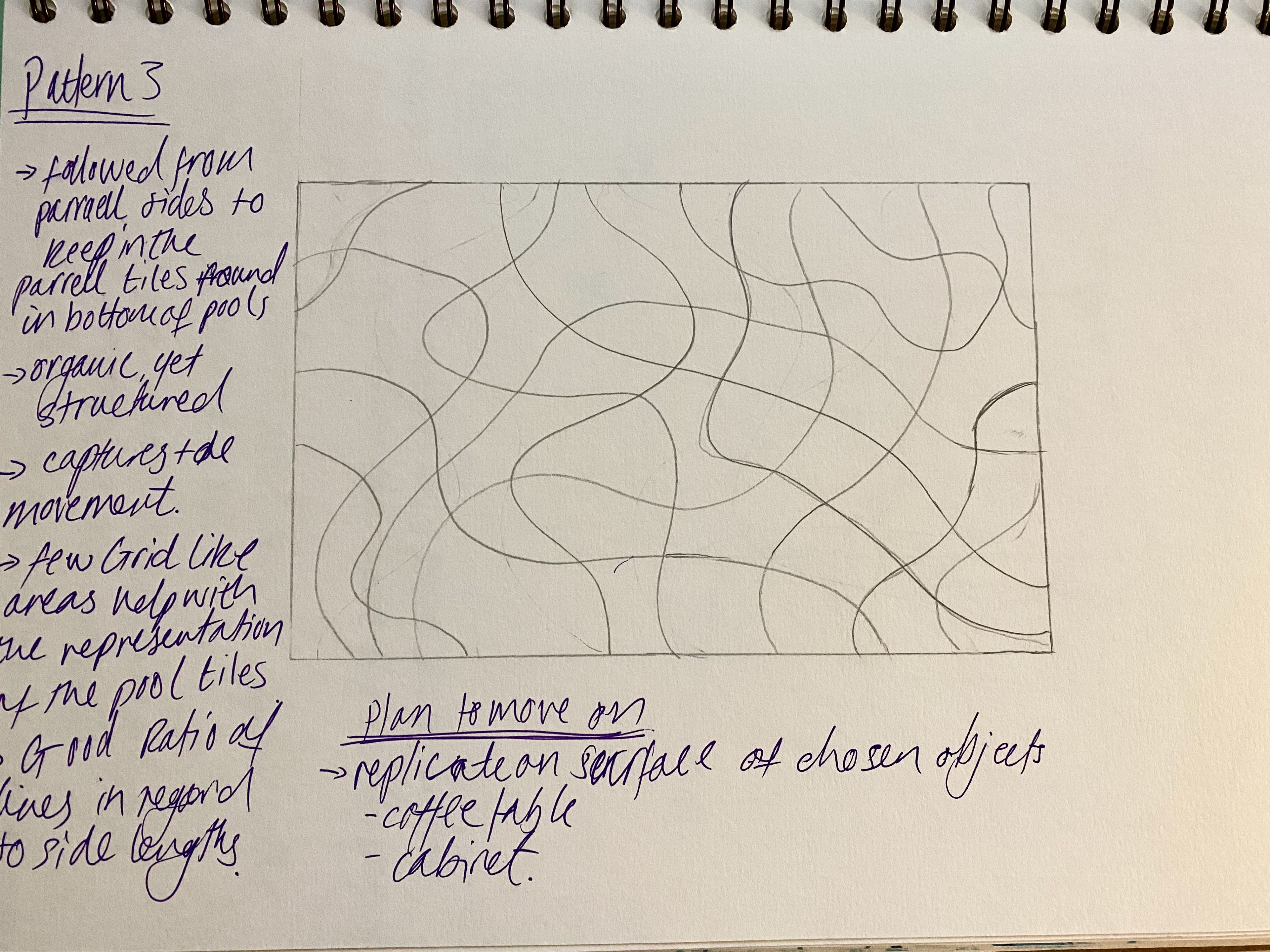
DECIDING THE SHAPE
The shape style for this collection is important. Anything too over the top can distract from the pattern. And so, I focused in on the defining characteristics of contemporary furniture design. During my explorations there were a few characteristics that kept reoccurring:
> Lines - simple, elegant lines is a key element of modern furniture pieces. Older pieces tend to have intricate details, however, the idea of less is more allows a feature element to shine through. This leads to blocks of shapes that are easy on the eye and allows the softer elements such as cushions and throws to shine through. The urban look is clean and energetic compared to the frills and curvaceous appeal of traditional design.
> Square Edges - new pieces tend to feature raised bottoms with angular metal legs. This creation of space all around the piece makes any item seem lighter. This production of negative space around an item can make an interior seem larger and brighter something that is highly desirable for many.
> Texture Variations - smooth surfaces allow wood grain to shine through as well as light reflection, whereas a fabric will add a cushioned comforting feel. Combining differing textures can make an inviting warm environment whilst maintaining a modern aesthetic. The state of a surface can also be emphasised by colour, matte finishes or shine.
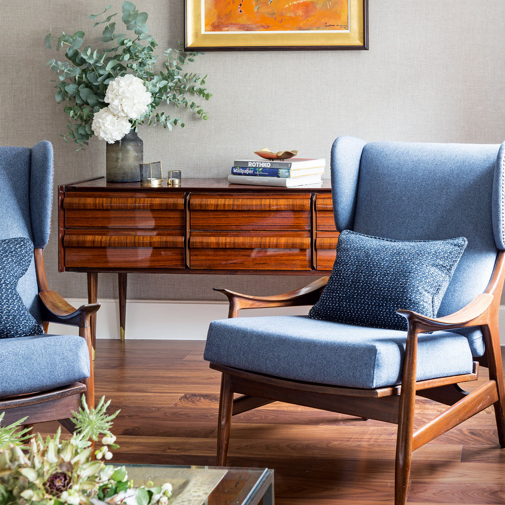
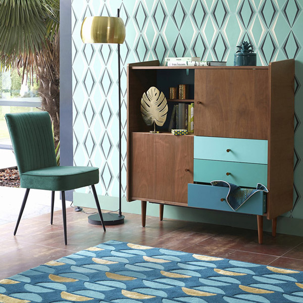
> Material Duo - it is safe to say that the revitalised material combination is wood and metal. Its use in modern furniture design creates an aesthetic that is a new classic. The duo works by fusing the industrial nature of forged metal with the organic, peaceful nature wood.
Antonio, 2019. Top Five Features of Contemporary Furniture Design - Avanti Furniture Top Five Features of Contemporary Furniture Design. [online] Avanti Furniture. Available at: <https://www.avantifurniture.net/top-five-features-of-contemporary-furniture-design/> [Accessed 29 March 2021].
Brenner, L., n.d. Characteristics of Contemporary Furniture. [online] Hunker. Available at: <https://www.hunker.com/13412314/characteristics-of-contemporary-furniture> [Accessed 30 March 2021].
Day, P., 2021. Characteristics of Contemporary Design. [online] Patrickdayhome.com. Available at: <https://www.patrickdayhome.com/Articles.asp?ID=285> [Accessed 31 March 2021].
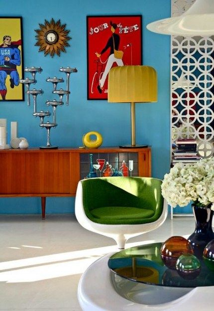
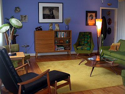
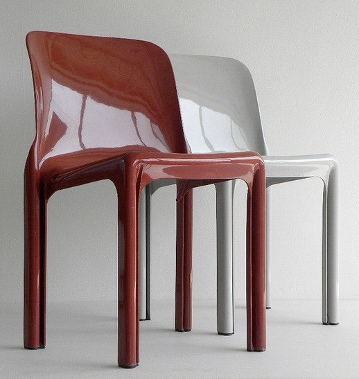
The ideal shapes for this collection would be simple with the metal and wood combination. By having a simple shape, it will allow the pattern to be the focus of the piece. In the past, pieces with a strong sense of colour had simple modern shapes. This is particularly evident in Retro furnishings. The 50s and 60s were a time of colour and brightness, most likely as a method of healing from the horrors of the previous decade. This was a time when people were looking to move forward and grow, adding colour would make all feel lighter.
https://designmuseum.azurewebsites.net/design/chairs-1960s
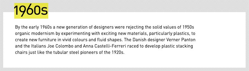
What was behind the design surge of the 1960's?
There is no denying that the 1960’s was a time of change and reform in all aspects of culture and politics. A new way of thinking was emerging, one full of possibility and boundaryless creativity. Up to this point furnishings were functional above all else, carved accents and darker wood stains were the norm. In the decade before pieces produced were still defined by the war, they were unemotional, solid, plain function. It is no surprise then that this age of change looked to the future and pushed their understanding on what is design.
“the 1960s was the decade in which design definitively established itself as a force that moved all strata of society, influenced their buying decisions and found a natural, identity-determining place in everyday society.” (The 1960s: Design, furniture and trends | Connox Blog, 2021).
With recent technologies, economic recovery, and better social standards there was no better time for a design boom. The 60’s were a time where the hallucinogenic and pop culture were making their mark, and so to match the new alternative lifestyle, bold dynamic interiors were in demand. Bright colours, simple geometric shapes and plastics were the way forward.
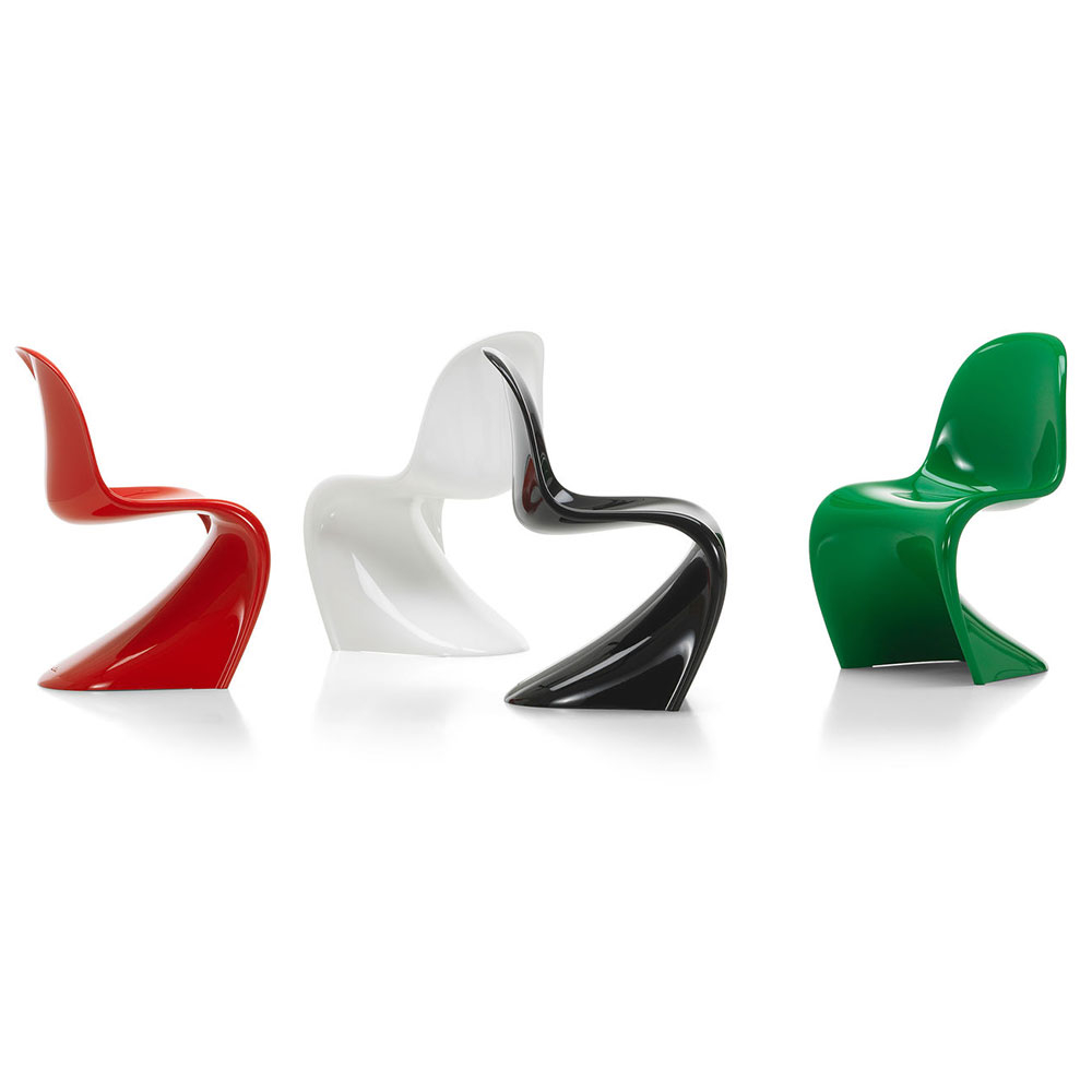
Technology is the one thing that truly allows design and ideas to move forward into reality. At this point it was technology that allowed all to access the new aesthetic. Synthetic materials are a cheap solution to achieving a goal, this meant that pieces that before would have needed hours a labour and artistry to create, could now be done faster with less hand labour, on a massive scale. This cheaper alternative also meant that following style trends was achievable and people didn’t have to invest in something they may fallout of love within a few years.
Many drew inspiration from this new love of synthetics, one notable being Verner Panton and the ‘Panton Chair’, a sweeping organic shaped piece that would have been difficult to achieve in traditional materials and processes.
Connox.co.uk. 2021. The 1960s: Design, furniture and trends | Connox Blog. [online] Available at: <https://www.connox.co.uk/design-knowledge/60s-design.html> [Accessed 10 May 2021].
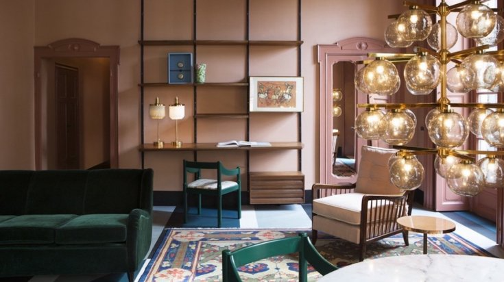
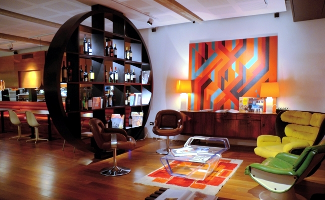
For my work, however, the sweeping organic shape isn't what I'm going for. It is the other side of this era of design that focuses on allowing colour to shine through with the use of simple elegant lines and shapes.
With this in mind, I have redesigned my ‘ASPIRE’ collection to become something more than just a piece of furniture. I wanted it to have some meaning behind it, and by relating the collection to the current global issue of COVID-19, the pieces will become something that draws the attention of many.
COLLECTION GOALS
In an unprecedented time, people from all kinds of backgrounds have been put on a level playing field. National lockdowns have meant that all have had to give up something. For some this was their escape route. Leisure facilities and recreational sites had to close to help manage the spread, having a knock-on effect on both physical and mental health.
The goal behind this collection is to combine the relaxing nature of routine with an environmental recognition in a contemporary design that will work in any surrounding.
THE NEW 'ASPIRE' COLLECTION
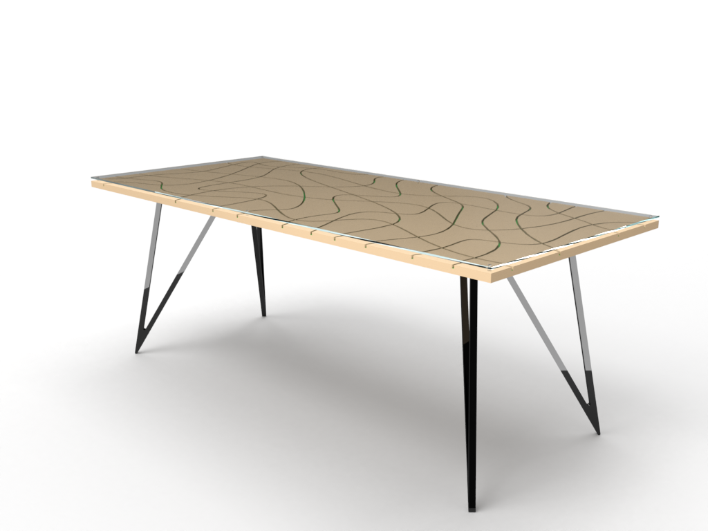
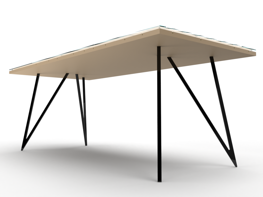
Coffee Table
A simple minimalist design that has a glass top allowing light to play through the chanels. This mimicks the way that light can reflect through the water of a pool. This will also be manipliated by the different lights of the day and its changing positions.

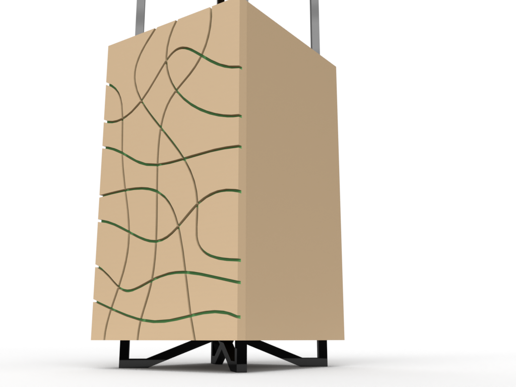
Cabinet
Every home has clutter that they wish to hide. This minimalist piece is the perfect solution with a push release on the doors there is no need for handles allowing the front pattern to stand out. The raised cabinet also allows a rather solid shape to seem light and elevated.

Side Table
A small surface perfect for a book or cup of coffee.
Round Dining Table
Every household has a central table that is used everyday. This is the table that is the perfect size for a quick catch up or family breakfast.

Large Dining Table
Featuring the same glass top, this larger scale dining table is perfect for when guests come over with plenty of room for everyone.
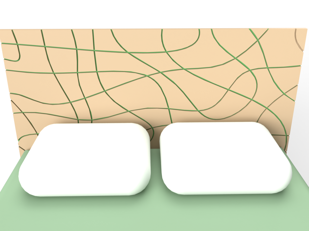
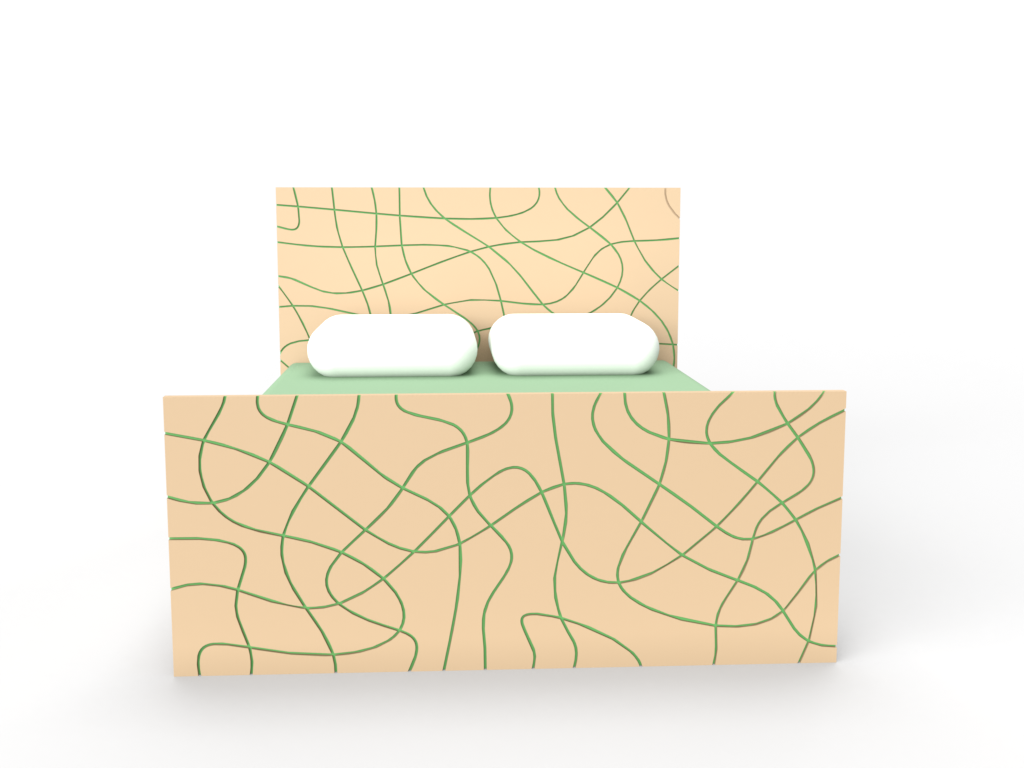
Bed Frame
This king-sized bedframe is a perfect feature for any bedroom, the enlarged pattern will catch your eye and promote a sense of relaxation.

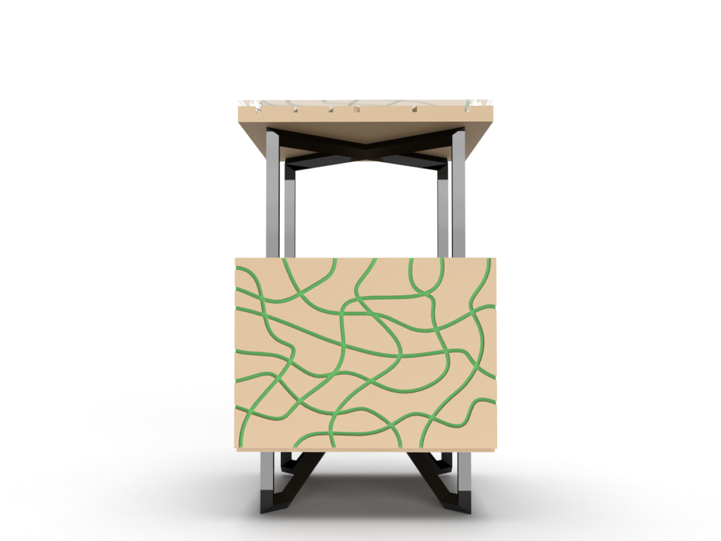
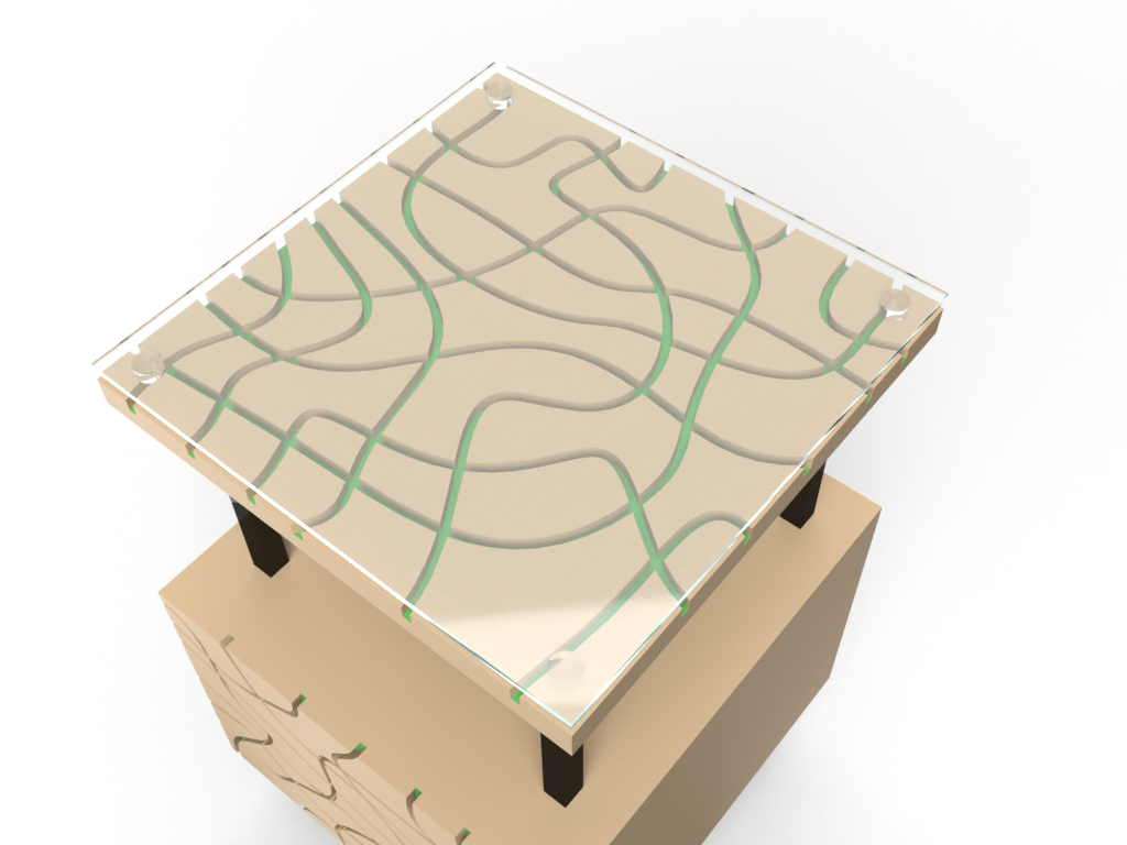
Bedside Table
To accompany the bed this elegant bedside table is perfect for keeping those odd and ends whilst having a new take on the pattern that allows for functionality.
Large Draw Unit
Taking the collection into the dressing room with this storage solution.


Standard Draw Unit
Smaller in size but still with an abundance of storage, this draw unit fits nicely into any space that just needs that little bit extra.

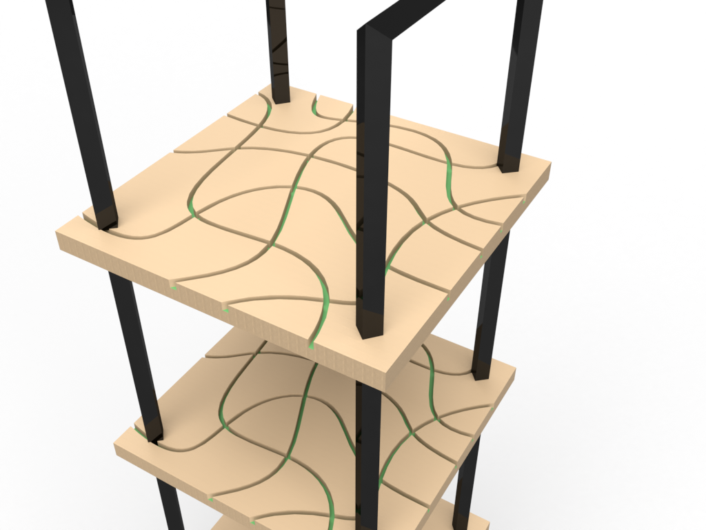
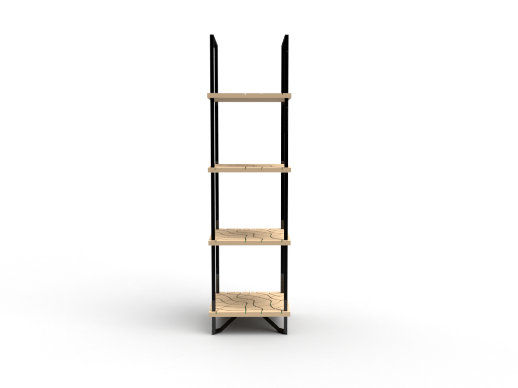
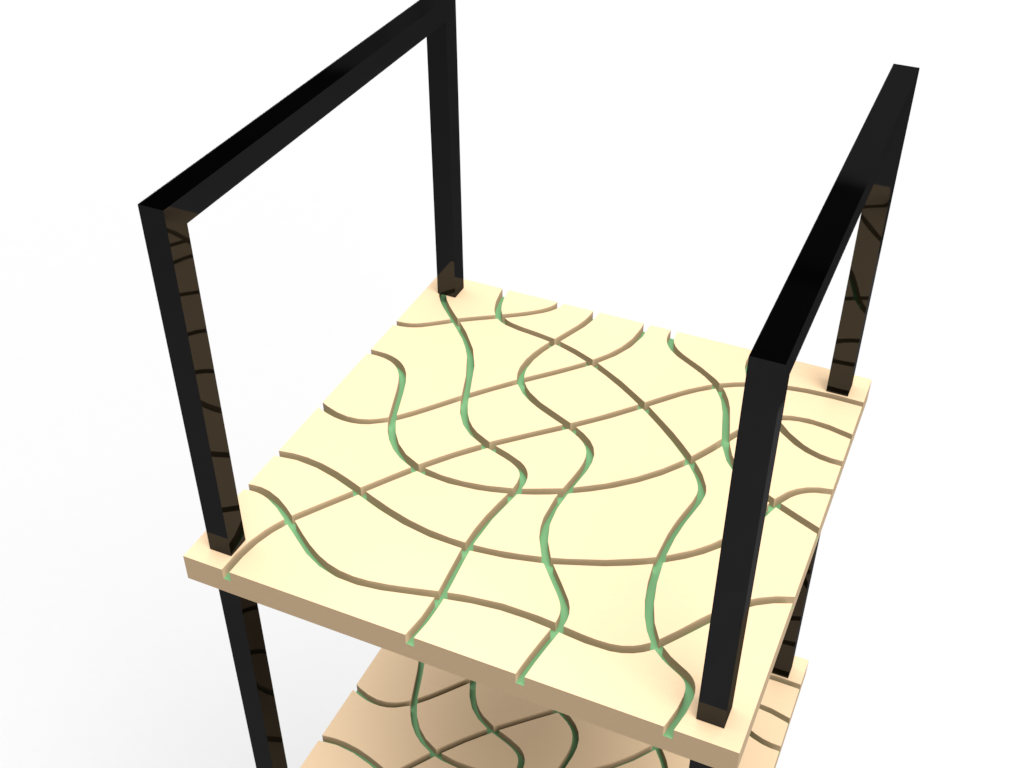
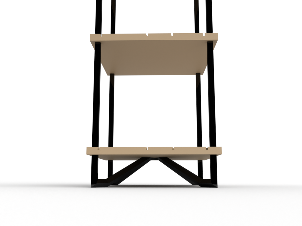
Shelving Unit
A strong statement perfect to hold those treasured items that deserve somewhere beautiful to be featured.

Storage Unit
The best of both worlds. this unit has the pride of a shelving unit with the ability to hide those not so attractive objects found around the home.