GESAMKUNSTWERK: Ideal Work of Art, A Total Artwork, An all embracing art form.
The summer research project given to us is to explore what we really want to do and be when it comes to our works and own practice. It is a way of fully realising all the style and technique developments I have been acquiring since the beginning of this course. When I started on this course, I had a keen interest in smaller works such as Jewellery, however this soon developed into a love for larger furniture and interior pieces. This is what I wish to develop as my career.
As I have produced my work, I have started to develop a style and identity as a maker. My work can most probably be categorised under Modern/Scandinavian, opting for light finishes and a desire to be more aware of the materials that I am using. This was amplified during our last term, which showed me that finding good quality useable materials often comes with a price tag.
The style of my designs calls for good quality materials as there is little room to hide. I want to use my final year to develop my craftsmanship so I can produce consistent results at an improved rate. This will be done through practice and workshop presence.
The basis of this part of the project is to form my own collection. This is a collection that I would use to summarise what is my idea of interesting design. I plan on making mine around classic designer as well as newer innovate makers.
To start my project I referenced, ‘50 designers you should know’ (Düchting and O'Donoghue, 2012). This is a resource that highlights the most iconic designs by 50 noteworthy designers. It includes a timeline of what led them through their career and information about their achievements and most popular designs.
My Presentation
In my presentation there was a range of designers from all sorts of time periods and movements. Generally, the time periods are from the 1940s onwards, this leads with the art deco and modernist movements leading all the way up to current works and collections.
JEAN PROUVE
Prouve is a key designer in 20th century design. His background is as a metal smith, this knowledge meant that he could easily use his skills to create innovative furniture designs that have become the inspiration for many designers. For me it is the simplicity of his work combined with clean lines and finishes. The design I chose for the collection is elegant yet effective with sloping lines that make the seat of the chair look as if it is just placed as opposed to constructed.
ANTONY CHAIR 1954

ISAMU NOGUCHI
Coming from a sculpture background. The understanding of materials and balance he gained meant that he could create dynamic designs that would be unachievable for other designers of his time. He uses organic shapes and biomorphic styles to create useable items.
COFFEE TABLE 1944
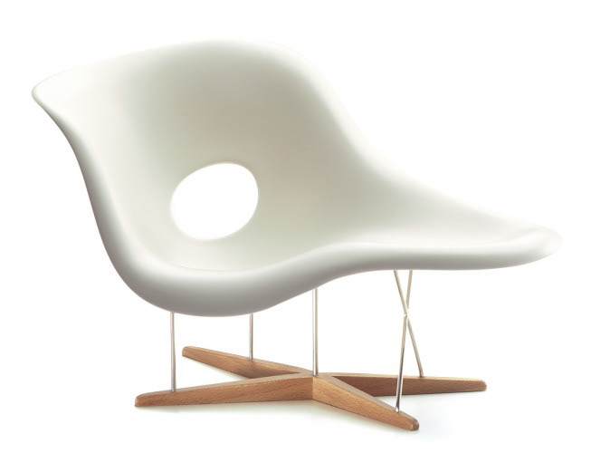
EAMES
The designing couple were at the forefront of innovative design in the 50’s. They used their skills in not only design but fill production and architecture. Have a partner that you can grow your ideas off means that you can have a second pair of eyes examining for form and processes you are using, developing each other further. They are the reason we have so many materials and processes in the design world today. You can't really look at furniture without exploring their work and lives.
LA CHAISE CHAIR 1948
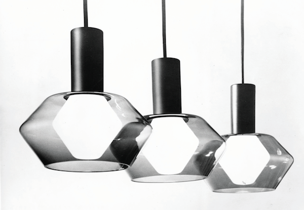
TAPIO WIRKKALA
With nature as an inspiration, it is no surprise that his roots are in Scandinavian design. He has a broad material skill set that he has applied to hand crafts as well as industrial mass scale production. Considered the ‘poet of wood and glass’ his pride in where he came from is present in all his works. His glass works follow the Nordic style with robust thicker pieces, reminiscent of carved ice. The piece I have looked at however has a more geometric style to it than a natural essence. The diamond shaped piece is accompanied with a bulb that echo's the same shape this relationship is unlike most of his organic pieces.
TW003 1960
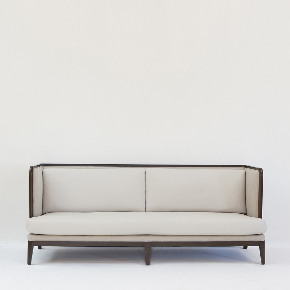
ANDREE PUTMAN
Known as the ‘diva of modern interior design’ Putman had a career in interiors as well as furniture. She used classic elements of design, reminiscent of the 1920’s art deco movements. These characteristics include grey tones, quality materials, classic forms, and simple but sophisticated details. Yet she was a woman of the modern world and the instigator of modern hotel interiors.
PAGODA SOFA- 1999 EDITION
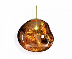
TOM DIXON
As a designer he has no professional training yet is one of the most significant contemporary British designers. His most well-known works are his lighting pieces. Most of his works are glass and/or metal, that create patterns through an effective use of shadow and light. His goal with his works is innovation and solid, sturdy pieces. For even though I know his lighting works, he also branches out into furniture pieces that use quality materials. These are all values that I wish to carry forward in my work.
MELT PENDANT 2015
JASPER MORRISON
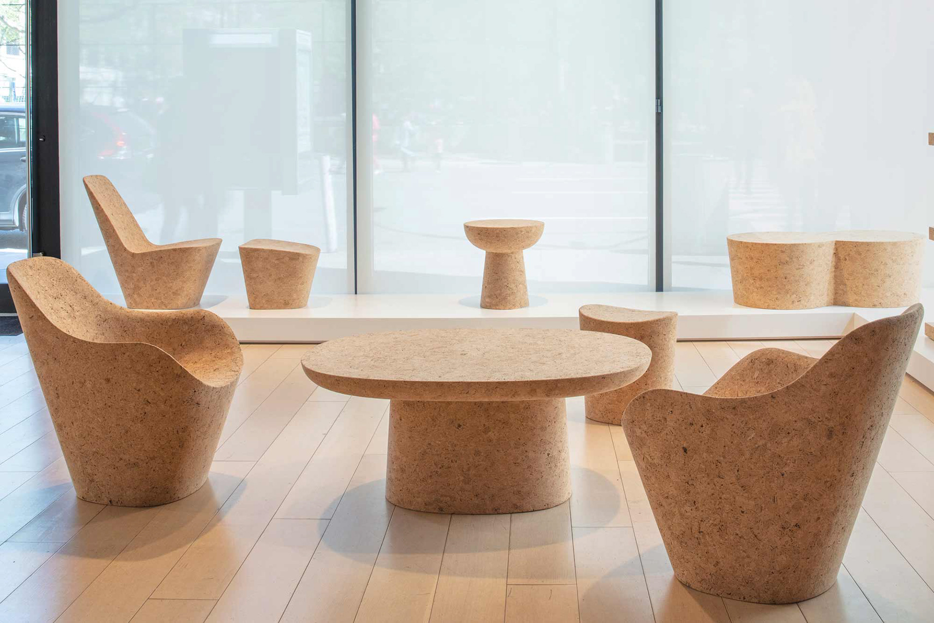
A representative for ‘new simplicity’ his stripped back designs speak for themselves. His work is innovative and unique. The piece/ collection that caught my eye, is his ‘cork’ work. Cork is a material that I am incredibly eager to explore. It is incredibly versatile, adaptable, and lightweight. However, it is a material with very little backing resources. Its main use in large quantities is for construction, meaning it isn't an easily attainable resource without considerable industry connections. This collection is incredibly apt at promoting this material as a viable sustain alternative to most destructive forms of design. Cork is derived from the bark of cork oak tree; this means that they tree doesn’t get destroyed or killed allowing for regeneration of material.
CORKS 2019
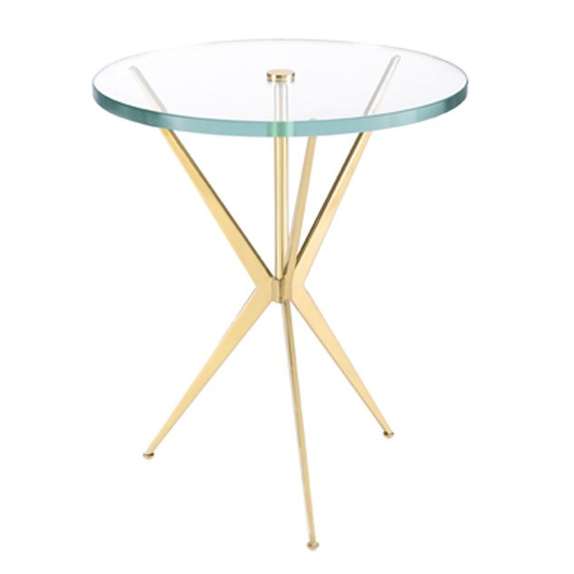
Nina campbell
A creator of art deco inspired works she creates modern pieces that seem reminiscent of classical designs and material presence. The Arthur table is one of those pieces that take you back to a peak of British design. A classic combination of glass and metal finishes of the elegant lines of this piece. As an acting furniture and interior designer, all the works can be adapted to the needs of customers, then produced by some of the finest makers in Britain.
ARTHUR TABLE
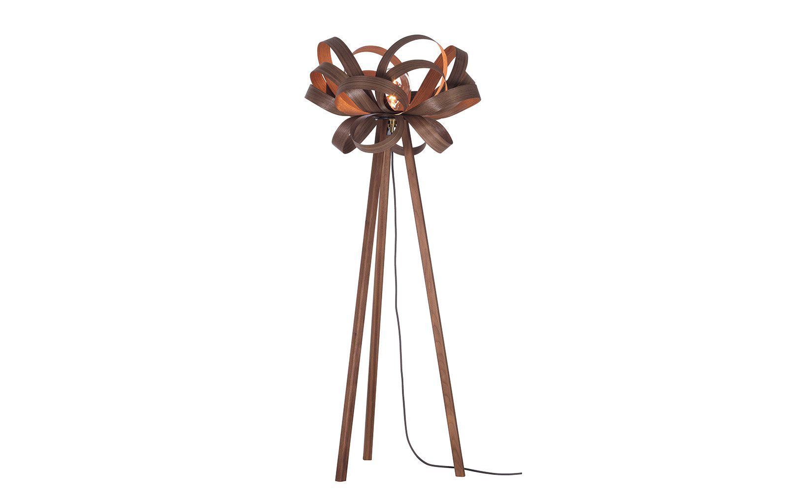
TOM RAFFIELD
When it comes to wood and lighting there is no one else who can produce as elegant a design as Tom Raffield. By using a mixture of wood types Raffield produces modern designs using a traditional technique. Even though he states he is “inspired by nature”, he designs will work in the most industrial inspired home. By having such a chameleon of a design aesthetic, he has managed to maintain a large customer value. This is something that I aspire to achieve. As one of the more new and upcoming designers he has also managed to gain a lot of partnerships with sellers such as John Lewis, once again increasing his market presence.
SKIPPER FLOOR LIGHT
MY RESPONSE
When looking through the work of these artists I had this vision of a textured surface. This is at a juxtaposition to the work these artists produced. Most of their works are smooth and finely finished. The work that they inspired featured a stepped profile that created a linear pattern. This is a simple design, but I believe it would be effective in creating a visual effect that gives a greater depth to a rather straight forward design piece.
The table would still be made usable through the use of a glass top. This would allow for functionality and the featured profile. There would be small supports on the top of the profile for this glass top to rest on. To allow for ease of movement the glass top would be removeable. By doing this the glass can be protected when transported and also removed for cleaning. Glass also has the unique quality of refracting light, by having the glass top it will have the ability to highlight and cast shadows along the profile.
6 WORDS
The words that were given to me were rather suitable for my sort of design. They were:
> Elegant- graceful and stylish in appearance or manner.
> Functional-designed to be practical and useful, rather than attractive.
> Minimal- characterised by the use of simple forms or structures, especially geometric or massive ones.
> Sustainable- able to be maintained at a certain rate or level.
> Retro- imitative of a style or fashion from the recent past.
> Craftsmanship- the quality of design and work shown in something made by hand; artistry.
Bearing these aspects in mind I created the following designs in the hopes that they can create the desired effects….
>DESIGN 1<
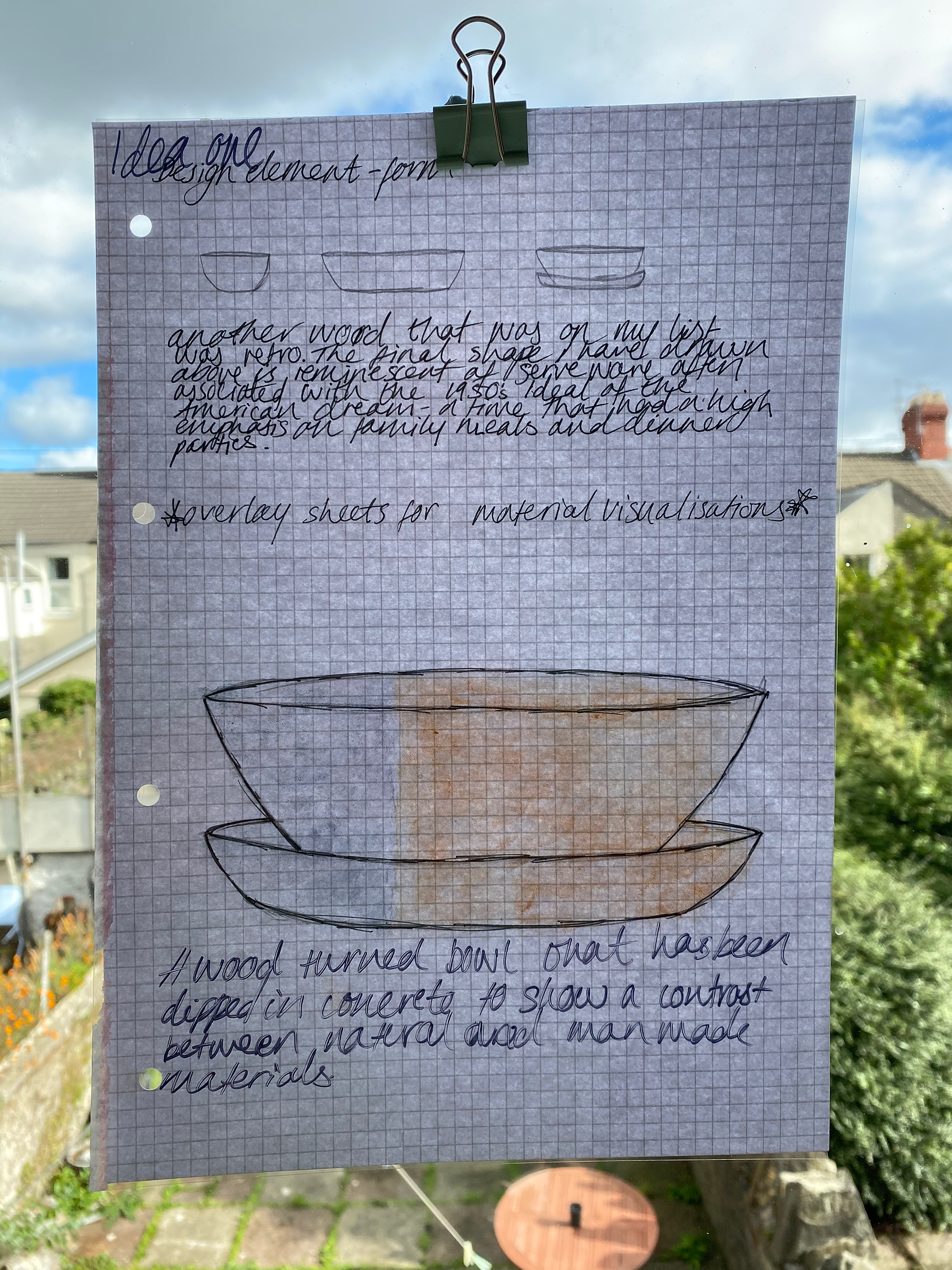
When you look at my previous works it is clear to see there is a hint of all the above aspects, or they are something that I want to improve upon for the future. My initial ideas are more of a process and material nature. The first is the idea to combine wood and cement or jesmonite. The inspiration for this was “craftsmanship”. The combination of wood and stone is something that is very popular amongst modern practices and consumer popular items. It produces this aesthetic of natural industrialism. The light washes often used for the wood and stone elements means that they aren't heavy or overbearing in an environment. This light aloof finish creates an atmosphere of airy relaxation. This sort of style is popular amongst younger consumers who are trying to establish a sense of relaxation and peace in their soundings.
The key feature of this design is the vertical split down the face of the bowl. This is to create a clean line that will be easy on the eyes and serve to also balance out the weight of the materials. The stone element will be severely heavier that the wood by creating this off-centre split will work to keep the bowl at a weight that is bearable to the consumer. It is functional decoration.
>DESIGN 2<
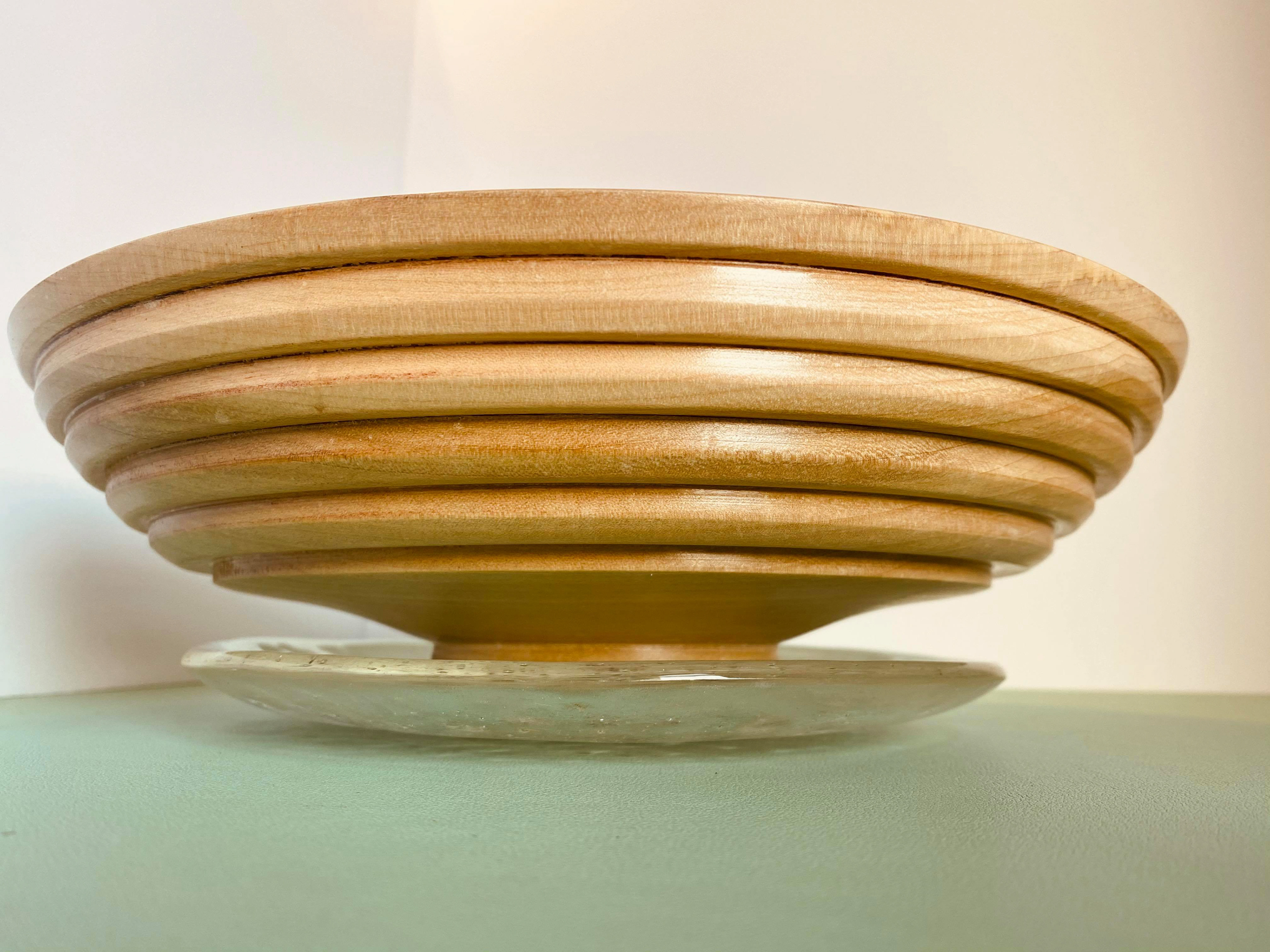
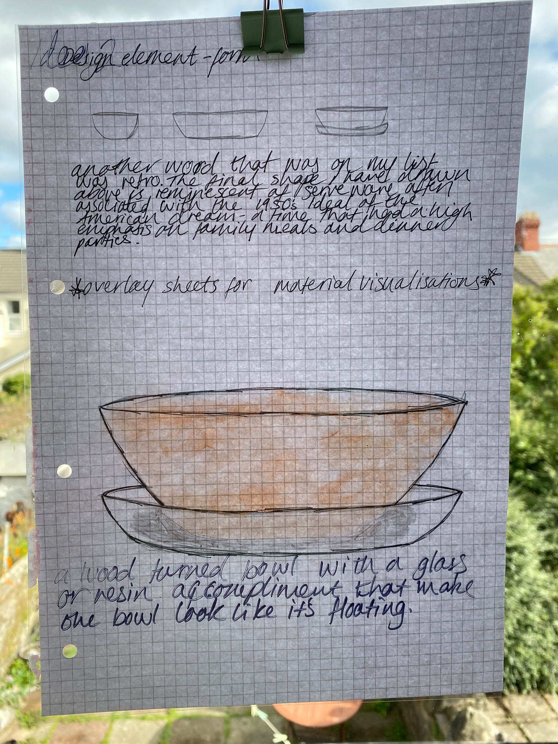
The second design I thought of is reminiscent of old school dinner parties. The supporting plate underneath the main bowl is to simulate a dinner service. This appeals to the retro aspect of my words. This design will feature two different materials- wood and glass. By combining the two materials it will create a different selection of viewing angles that wouldn’t be achievable through the use of denser materials. The glass will balance out the solid nature of the wood, yet will most likely be the heavier of the two.
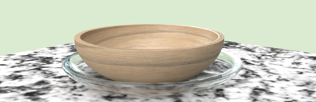
CAD MODEL
The quick model below shows how the piece could look it is not exact in anyway but shows how the materials complement each other. I recreated this visual using adobe software, as part of their stock images they provide a hollow dish shape that can be scaled in a way needed by the user. This helped to realise that It was the second design that I wanted to do. The way that the glass dish makes it look as if the wooden bowl is floating. This is a contrast to the solid nature of the material, making it feel lighter and more elegant.
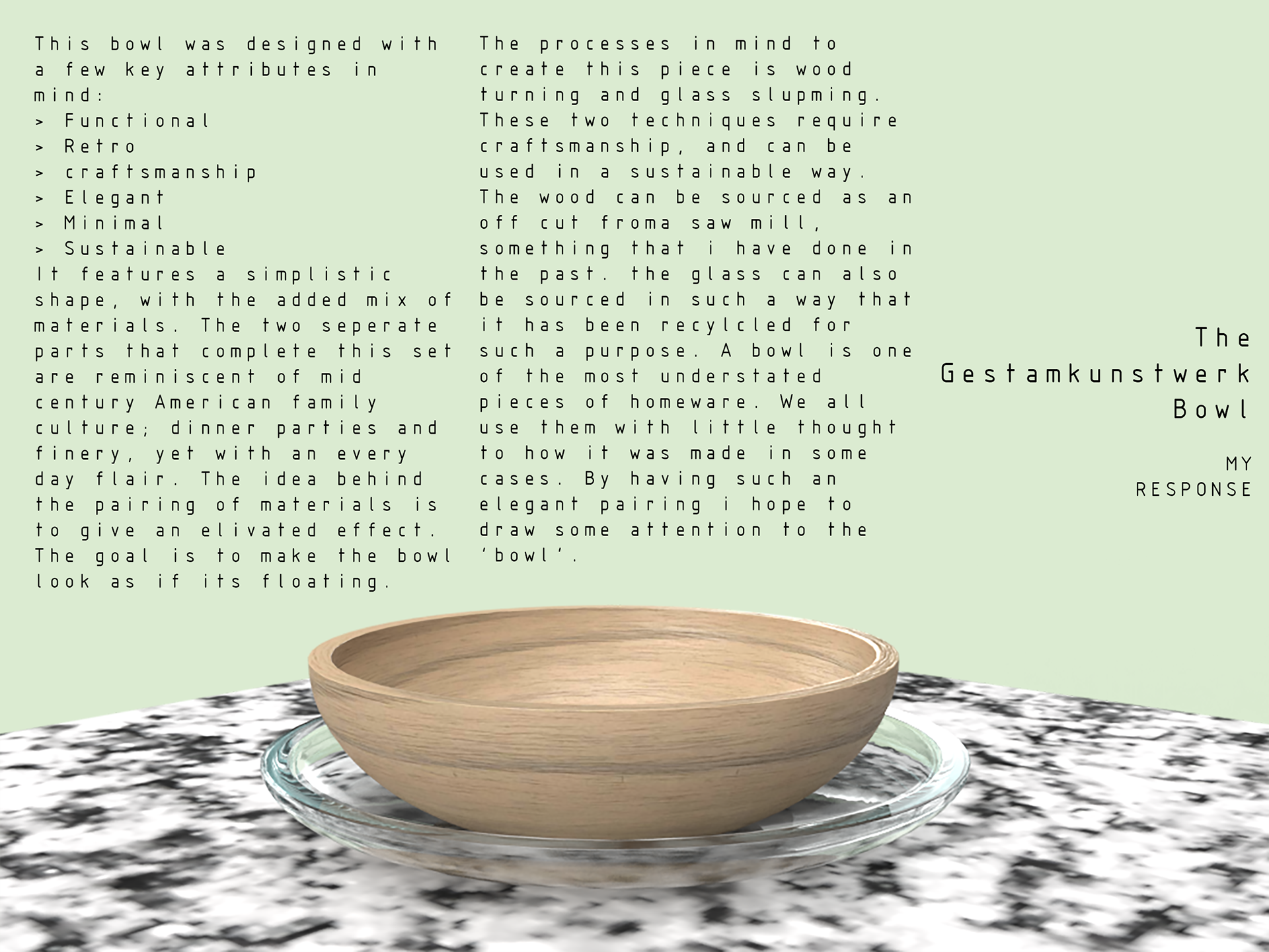
GENERATED DESIGN SHEET
Initial design sheet to bring together context and visuals.
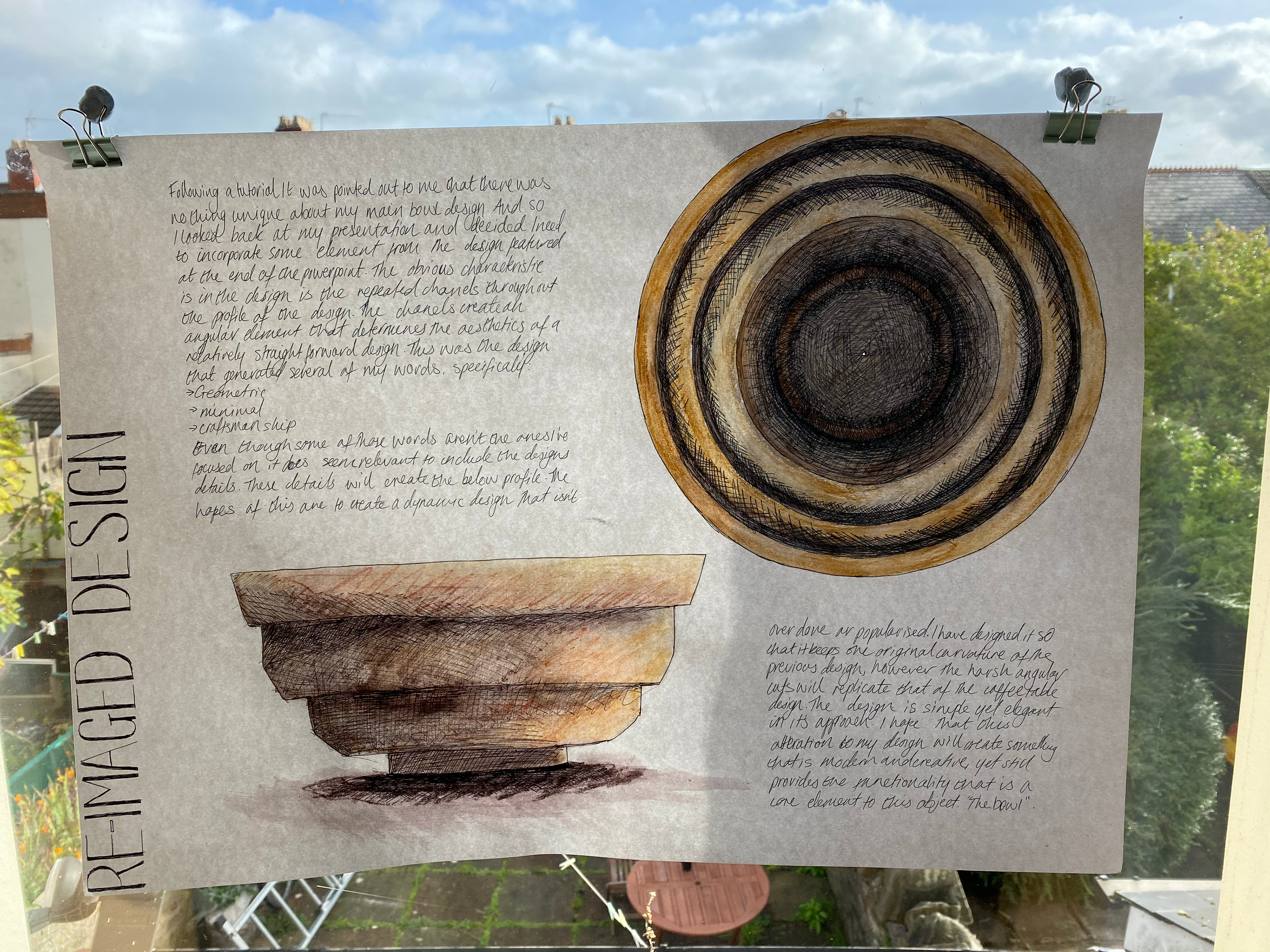
DESIGN UPDATE _19/10/2020
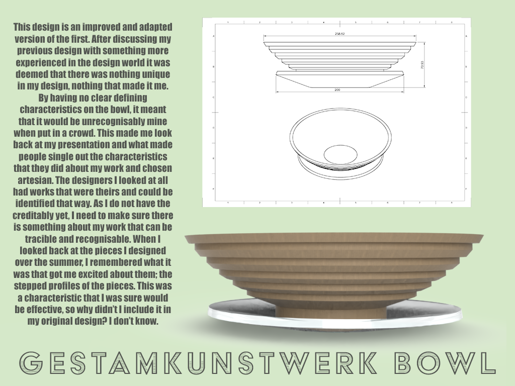
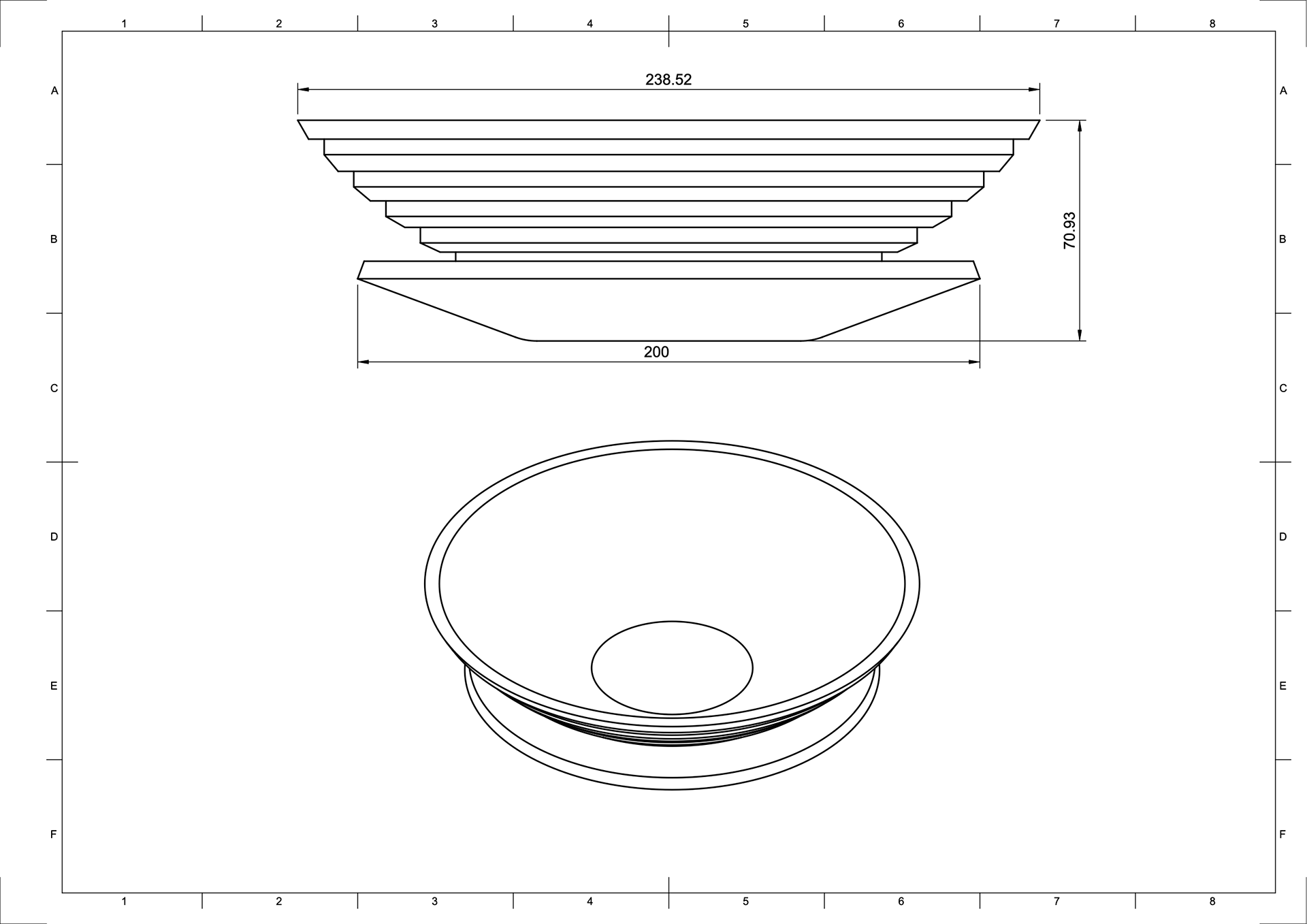
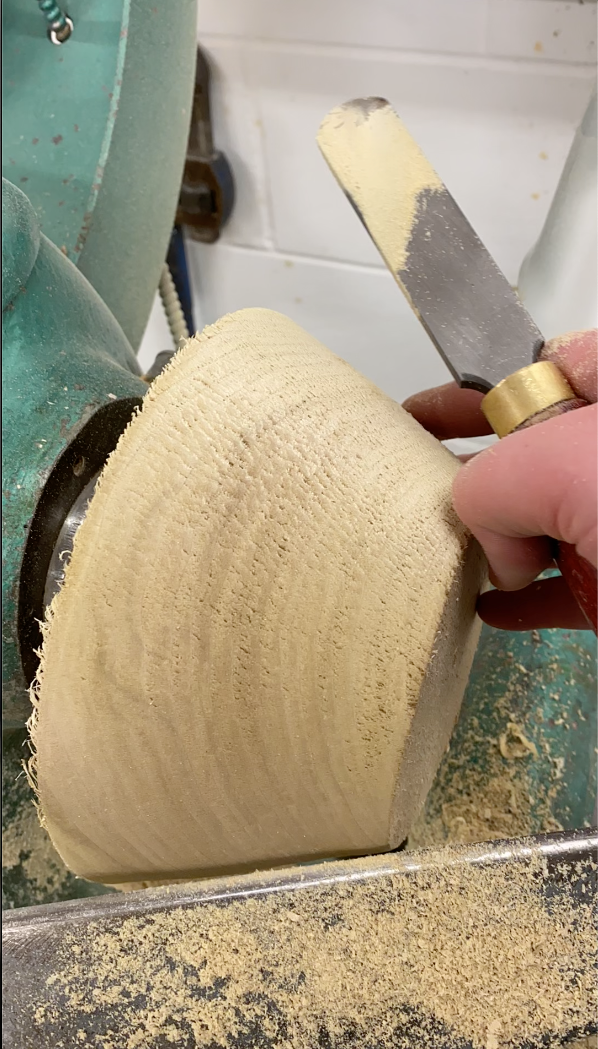
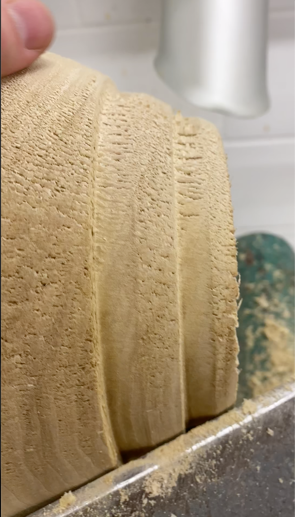
This design is an improved and adapted version of the first. After discussing my previous design with something more experienced in the design world it was deemed that there was nothing unique in my design, nothing that made it me. By having no clear defining characteristics on the bowl, it meant that it would be unrecognisably mine when put in a crowd. This made me look back at my presentation and what made people single out the characteristics that they did about my work and chosen artesian. The designers I looked at all had works that were theirs and could be identified that way. As I do not have the creditably yet, I need to make sure there is something about my work that can be tracible and recognisable. When I looked back at the pieces I designed over the summer, I remembered what it was that got me excited about them; the stepped profiles of the pieces. This was a characteristic that I was sure would be effective, so why didn’t I include it in my original design? I don’t know.
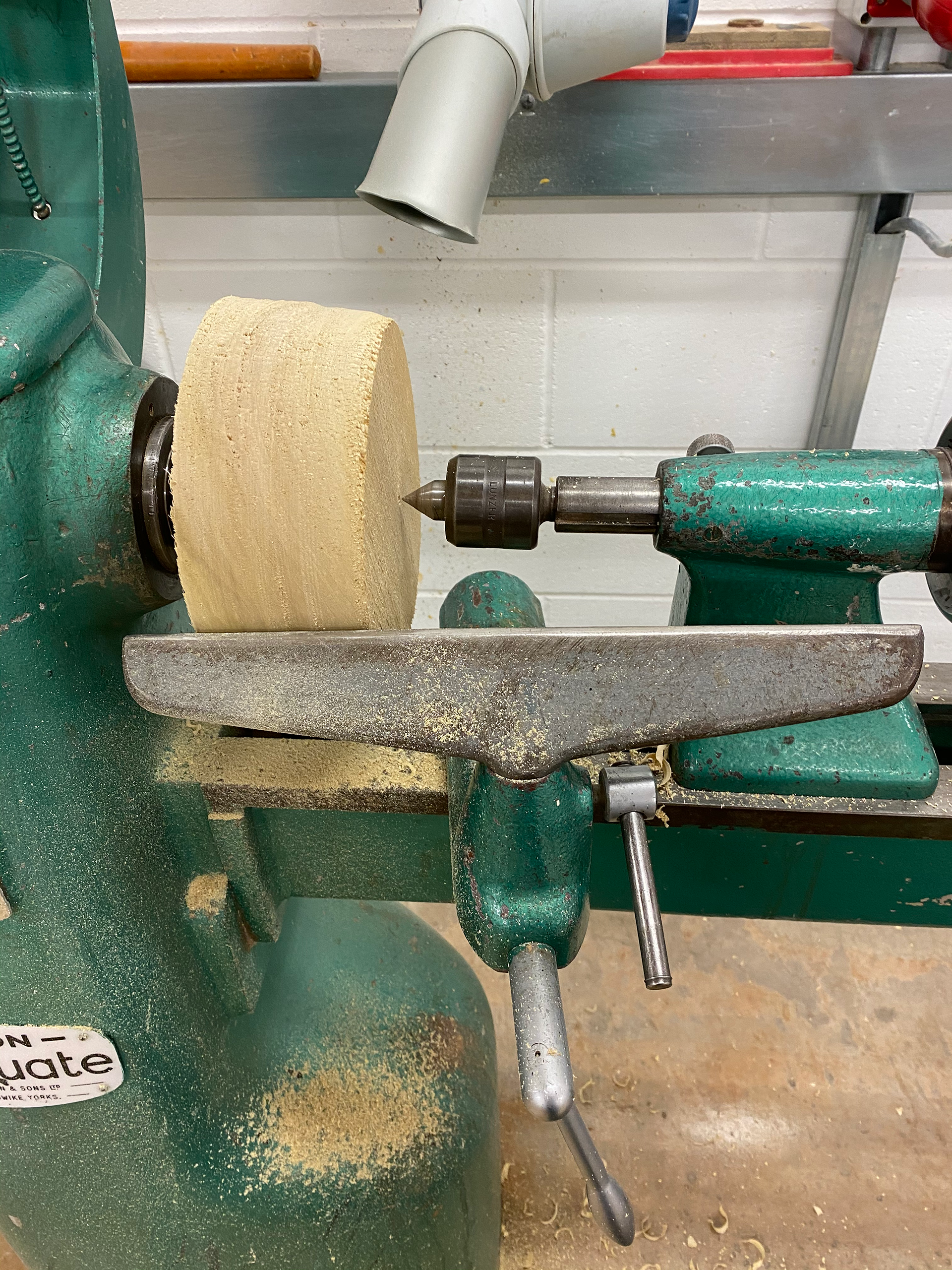
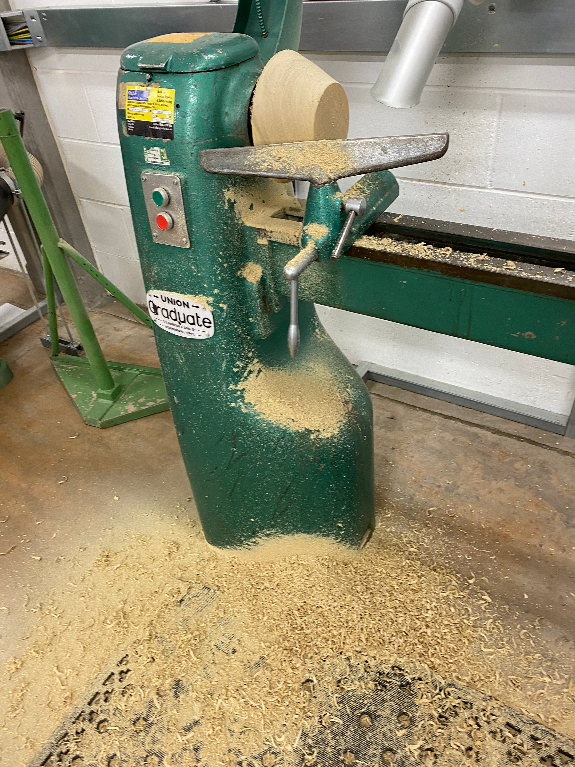
PROCESS
WOOD
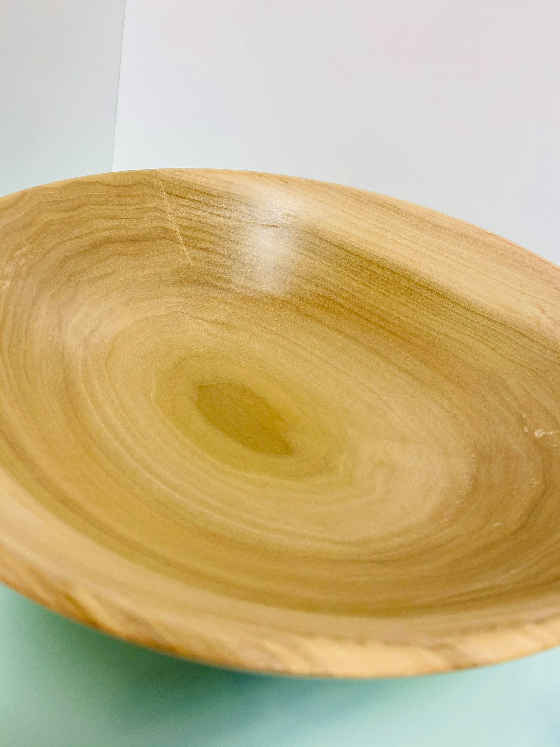
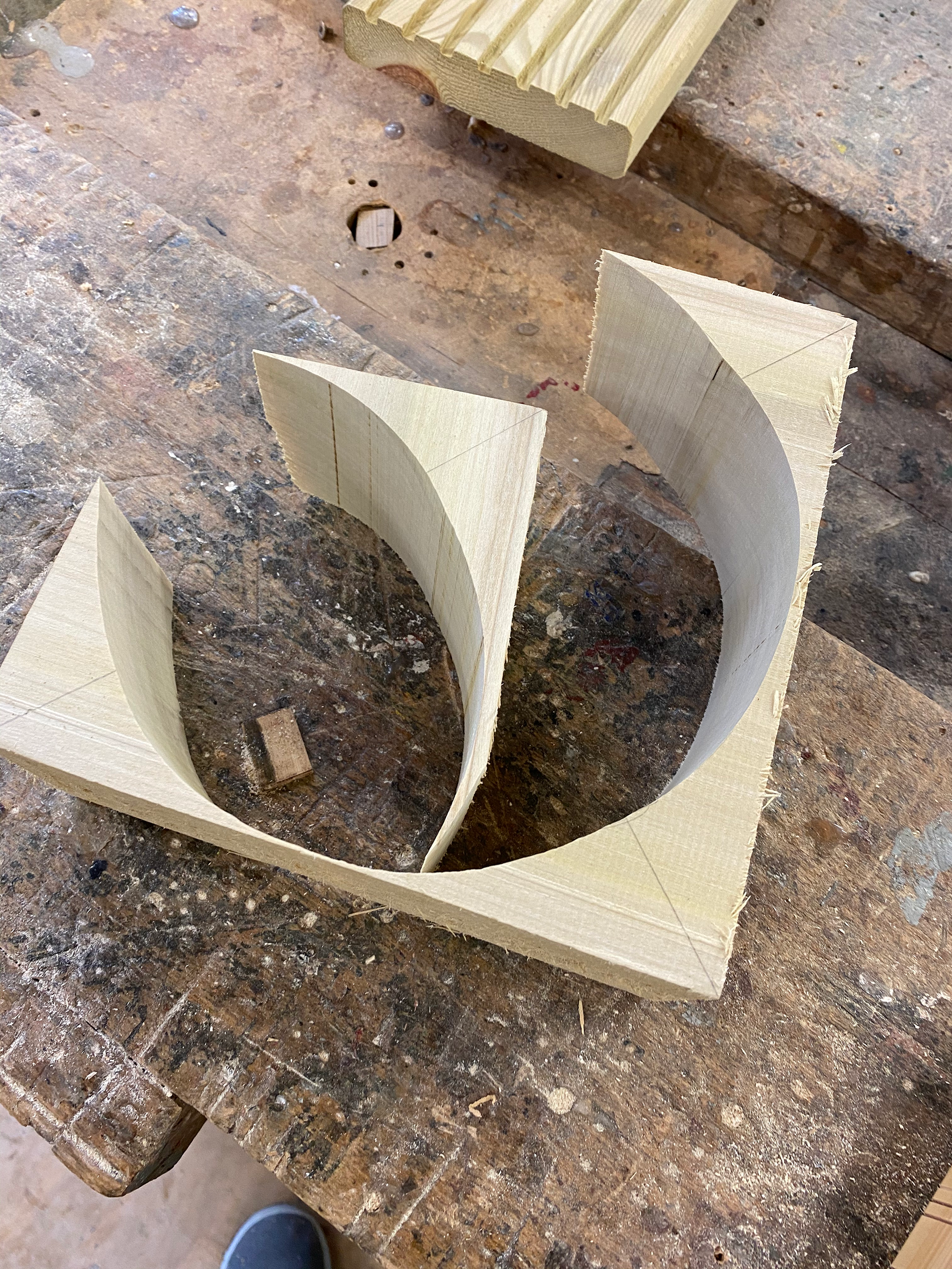
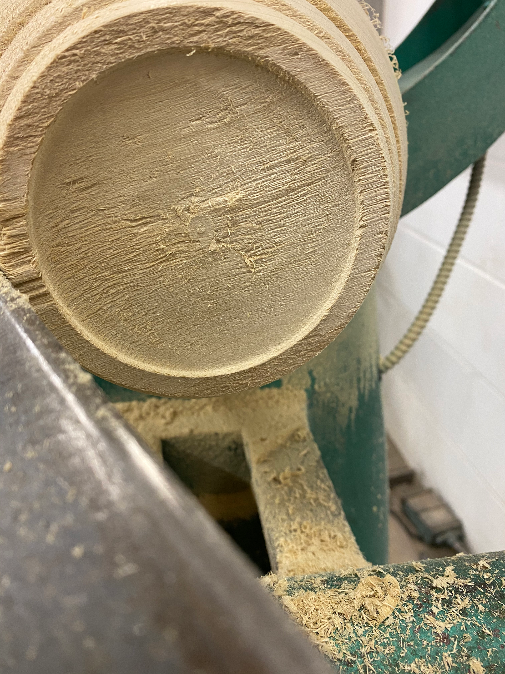
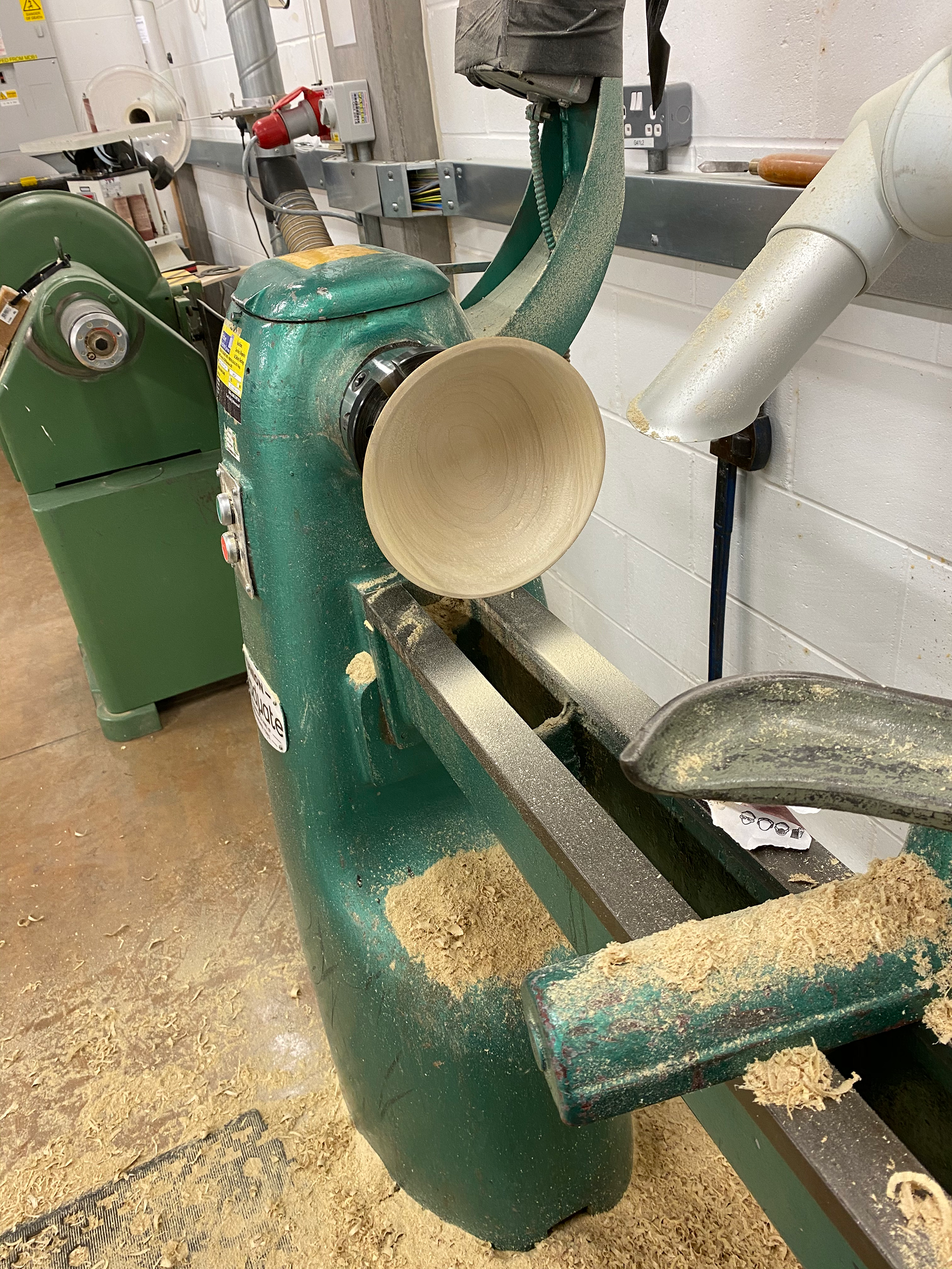
Since this is a wooden bowl it makes sense to use the lathe. I have done a few pieces on the lathe in the past so was confident that I could produce a strong outcome. As I made the bowl however, more and more inconsistencies in the wood emerged. I wasn’t happy with this bowl. The scaling was off, and the quality wasn’t great. However, it was a good first attempt.

GLASS
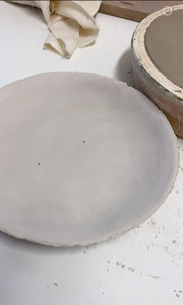
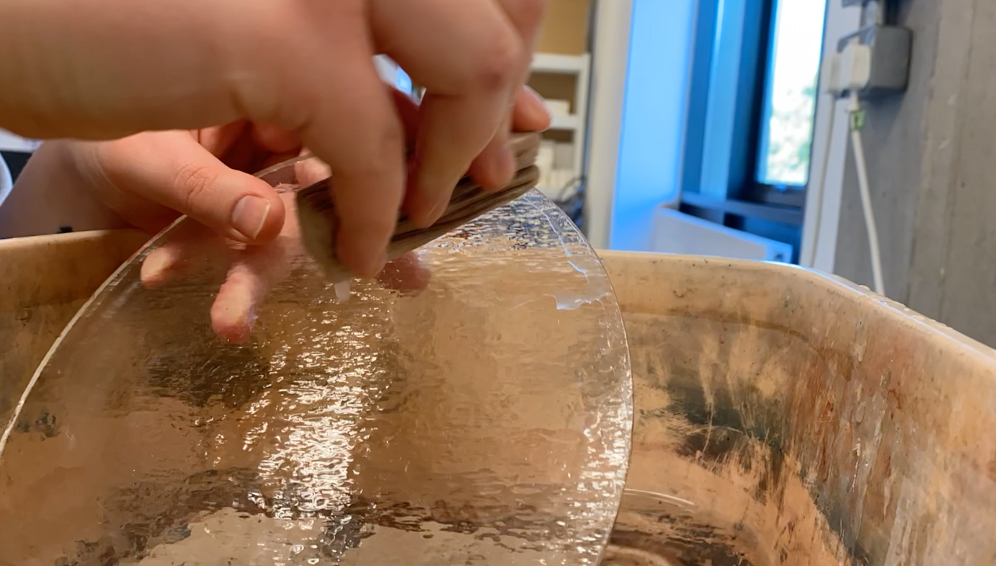
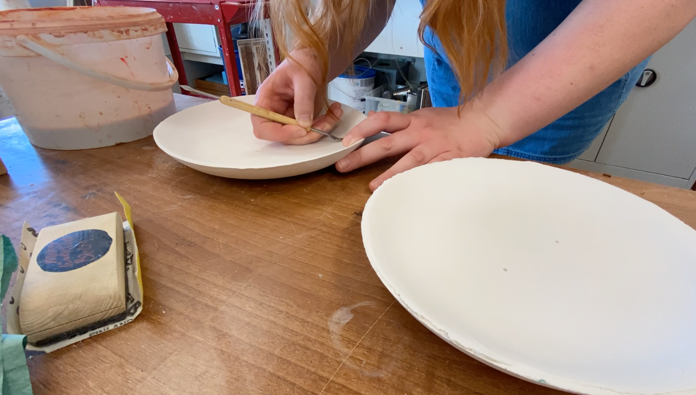
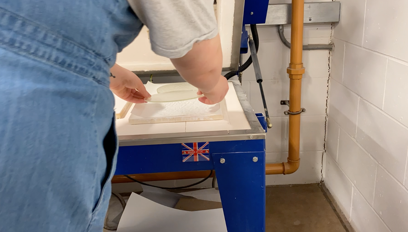
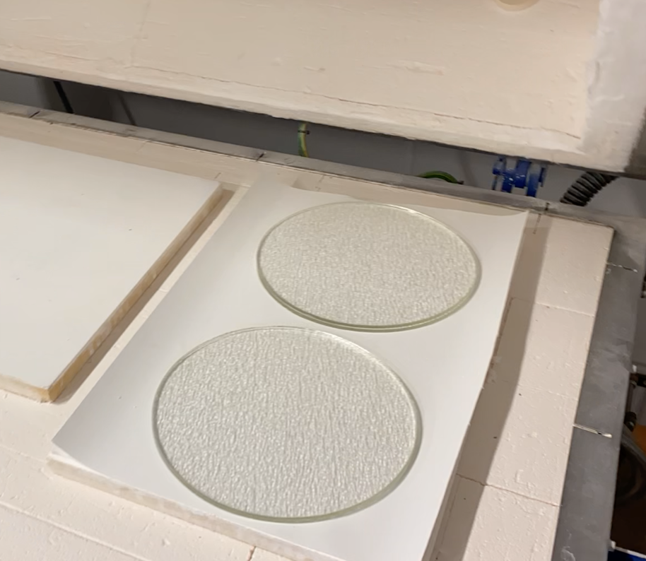
When it came to the glass element, I had next to no experience in using the material. This meant I was sure how it would come out. However, it did mean that I would gain yet another skill and experience for when I leave this course. I created the mould that the glass would be slumped in, again I haven't done much ceramic work; this meant I was able to develop this area of my skillset. Once fired a ceramic release was applied to the mould which prevented the glass from fusing to the ceramic in the kiln.

FILM PRODUCTION
Below is the film I produced to accompany my bowl. This experience was more about the process for me and so this is what I featured as my film.
FINAL OUTCOME
This bowl project was a strange one for me. I didn’t necessarily work to an audience or movement. It was about the aesthetics. I wanted to produce something that encapsulated my 6 words in a slightly different way. The process was an important element, whereas for some it would be the intricate details or how the piece was going to be used. But I focused on how I was going to make it. As a furniture designer/maker I don’t see bowl production as being an integral part of what I plan on doing. However, I used it as an opportunity to develop my CAD work and visual elements.
Even though I did remake my wooden bowl I am still not 100% happy with how this turned out. This is mainly tailored towards the glass element. As I hadn't worked with the material before I wasn’t sure how it was going to move or form. The glass dish is too small to accompany the wooden bowl. I also feel like it should be deeper to have a more cohesive line with the bowl. The dish however is the right size for the original bowl I made. This proves that the concept would work but just needs more time to explore its development. This has been more of a learning experience in the way that I should've explored how the glass would behave and which size would be appropriate for the bowl. The scaling can also be applied to the wooden bowl. The one I made is large; much larger than the one I had in mind. It is more the size of a fruit bowl when I was aiming to produce a dinner set aesthetic. However, I did manage to play with the width of the ridges and feel that the smaller ones have a more elegant presence.