The first project of my second year is one that has multiple opportunities and directions for me to go. It is a mixture of live briefs and competitions that span across several different areas and disciplines. The idea of this project is so that we can start to find our footing as artists, makers, or designers.
There are 6 different opportunities in total:
1. Library Live Brief: book art & construction.
2. St Fagans: museum & archive - referencing tradition
3. Pewter Live: pewter object (decorative, household or jewellery).
4. BAMS: British Art Medal Society: medal as art
5. Craft in the Bay: curation & show case
6. MADE:com Talent Lab
Each of the options have their own uniqueness about them. The first explores how art books put together. The second is a venture with the national museum of wales that explores artefacts and how they can be made relevant again. Pewter live is a competition to create an object whether it functional or decorative, the main stipulation is that it must be made of at least 50% pewter. BAMS is an annual competition around the area of casting, the idea is to make an artistic medal; to make this easier they have provided a theme of endangered animals. Craft in the bay is the one project that is about working with others to curate an exhibition.
The last project is the one that really caught my attention. Made.com is a website that I frequently look at and have previously explored for job options. As furnishings is something that I want to go in to as my profession this really seems like the option for me.
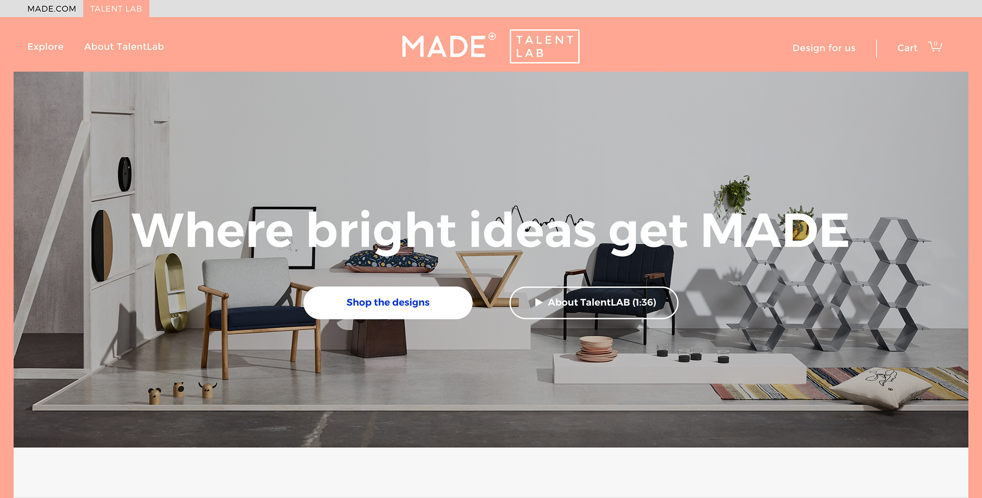
I started this process by looking at their website and exploring the items that they had on there. The key aspect of this project is their design lab; a platform for aspiring designers to show their ideas and potentially get them produced.
(link to the talent lab: https://www.made.com/talentlab/ )
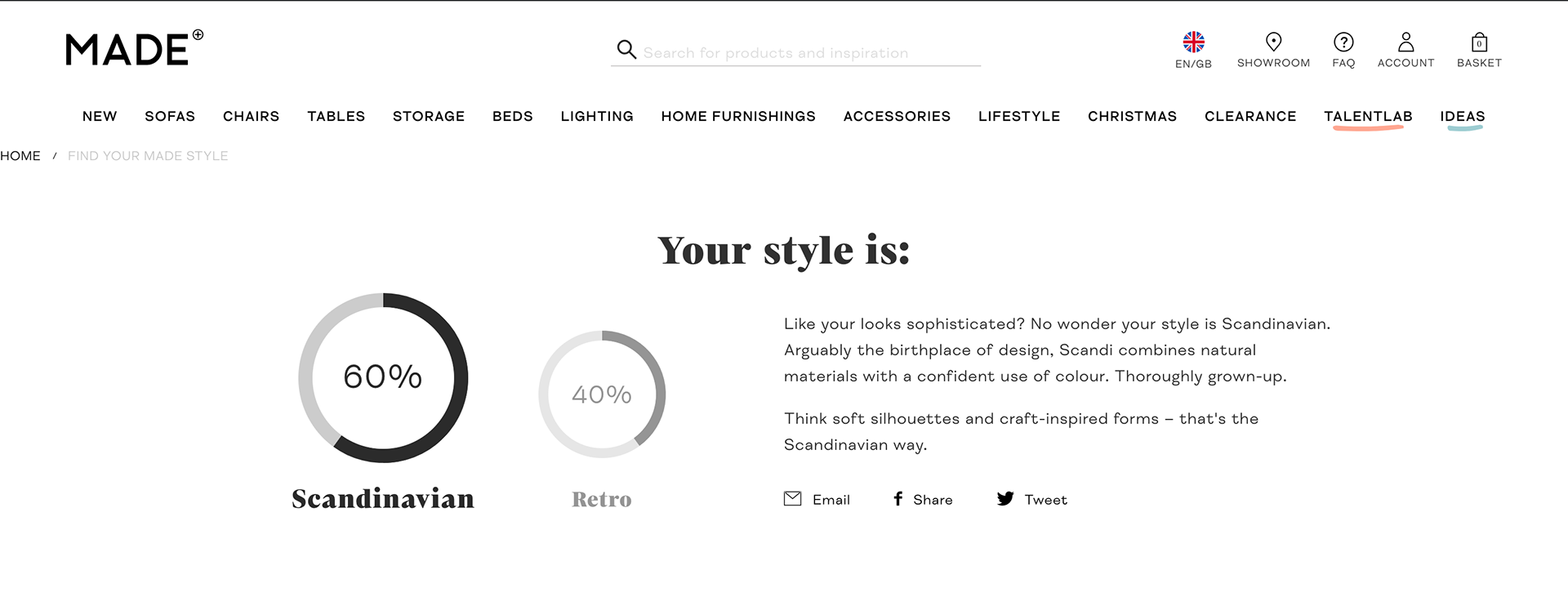
Whilst I was exploring their website, I found their style inspiration generator. This was a useful tool for me as a I wasn’t sure what my style tastes were classed as. As it turns out my style appears to be Scandinavian Retro, which now that I think about it is the right way to phase it. The simplistic yet beautiful designs are something that I love, as well as the material choices of the Scandinavian way.
"What Is Retro Furniture
Retro style can be whimsical; it can allude to pop-culture and even be tacky or kitschy. It can have nods to trends in pop culture, fashion, graphic design, natural resources, or current events. This is what retro furniture is; it's anything but classic."
"Scandinavian design is marked by a focus on clean, simple lines, minimalism, and functionality without sacrificing beauty."
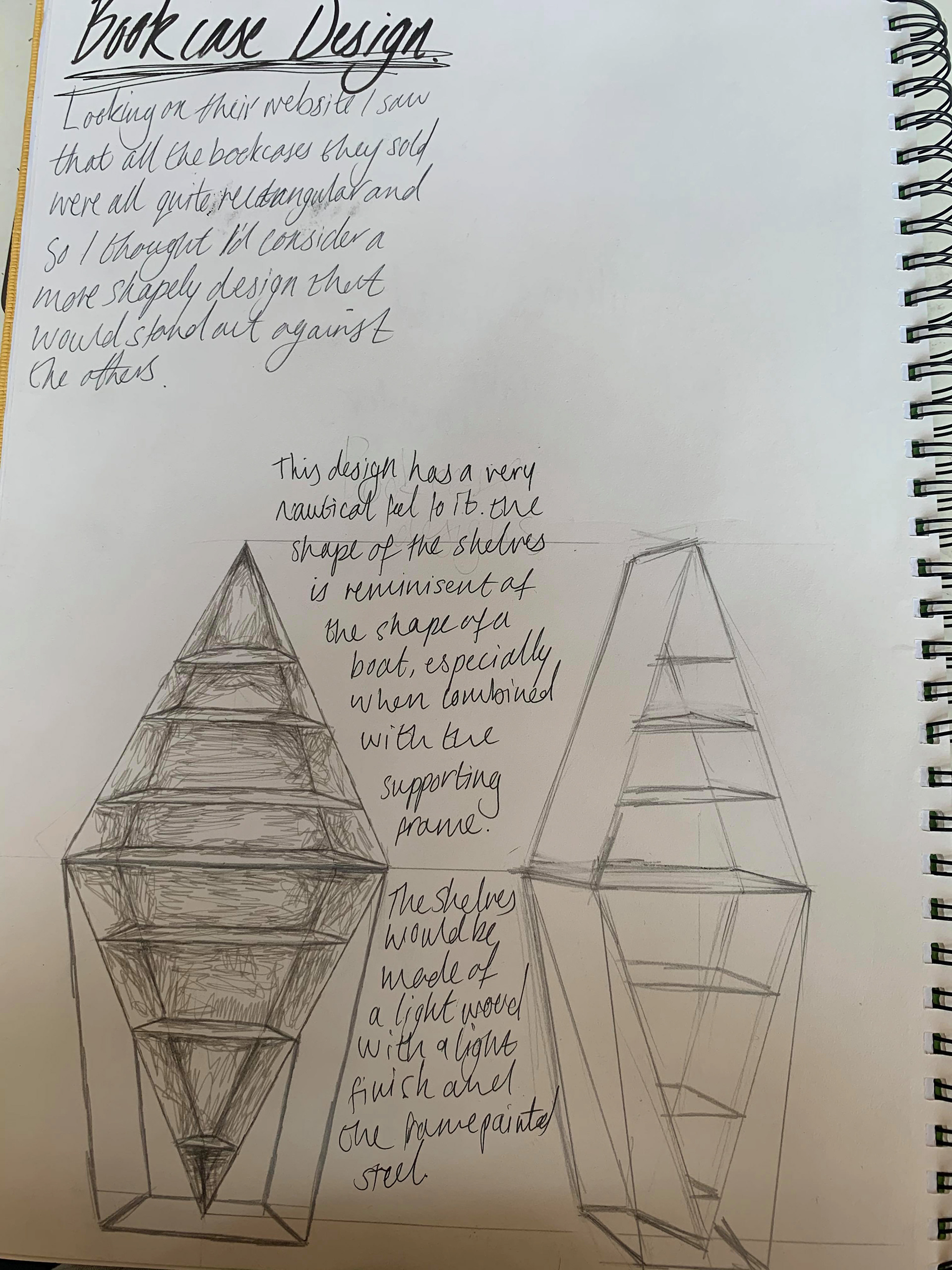
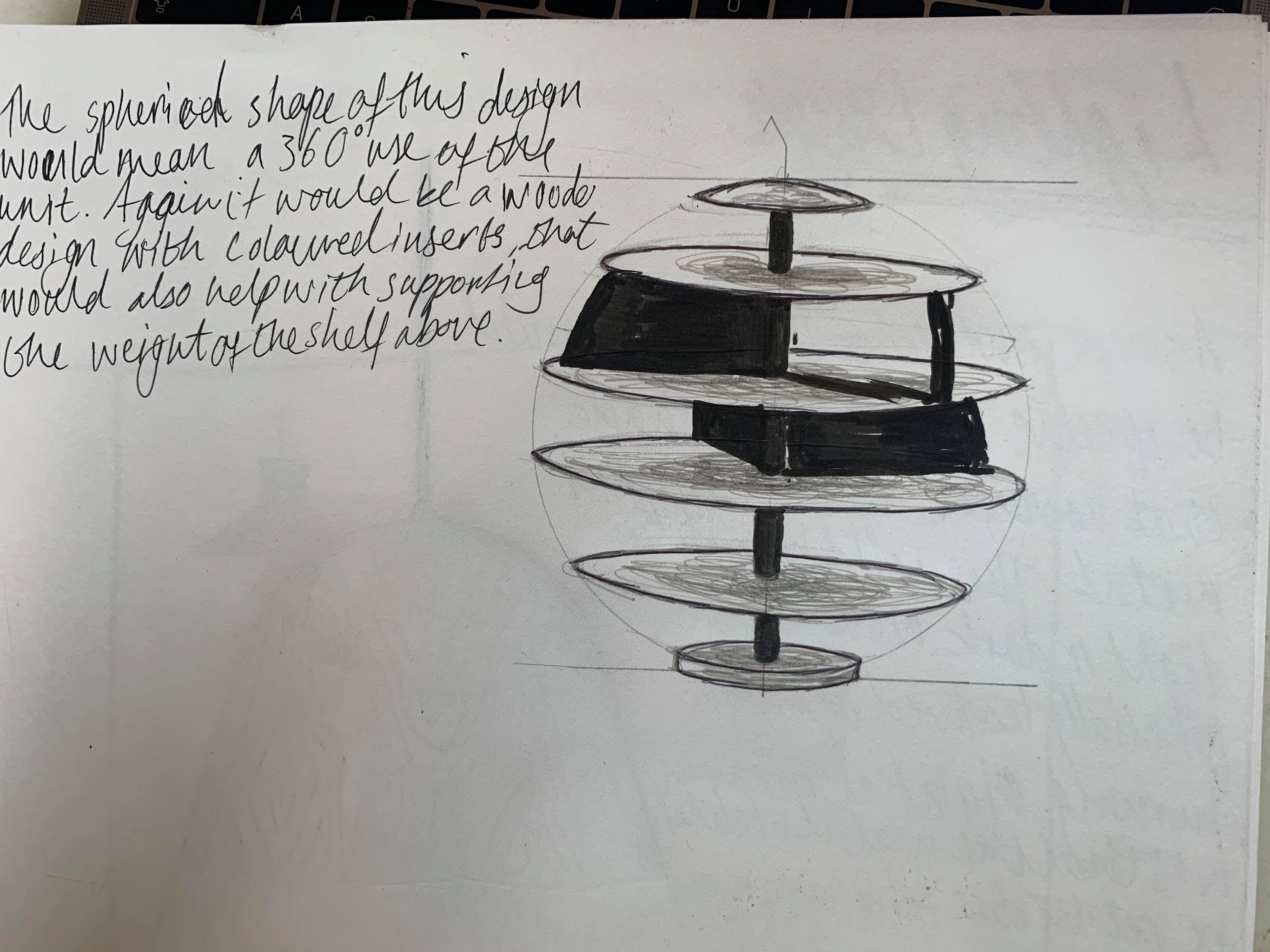
What do I plan on making??
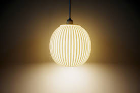
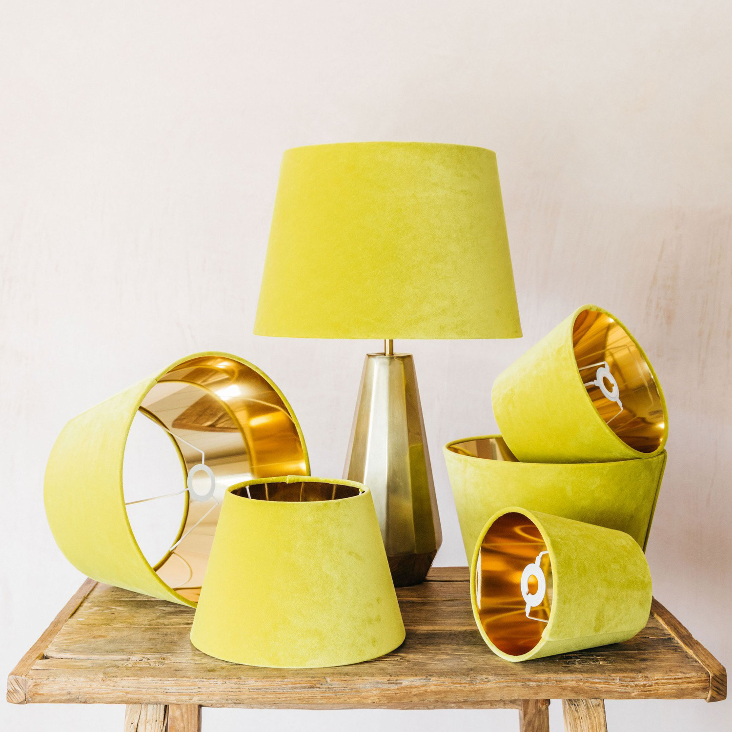
My initial idea was to design a bookcase, lamp, and maybe a few other things to then pick which one I wanted to develop. I then realised that time was not abundant for this project and I needed to decide rather quickly. I decided to go with the lamp design I did. Retro lamp shapes are popular right now and would be rather straight forward to produce on the lathe.

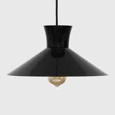
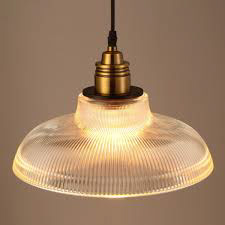
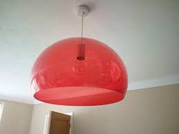
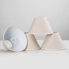
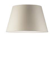
I started by looking at different shapes of lamps that are classed as ‘retro’. From these I then looked at how I could shape my own and the different types of wood that are used in Scandinavian pieces.
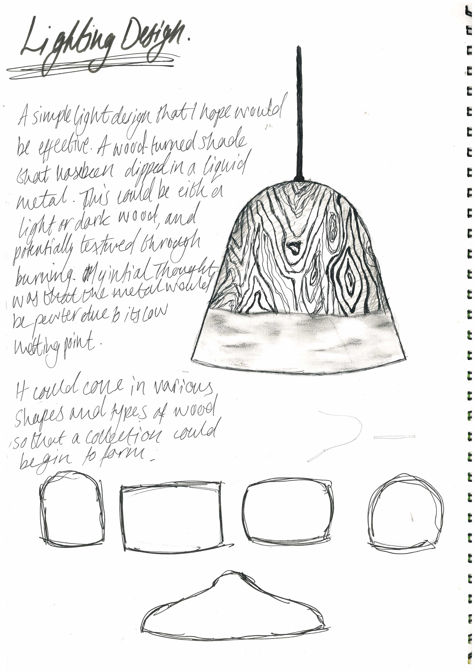
The woods that I found were a common theme in this style are light woods such as Ash, Beech, and Birch. The next challenge for me was finding some wood the size I needed for my design.
[Hover over wood to see what kind it is]
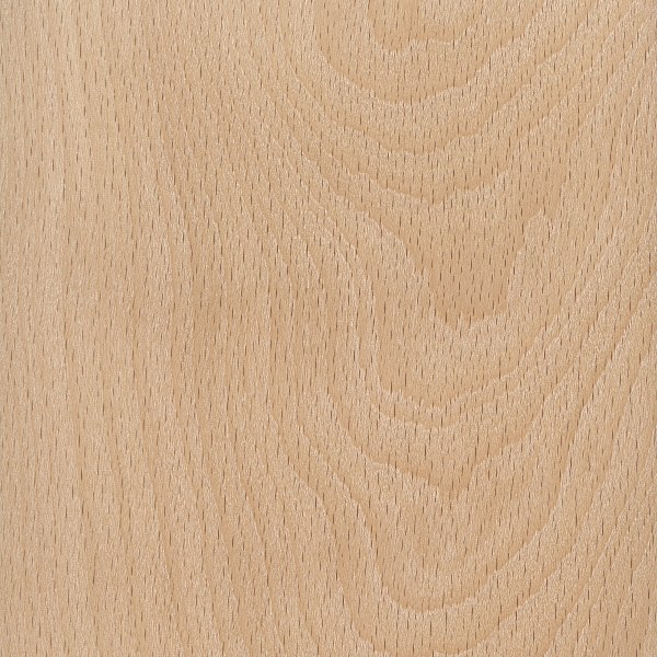
american beech

Ash

Grey Birch
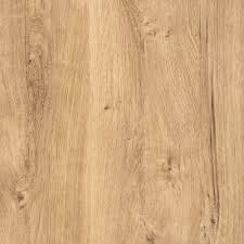
Oak
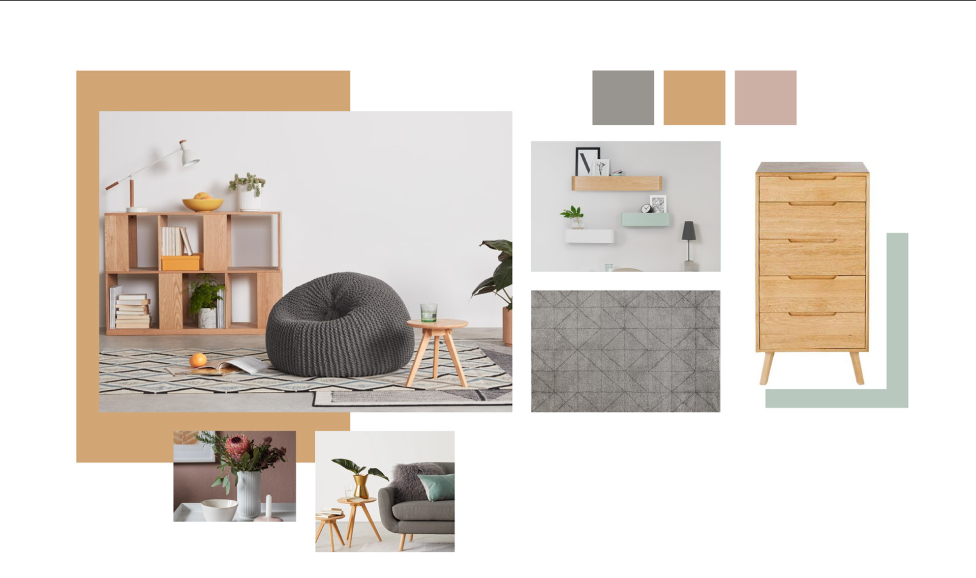
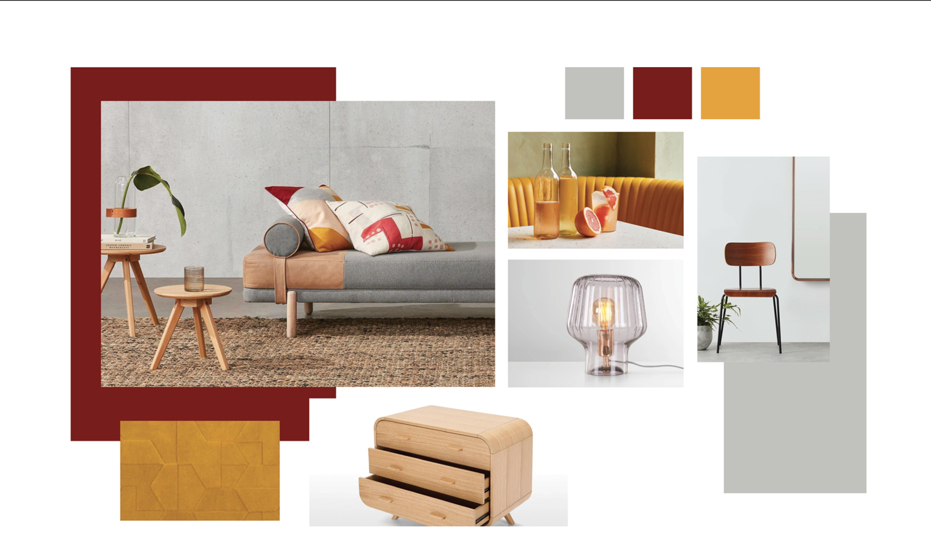
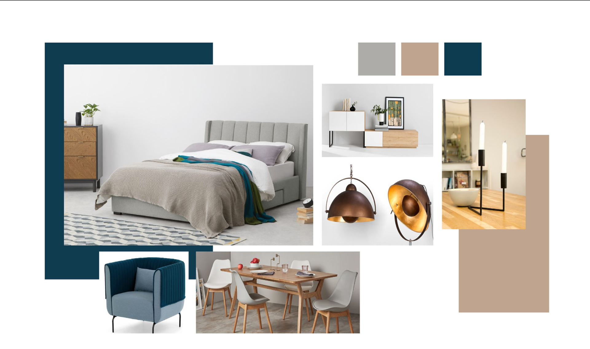
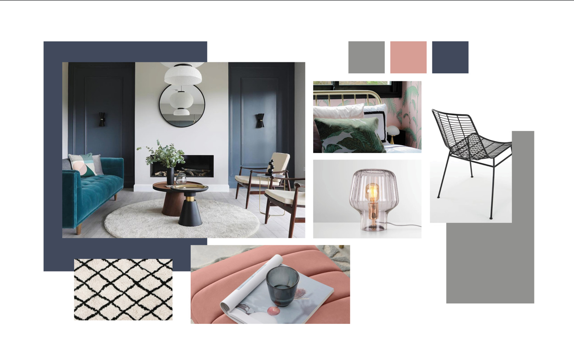
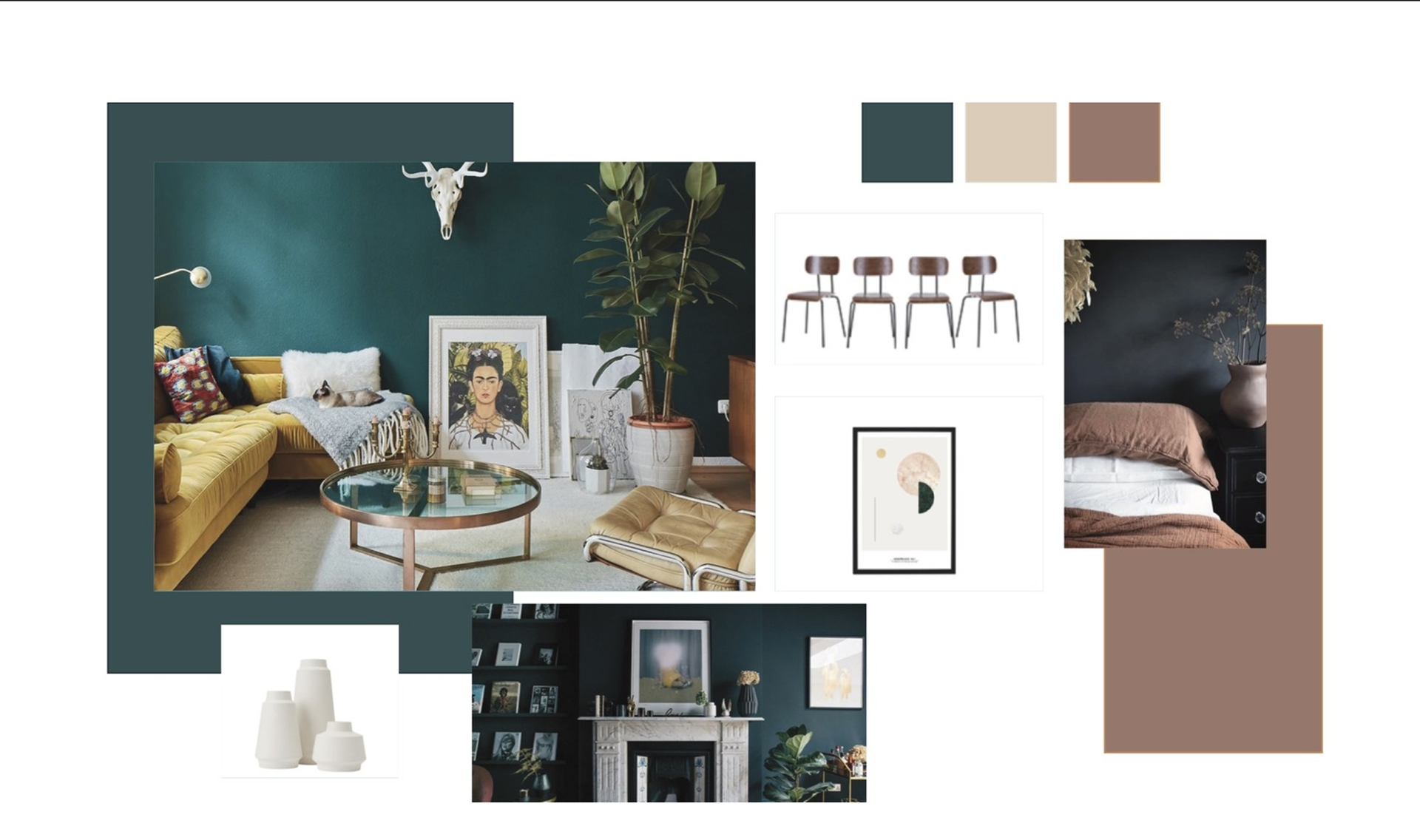
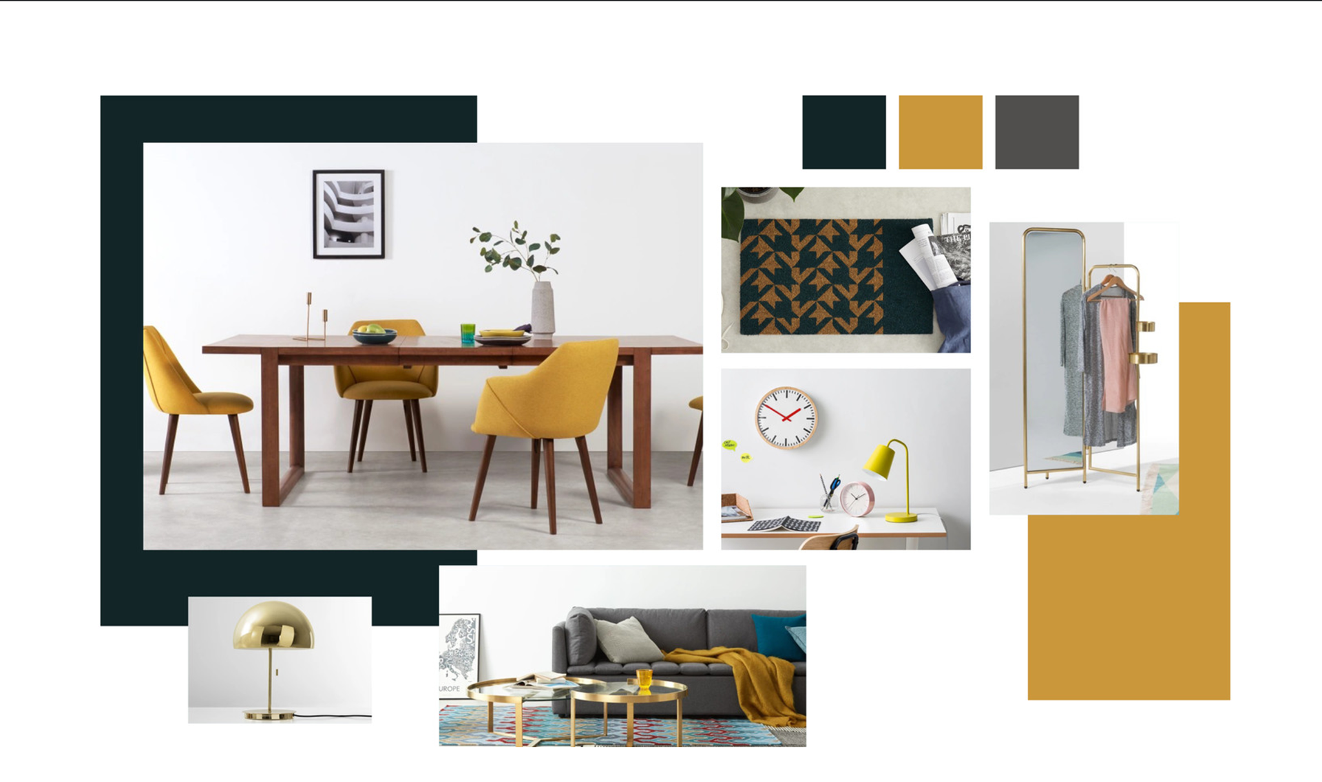
Scandinavian style is dominated by their seasons. They have cold, long and dark winters and so their furnishings try to create a warm and welcoming atmosphere that takes them out of the cold. Their use of wood is the main characteristic used to do this. They use it for floors, walls, furniture and lighting. They also have an emphasis of plush fabrics to soften the feel of the wood. The bright colours of the fabrics combined with the pale woods gets amplified by their use of light to create a true home atmosphere.
The style is also dominated by basic shapes. They specialise in smooth clean lines that are complimented by the plush cottons and furs that are often used. They also use a soft colour palette that still stands out against the light fabrics. The wool-white or beige is mixed with other pastels such as blue, mint, or rose.
Websites I used for reference that also show other aspects of the style-
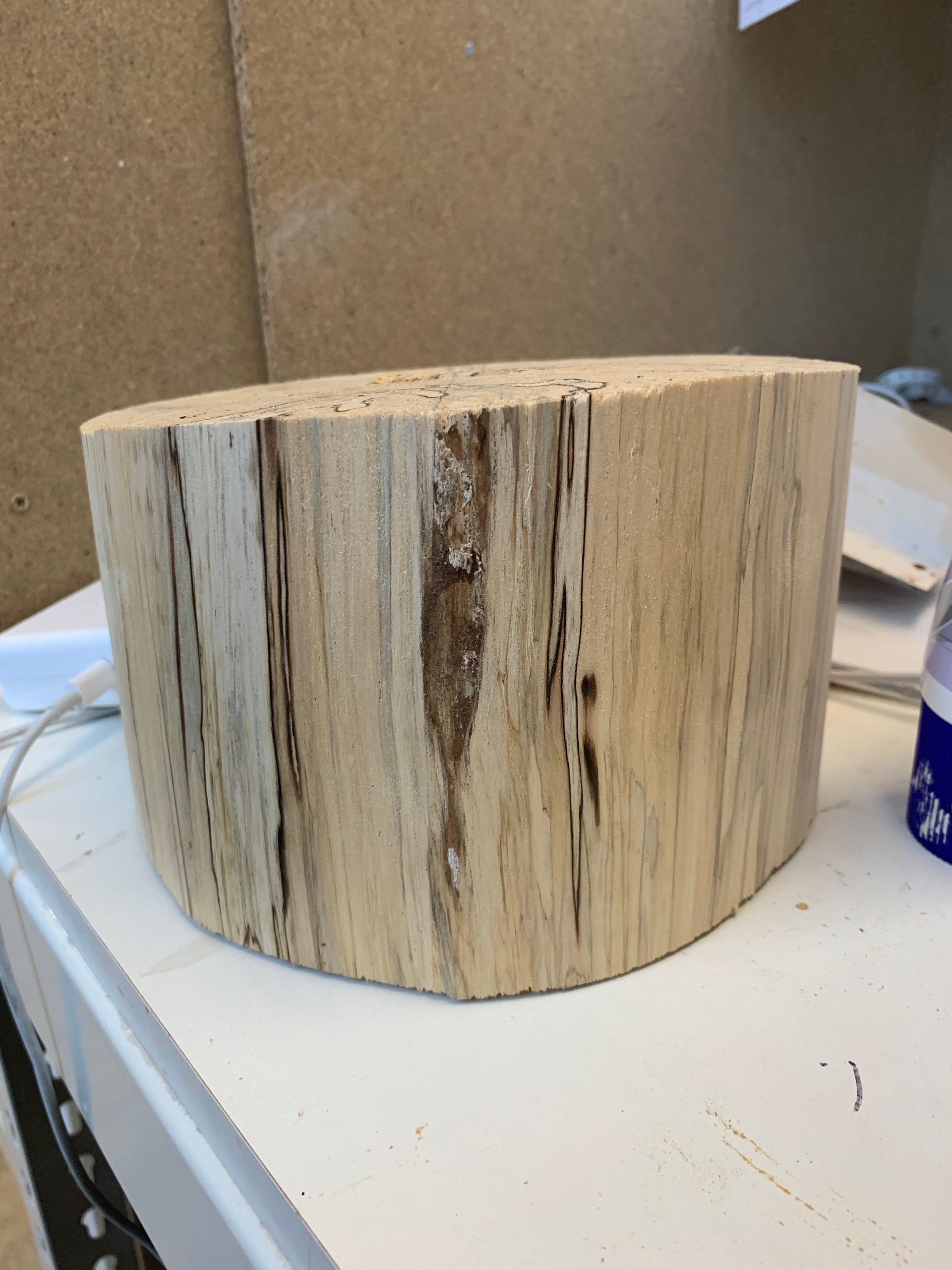
I struggled to find a piece of wood online, so I started asking people I knew if they had any or knew where I could get some. Luckily my dad found the perfect bit of wood for me in a barn. This bit of wood had been there for a number of years; this meant that the wood was already dry, and I could start to turn it as soon as possible. As it had been a couple of months and the summer since I had used the lathe, I decided that I should probably refresh myself on the process and how the machines needed to be set up. I found a fantastic clip on youtube that was really thorough and exactly the refresher that I needed:
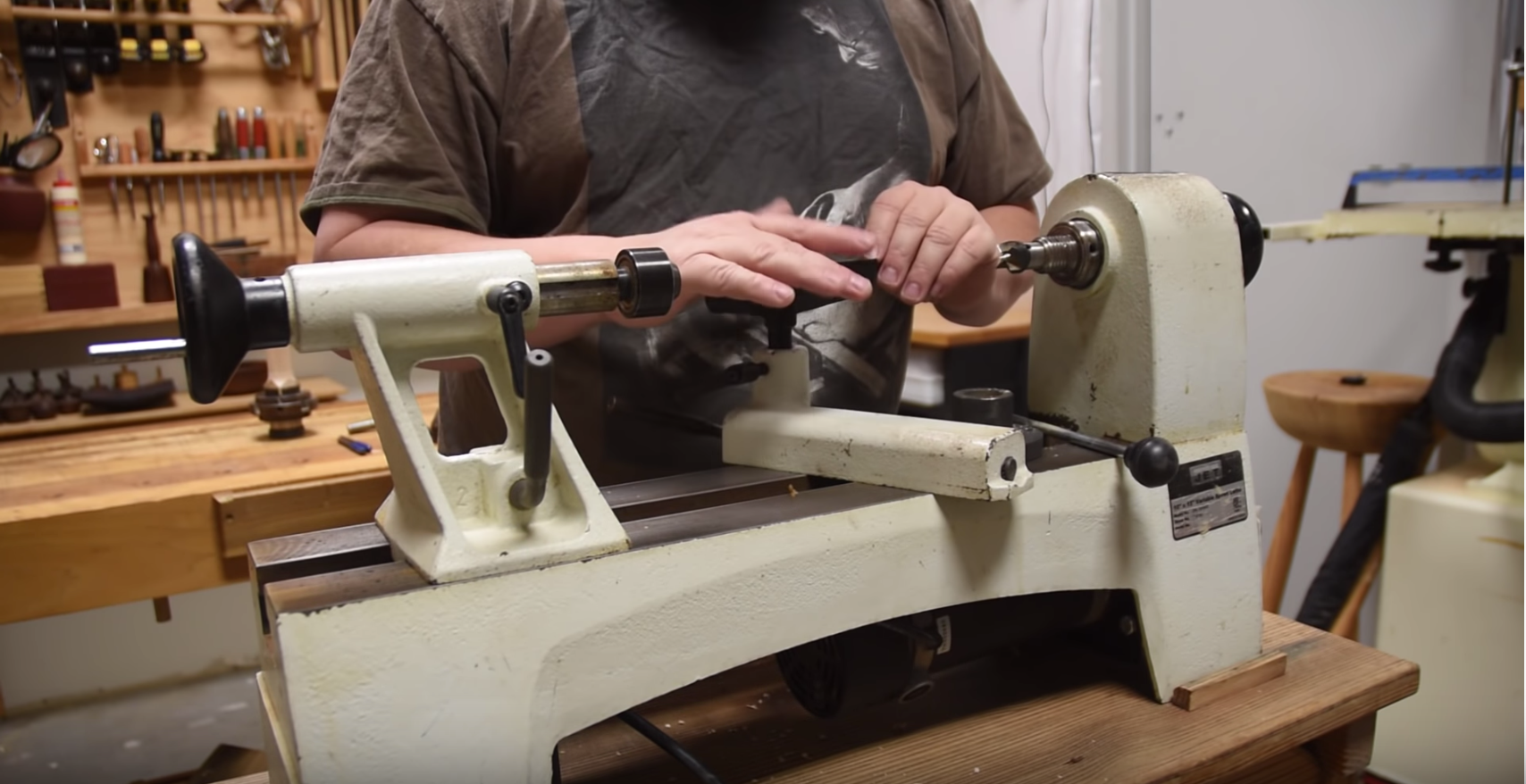
STARTING THE LAMP
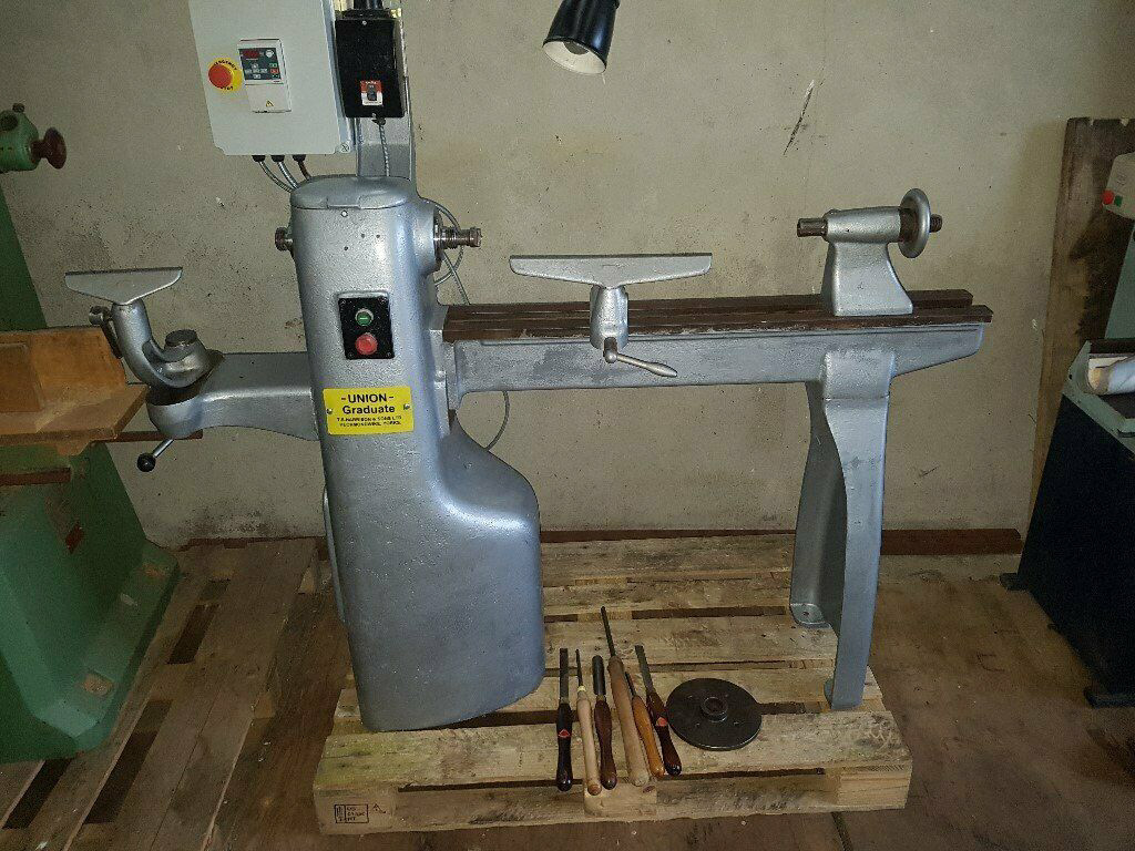
A lathe similar to the one in the wood workshop.
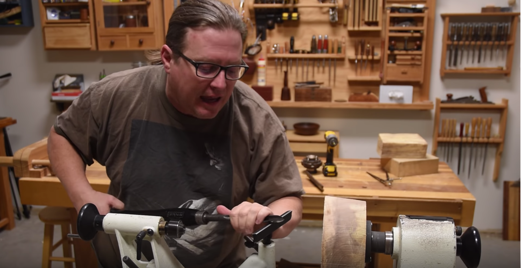
The first step to starting to make the lamp was to create a more circular shape. This makes the initial “roughing” of the wood safer as the tool rest can be closer to the wood at all aspects and sides. To do this I used the band saw. Then the wood had to be flattened out so that the face plate was sat as smoothly as possible to the wood so that the wood is turned evenly and safely. When it came to start the turn I used the brace on the other side of the lathe so that the wood was supported during the roughest stage.
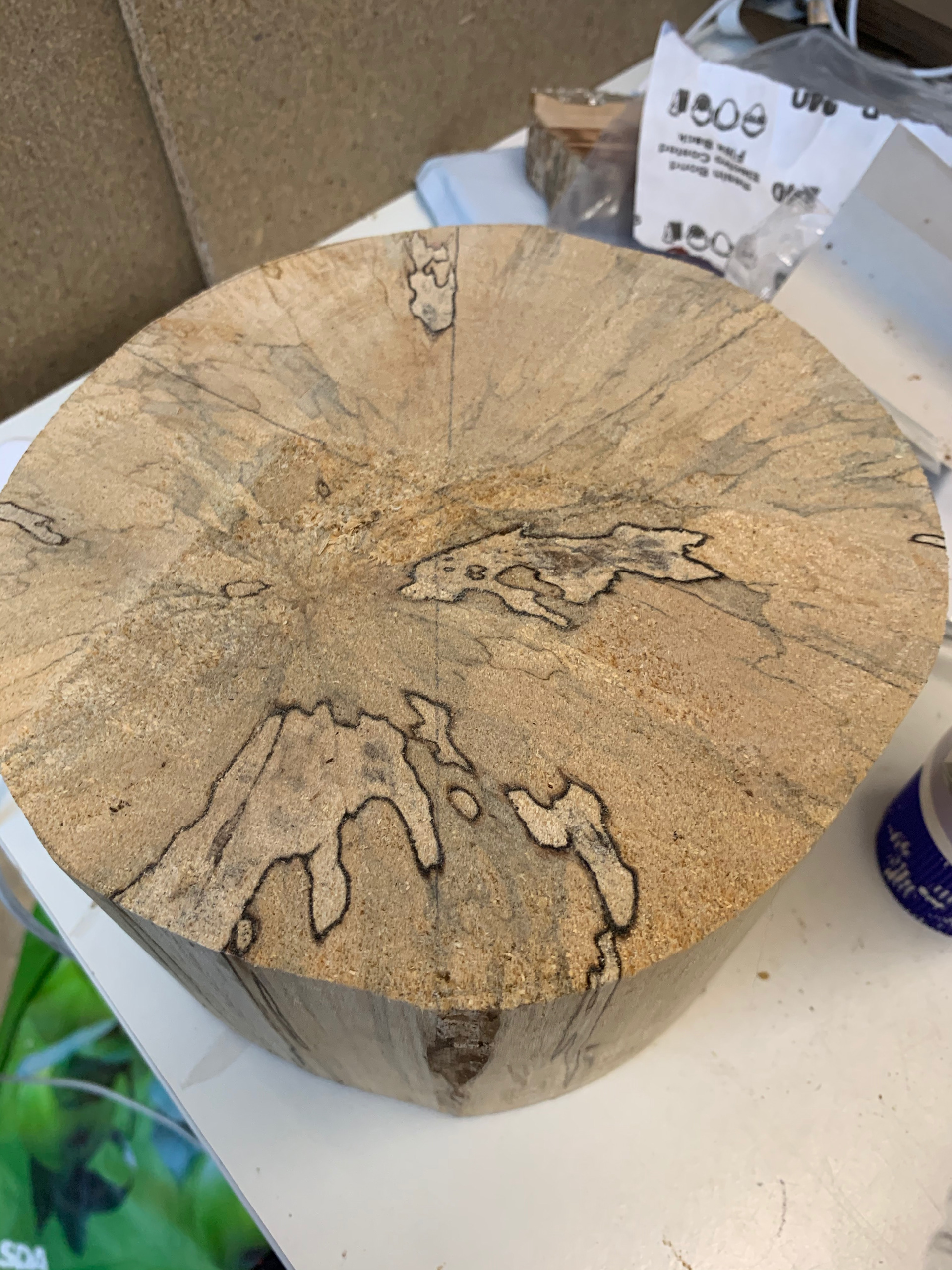
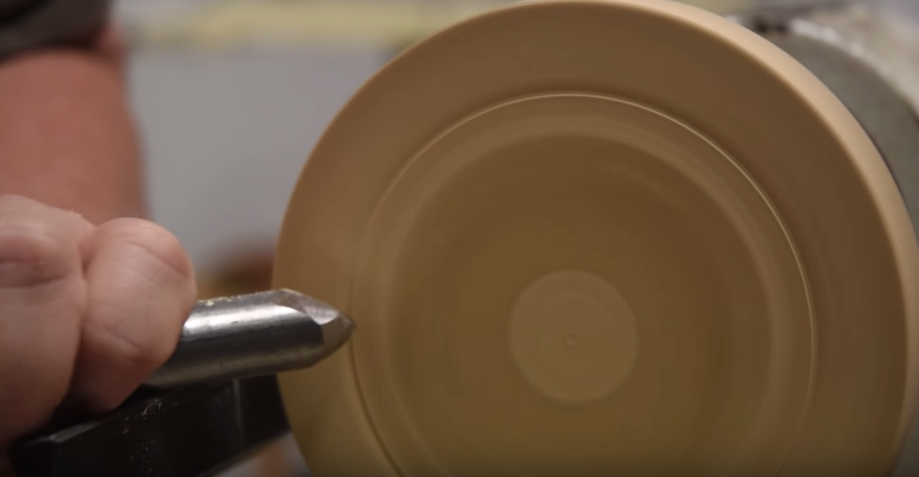
Once the wood was rounded off, I was able to start shaping it. I started with forming the tip of the shade and the gradually move towards what would be the bell of the shade. Th top needs to be a pinched shape so that the clamp can go on the far end for when I did the middle.
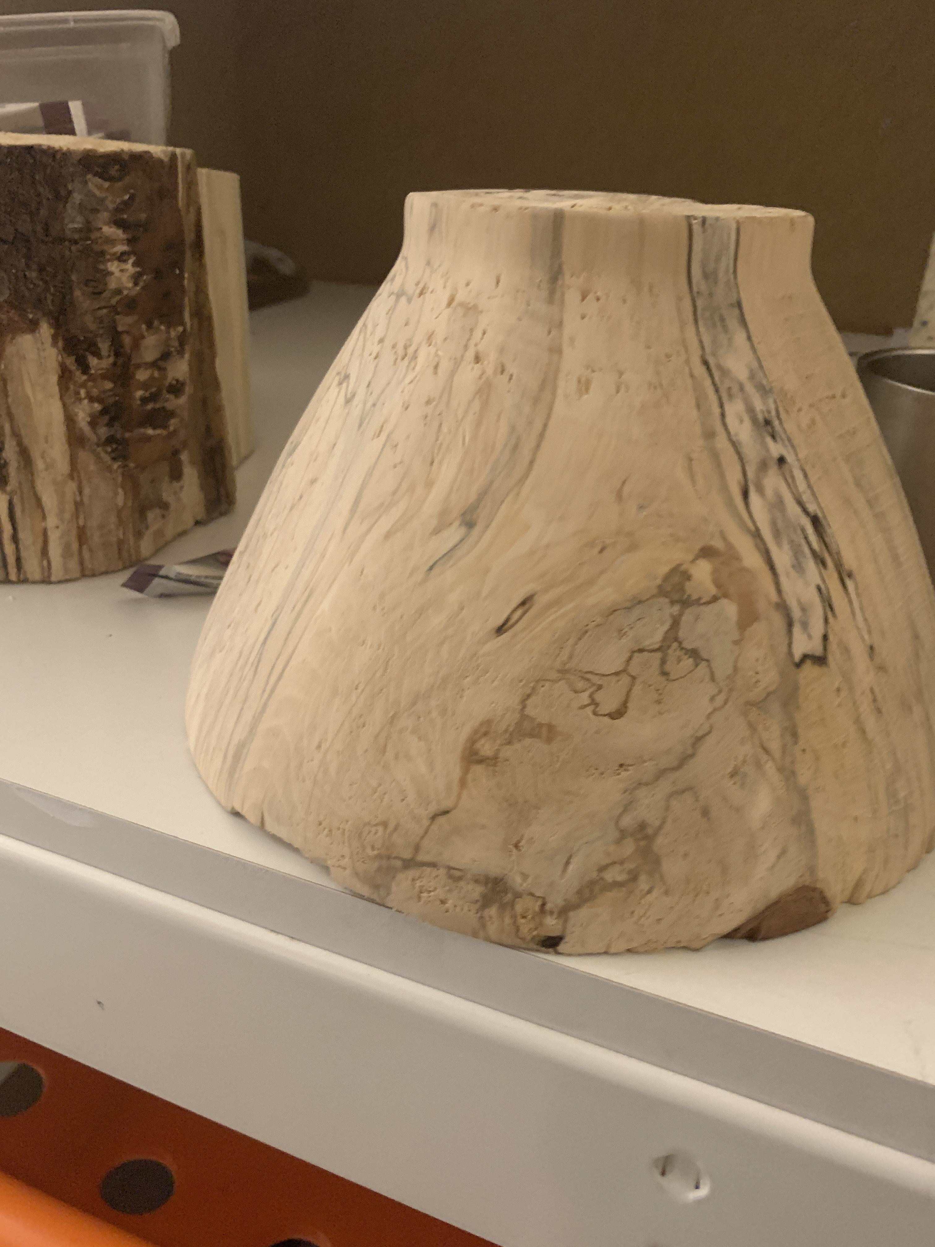
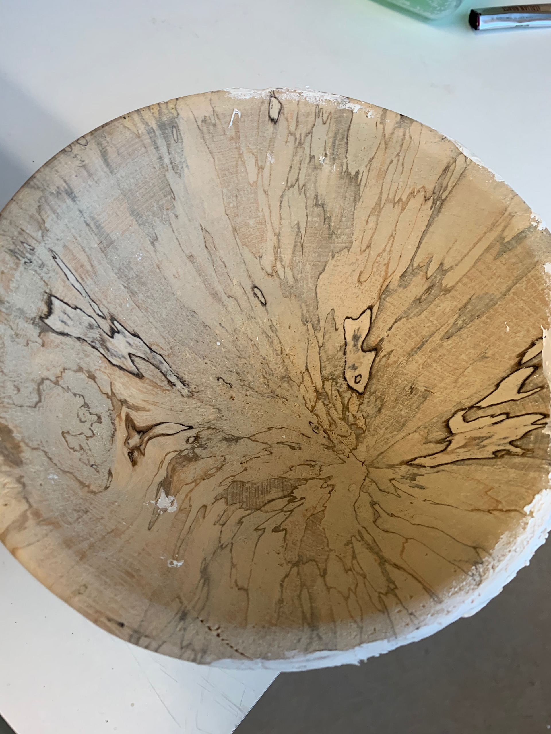
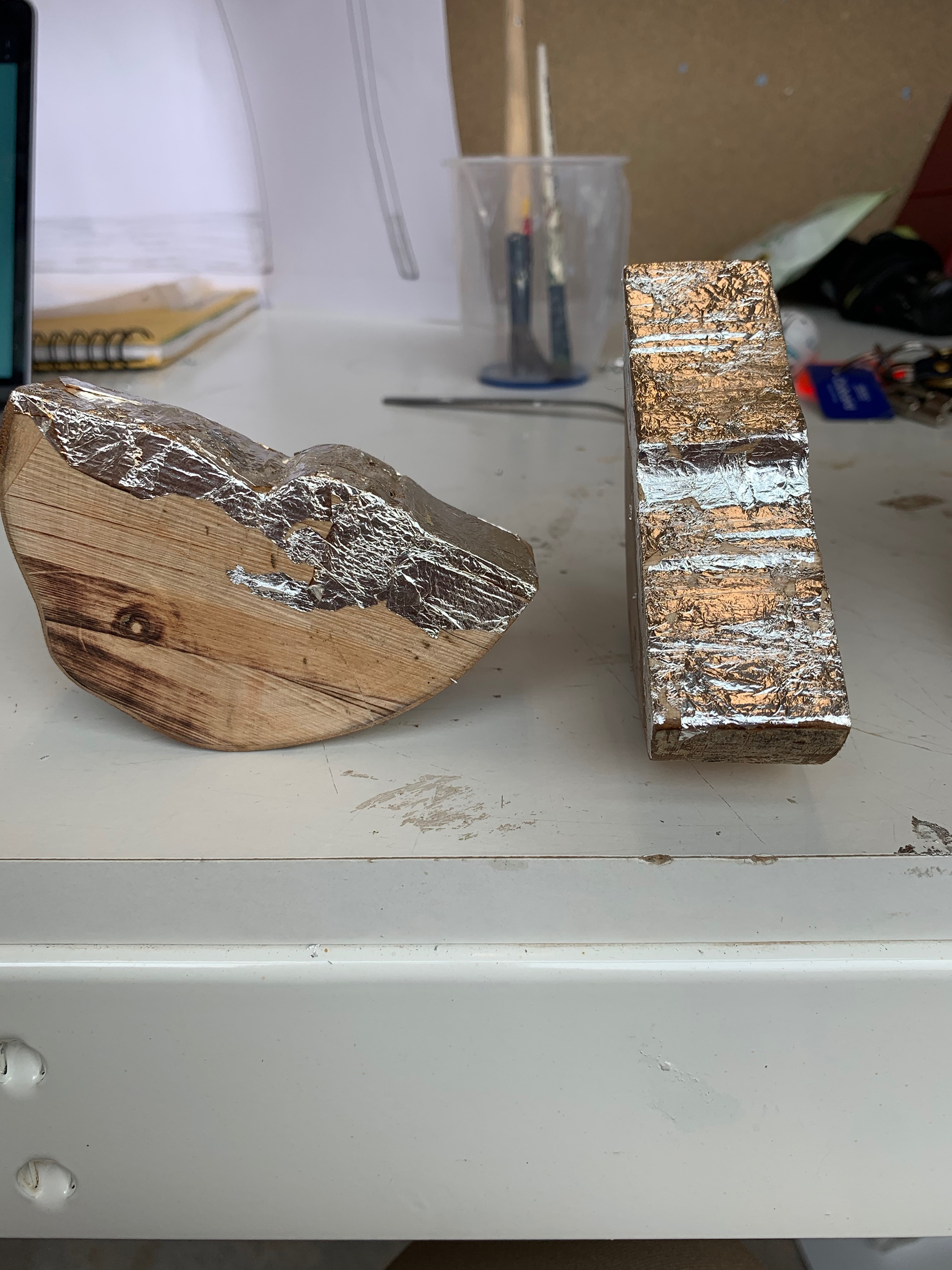
As you can see the wood started to splinter and chip. This was due to the direction I was cutting into the grain. With most turning you try to go perpendicular to the grain, I however, was going parallel. This meant that the small ends of wood that may not have been taken away with the chisel came away any just because there wasn’t anything keeping them in place. This was not helped by the fact that it is a very soft wood and so there wasn’t a lot of pressure on the grains anyway; the turning lessened it even more.
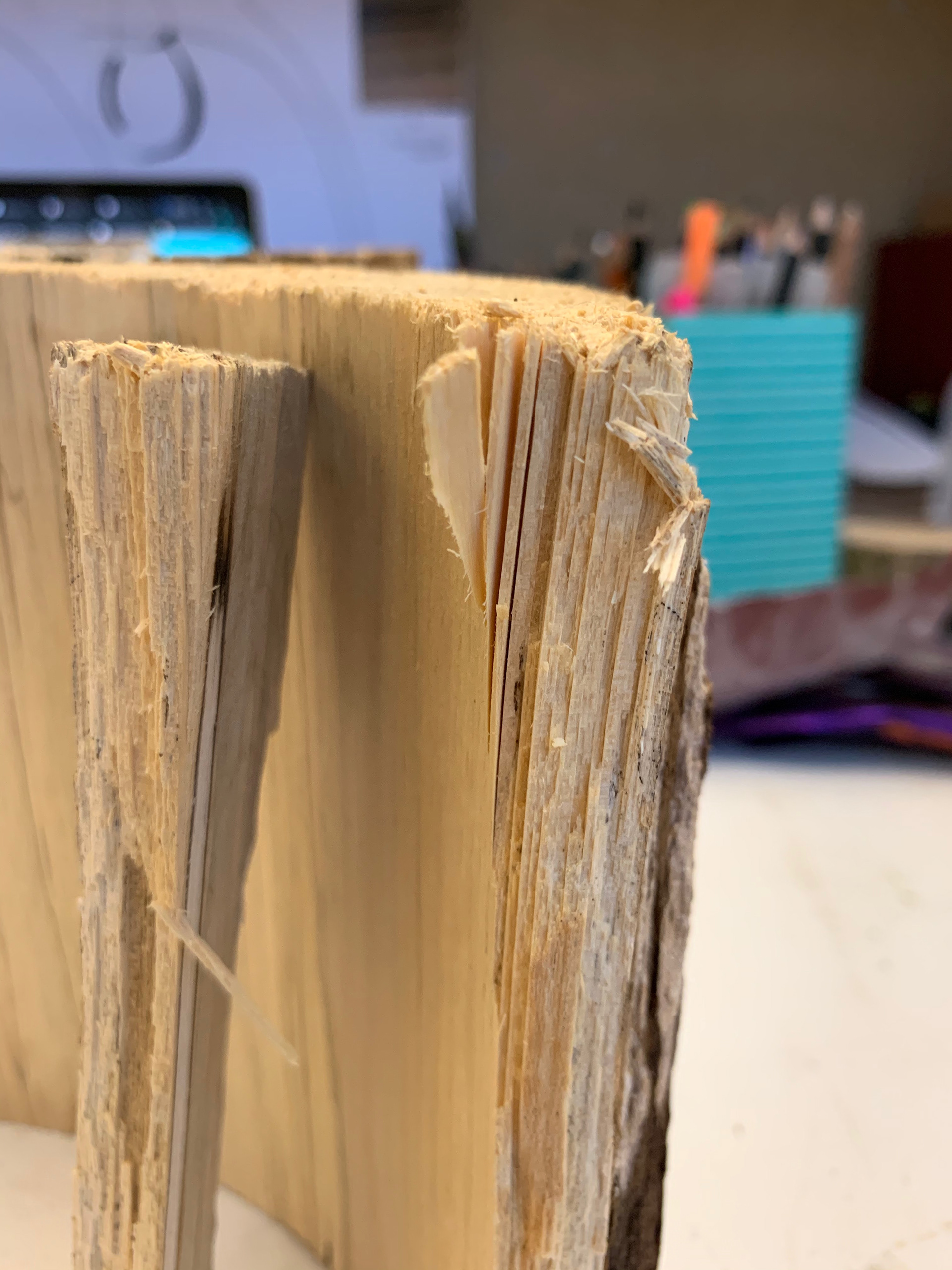
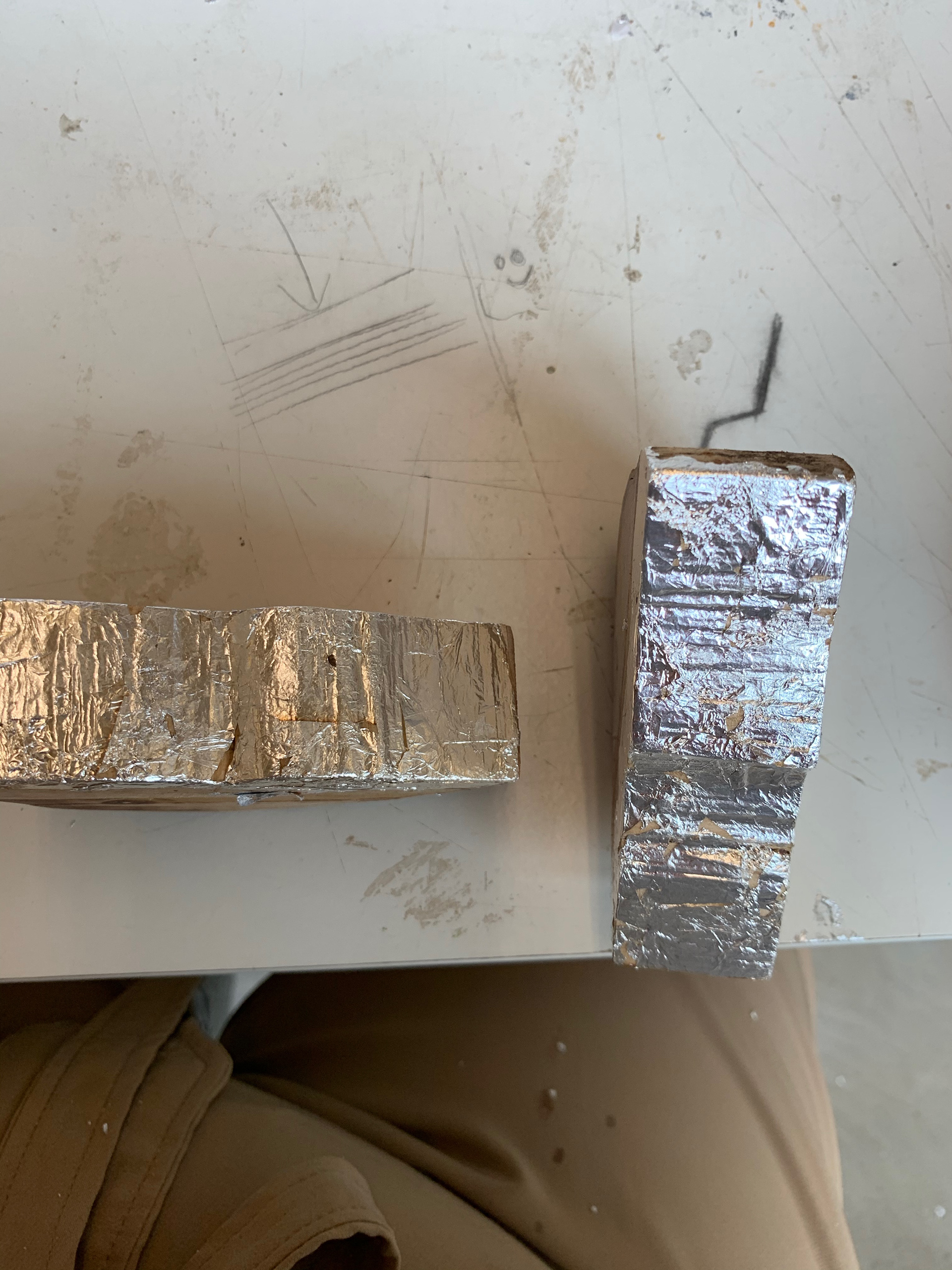
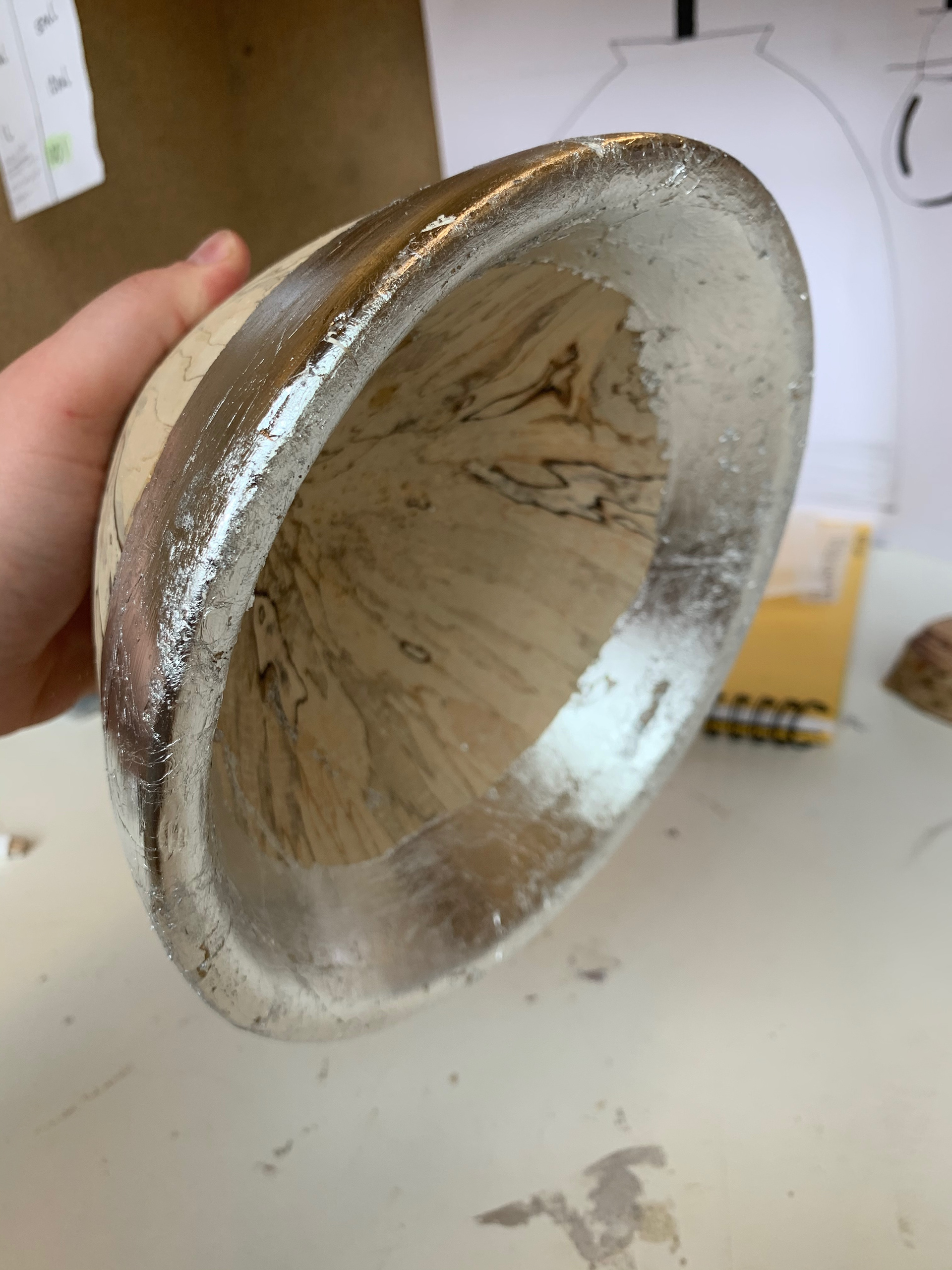
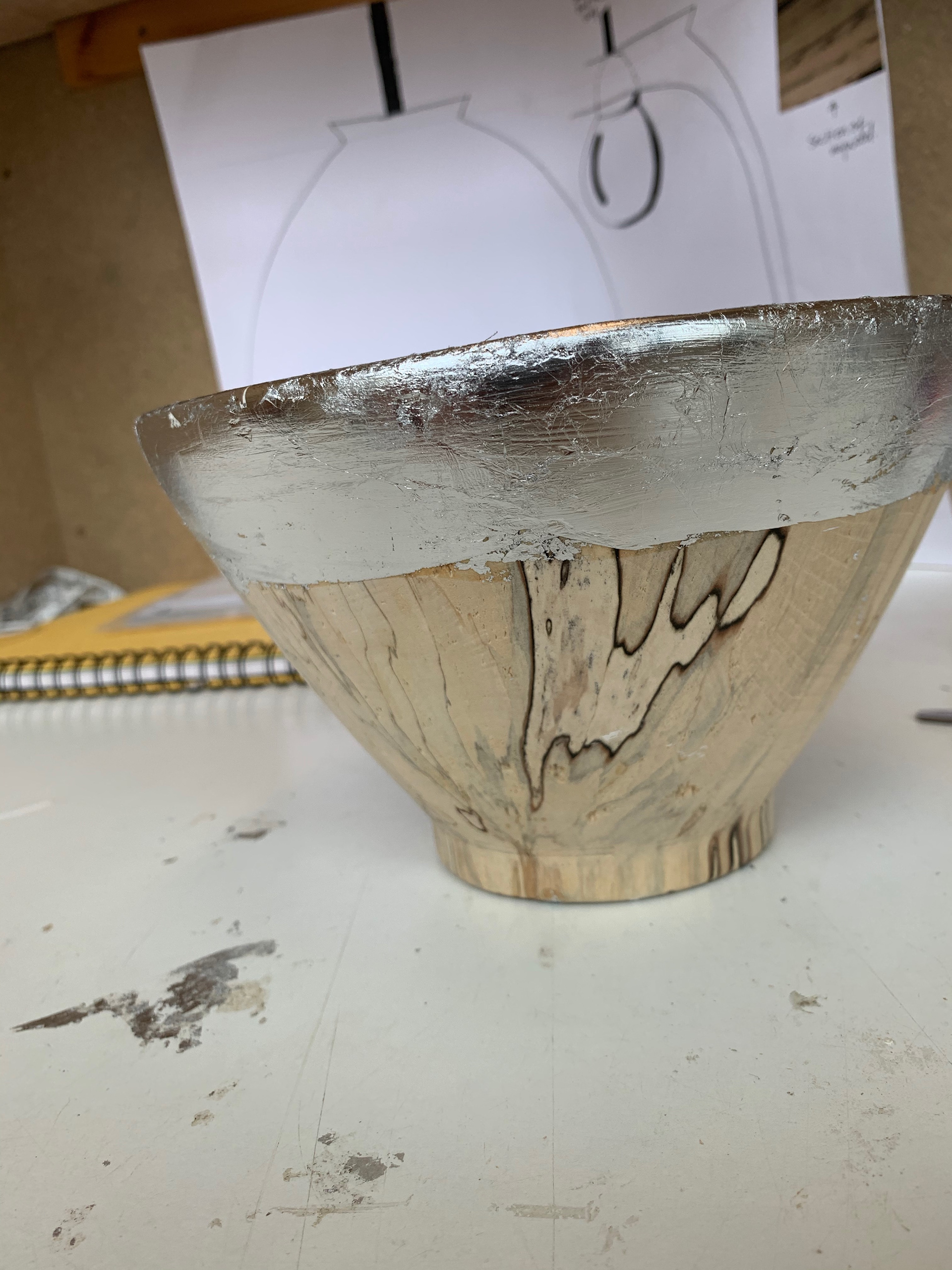
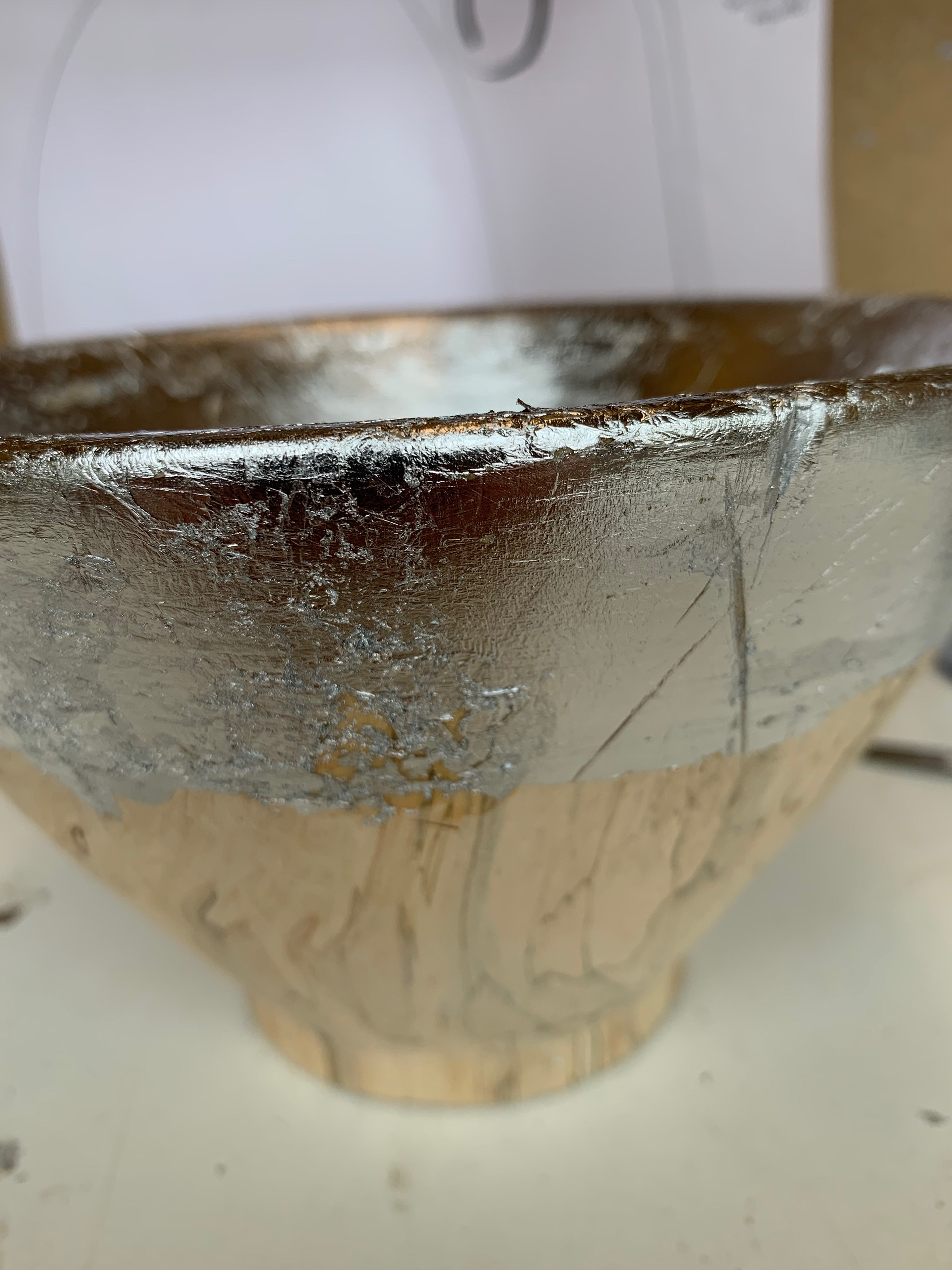
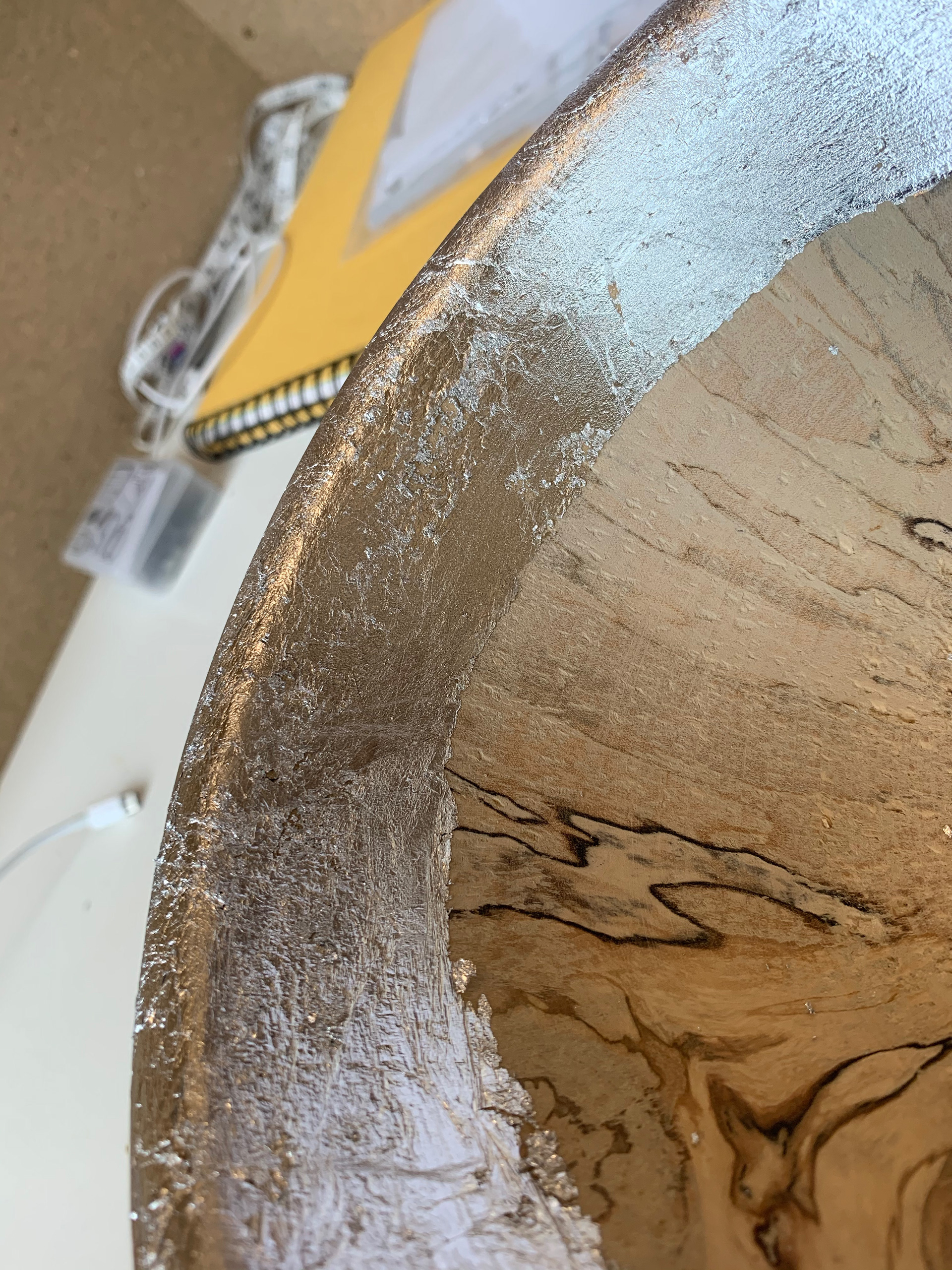
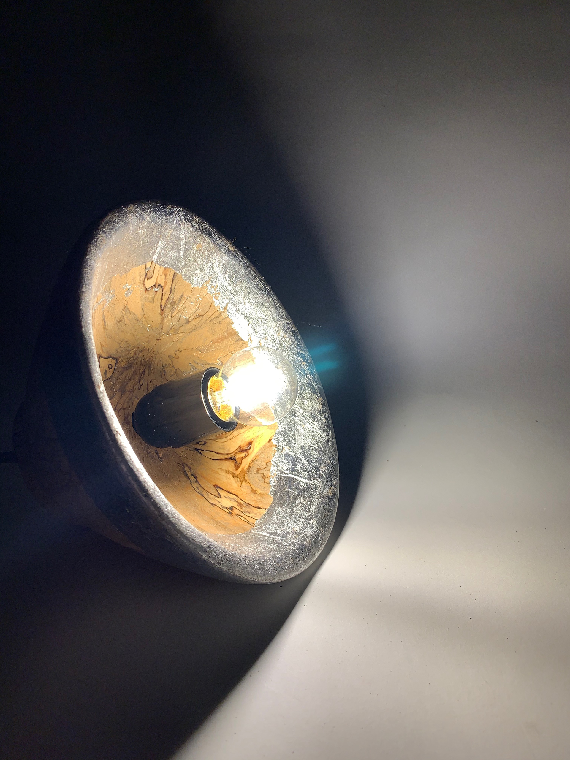
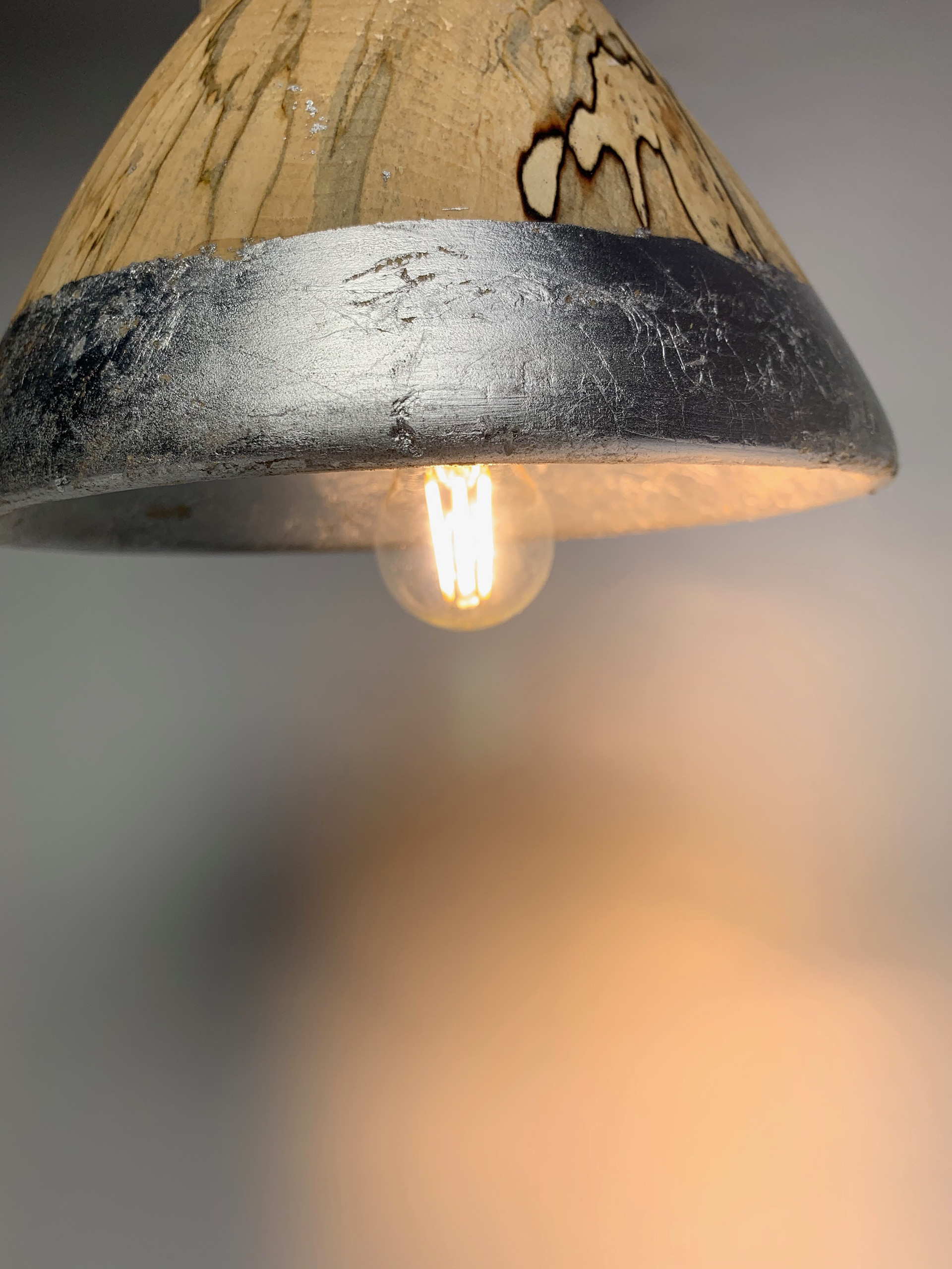
I wasn’t worried about this too much though. I had planned to cover the bottom of the shade in silver leaf; as this was where the majority of the chips were occurring, they would be covered. The only thing I had to make sure I did before I applied the leaf was make sure that I filled in the chips and sanded it down to make sure that there was a smooth surface for it to be applied to.
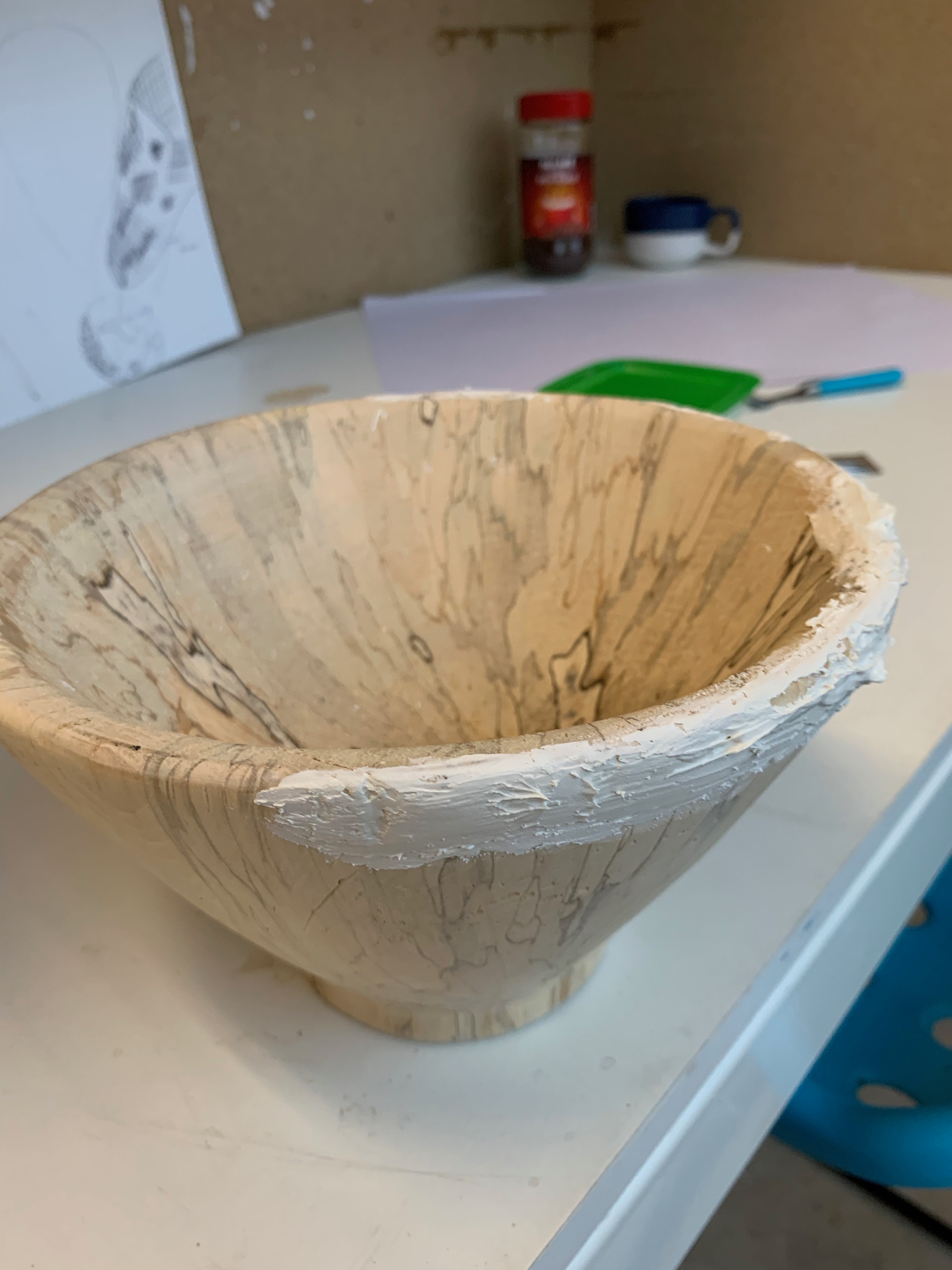
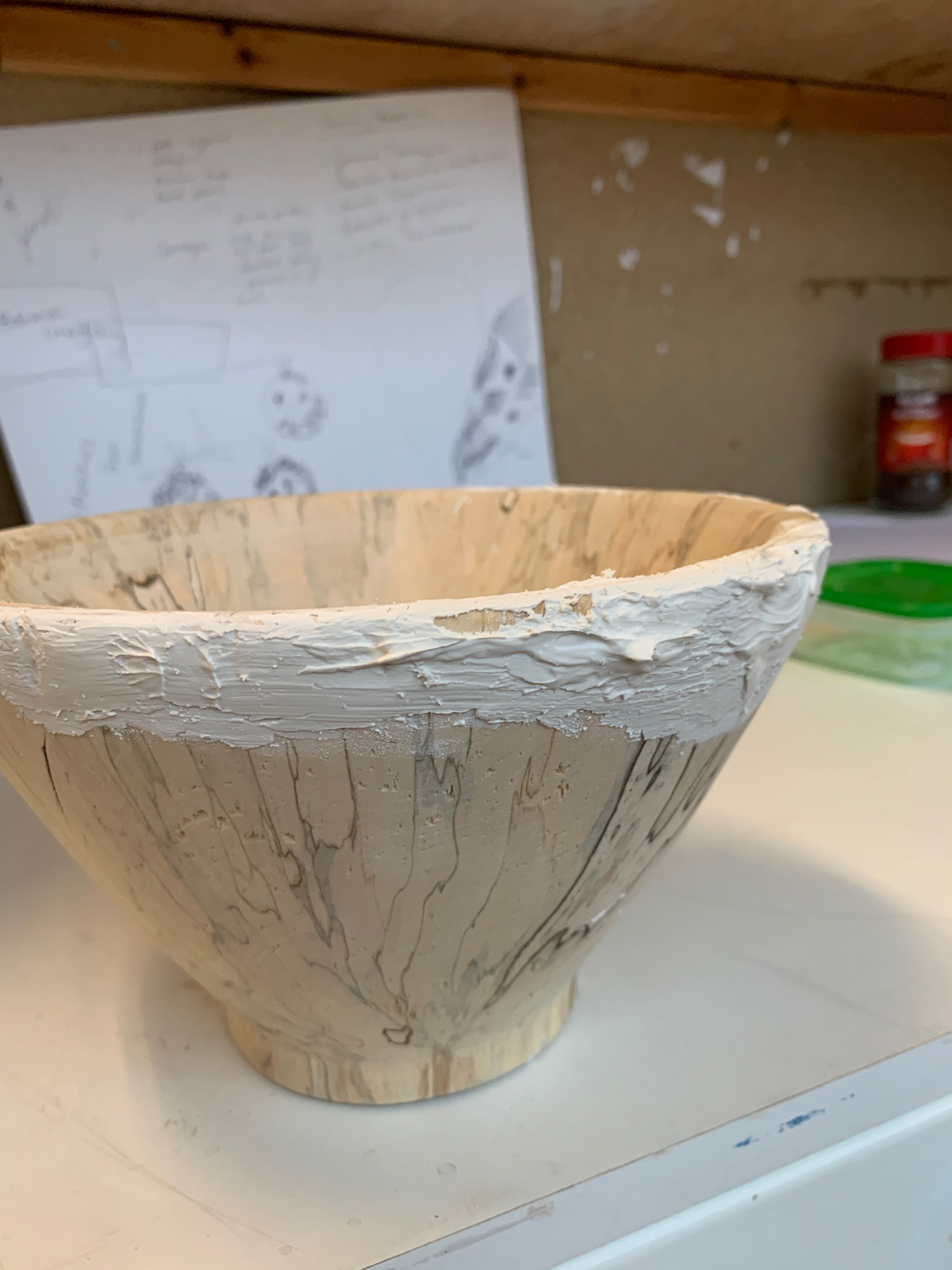
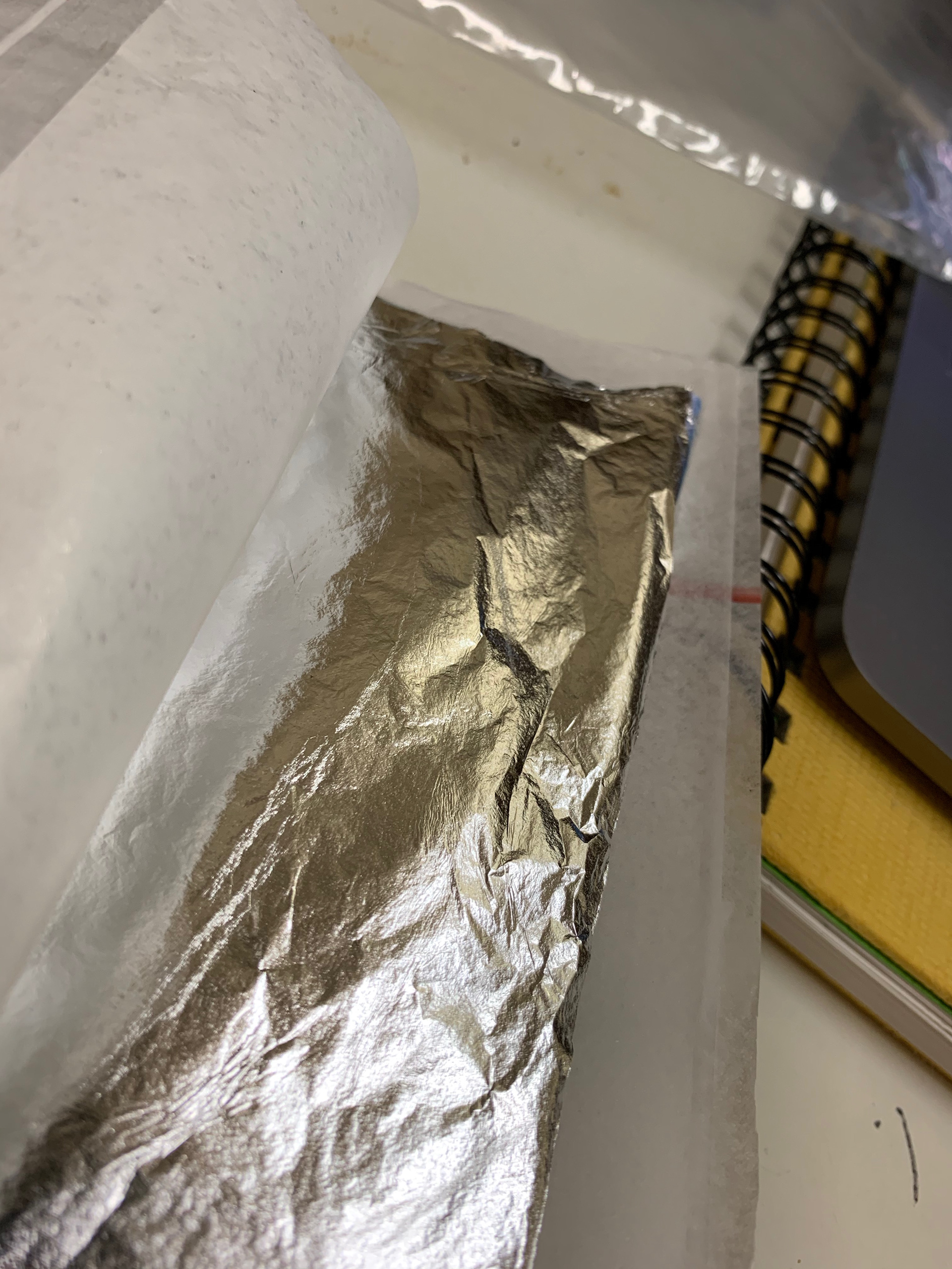
Now the clear next stage is to add the silver leaf. I say silver leaf though I am actually using imitation silver leaf for this prototype purely for cost reasons. I need a fair amount of silver leaf for what I want to do and so the best thing was to get something that has the effect I wanted since the shade I have made isn’t the size I intended it to be in the first place.
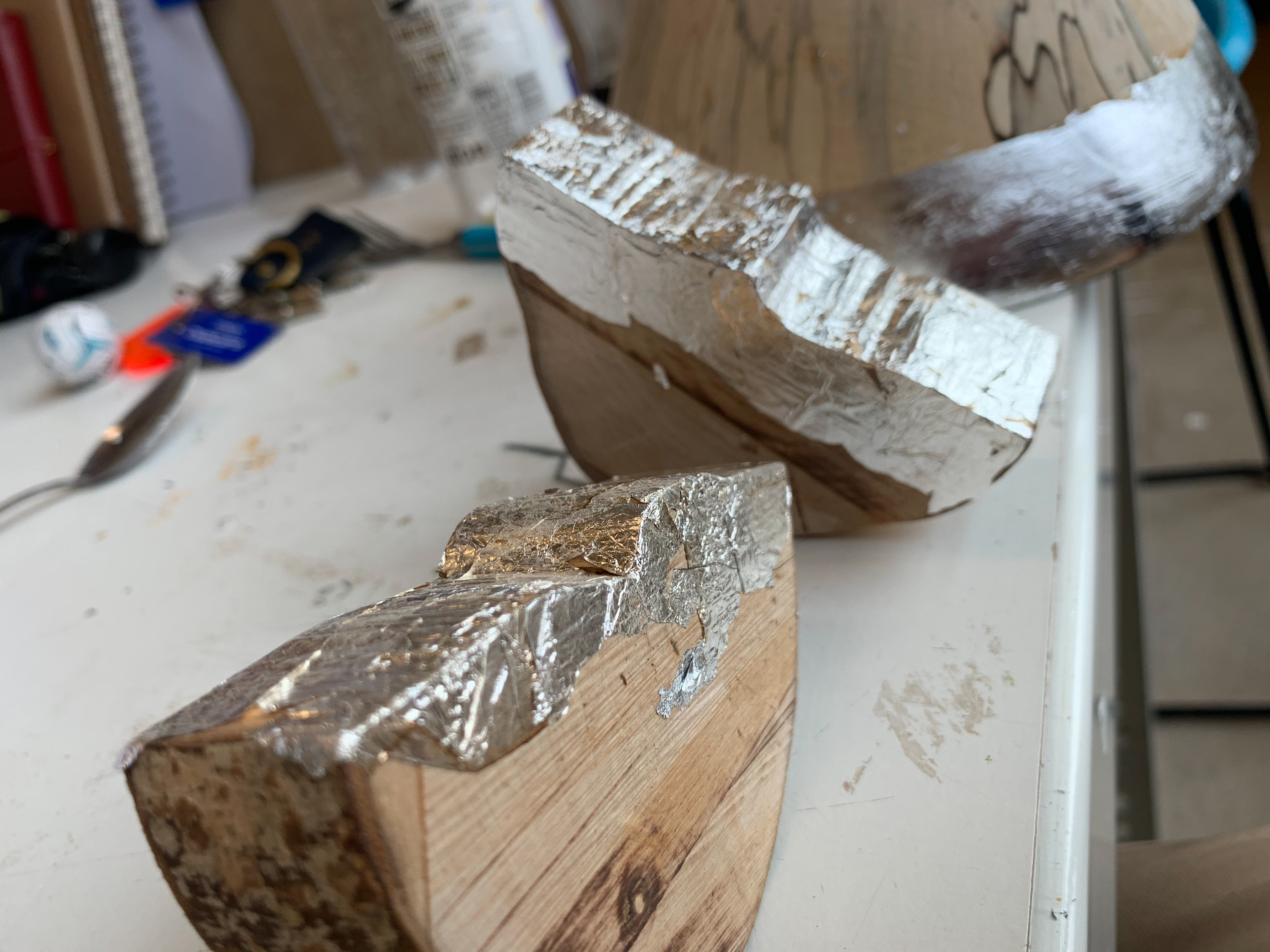
Samples of original silver leaf
Samples of original silver leaf
Samples of original silver leaf
Imitation silver leaf
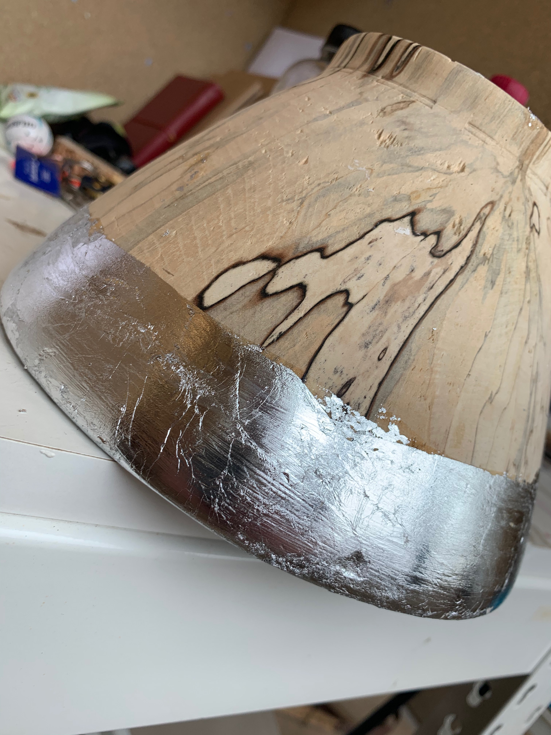
Now the challenge for the application is creating a straight line on a curved surface. My solution for this...... don’t have a straight line. The Scandinavians may worship clean lines, but they also love nature and organic forms. Silver leaf clings to the glue wherever it is applied and so it is quite easy to create an affective natural finish. This is what I tried to achieve on my lampshade, and I think it was a success.
Final application
Final application
Final application
Final application
Final application
The next step in this project??? Turn it into an actual working light. I bought the necessary components to make it work. Now in an interior space you would probably have the light attached to the mains however for this I am doing it so that I can plug it in anywhere to demonstrate.
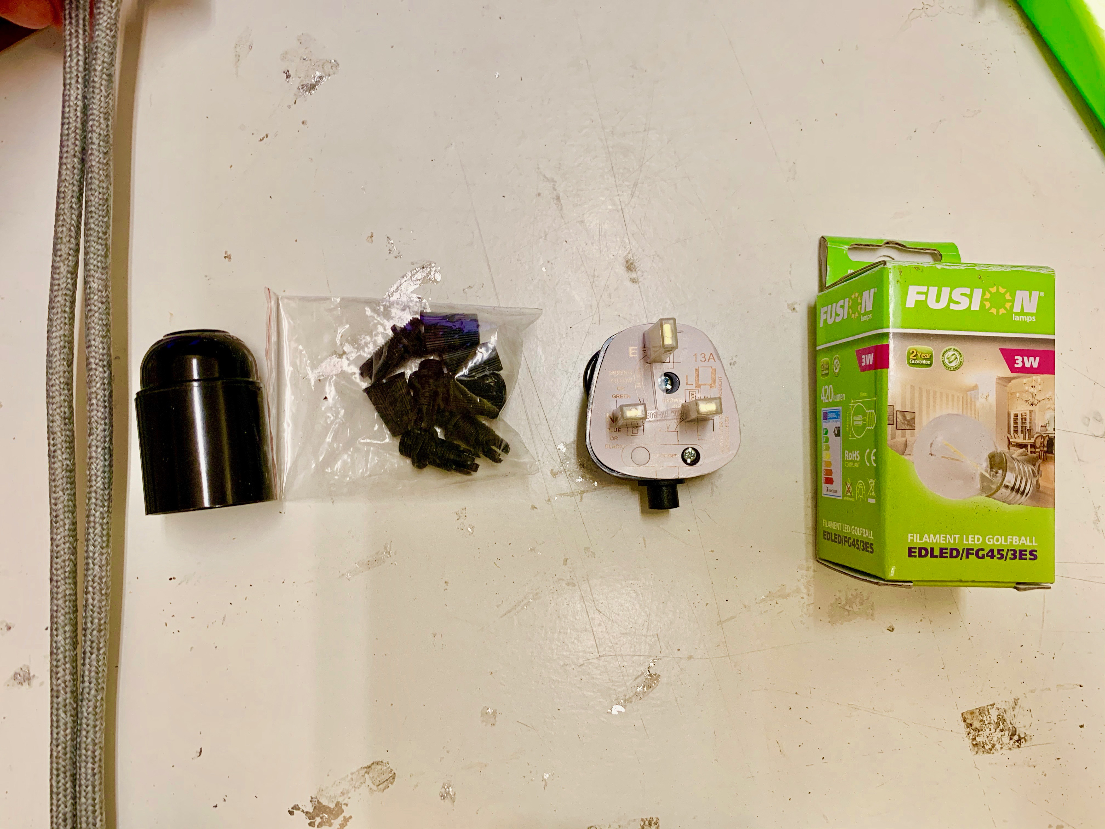
The assembly was quite straightforward all the I had to do was drill a hole in the top for the wire, whilst making it slightly bigger on the inside so that the bulb holder could rest flush with the wood. I left the wood quite thick at the top of the shade to reduce the chance of the wood splitting when it came to the drill and cable going through it and later to support the weight of it all; if I had left it thinner the would have been a chance that the weight of it all once hung.


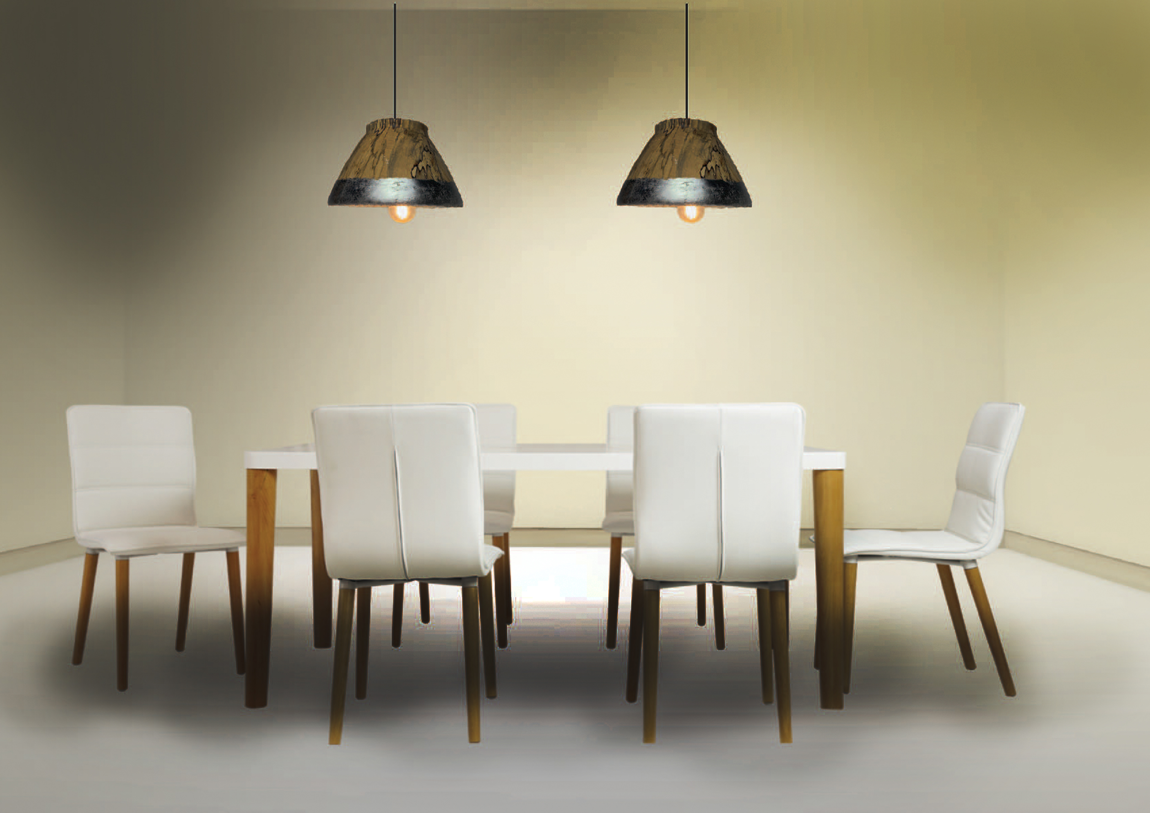
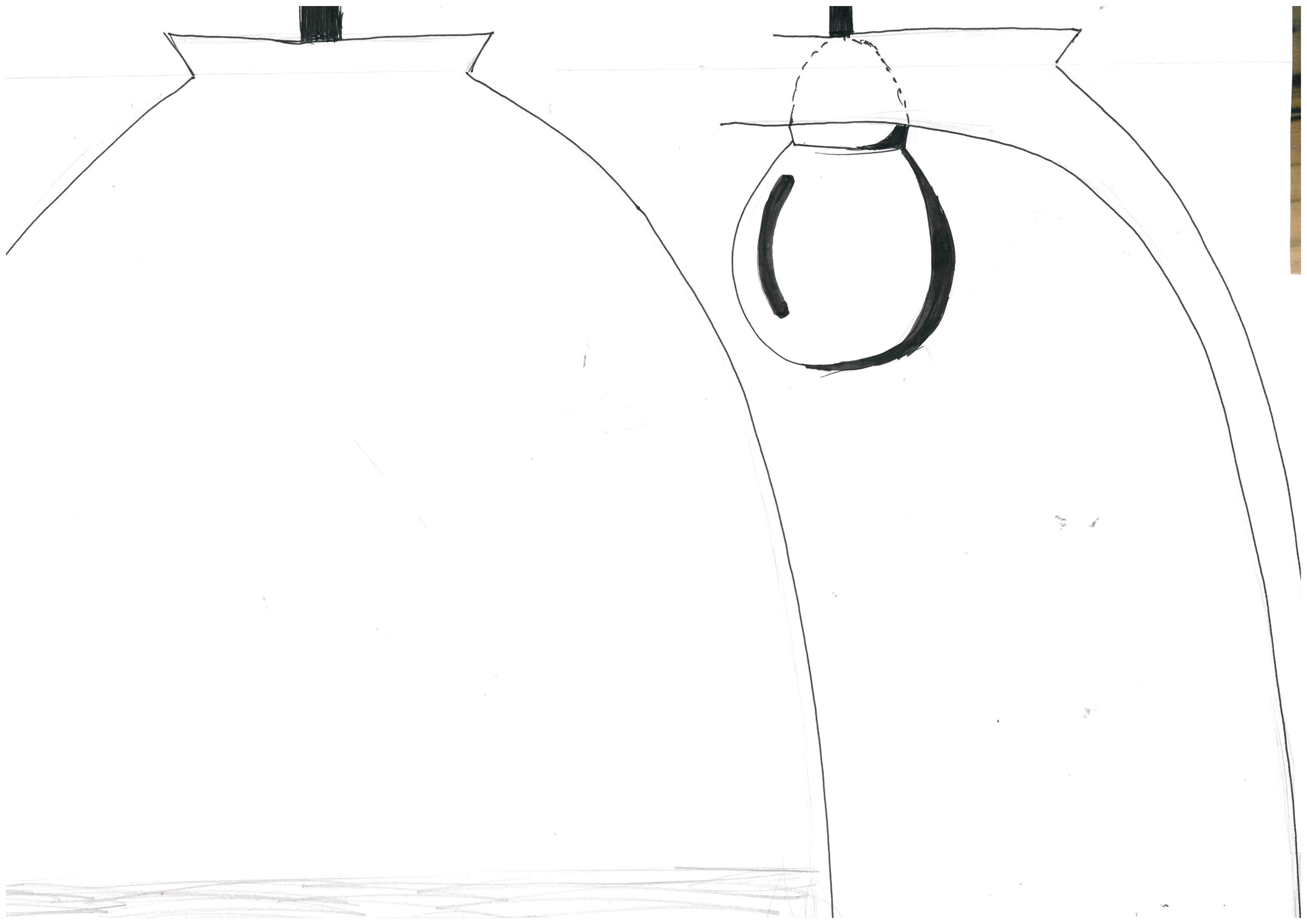
And it did. Once the wiring was done, I was finally able to see how my piece looked. I must admit when it was there by itself it didn’t look that impressive. And I realised that the size of the one I made would work well as a collection or series. multiple lights together would be great ambient lighting for a dining table or would work well as a suspended bedside light as it gives off just enough for this. Obviously bigger ones would give off more light and would be more impressive and dominant. I also realised that other colours would work well for the band; it doesn’t have to be metal a forest green or matt black band would be just as aesthetically pleasing and would also change the amount of light that is produced, for the silver leaf helps to disperse the light, but isn’t completely necessary.
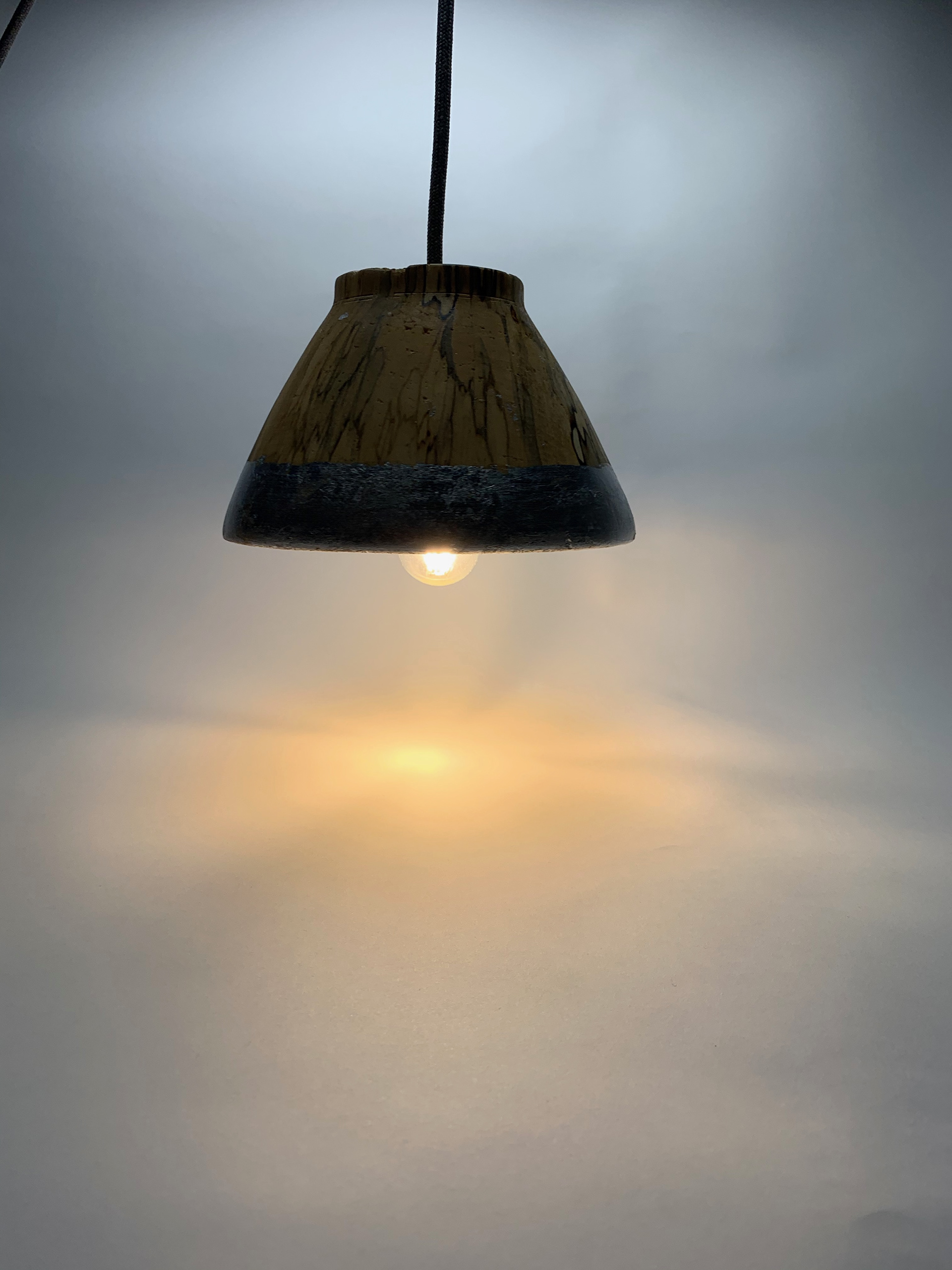
To show how the lights would look I made up a visualisation of how it would look.

PRESENTATION BOARD DEVELOPMENT
The other outcome I needed to produce was a presentation board.
Screen shot of the brief/module handbook.
I wasn’t sure where to start with this went to look at some examples. The general idea I got from them was that I needed to include information such as pricing, materials, where it would be used, and any other details that would help you to pitch your design.
For my presentation board I decided I wanted to put my own style on it. I had a reoccurring theme of soft yellow and grey boxes and outlines and so I put these on my board. I also wanted to get the retro theme across firmly and so used the font ‘American typewriter’. I also included examples of Scandi design and retro lamp shades to show the reasoning behind my design.
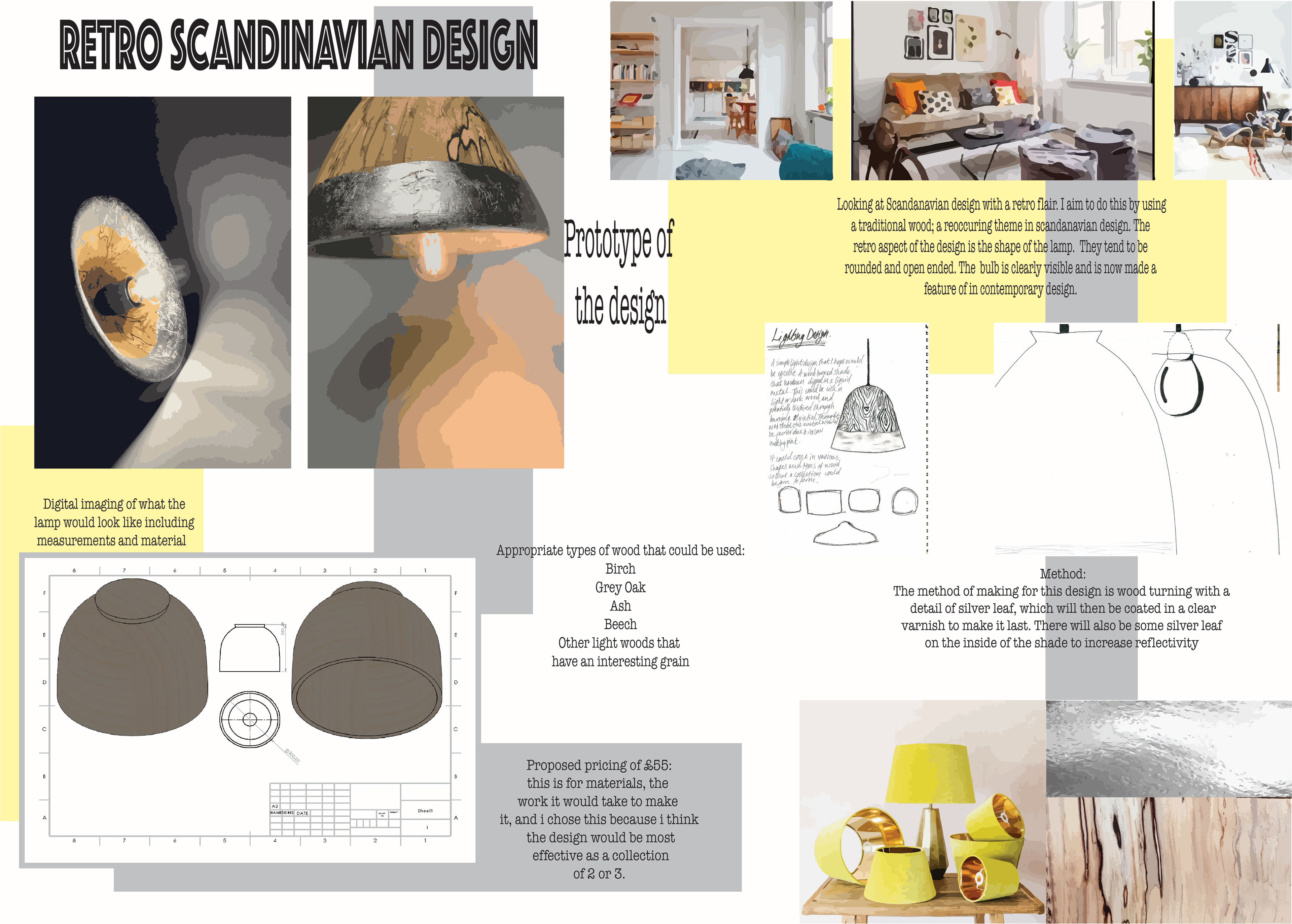
I will also include my visualisation in my presentation for the added detail.