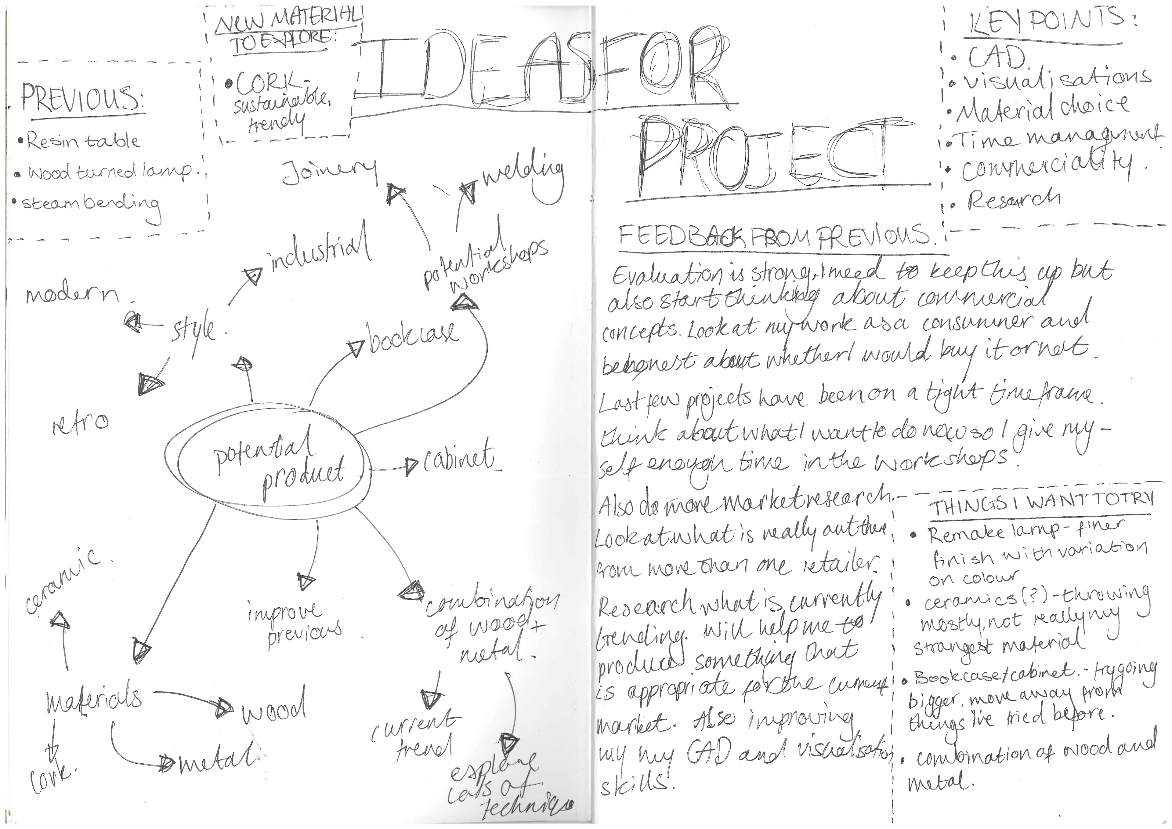
As this is my final project for this year, I want to really push myself and my abilities. It is my aim to one day start my own furniture practice. I hope to do this by starting to find my niche styles and material combinations. This is something that will help to understand what my practice would be and how it develops. Therefore, I hope to use this as an opportunity to start my first collection.
I will aim to make a collection of designs that follow a similar style. From this I will aim to make one full-scale piece and a selection of miniatures. As well as start to understand what it will take to do this sort of work, including suppliers and time scale. I know that this time last year I created my biggest piece of work to date, and so I hope to display how my skills and style have developed by surpassing what I did last year. I believe the collection of designs, miniatures, and full-scale prototype will do this.
A few other targets that I am aiming to set for myself are:
>Developing my CAD skills- this is a vital skill for me to have in the modern industry.
>Photography- I want to be able to showcase my work through professional looking photography and graphic work.
>Market research- I need to create a stronger understanding for how my work should be priced and how this is reflected through material choices and how the work is finished.
>Material sourcing- I want to explore and expand my options when it comes to sourcing my materials. I am also going to consider how I can repurpose old furniture as part of my work.
>Digital design sheets- improve how I showcase my ideas and designs when it comes to presentations. A professional looking design sheet can make a difference in how a design is received.
>Model making- create models that fully conceptualise what I am trying to achieve.
STARTING POINT
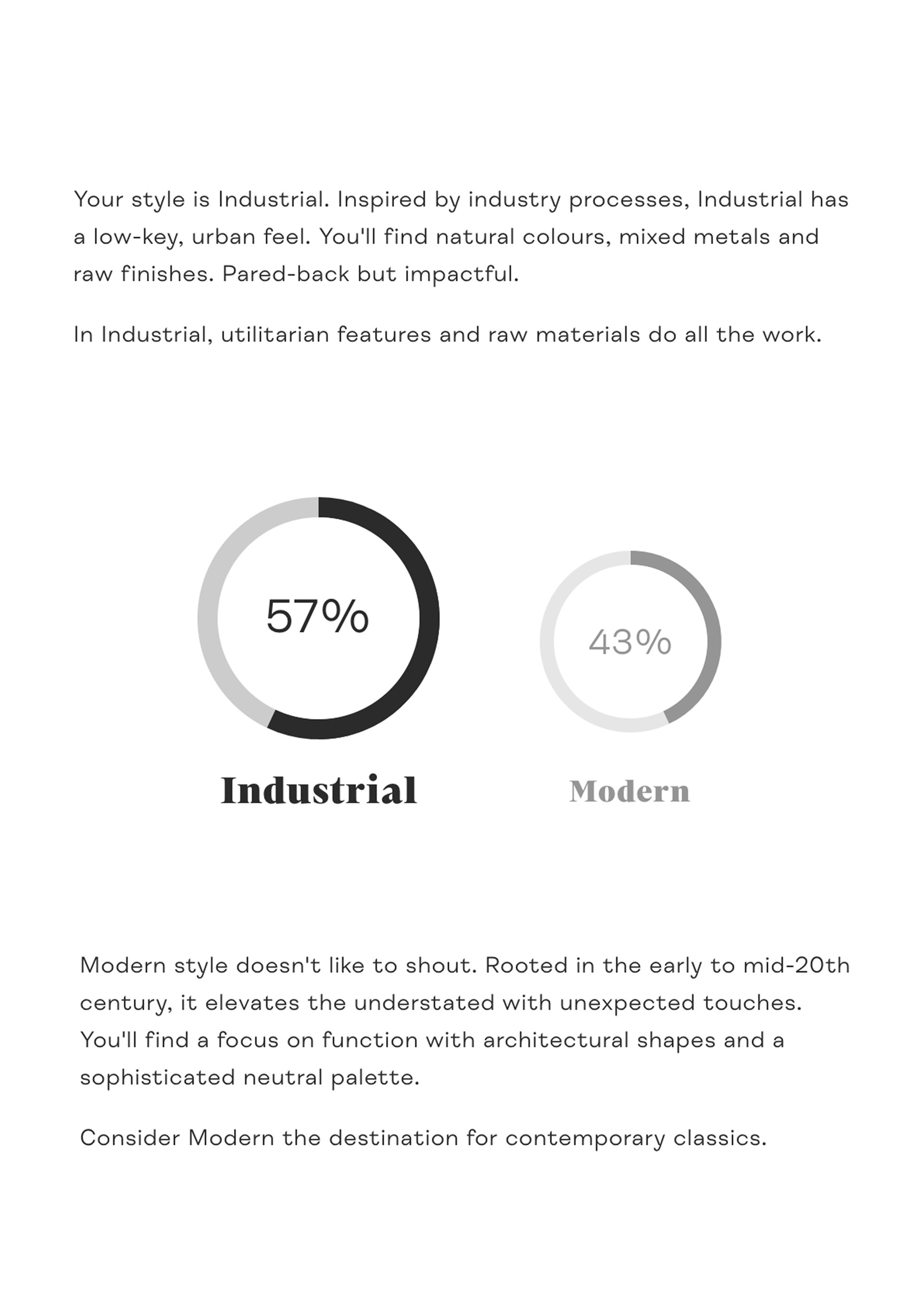
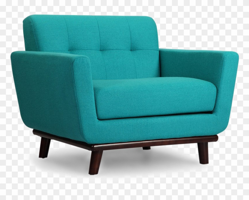
I started my design process by looking at what kind of style that I was attracted to. To do this I decided to use the inspiration generator on the MADE.com website, this was a valuable tool for me at the start of the year when I was trying to decide what I wanted to look at. This time my results were Industrial and Modern.
With this in mind I started to collate images that followed these style trends and that I also enjoy. This was to allow me to see the different characteristics between the two including colour palettes and finishes.
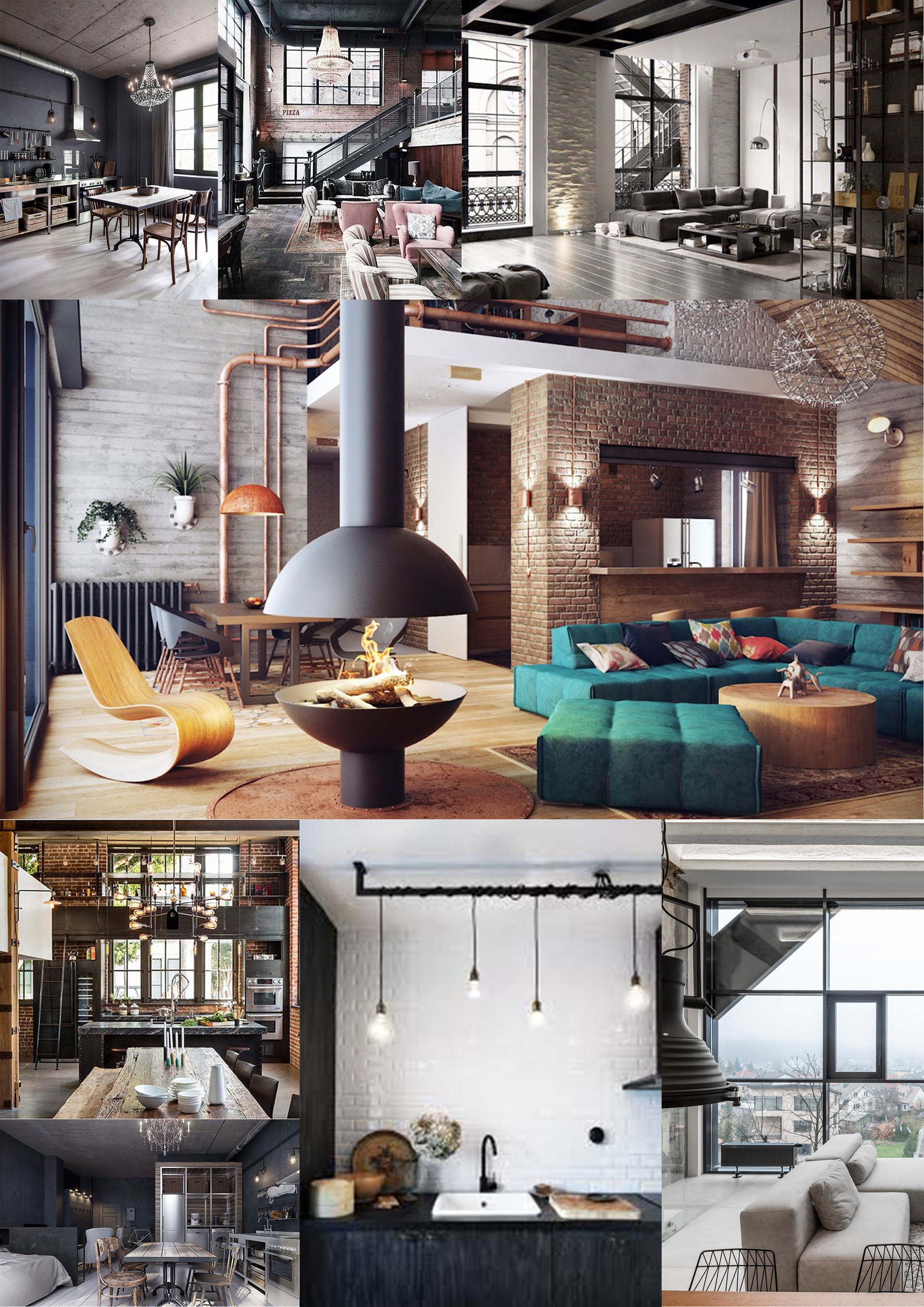
Industrial Inspiration Images.
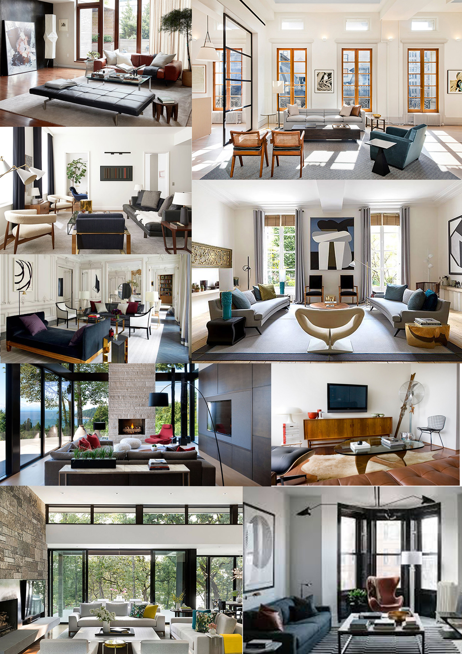
Modern Inspiration Images.
As I want to have a more professional and informed process this time, I also looked to WGSN to explore trends and the most current aspects of furniture design and making. The hope for this is that I can create a collection that is on trend whilst also trying to be more aware of what is being designed around me.

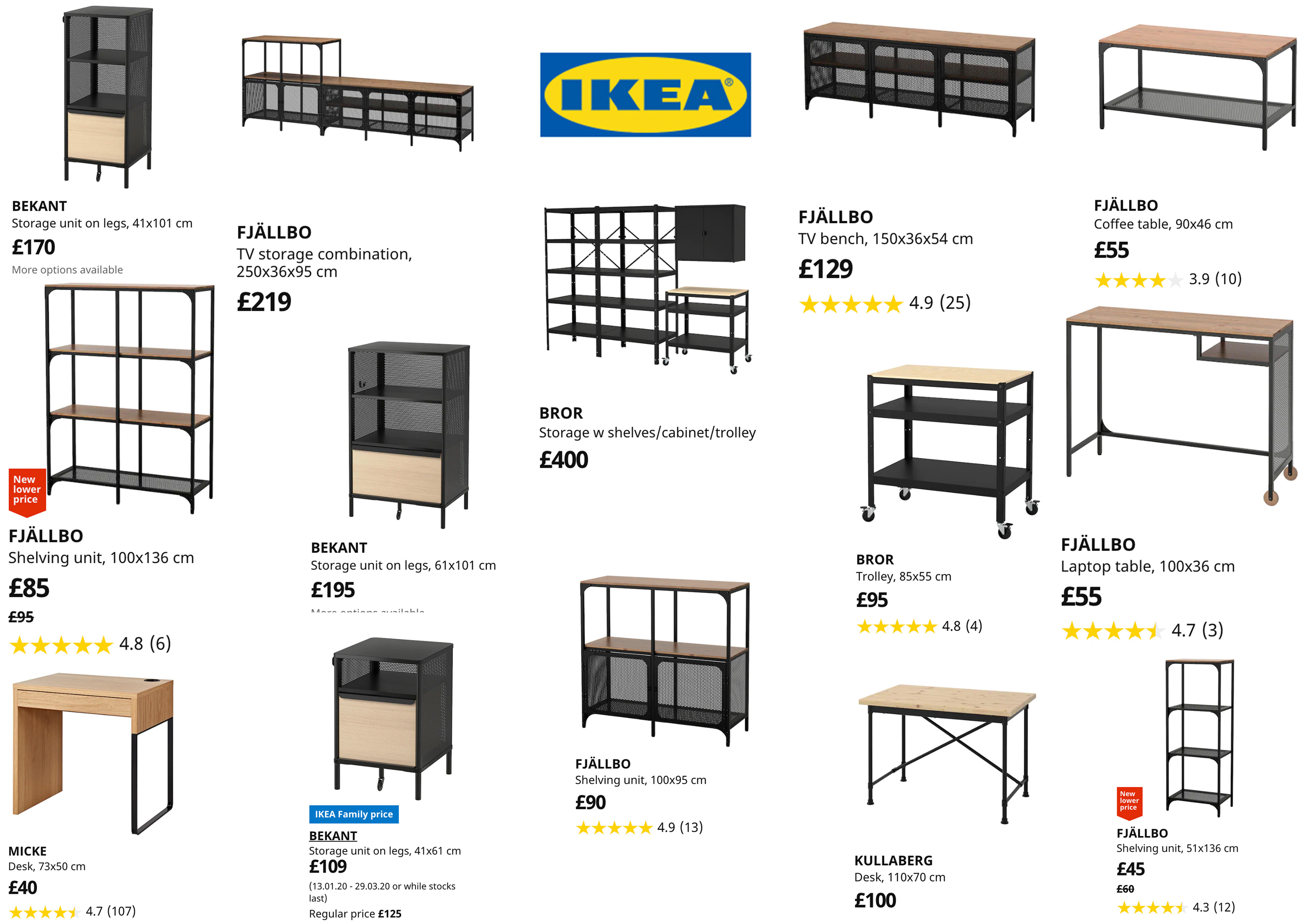
Images from the IKEA website with similar design details.
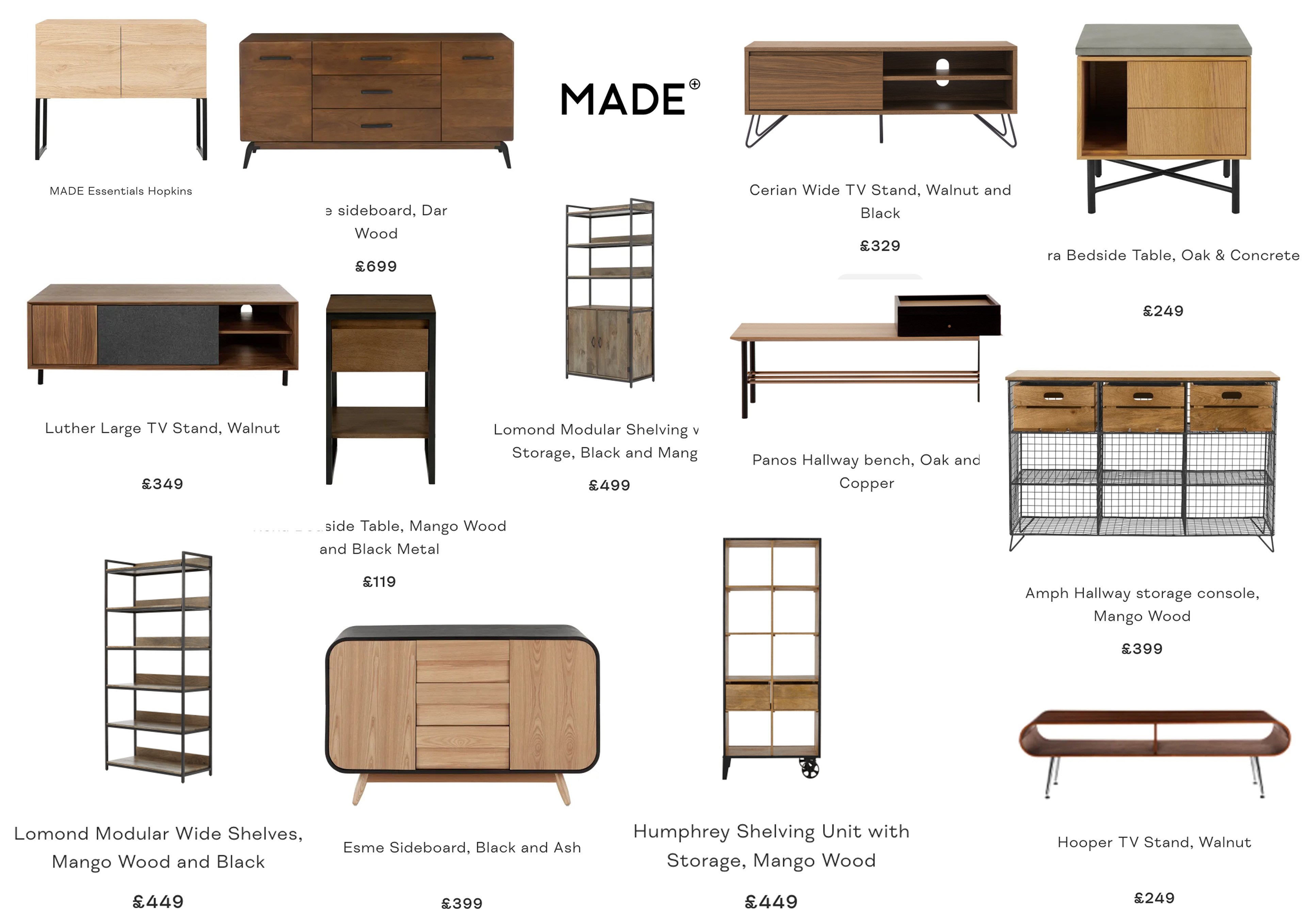
Images from the MADE.com website with similar design details.
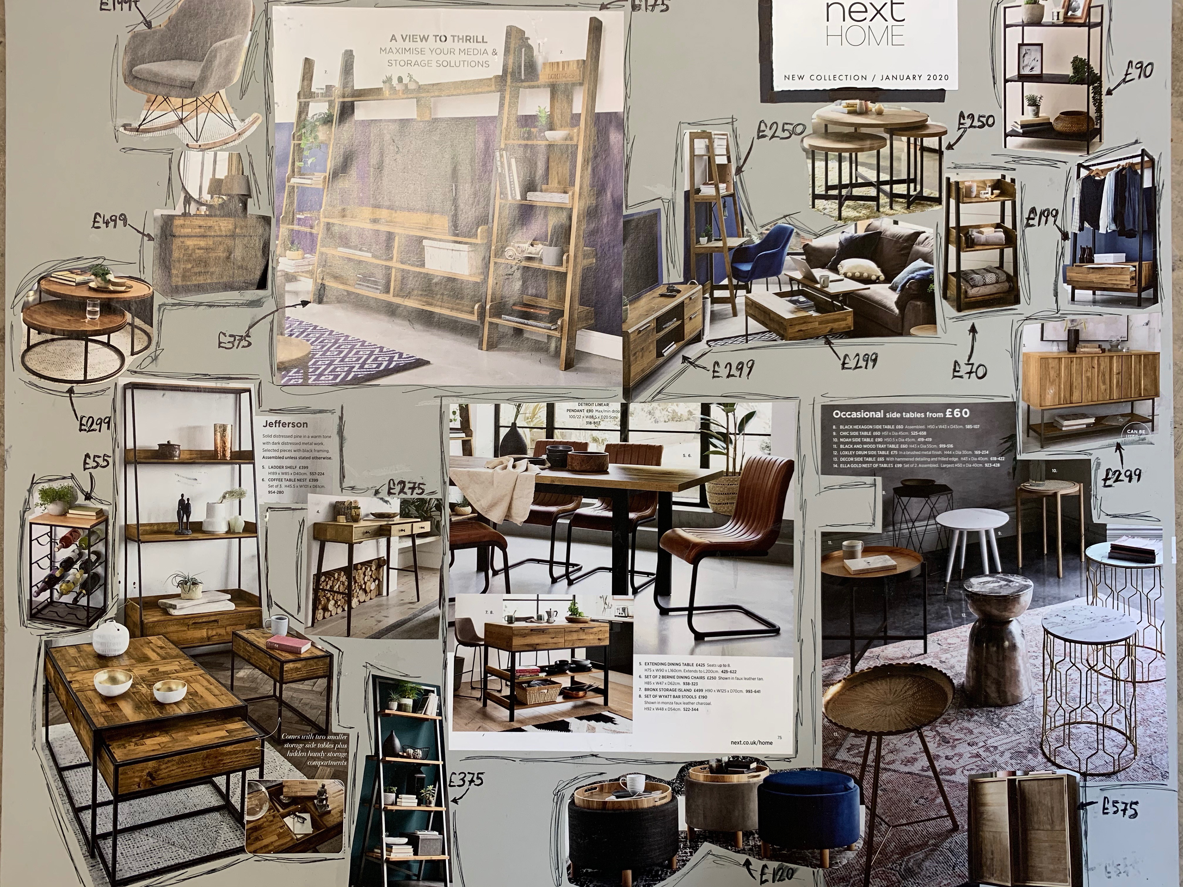
Images from the NEXT January collection catalogue.
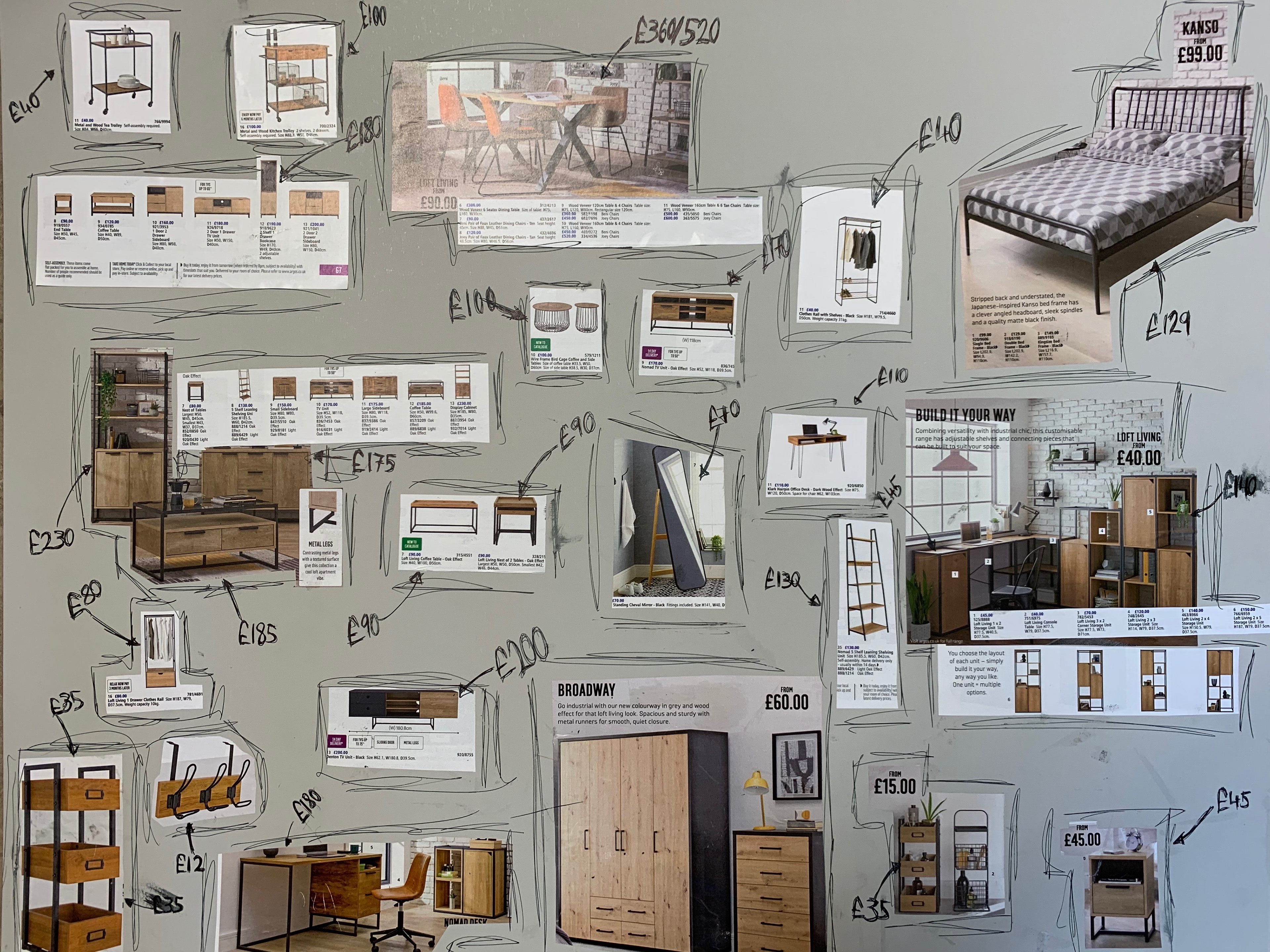
Images from the ARGOS spring/summer collection catalogue.

Images from DUNELM collection pamphlets.
POTENTIAL DESIGNS
I wanted to explore classic modernist designs. And so, I have decided to do my own take on some classic pieces. I intend to make this using wood and metal; the hope is that this will create the industrial style and aesthetic that I am aiming for.

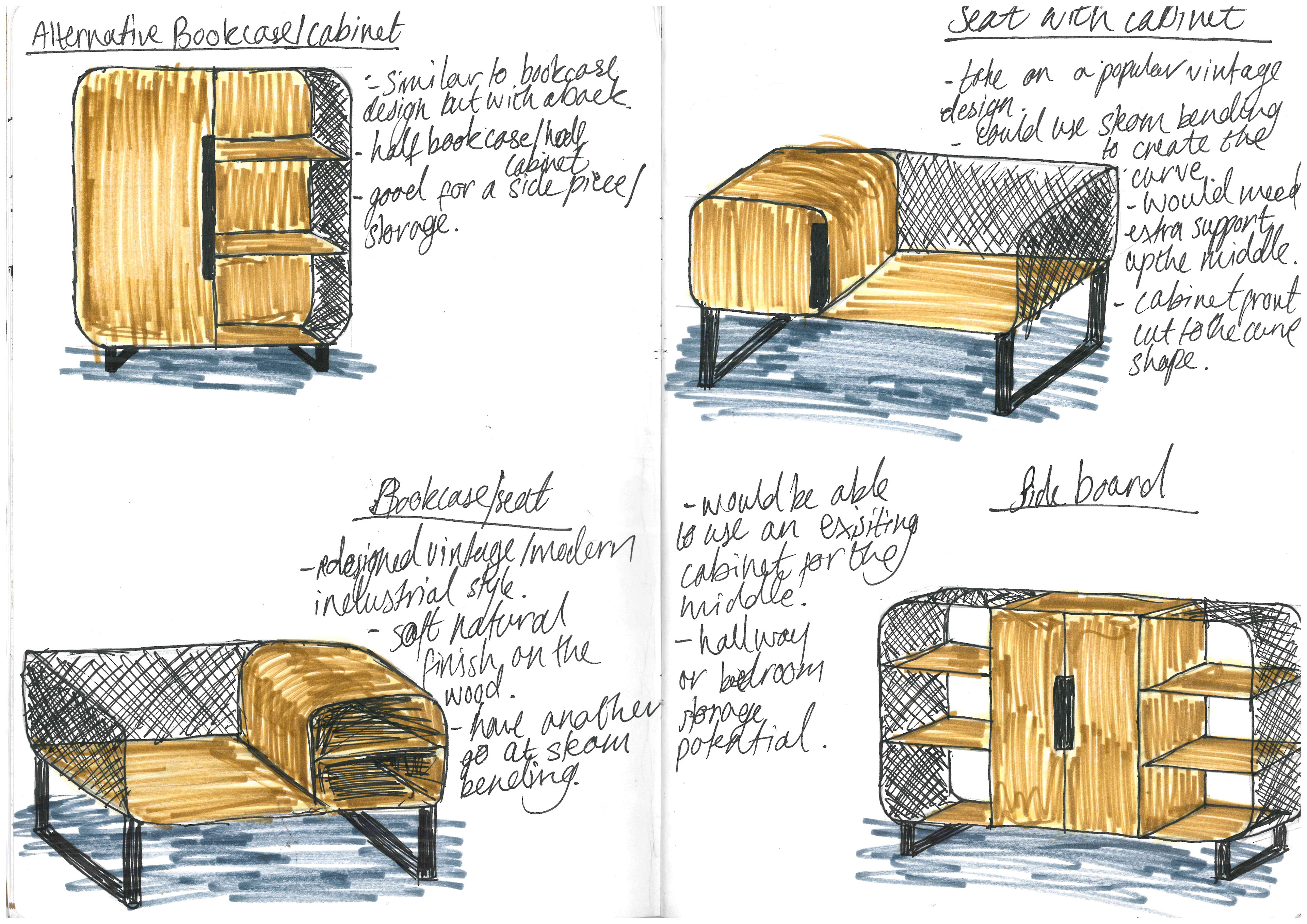
Whilst designing these pieces I tried to keep in mind the research that I had done. Most of the higher end brands had more than one design following a style. This idea of a collection is something that I would have to explore as a practicing furniture designer and maker. The designs all have a similar theme when it comes to the use of the materials and their place in the designs. I also tried to create pieces that would work well together in a single room. This included a TV stand and a side cabinet.
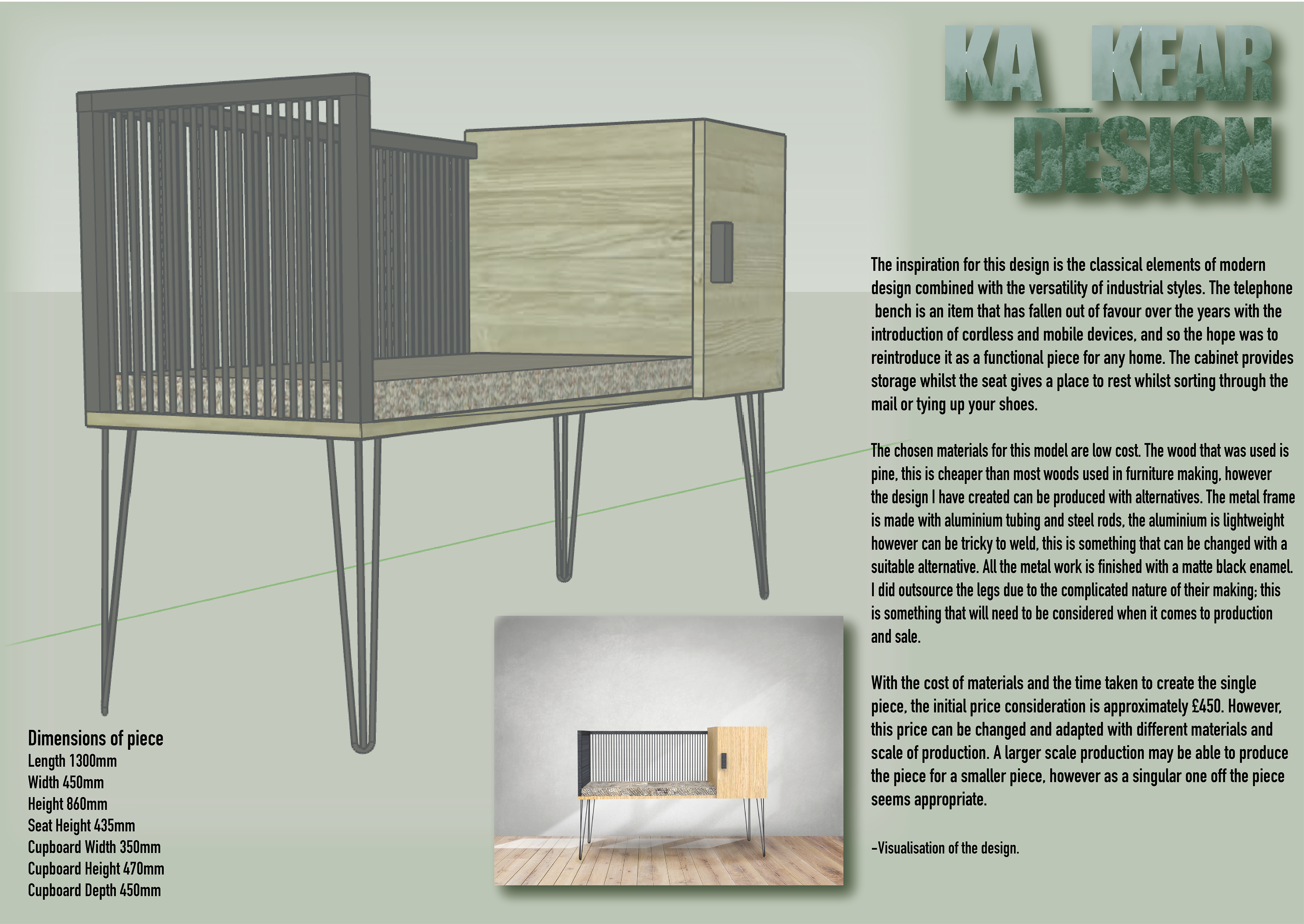
I decided to go with one of my last designs. I wanted to develop this since there weren’t any other pieces like it and it would give me a good challenge. It also is an accumulation of the target I set myself at the beginning of the year “get more ambitious with my work”, as well as wanting to focus on wood and metal work for this year. The other side of it is that it is clearly a modernist design; the telephone seat was a necessity for many when landlines were corded and there was only one access point. And so I hope to bring this design into the industrial style that is so popular these days.
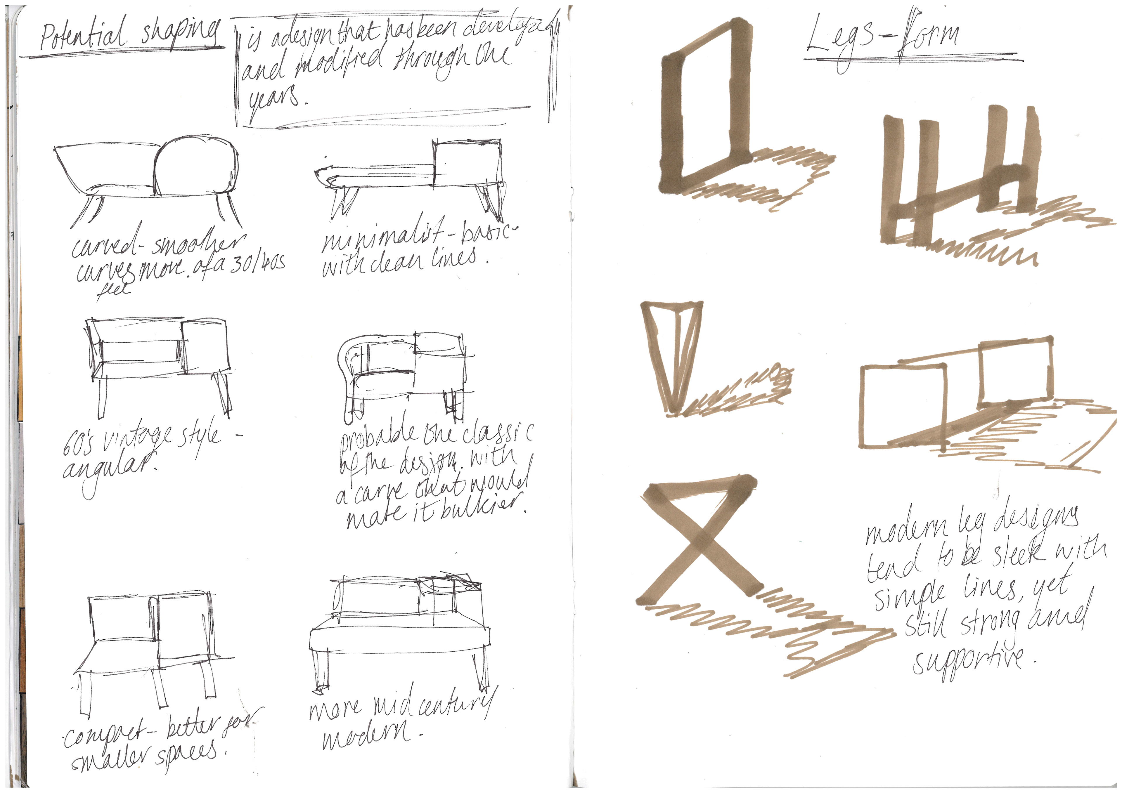
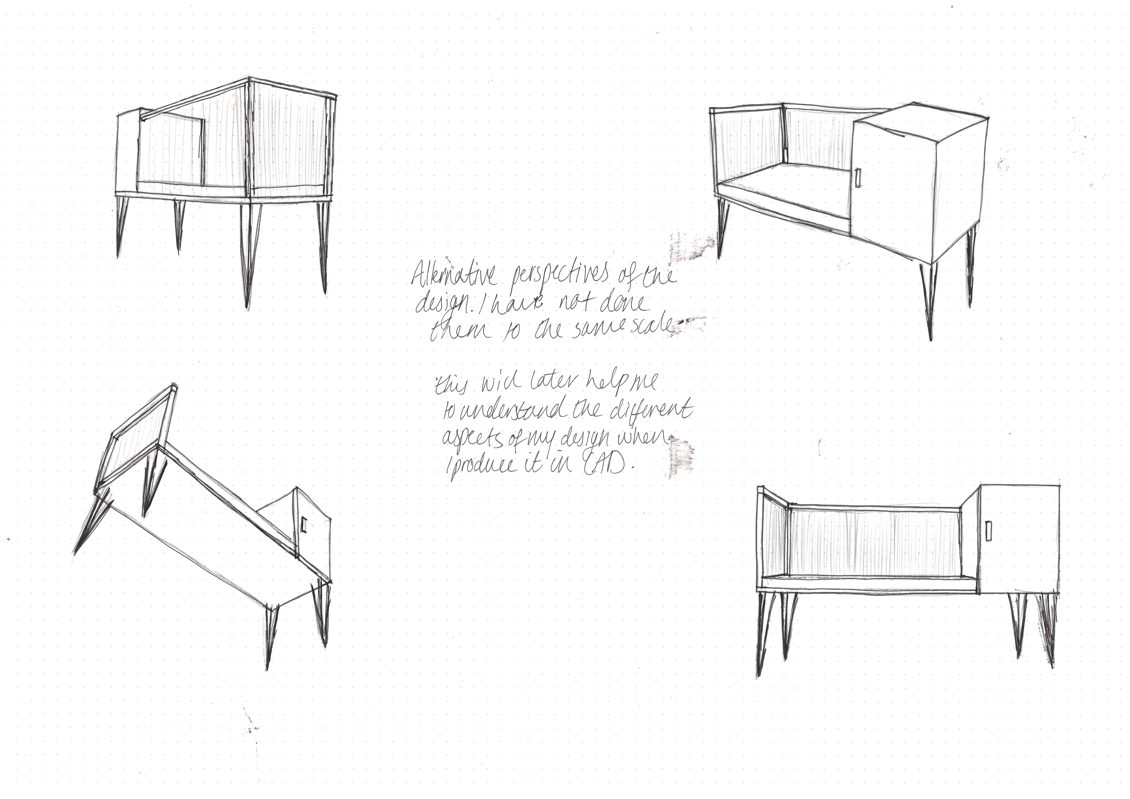
The next stage for me was to explore the different variations on the design concept that already exist. I did a few thumbnail sketches that explore these. It made me realise that I wanted to do a more angular style that is more orientated with modernist design. The angular shape definitely gives it a more 50’s feel which is when this design was popularised and most variations were inspired.

When thinking about the size of this piece there are a few things I'm considering:
The standard size for a chair, including height and size of the seat.
If I also wanted to personalise this design for my current situation. My mother is disabled and so struggles with lower seats, one that is slightly higher would be beneficial for her
If I wanted to do a larger seat for comfort
How thick I want the material to be.
All of these little details would affect the cuts of materials I will make and the shaping and so I need to go into the workshops with a solid plan of what I want to achieve. This means a lot of preparatory drawings and CAD explorations.
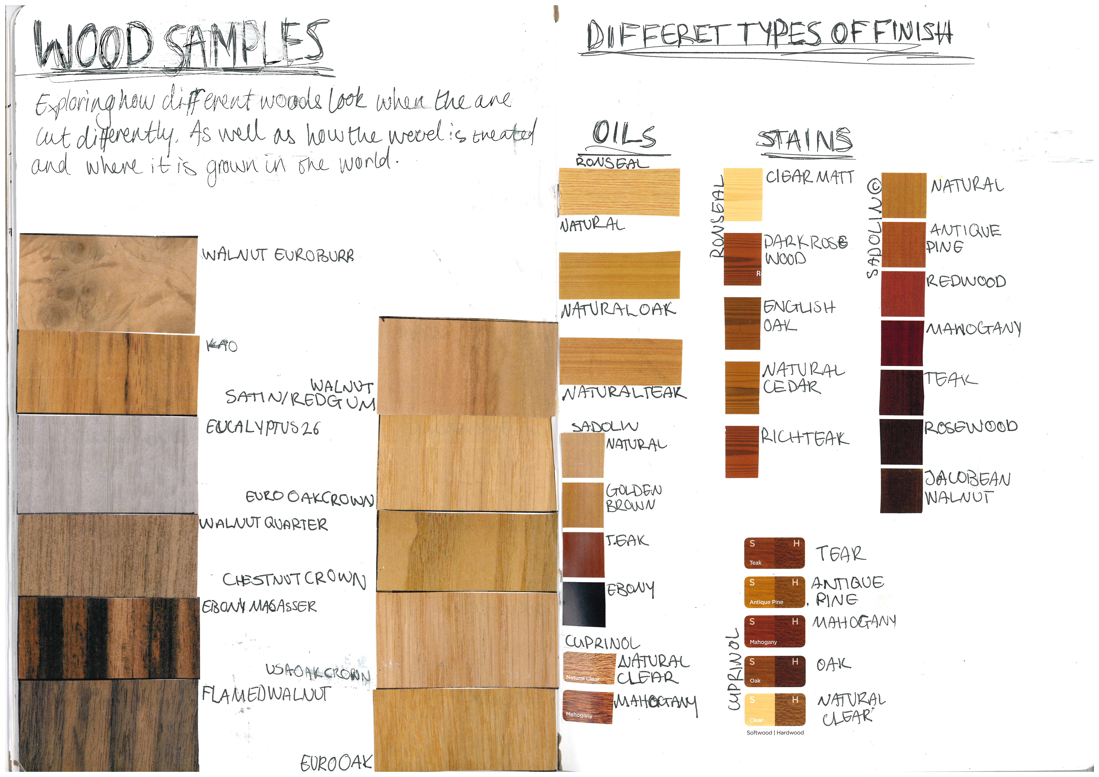
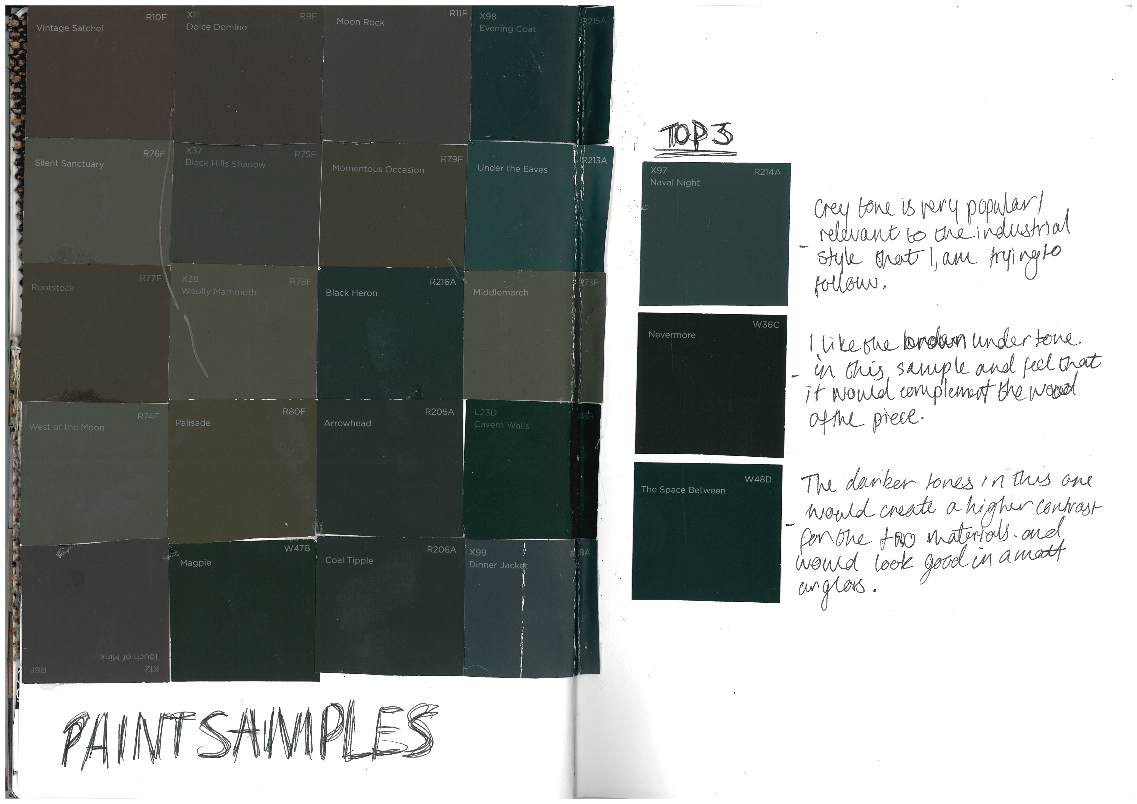
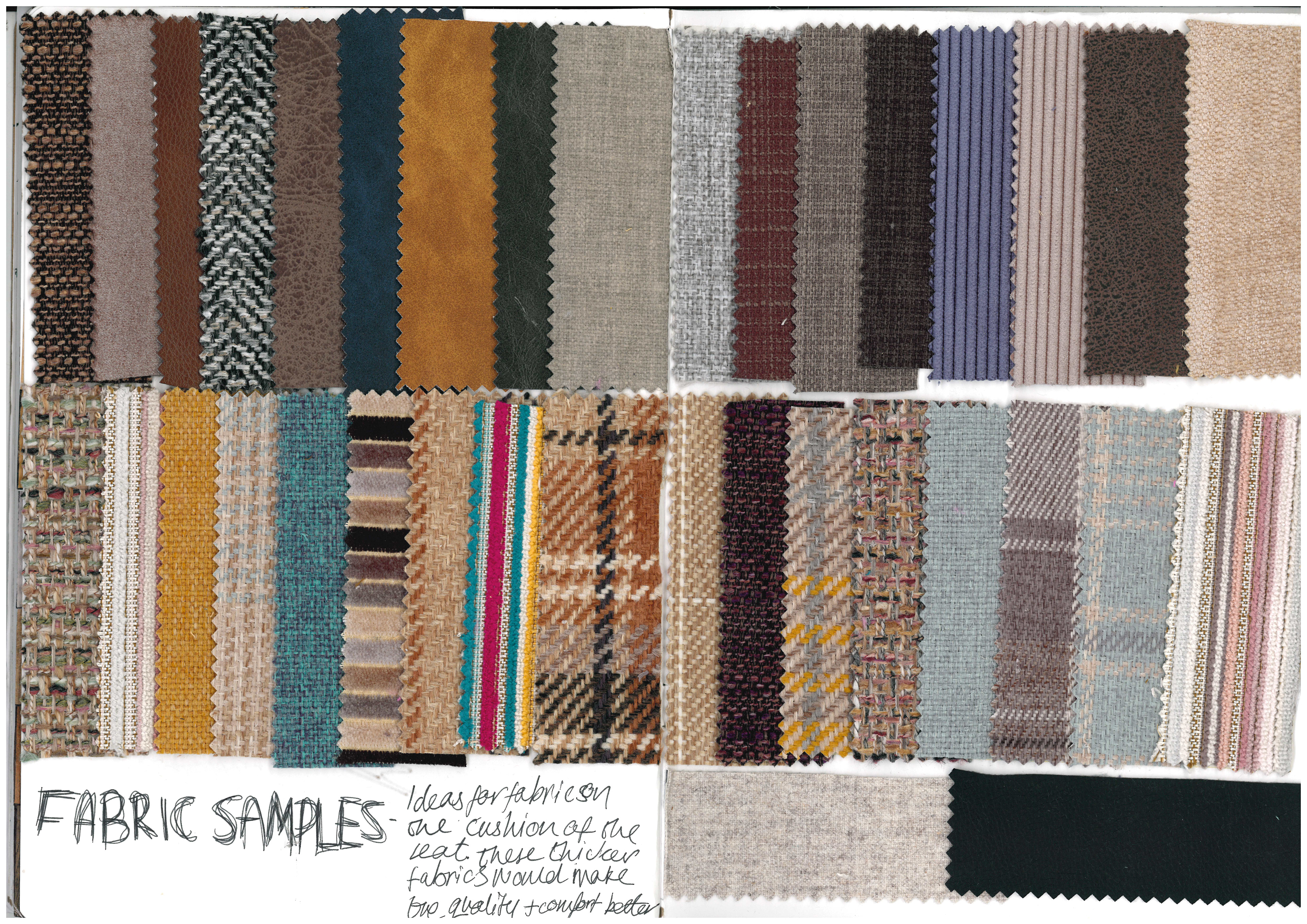
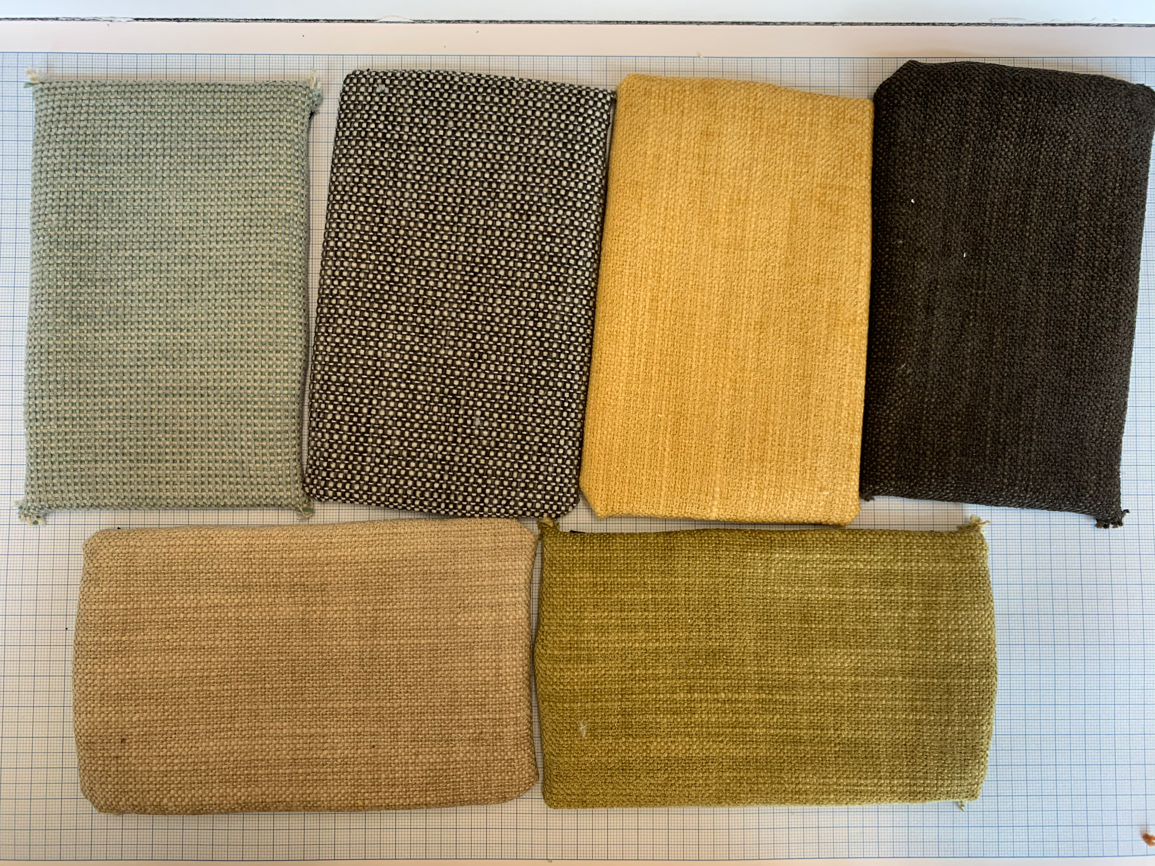
Having a clear understanding of what materials there are will help me to do this. And so, in preparation I have looked at several different wood samples and finishes, as well as paint for the metal work and fabric for the seat padding. The seat padding is something that isn't on my initial design’s but I felt that it would add an extra comfort element as well as an aesthetic finish.
MODEL MAKING
In previous projects I haven’t really focused on the models that I could create. And so, I want to really focus on how it can help me to communicate and visualise my intentions in a way that is easier for others to understand.
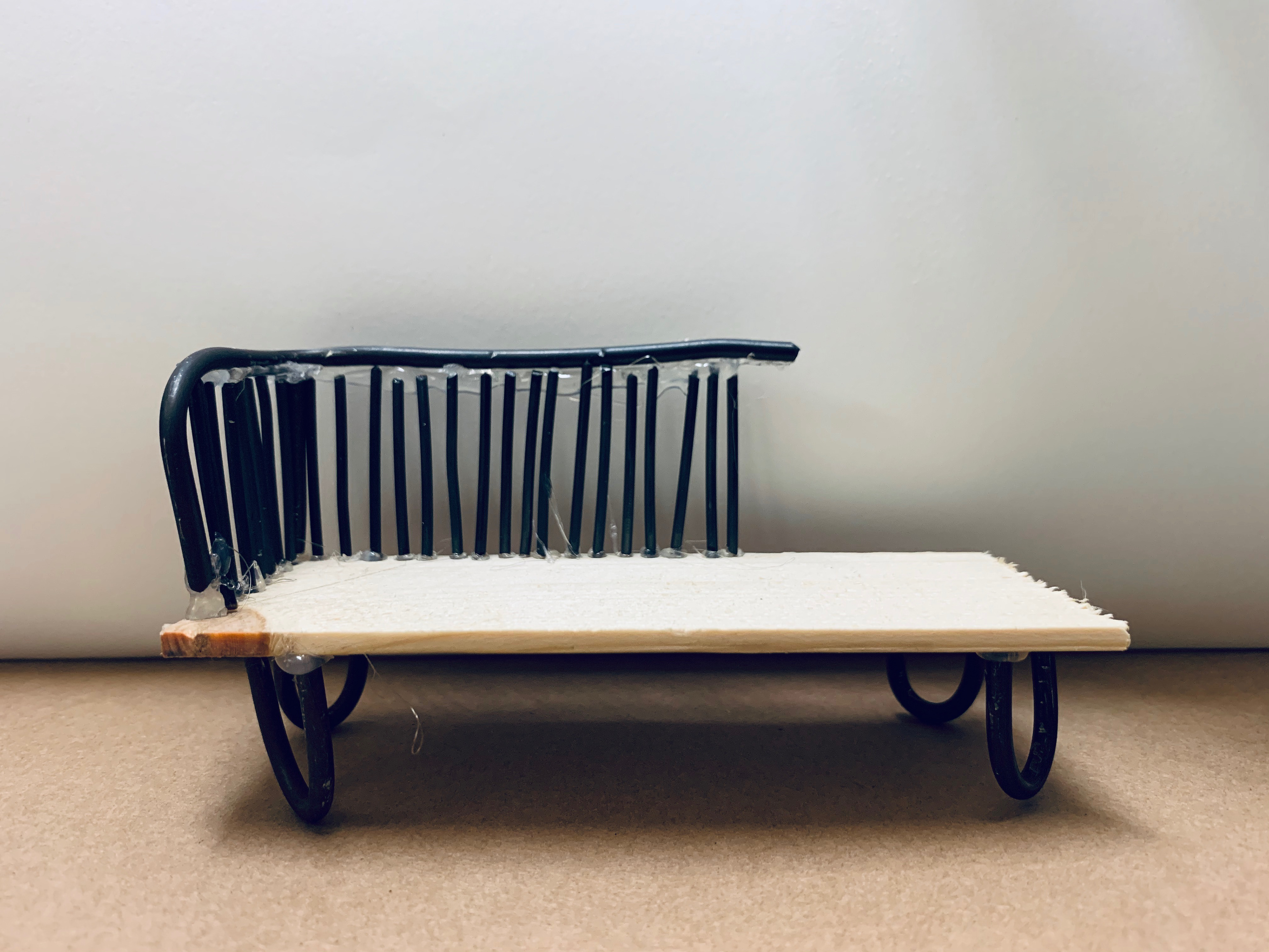
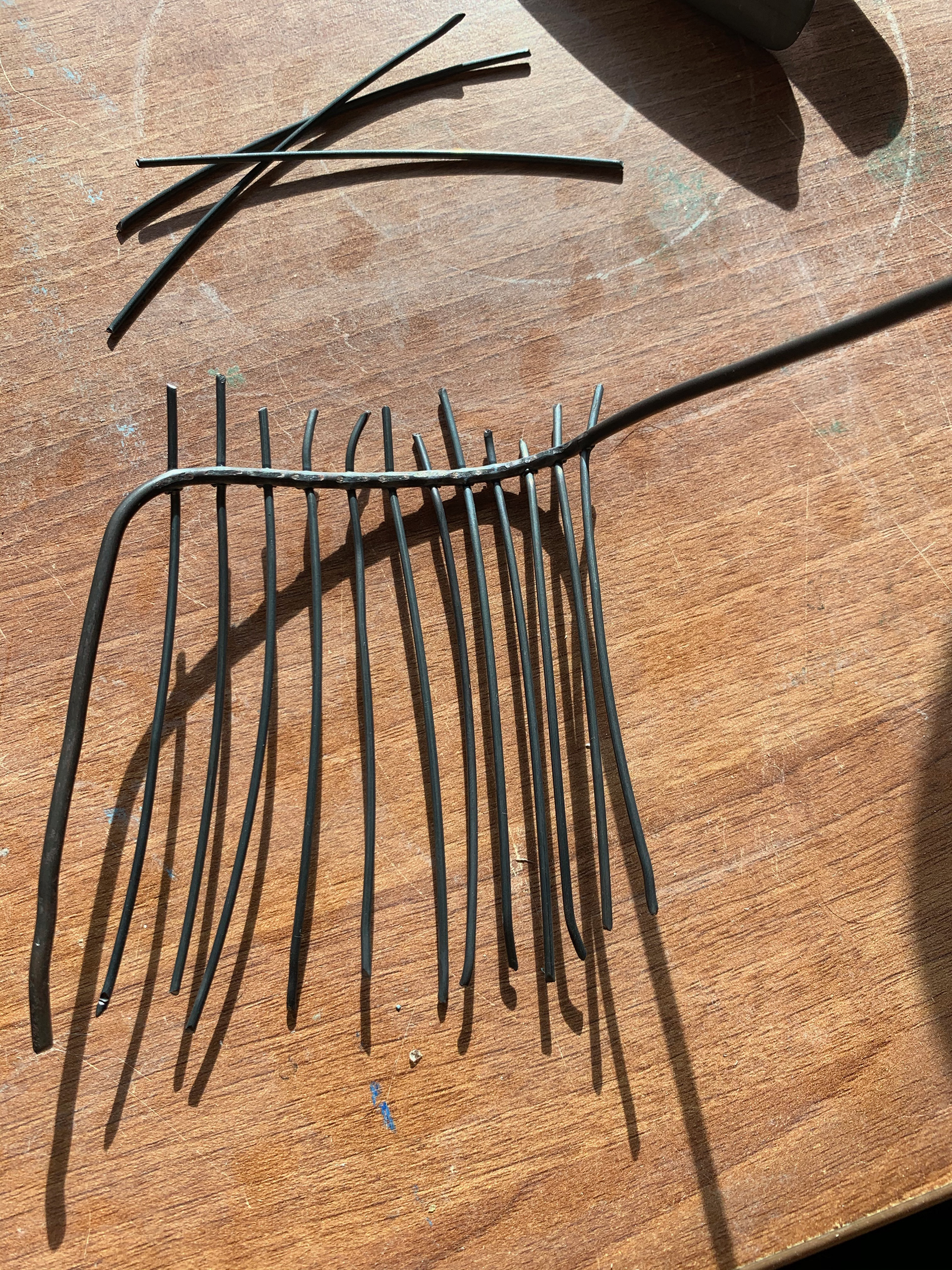
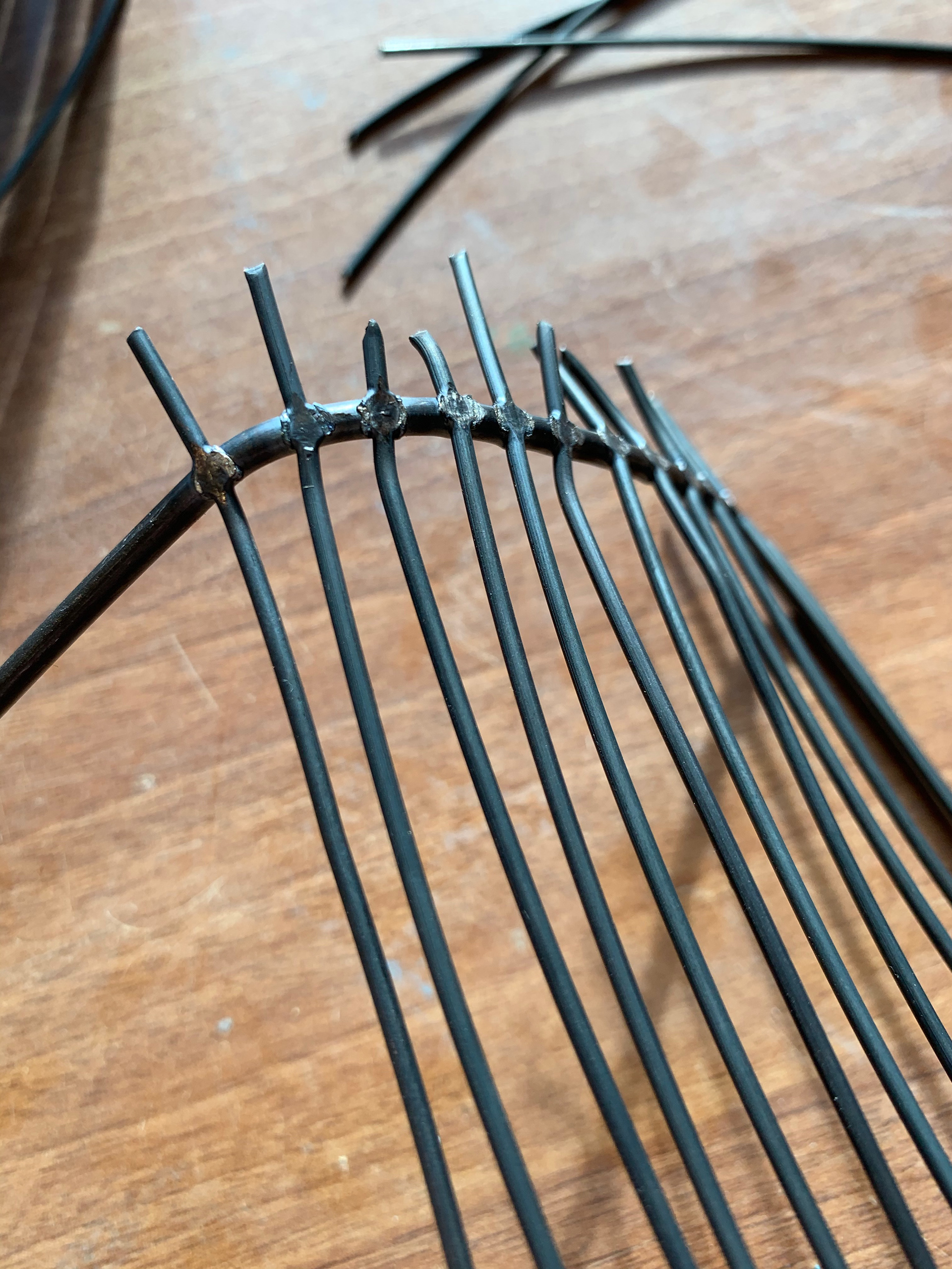
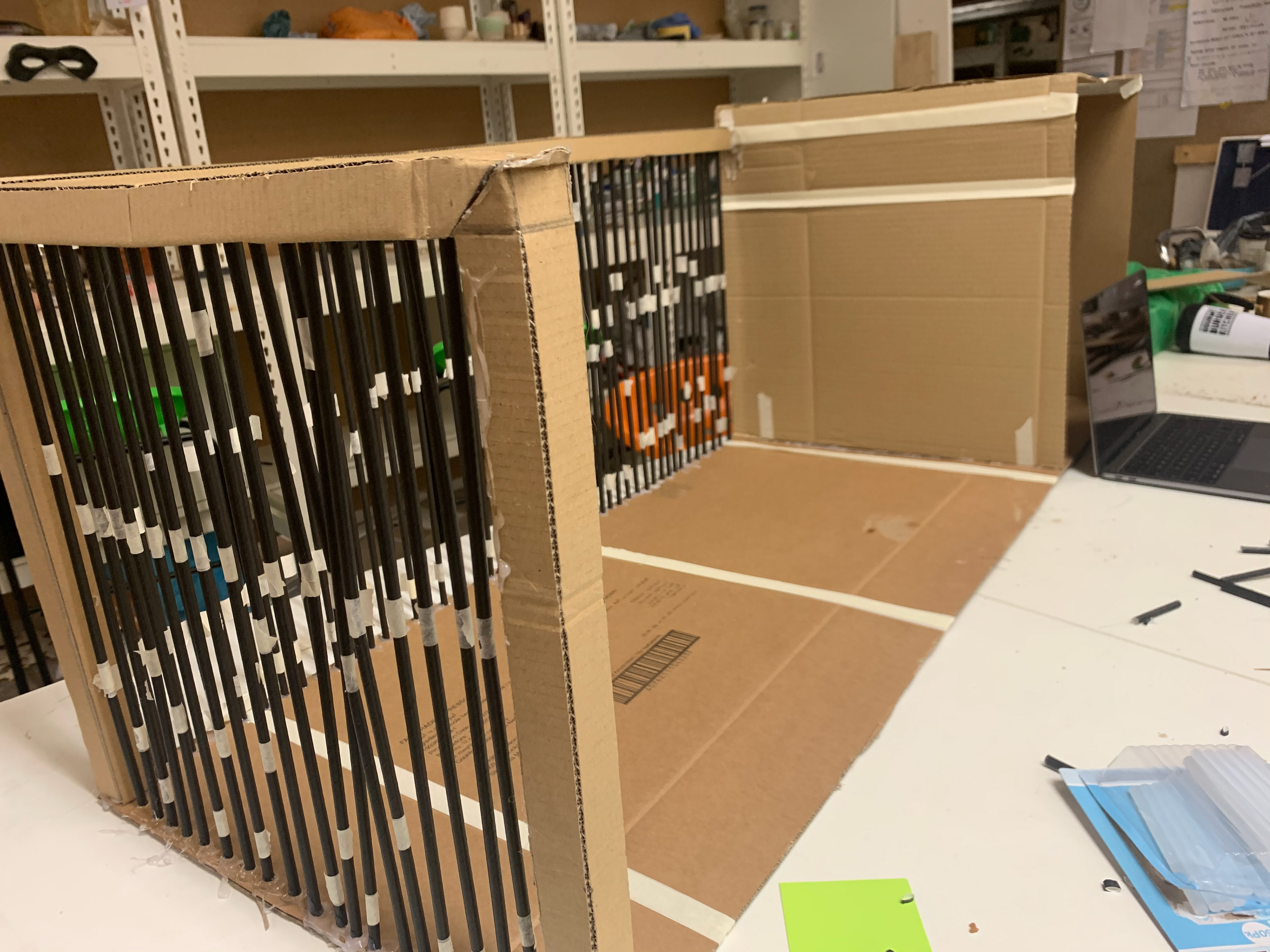
I started with a simple initial model that helped me to see the proportions. This isn’t to scale and I purely to act as an initial concept to help communicate my idea. This isn’t completely finished as I wanted to create a more sophisticated model using some of the techniques I learnt with wire.

WIRE FOR THE MODEL

SPOT WELDER
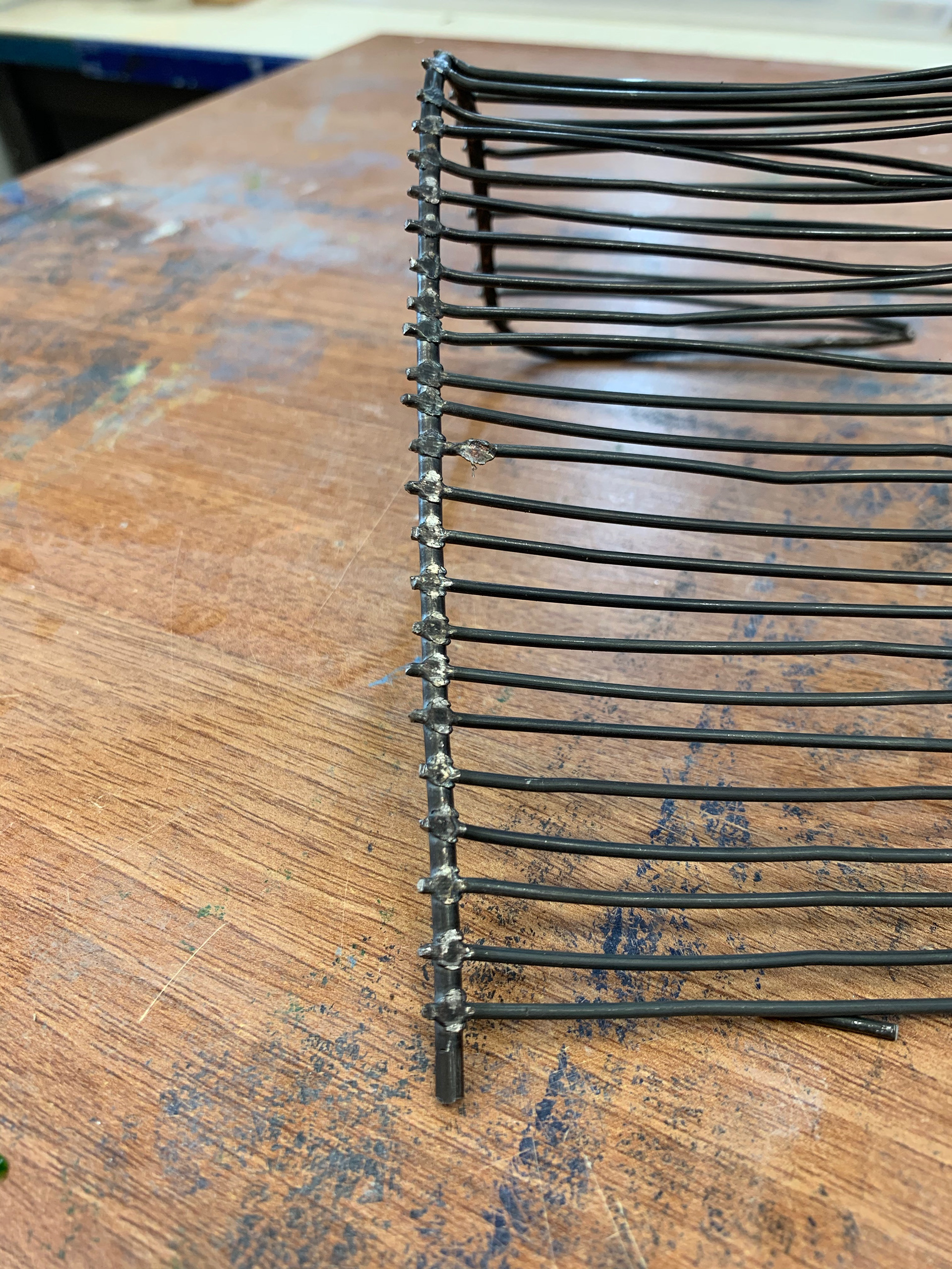


MAKING THE LEGS

FILING DOWN THE ENDS

ASSEMBLY
CHANGEABLE CUSHIONS
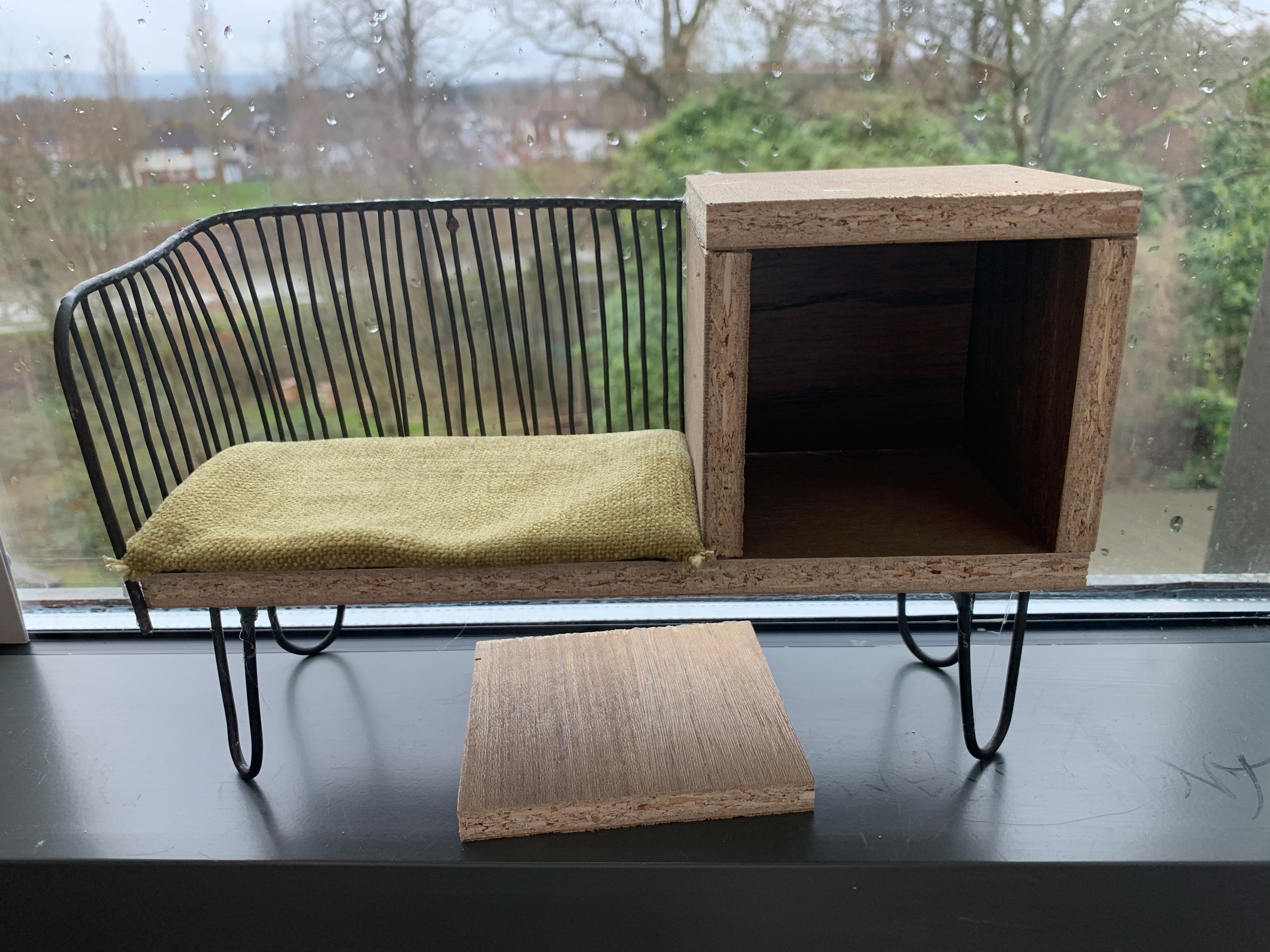
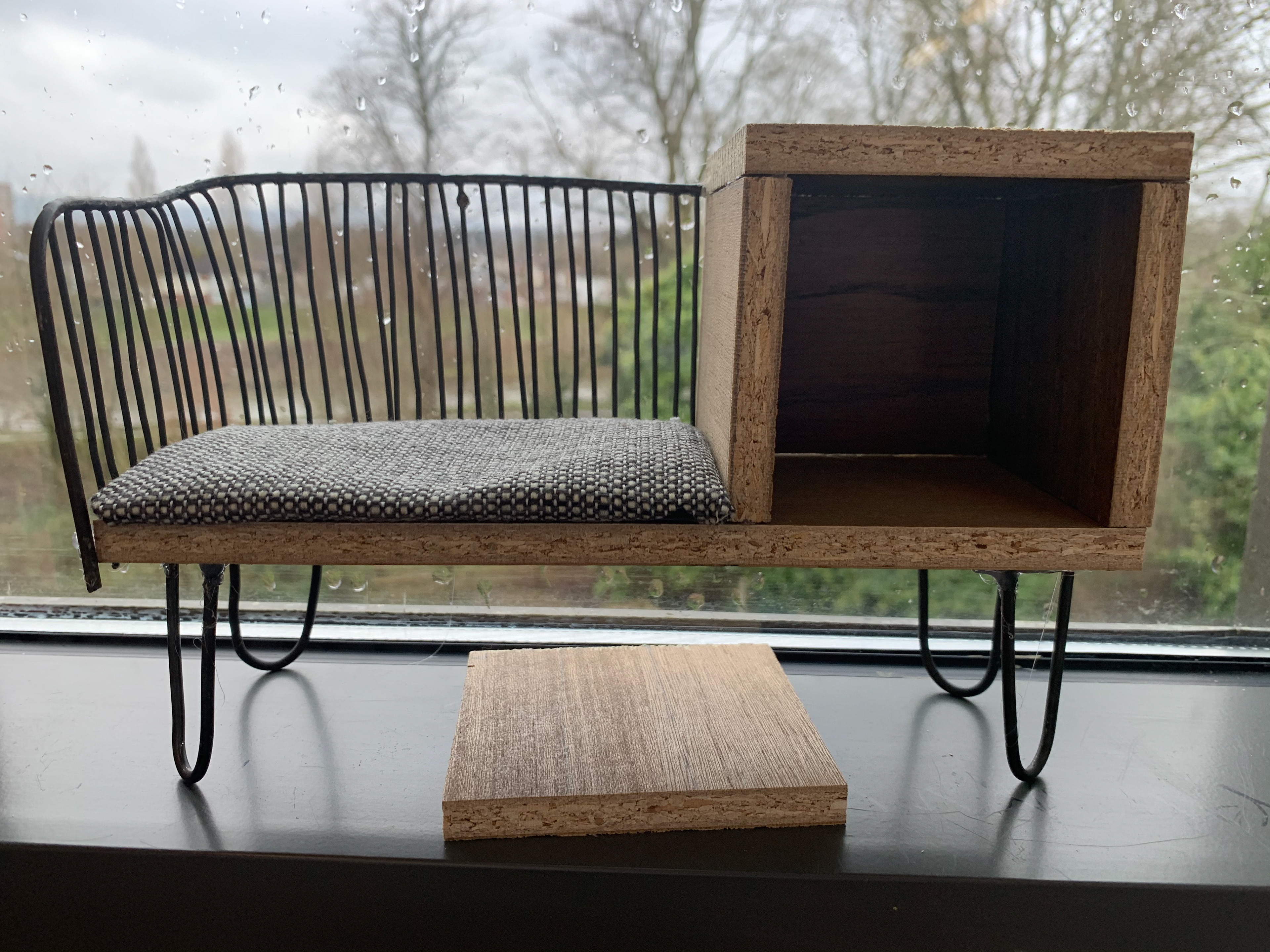
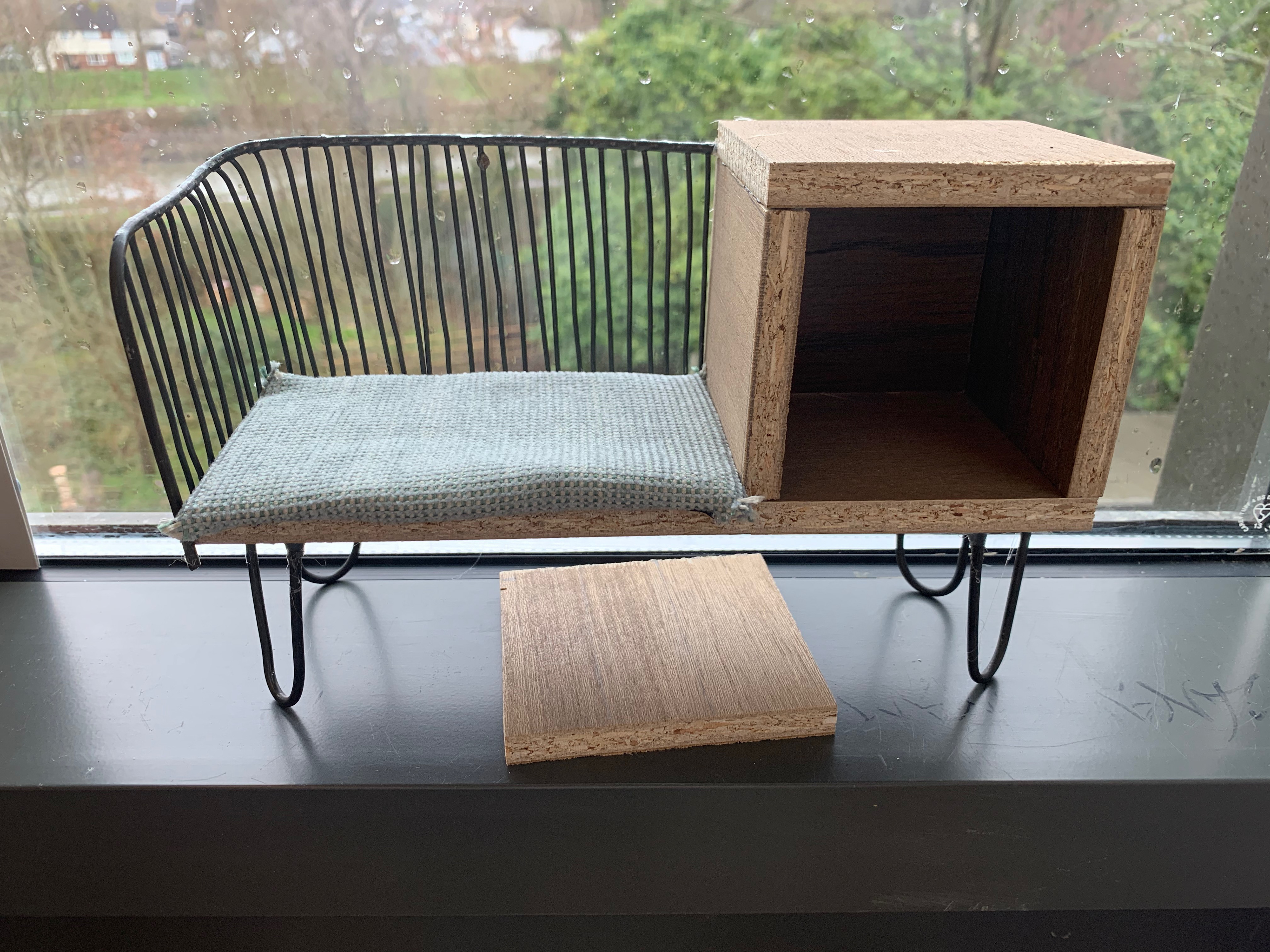

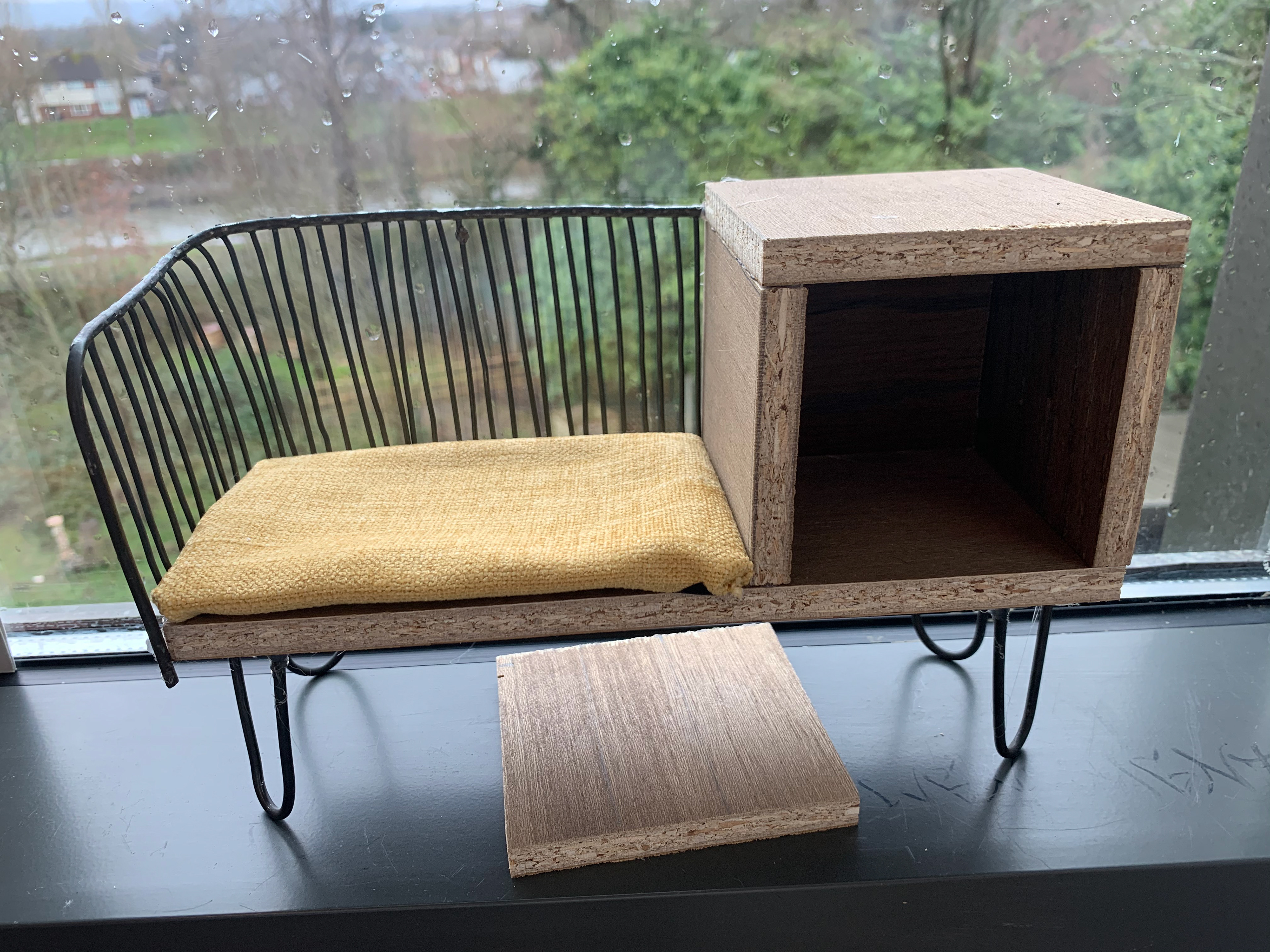
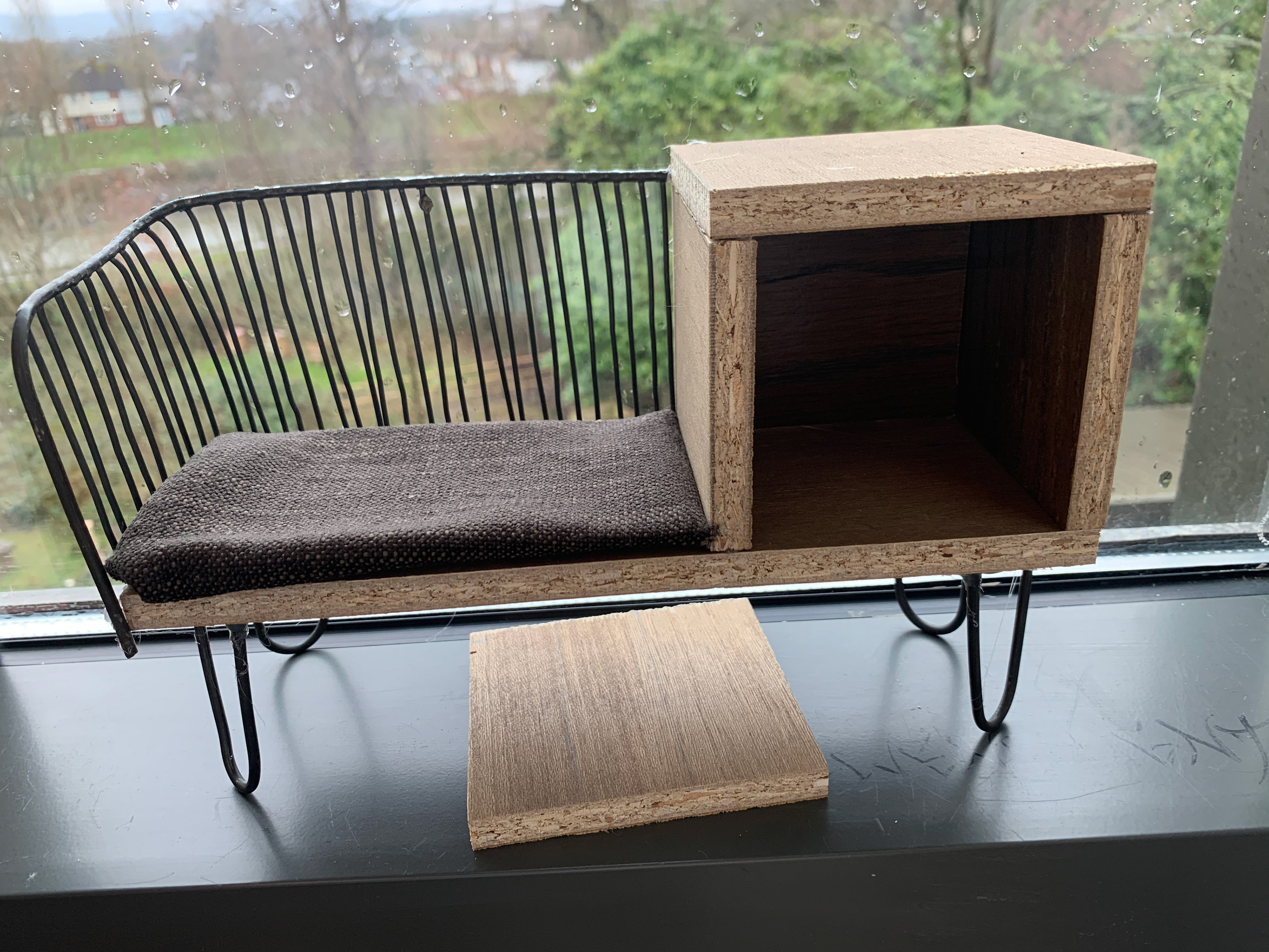
My second model has more thought and time put into it. The wire work was spot welded, so it has a cleaner finished and then filed down. The wire work isn’t as smooth or straight as I would like however I can improve this with the next model. I have also made interchangeable seat cushions so that I can explore how the different materials and colours would affect the piece. This will also help me to decide the final cushion materials. I would also like to find a more suitable adhesive that isn’t to clunky to look at. This could be improved once I have done the CAD designs so that I can realise how many of the rods I will need. Instead of gluing I could put small holes into the wood which would then have a single rod in it with a small amount of adhesive on the end. There are also small hinges to go on the inside of the cupboard allowing it to function as the actual piece will. This may develop into having a magnet on the inside which will act as a refinement for the final piece.
FULL SIZE MODEL

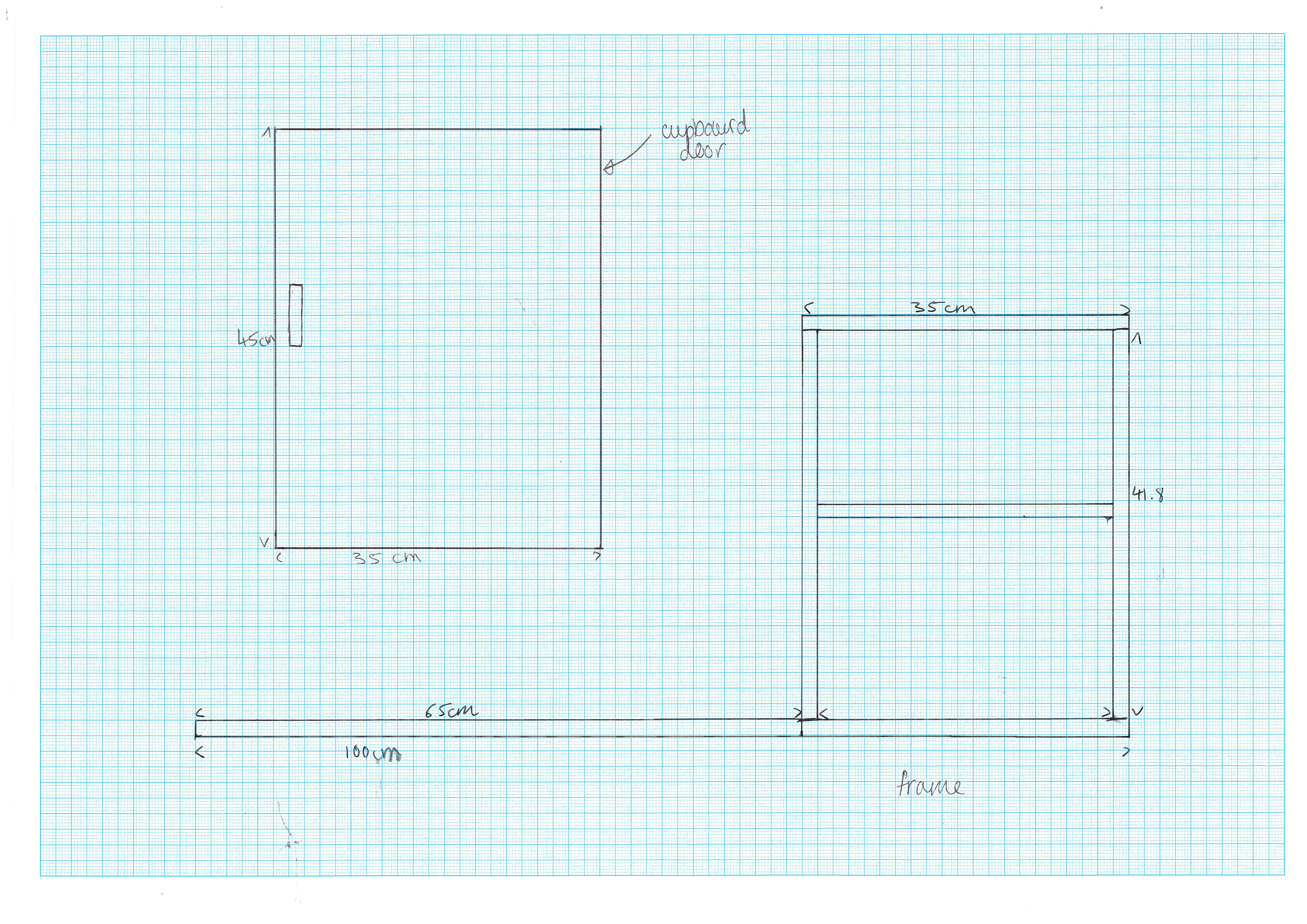
-MEASUREMENT CHANGES-
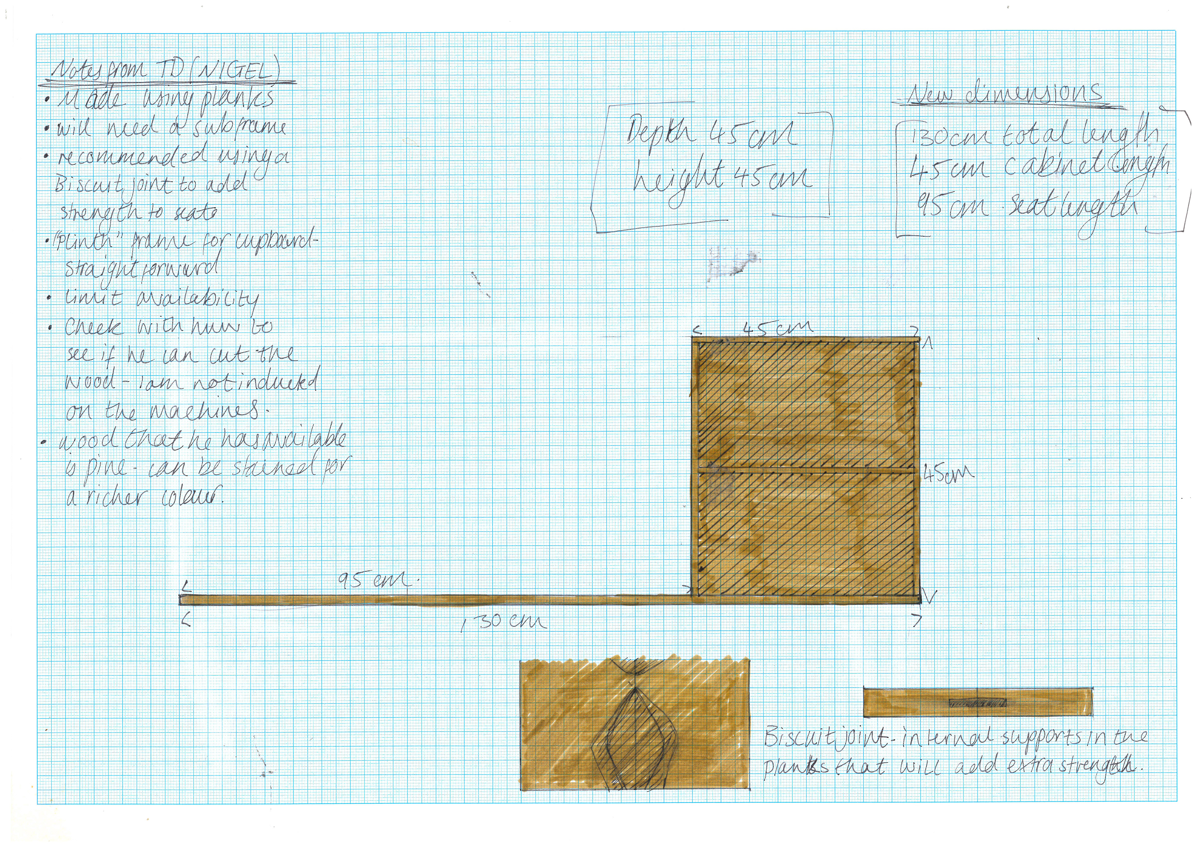
After having a discussion with the wood workshop technician (Nigel) about the materials he has available and how he would recommend I make the piece, I realised that the dimensions I had initially decided upon were far too small. He helped me to realise that the one metre total length would not make for a well-proportioned product. The seat would've been far too small for anyone to use it comfortably. The seat itself would need to be nearly a metre alone for it to be functional, and the cupboard could also do with being larger. He also informed me of the best way to get the support and strength in the seat; a biscuit joint would not only join the planks together but increase the strength and stability of the unit. This will also be a good technique to construct the rest of the unit however isn’t completely necessary.
CAD MODELLING - sketch up
In previous projects I have used solid works to create my CAD designs. I don’t particularly like this software; this is probably due to my inexperience with CAD processes. It was recommended to me to try sketch up as a more introductory choice.
To start with I had a play with some of the tools and applications that the program provides as well as a brief tutorial on it. I found the command systems were a lot more straight forward and basic with an uncluttered interface that was easy for me to get the hang of.
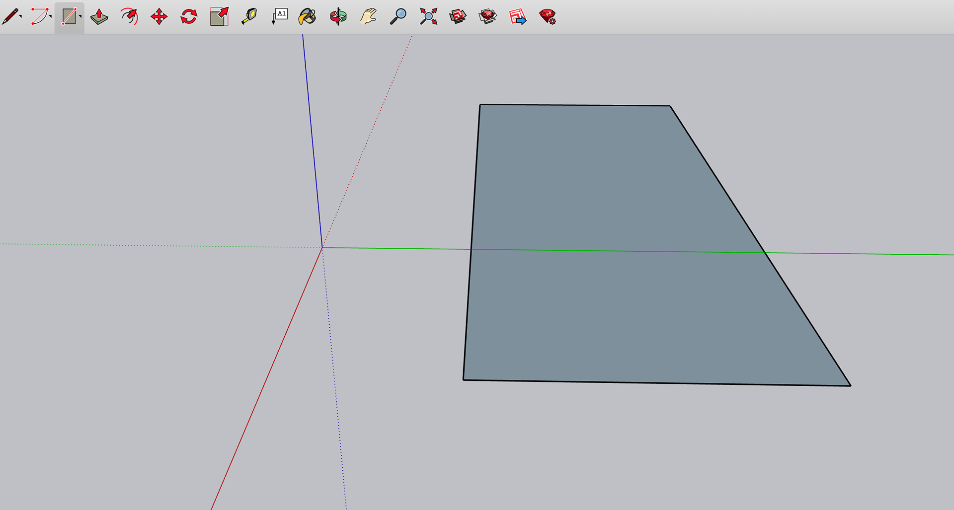
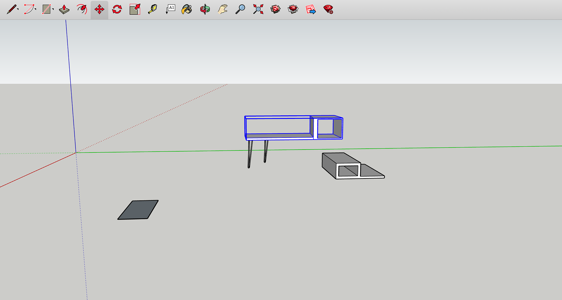
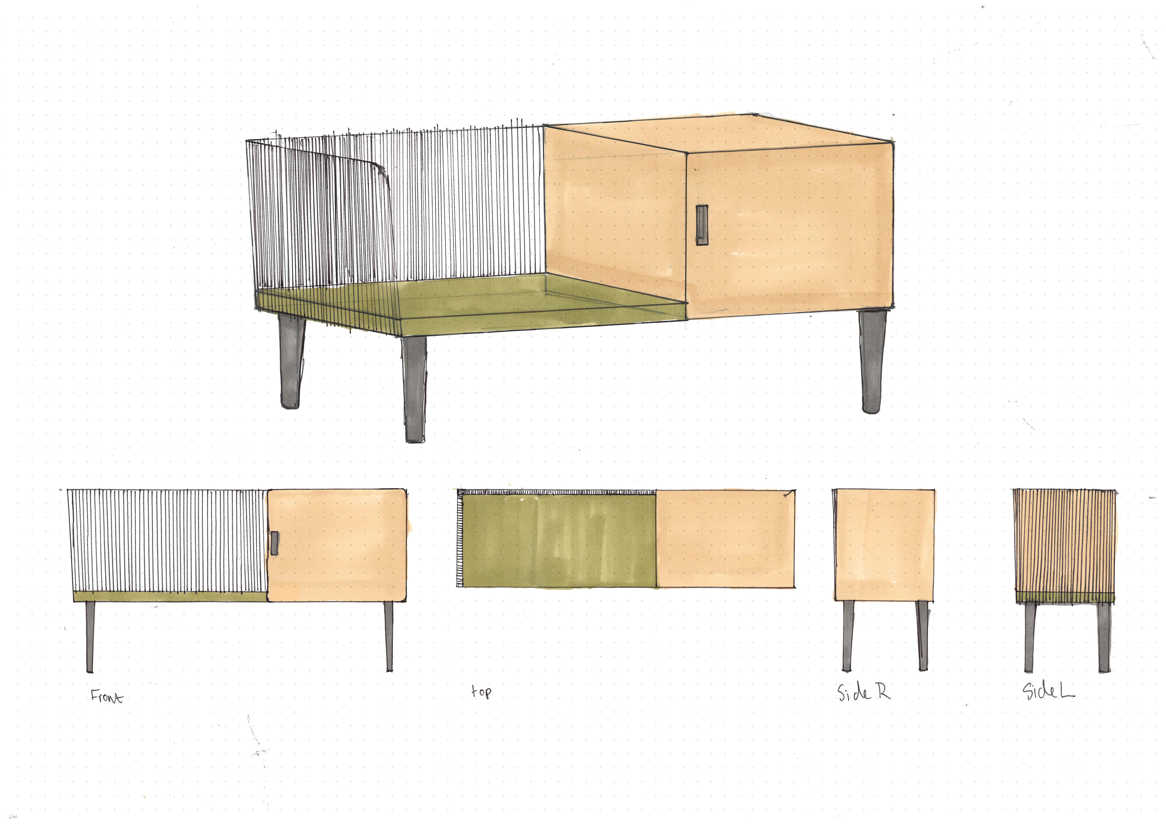
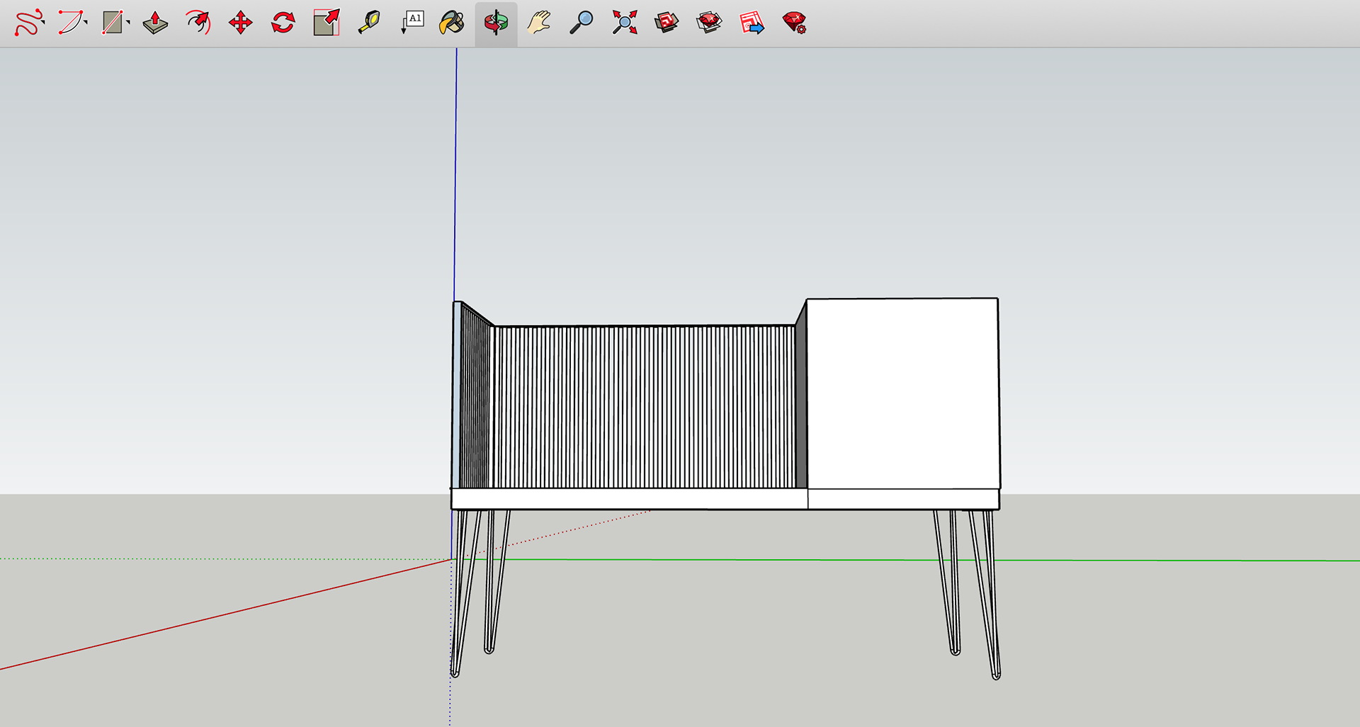
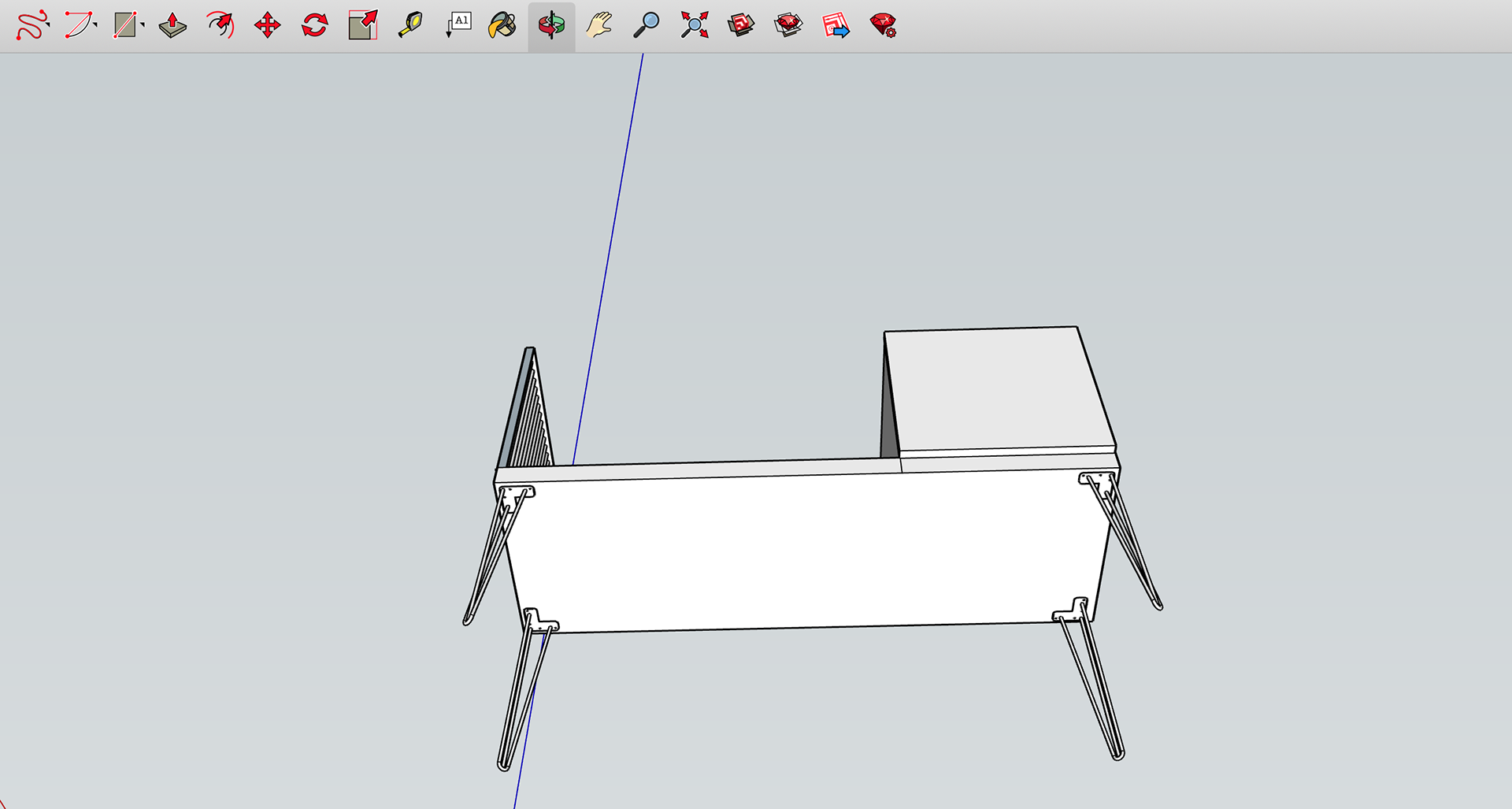
I soon started to make my design. I focused on getting the readjusted measurements on there so that I could start to visualise the proportions. The measurements were all exact for the wooden proportions of the piece. However, I struggled with the metal pieces due to the precision of them. It was also discussed in my tutorial that I need to be more considerate about the consistency between my CAD design and the materials I intend to use.
The next stage for me was to proportion the legs and cupboard doors. This will help me to further visualise what the outcome will look like. I didn’t add further details such as the door handle since I will be redoing the piece.
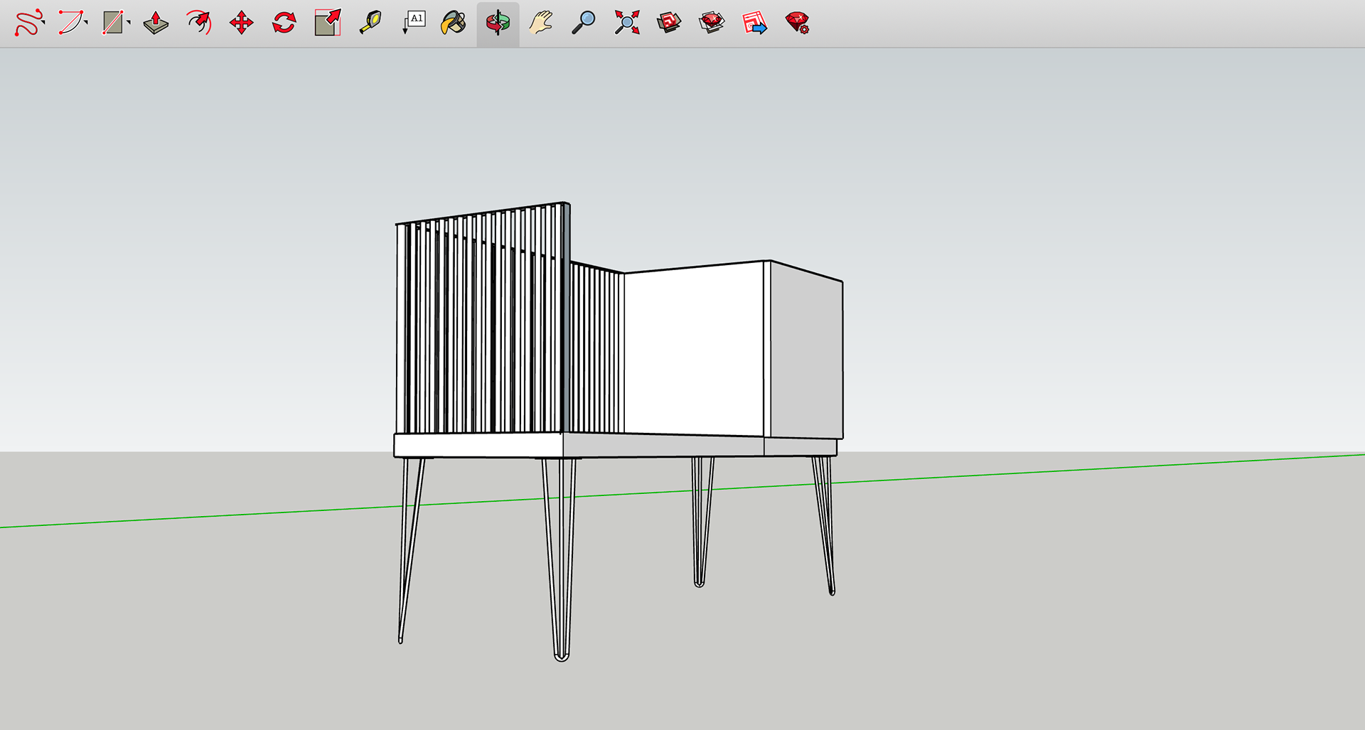

FINAL CAD DESIGN
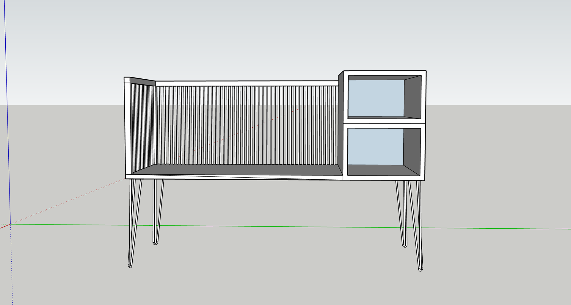
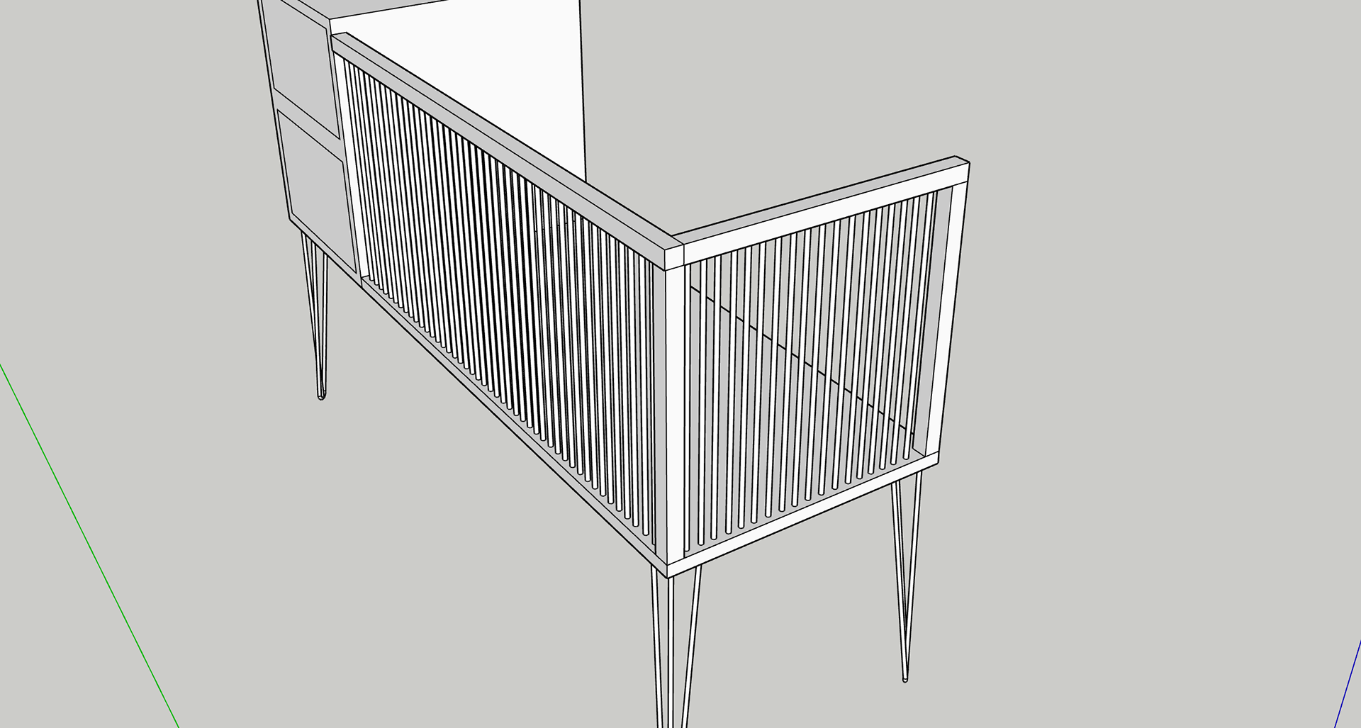
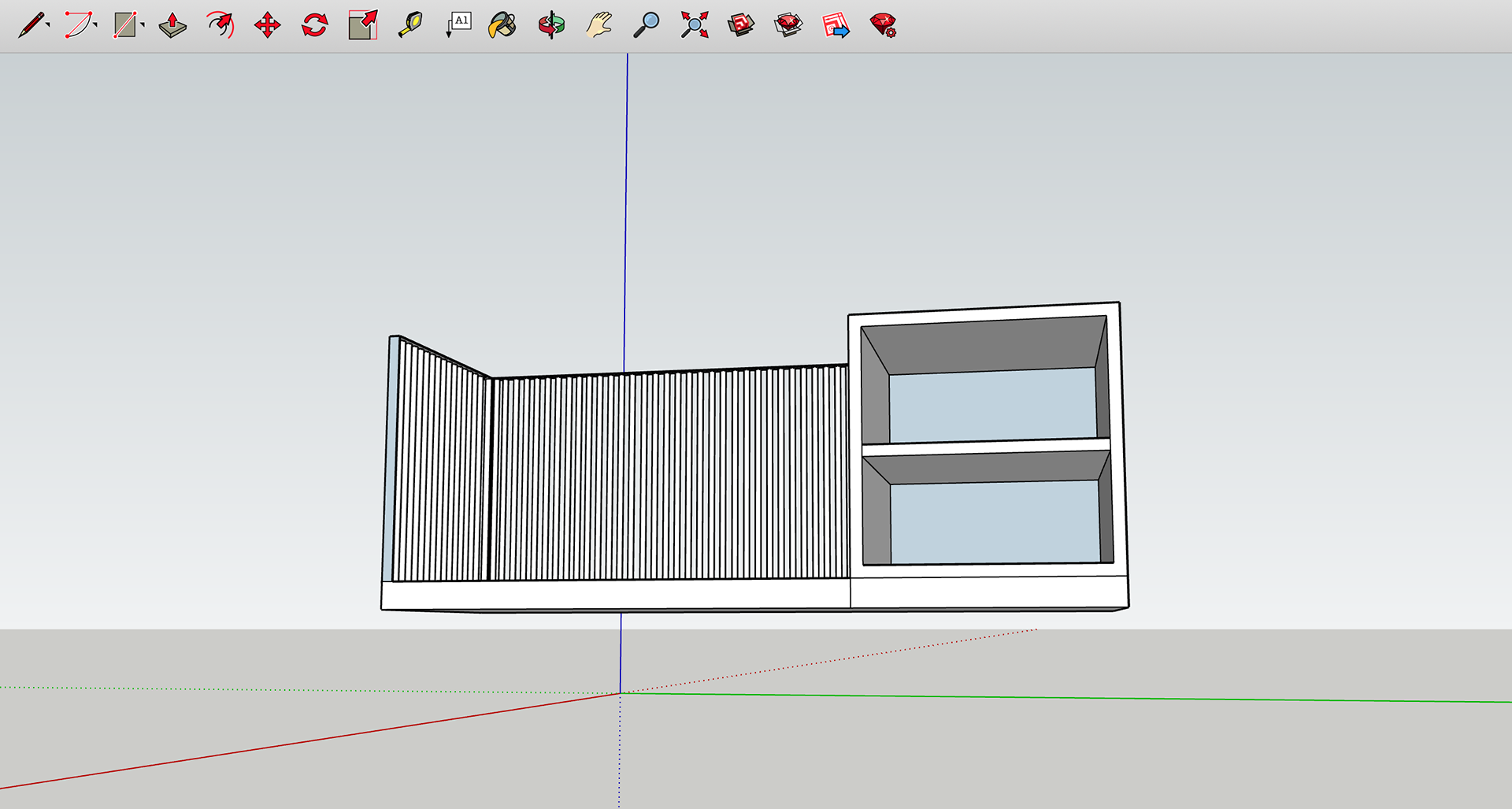
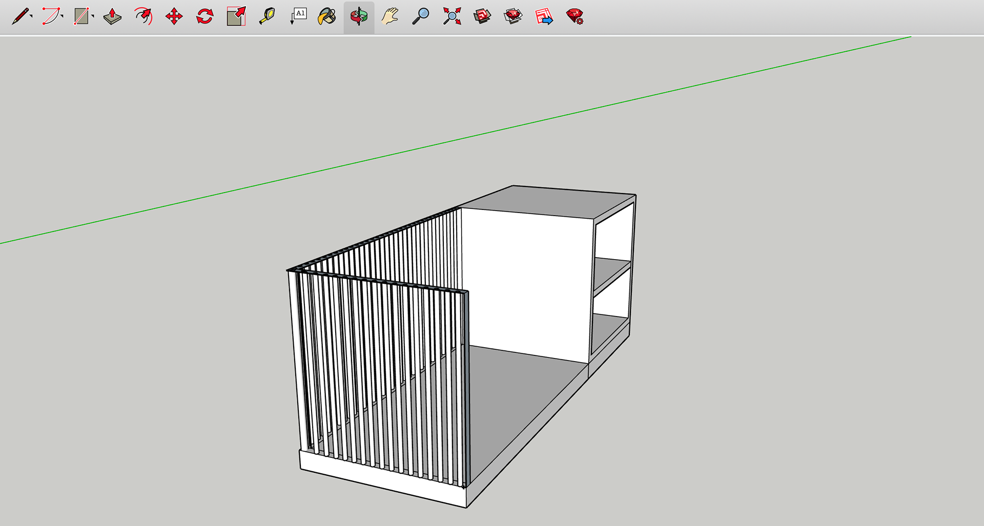
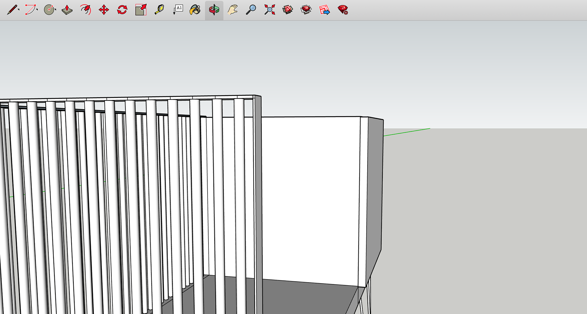
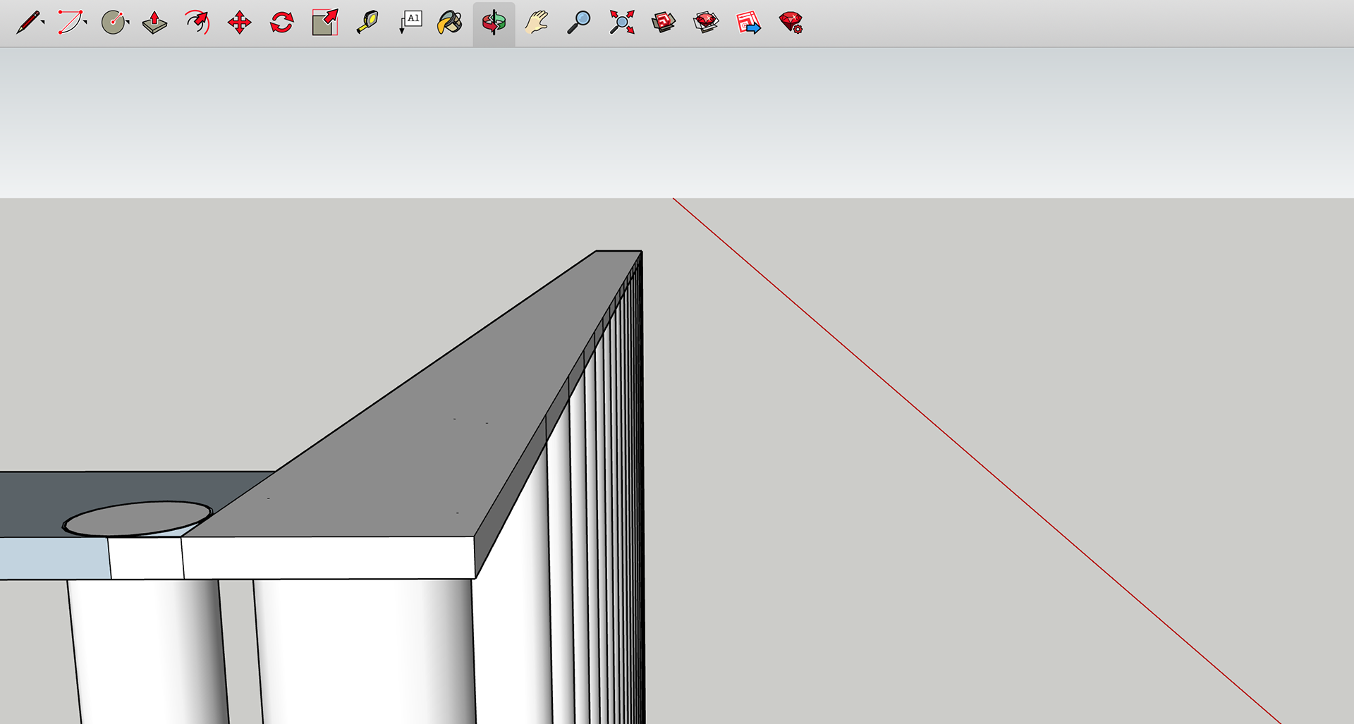
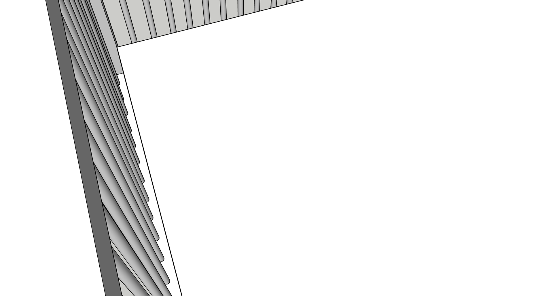
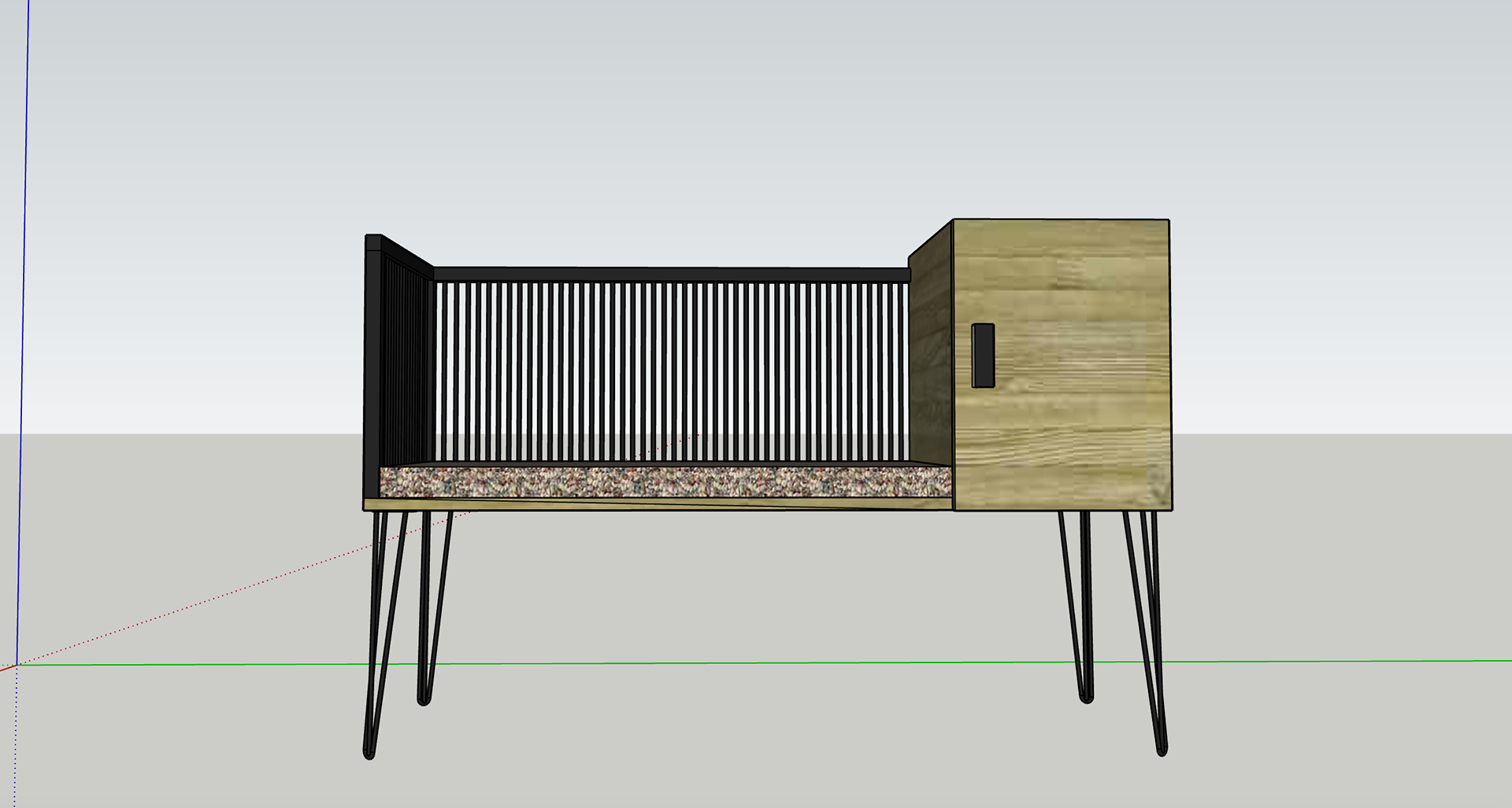
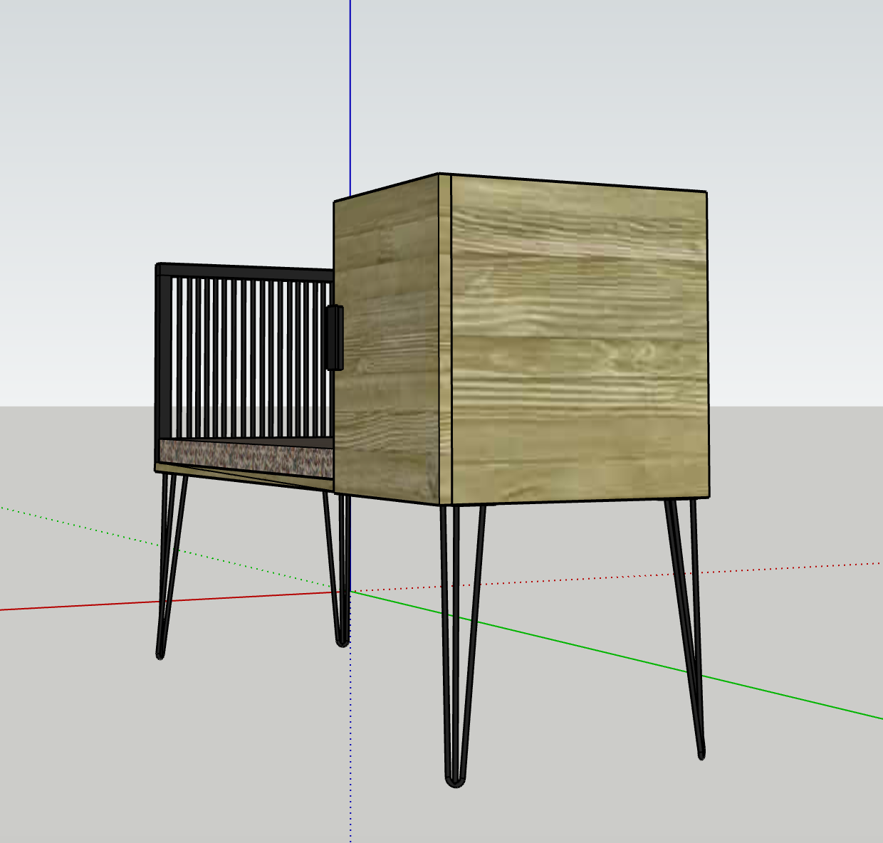
As mentioned, the main concern for my previous design was that it was inconsistent with my material choices. And so, I took more care to fully think about all aspects including the spacing between the rods as well as where they will attach to the separate elements. I also added the door handle, however this may not be the one I use for the piece it is purely representative. I have also included the height and dimensions of the cushion I intend to add to the seat.
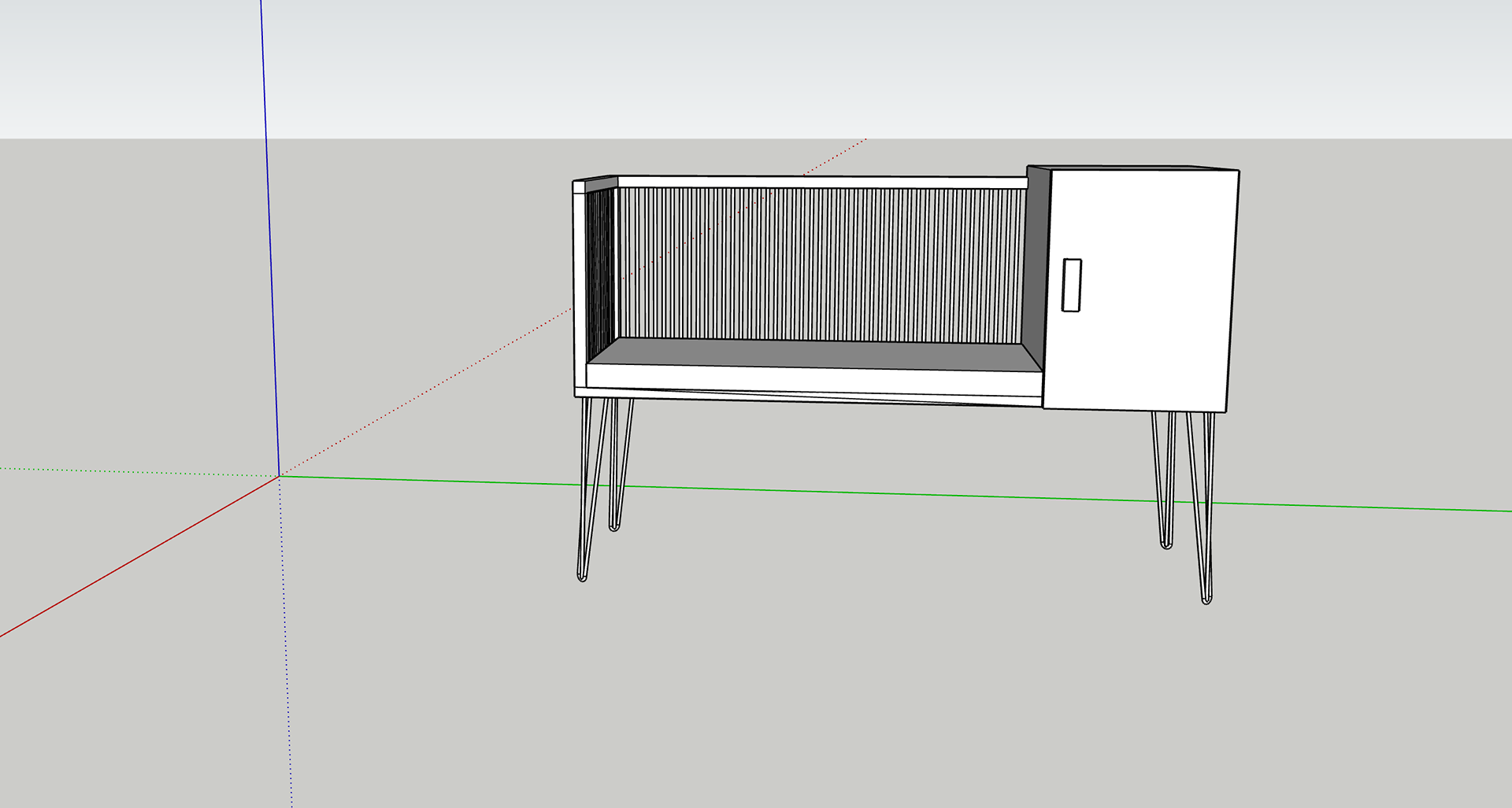
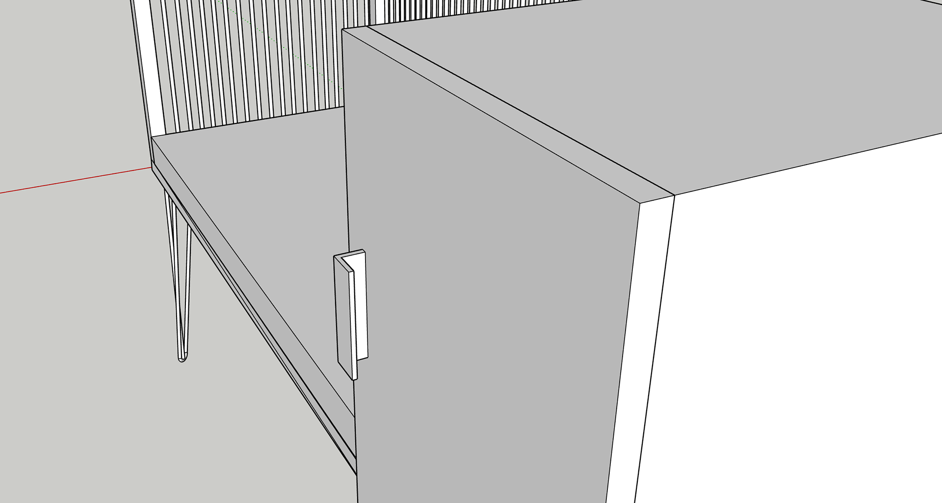

Once I was happy with all my measurements, I added the textures of the different materials so that people could see how the final piece intends to look. The metal work will be all the same colour, however I my experiment with the finish; do I want a matte finish, or do I want more of a gloss effect? The wood available to me is pine, as this is quite a light wood, I will stain it to give it more of a mid-toned look, I will sample a range of different varnishes and stains to see which I prefer. The fabric is still something that I haven't particularly investigated and so the fabric there is not true to the final look.
VISUALISATIONS FROM CAD
The next stage for my CAD work was to turn it in to a digital visualisation. I have done this for previous projects and it really helps me to communicate my ideas. As I won't be able to finish my designs in the way I planned I will use this as a further tool as that people can understand where I intended to take the project and where it may go in the future.
To create this visual I used Dimensions by Adobe. This was the first time I have used this software. My initial thoughts were that it is a good software but will take practice to get used the tools it provides. I did two different visuals the first one was more of a trial. It was doing this that I realised that care needs to be taken with background selection as any shadows or highlights included may not be picked up very well by the software. With the second I took more care with the background and discovered how to change the directions and intensities of light sources so that it can be well assimilated into the background image. I did upload the rendered images into photoshop to enhance certain areas and add some objects to the scene. I felt that this really bought the look together.
First Attempt

Second Attempt
ZINE DEVELOPMENT
As part of this module we were asked to produce an artist book or ‘zine’. I really struggled to come up with an idea for my book, whether to do it on a certain concept or my work. The concepts I considered were sustainability and Scandinavian design, however, thinking about the other units I am currently working on I decided to do a ‘collection’. Quite often in the design world, curations of designs are displayed in a collection, they tend to have similar design features such a material choice and colourings. There are several different aspects of the collection ideas that I will need to consider such as layout, font choice, colour schemes, and consistency.
EXPLORATION OF 'ZINES'
To give myself an idea of that I should be looking for I looked at examples of layout and colour schemes for inspiration. There were several different options that made me realise that there can be different positioning of images and/or text on each page. There can be a sense of consistency through the book without having it the same on each page. However, the continuity of having the same themes on each page would be an aesthetic statement.
SOFTWARE CHOICE
There are a few possible options for this. I personally chose like this was a good opportunity to use InDesign, an adobe software specifically used for magazine and book design and layout. I have tried to use it in the past but had little experience with the adobe system; I have had a few more years of illustrator and photoshop that have helped me to understand the software better. There are several advantages to using such systems, there is a lot of styling options and manipulations that you can do, as well as a large community that has tutorials to help you with anything you don’t understand. The interface is the standard scheme for adobe software's which makes it easy to navigate, as shown below:
STAGES OF VISUALISATION MAKING
In the past when I've gotten to this sort of stage in a project, I produce a visualisation of how the piece may look in situ. However, since I plan on doing a collection, I won't be able to do the visuals the way I normally do. Normally I take a high-quality image of the piece in a photographic studio; this allows me to choose the direction of the lighting as well as its intensity. This does lead to a limit on perspective options, but it does show the actual finished work in detail.
For this task, however, I am going to use CAD to digitally produce the pieces. At the start of the design process I did several different sketches of potential design options; I am going to work from these to produce different works that can be ‘featured’ in this collection. I will then render these and place them in an environment as I usually do.
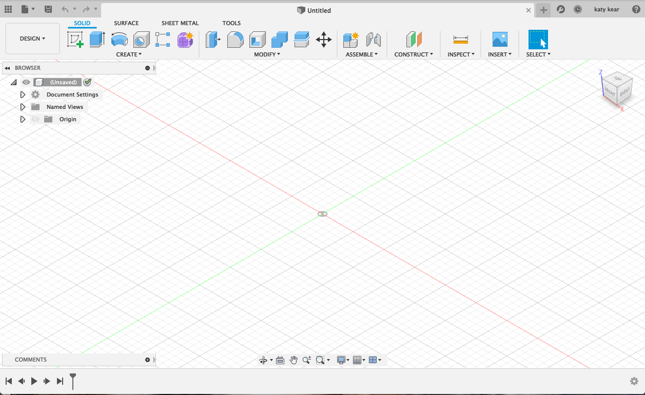
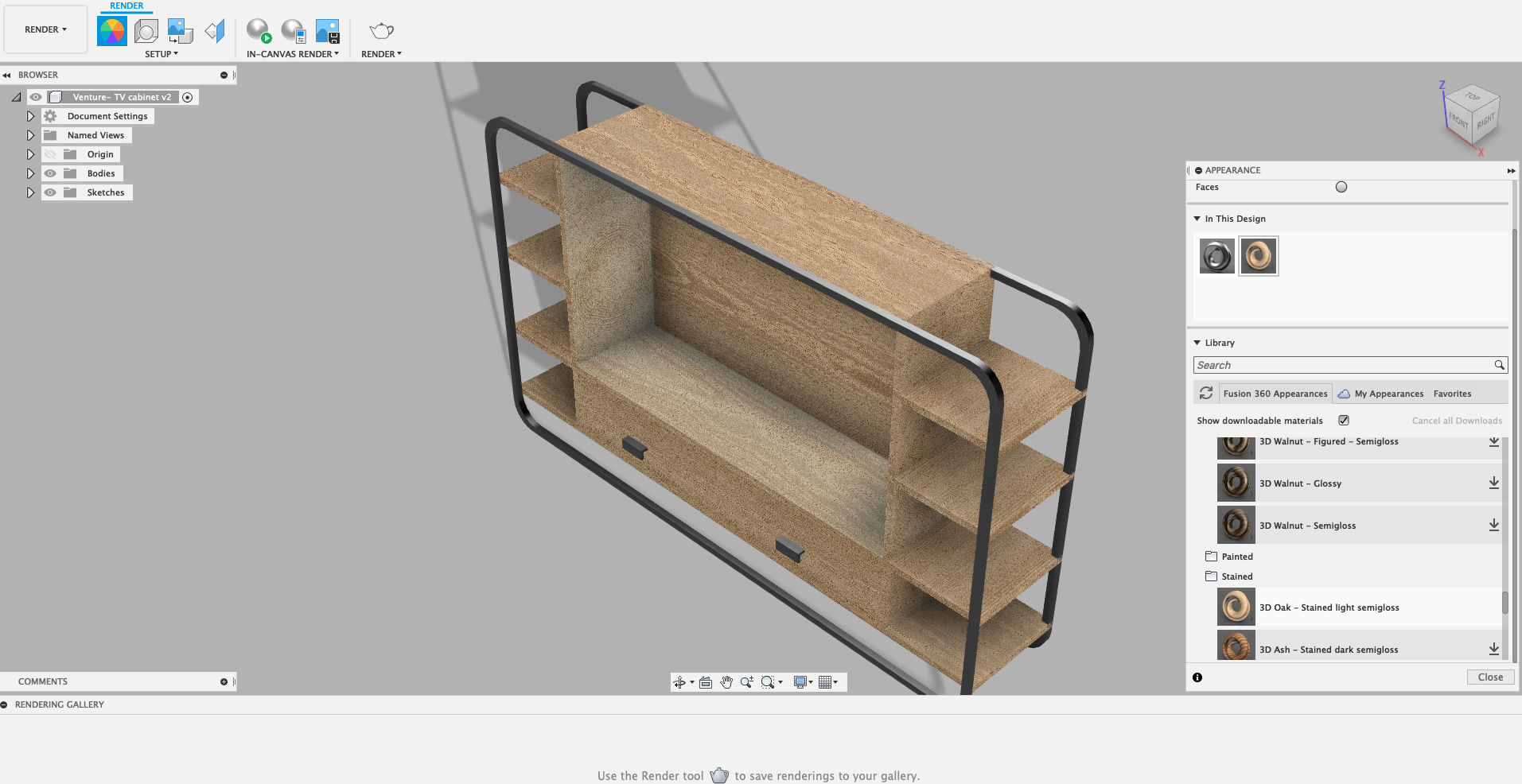
My previous CAD work for this project had been carried out using Sketchup, however, this currently isn't available to me. I have been recommended an alternative software called Fusion 360. I have found that it is slightly more sophisticated than Sketchup, and even though the interface isn't as straightforward it is much easier to produce my designs. I do however miss certain options available in sketch up such as the “components” window, but this may be a case of I haven't found the equivalent.
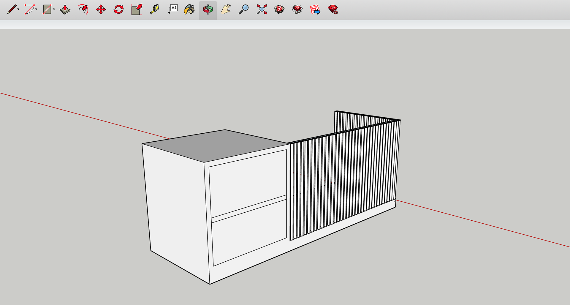
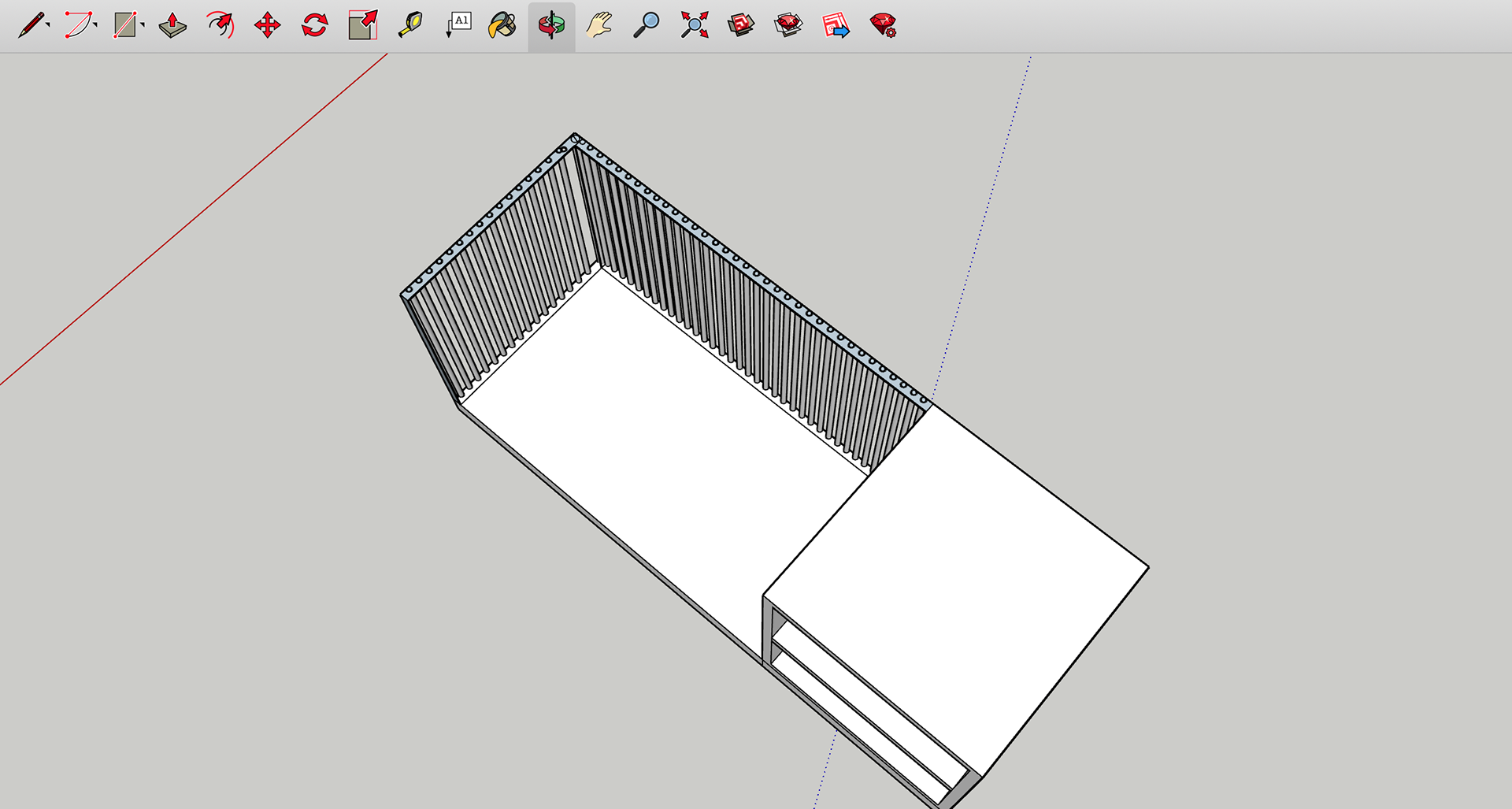
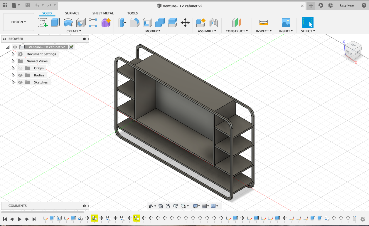
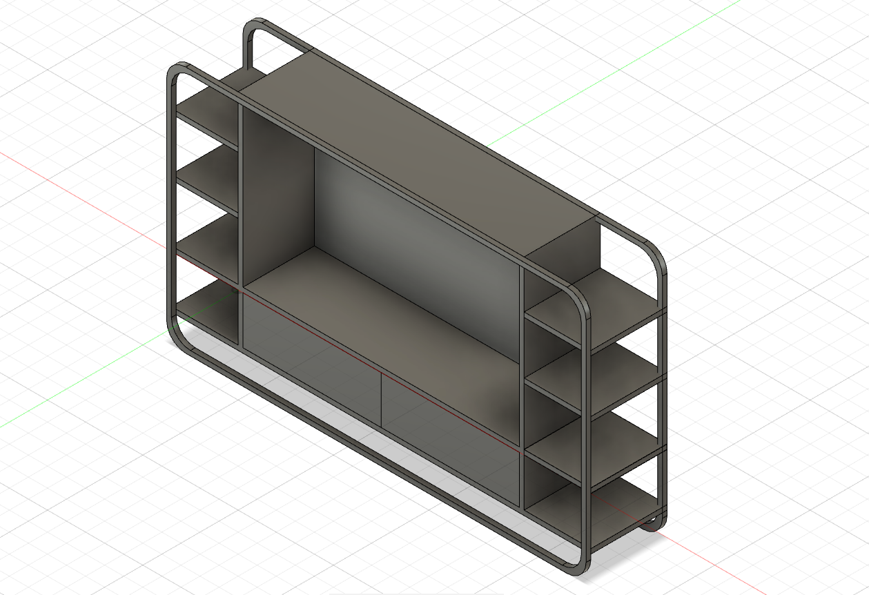
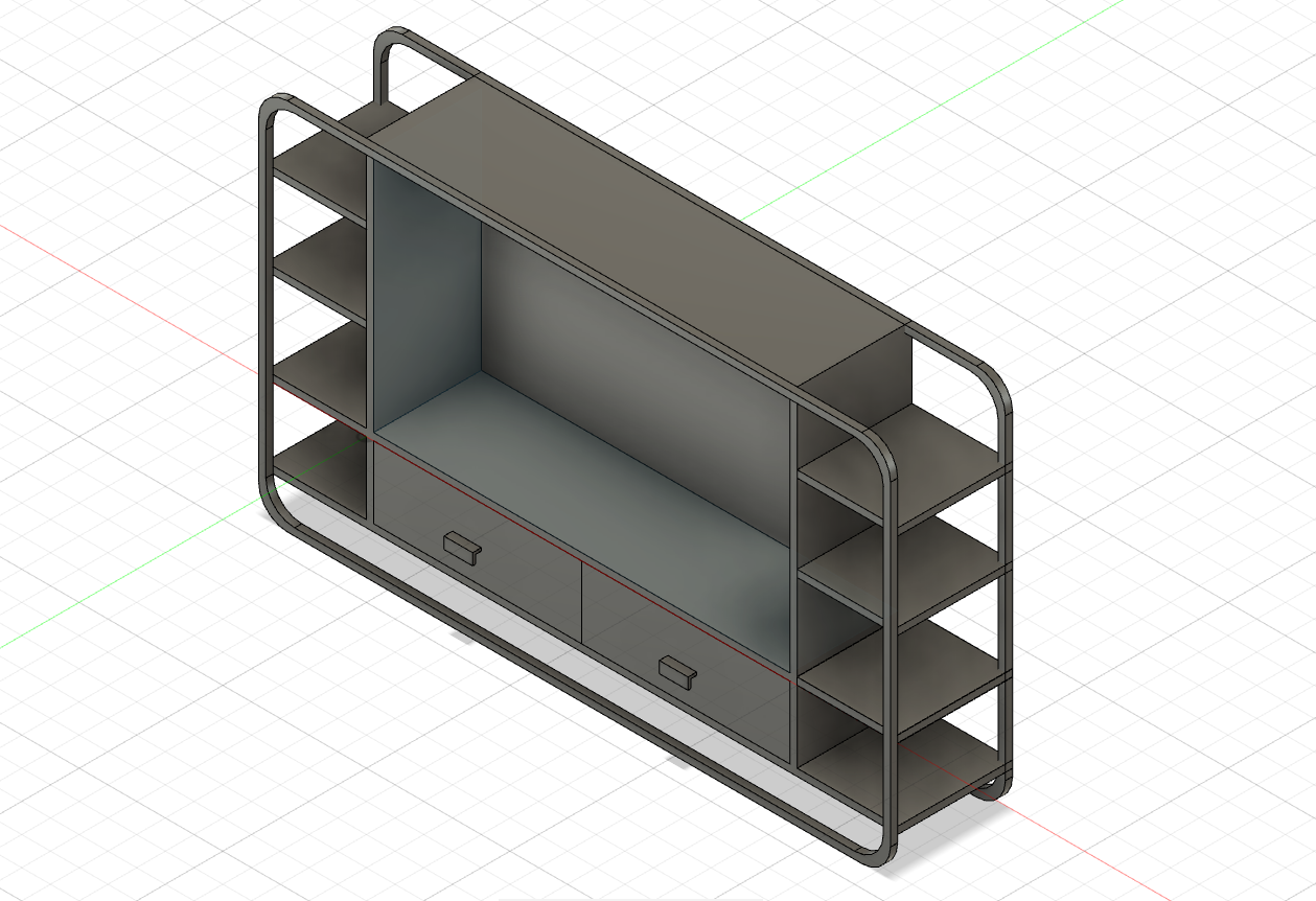
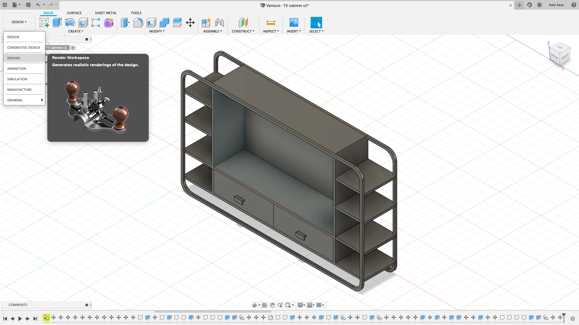
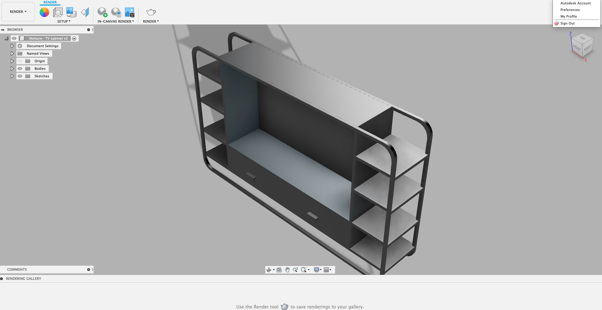
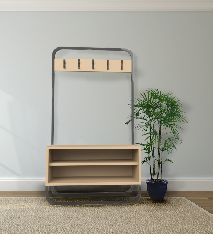
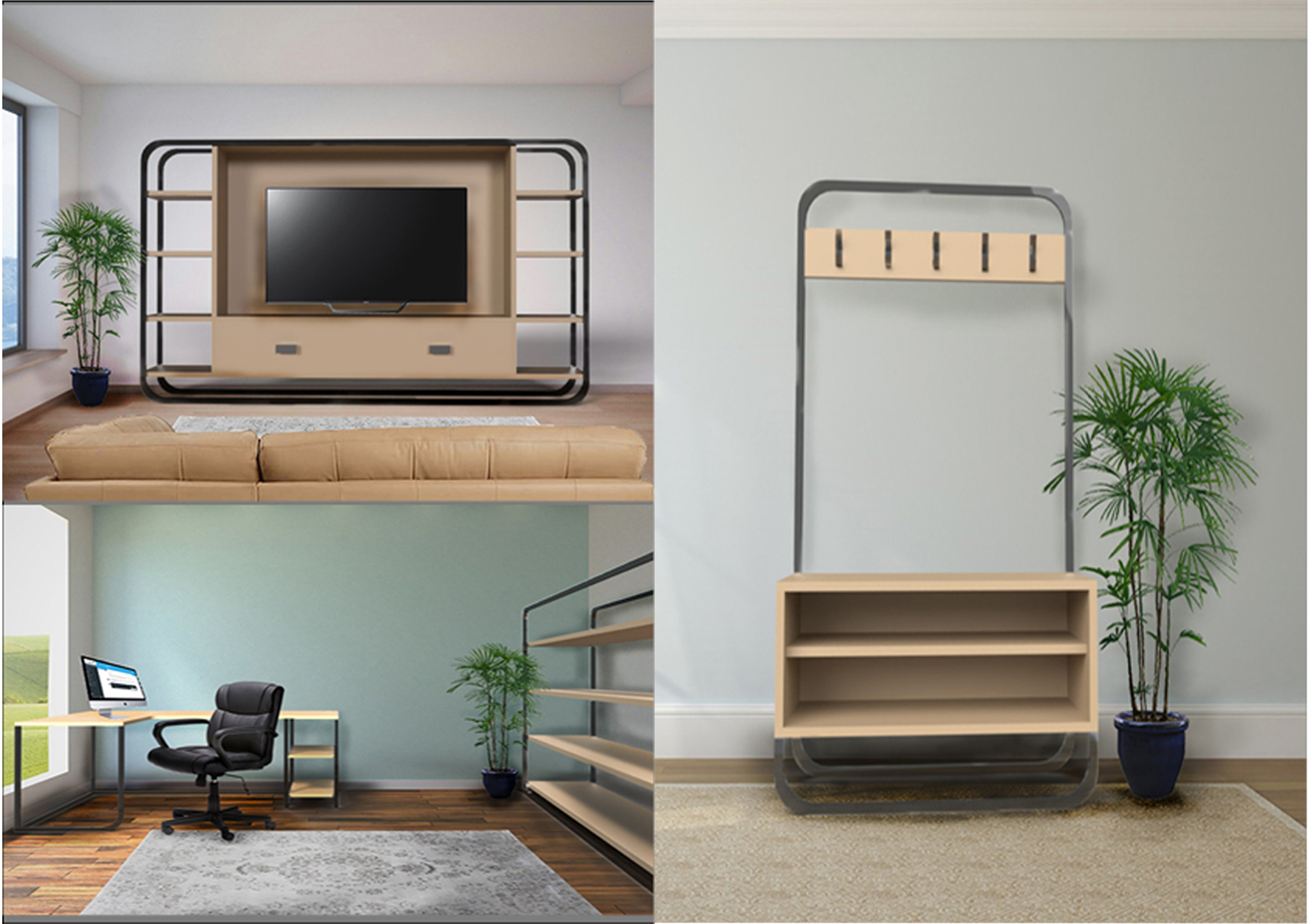
One of the designs I had produced for this collection is a TV cabinet. Below is how it looked in the software. I found it a much easier software manipulate due to the commands, particularly the viewpoints. With Sketchup I have often had problems with the orientation as I work, with the ‘home’ option I am able to get orientated quickly, smoothing out the process. I know this is a small thing, but it has made a difference to how I feel about CAD work. Before this process I had very little experience with it. The other thing that I enjoyed is the rendering process. With SketchUp I had to download additional software extensions to render, however, Fusion 360 comes equipped with its own system. It is straightforward due to the ‘Bodies’ list for me to add materials and textures. The system works by highlighting the chosen body on the design making it effortless to create an accurate visual. Once this is done, I then export it as an OBJ (object) file to use with a complimenting software.

Now even though Fusion 360 probably has its own system for visualisations, I have recently started using Adobe Dimensions. As I mentioned before, I am experienced with the adobe set up and commands, making it an undemanding choice. As explained before, the adobe community means that there is a lot of support and tutorials available. I managed to understand the uses of the software quickly. The ‘match image’ tool was a very important part of this. It aligns the scene perspective with the one of the background images, as well as resolution and size. There is also the choice of adjusting the lighting angles, height and intensity. They also provide models within the software that can be placed in the scene to add relevant details. Once happy with the placement of everything, the rendering operation offers several outputs, such as a PDS (photoshop file) and PNG.

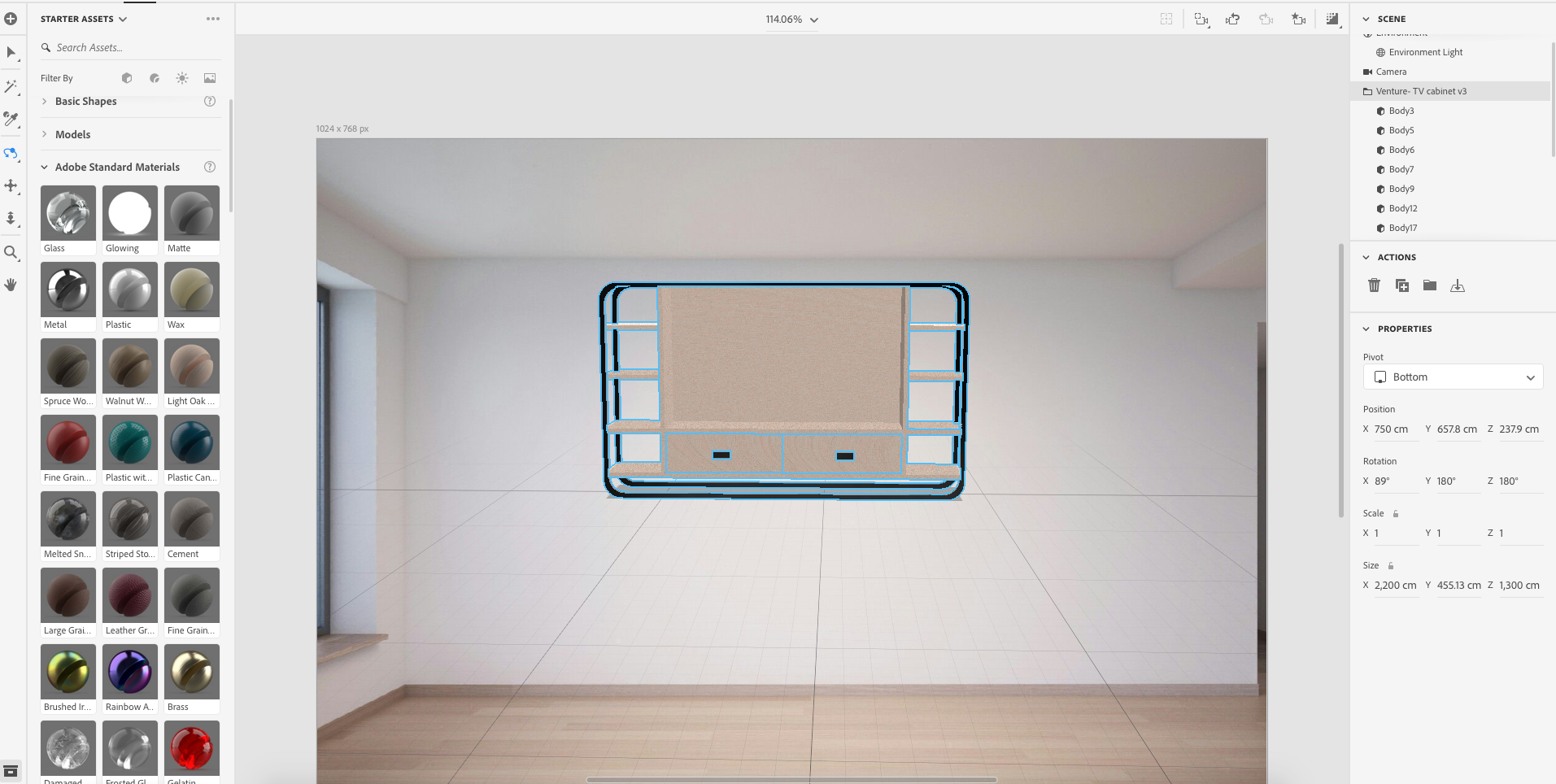

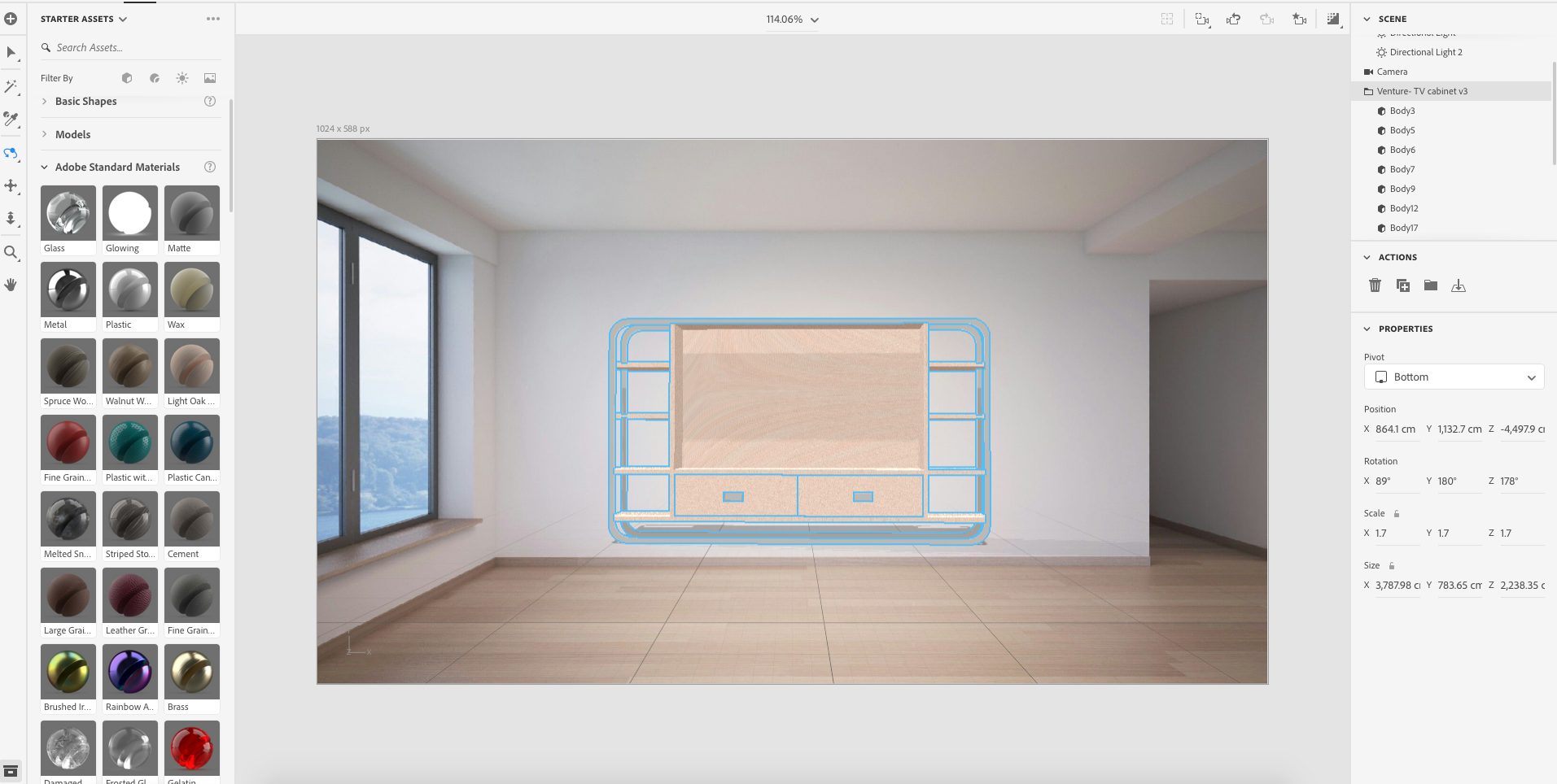
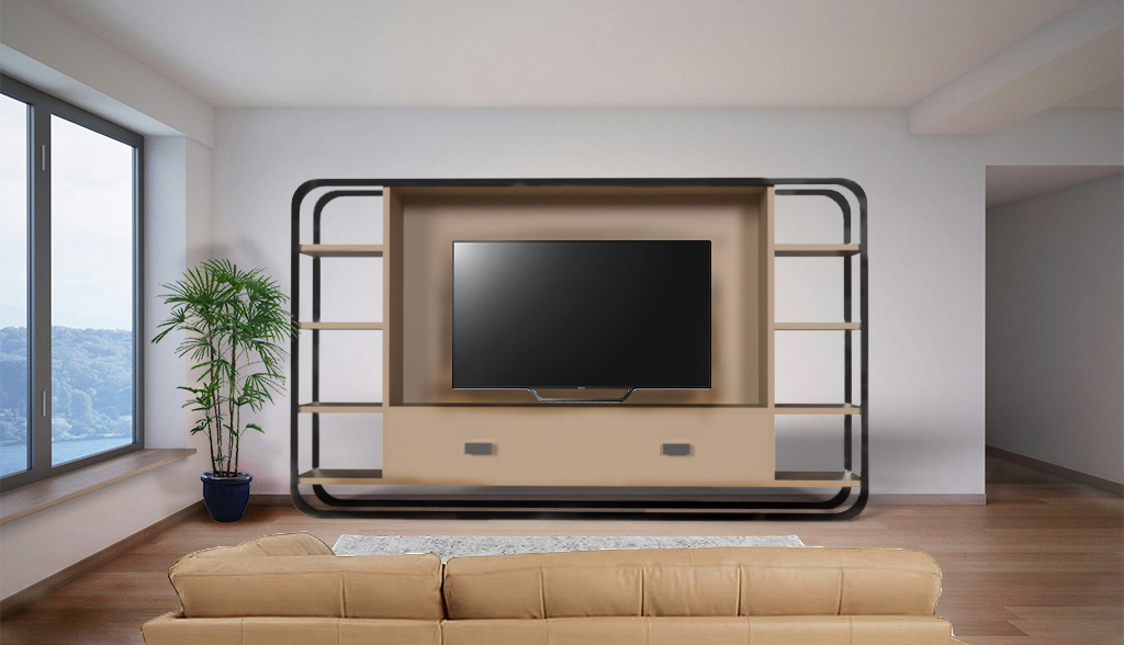
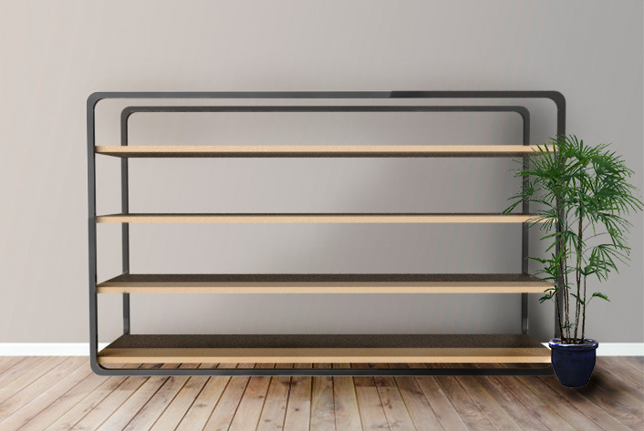
The photoshop file means that I can open the image straight away with the existing objects in layers. It also means I can add further scene details and objects to make it more realistic of an environment. In the case of the TV cabinet I added details such as the TV and its shadows, as well as environmental aspects such as a plant, rug, and sofa. The idea being that these details create a more realistic environment that would be an aspect of a collection from established designers, much like the ones I looked at for the beginning of this project.
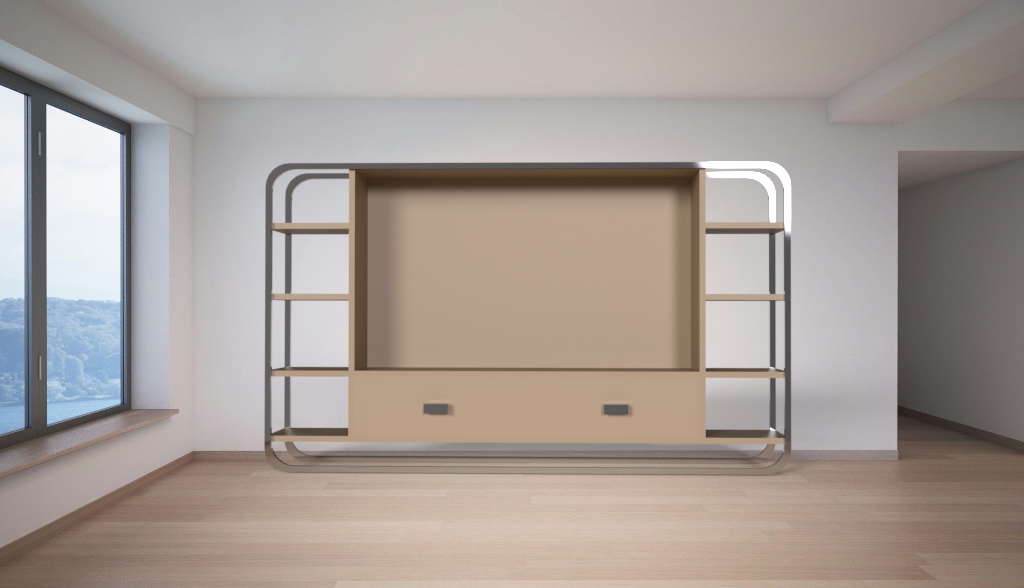


FINISHED VISUAL
The image below is the finished visual that I can use in the book. I think it worked out well, it isn't the same as my usual finish, however, it is a good alternative method of production, and one I will be exploring more in the future.

FINISHED VISUALISATIONS FOR COLLECTION


LOGO/TITLE
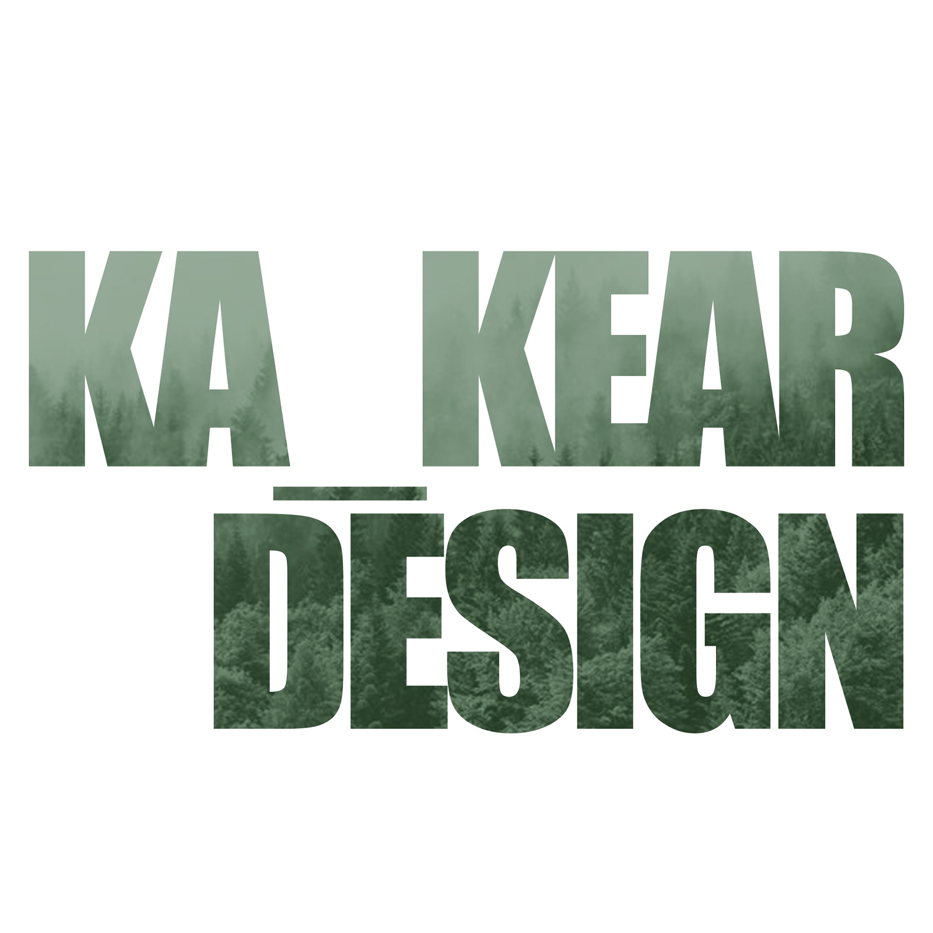
The next thing that I considered creating for this collection was a logo. This adds a sense of identity to the work as well as recognisability once there are a range of collections. I plan to create several different collections in the coming years. Once I graduate, I want to start my own business, by already having a logo it means that I will be ahead with the commercial and marketing aspects. There were a few different ideas I had, both along similar lines but at the end of the day I worked towards including a few different aspects. These included an armchair, forest scene, and the name that I want. the name is one that i use on my social media accounts.
KA_KEAR DESIGN

I was rather proud of my first attempt. However, when I showed it to a few people they had a few critiques. The doesn’t seem to be direct correlations between the armchair and the idea. There was also no elegant way of including the name in this design.
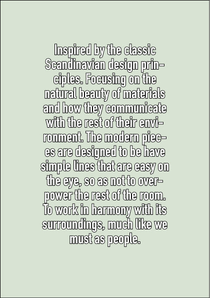
I then took a different approach where I tried to characterise the fundamentals of the work without the presence of the furniture item. This led to the finalised logo below. I choose to use the forest scenery due to the materials I work with as well as the hope to work sustainably and in an environmentally friendly manner. I also used the green tones to back the ideology further. I believe that this is a good logo that would be recognisable and easy to carry across platforms.
LAYOUT
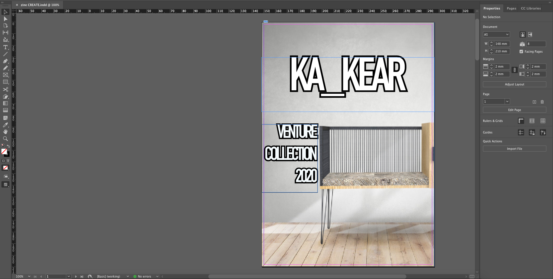
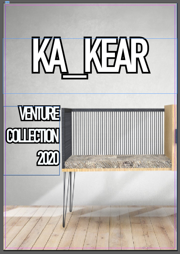
I did the first layout before I had designed the logo. The initial cover featured the digital model of the piece I am making. I did two different visualisations for the model, and so it made sense that it had the ability to feature twice in the collection booklet. The front image was only partially showing the design; I felt this gave a sense of mystery. Since only part of the image was on display it wouldn’t matter that it was shown twice, as well as the fact that the two environments were so different. However, once I had imported the logo it didn’t look as good. There were too many textures and other details that I really don’t want. I want an elegant finish that will be translatable and will look good with future works. And so, I rethought the design.
I went with the block of colour for the background because it highlights the tones and details in the logo as well as working well with the text. The off centred writing has a modern feel to it. I believe that it is sleek and more professional than the previous. I also tried to consider what the pages would print like. I felt the solid background would print much better than the image-based version. The fewer textures will leave a stand out print, especially if there is a gloss finish.

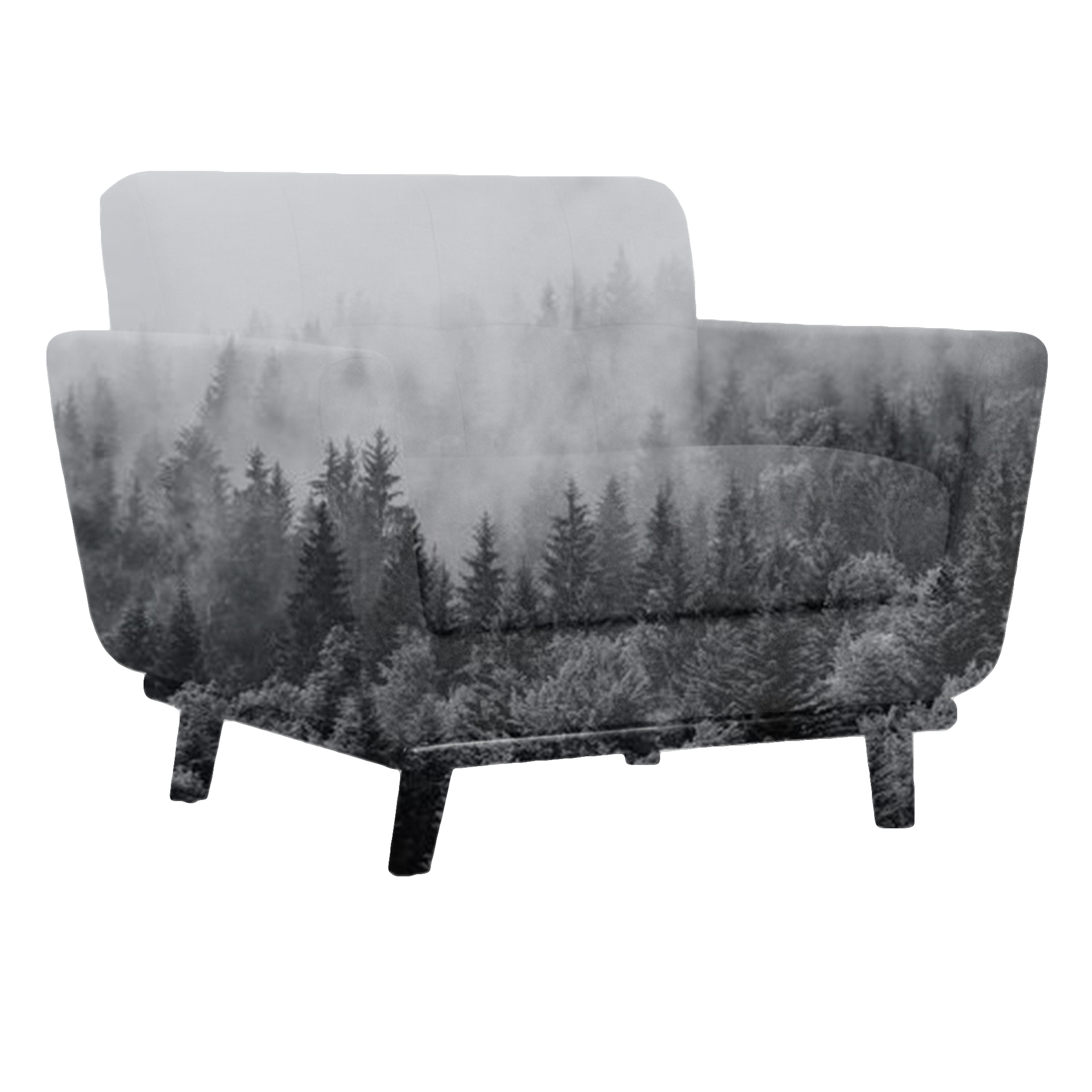
For the consecutive page I used the alternative imagery I produced for my current piece of work. It had a positioning which allowed for text that didn’t overlap the scenery. It is coincidence that the tone of the image pairs well with the cover page, but it is something that works in favour of the theme. By having the soft green/blue tones it means that the wood and metal of the furniture stands out. It also gives it a soft daylight glow that would be realistic of the environment the piece would be featured in.
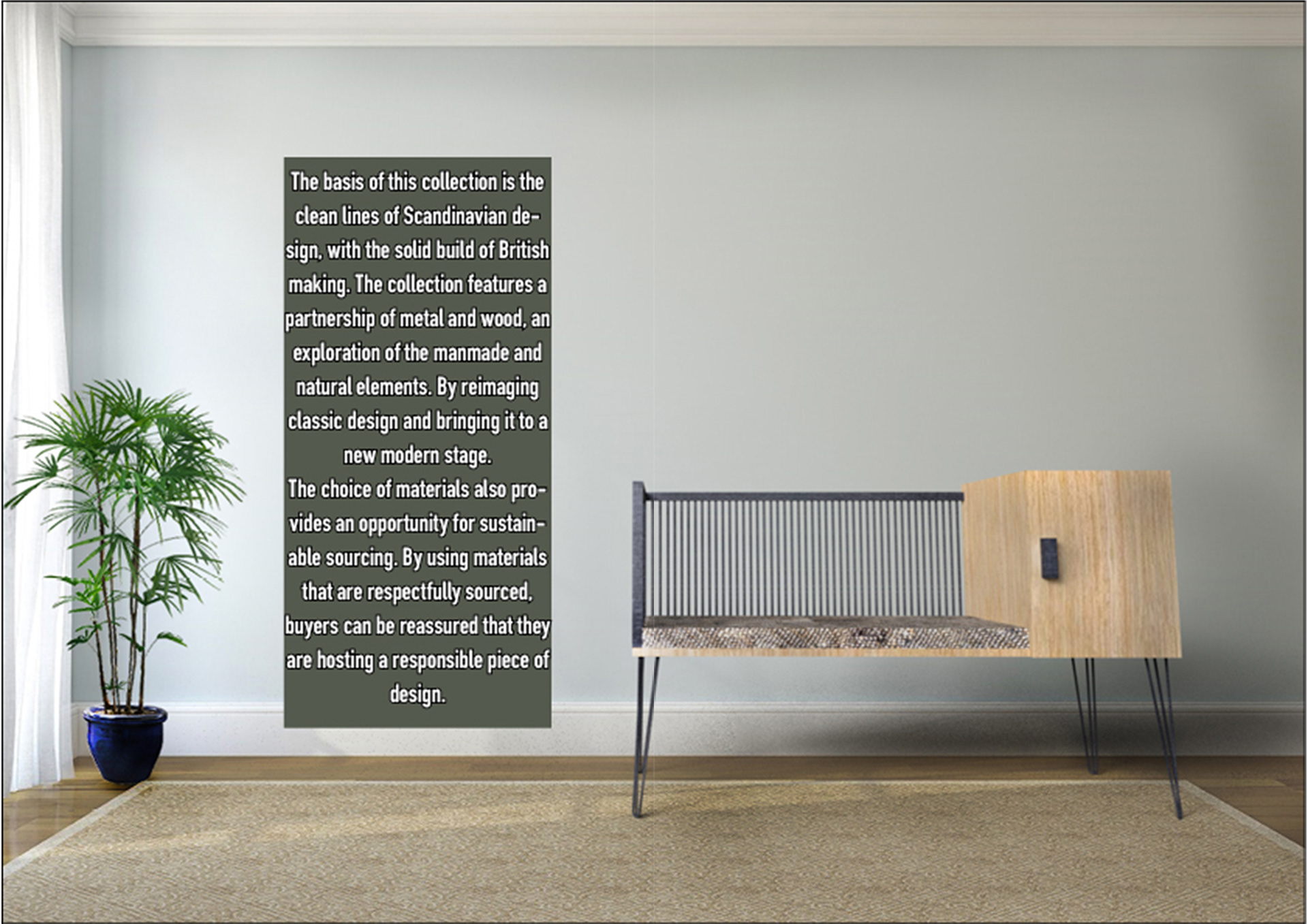
The text on the pages explores the ideas behind the collection. These include the materials and tones, as well as sourcing and goals of sustainability. These are all things that I want to achieve after my degree and as I look towards starting my own business; they are also the tones and ideas that I am addressing in my dissertation.

DESIGN SHEET
My previous design sheets have seemed somewhat overcrowded and hard to follow. And so, I tried to produce a more elegant minimalist sheet that contains the information needed without being overly confusing, and with minimal colour combinations. I choose to use the same themes as the zine work to create a sense of continuity and professionalism.
CONSTRUCTION/ WORKSHOP INDUCTIONS
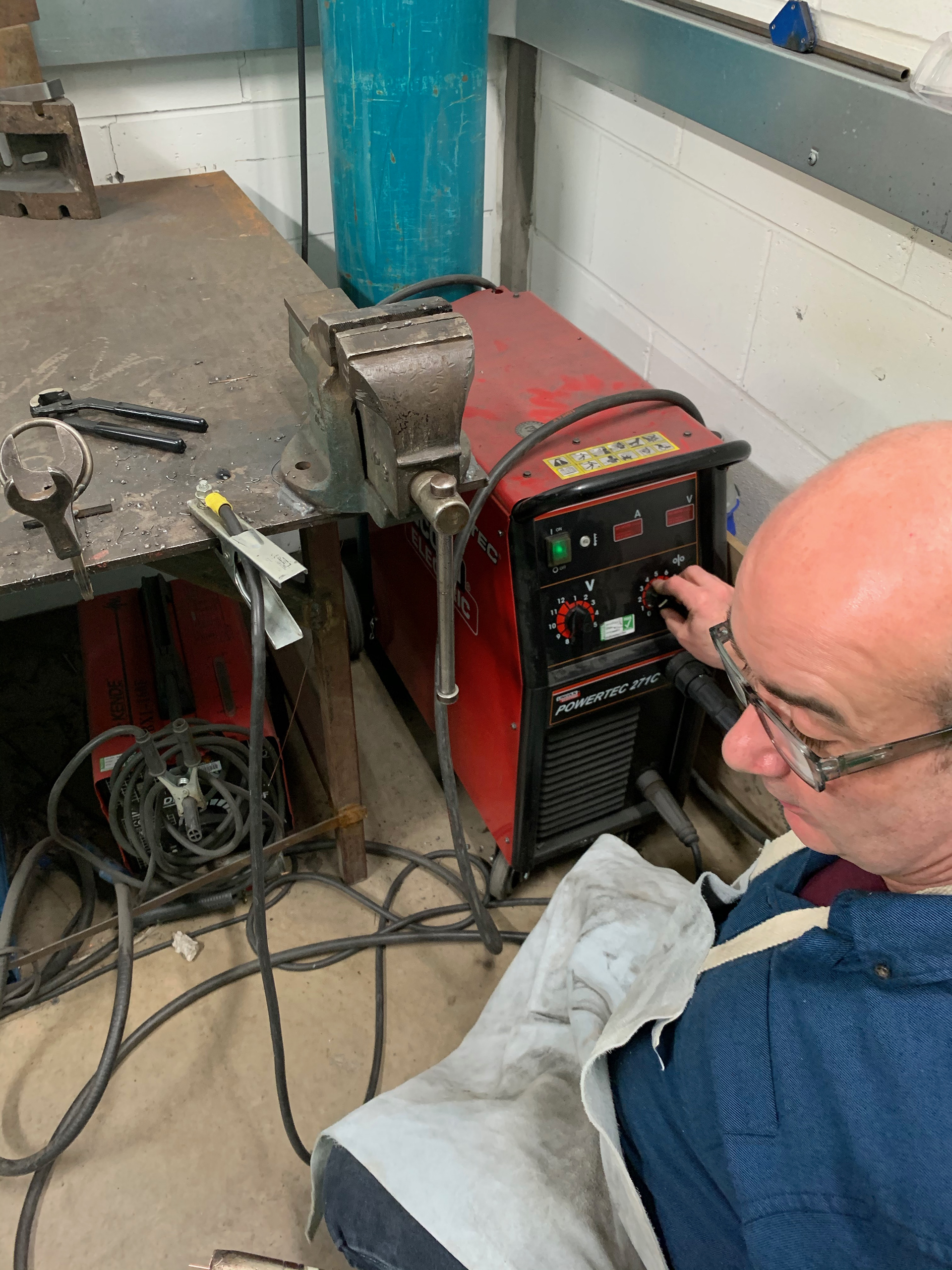
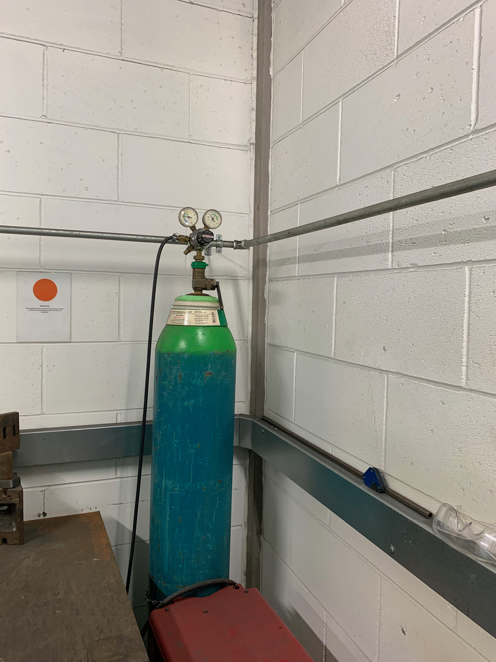
WELDING WORKSHOP
The first material that I managed to source was the metal tubing for the frame. There was aluminium in the workshop which was light weight and the size that I had imagined for the piece. I knew that I would most likely have to do a welding workshop to be able to join them I managed to book in to one on 12/3/2020.
The problem with the aluminium is that it can be very difficult to weld. The material needs to be extremely clean and time needs to be taken with the process. It will work it will just take time.

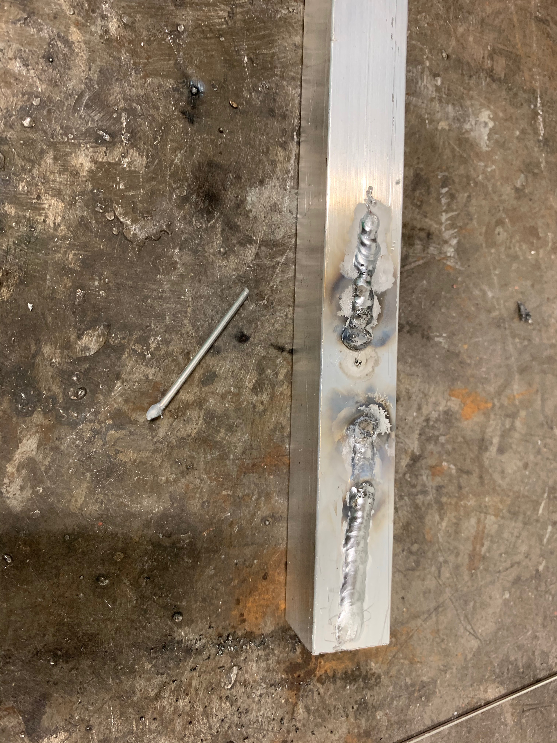
aluminium welding
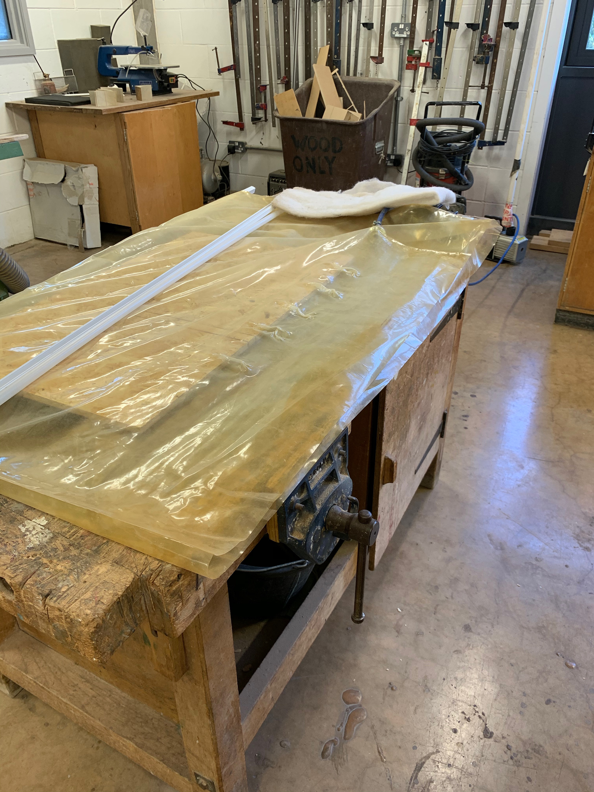
LAMINATION WORKSHOP
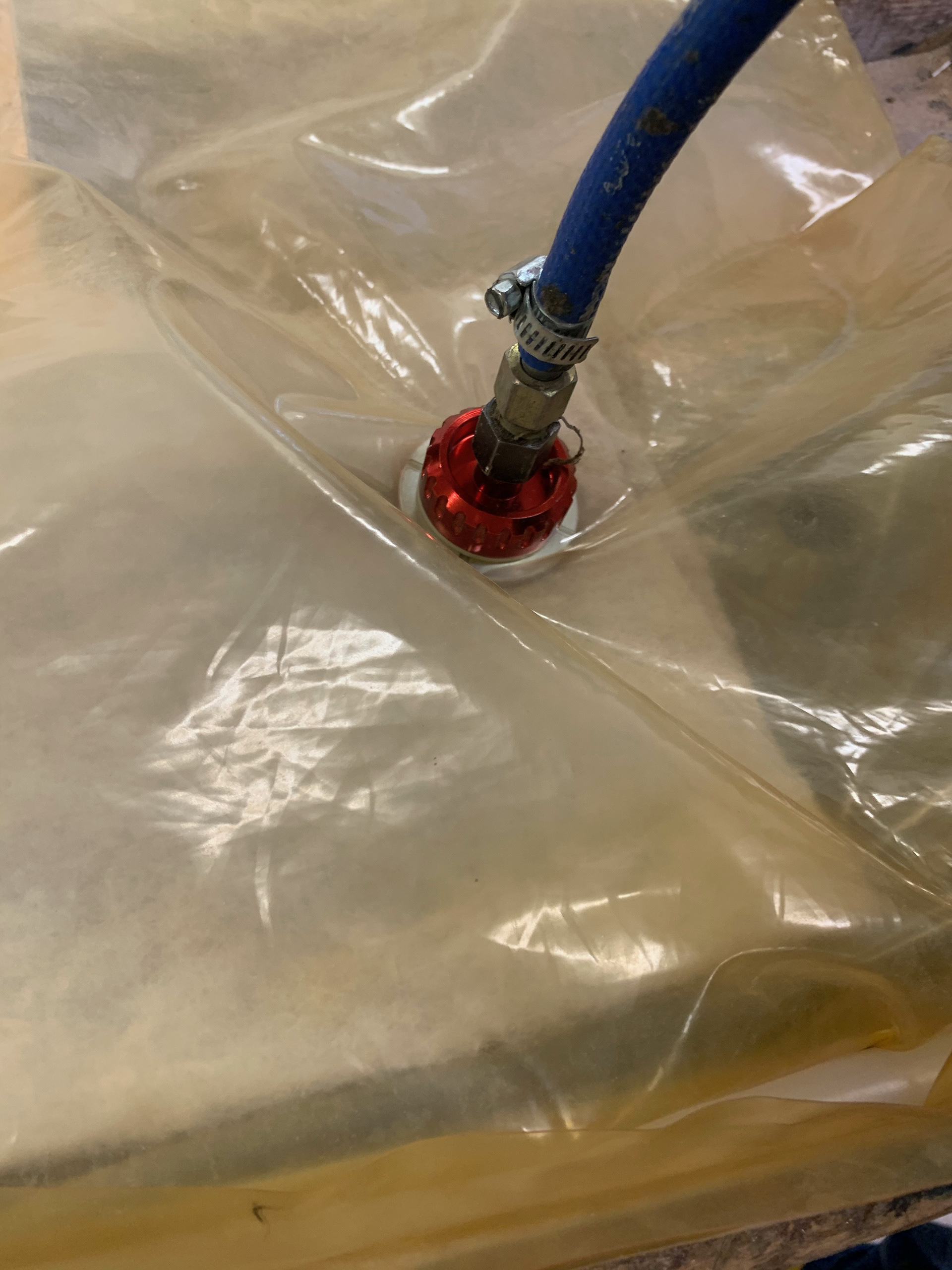
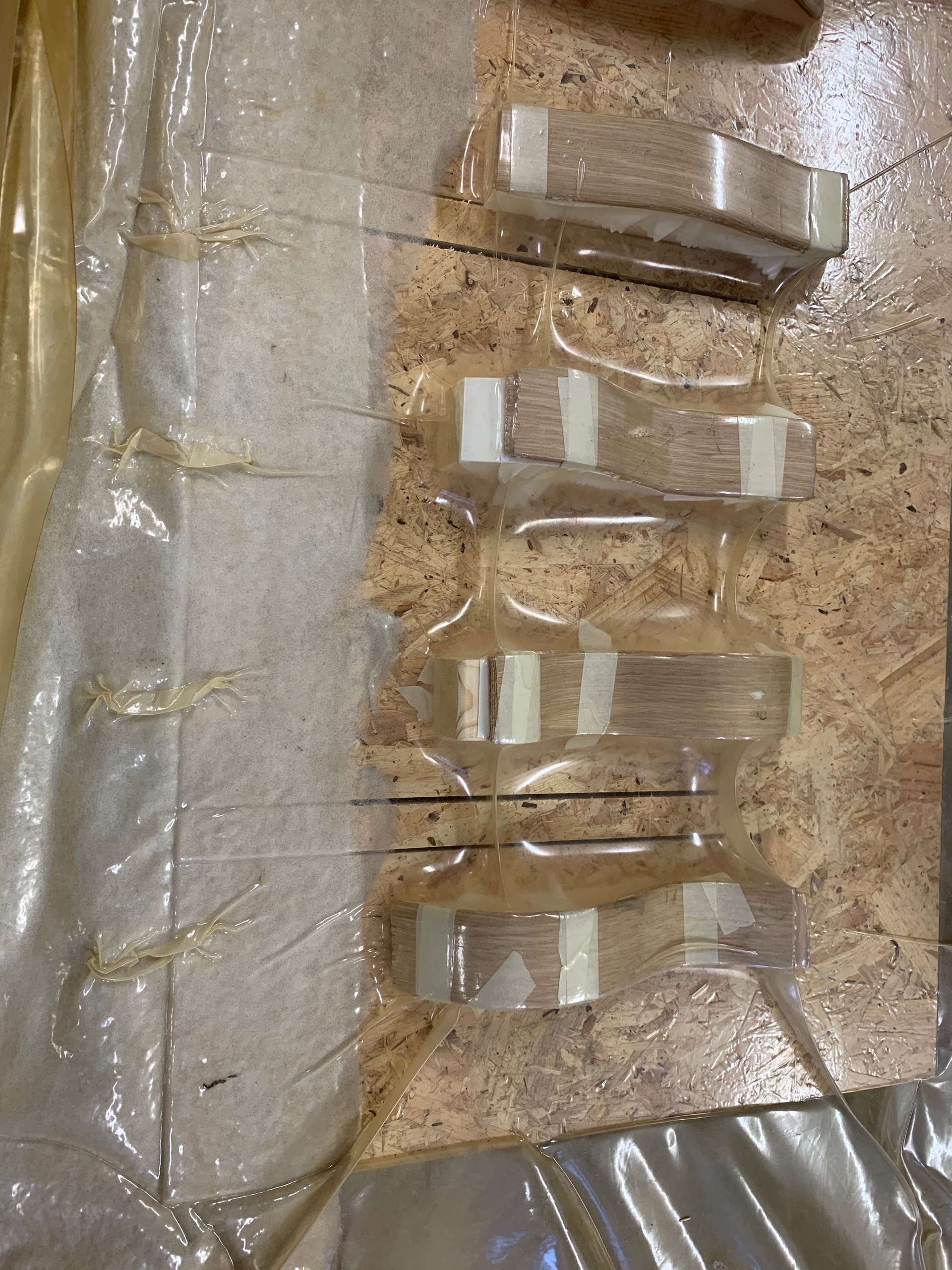
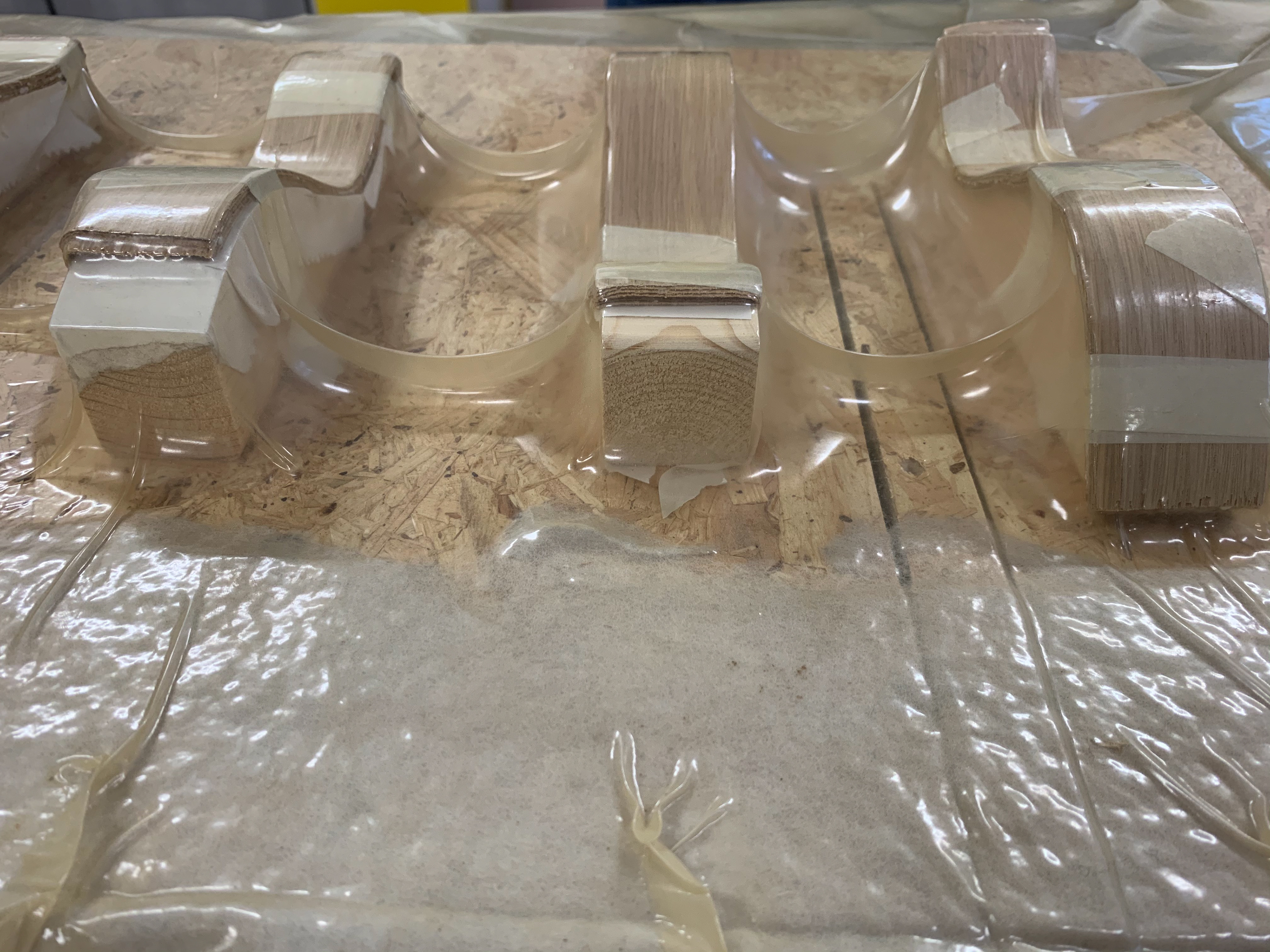
I also did a workshop on lamination. This isn't a process that I will be using for this project however it is a good skill to have for any future work that I might undertake. The technique provides a structural advantage that can be shaped yet also being a low-cost alternative to other shaping techniques.
The technique uses a vacuum to create a pressure on the different layers that have been glued to shape and bond them together. There are a few things that need to be considered when using this technique:
>For a truly strong lamination the grain should alternate.
>The wood should not overhang the mould because of the pressure exerted on it, the pressure will change the shape of the wood whilst in the bag.
>There must also be a form of membrane in the vacuum, so the bag doesn’t get sucked up into the pump stopping the process from working


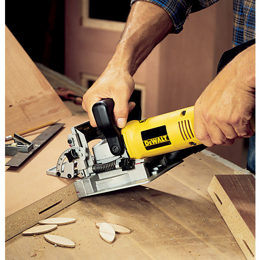
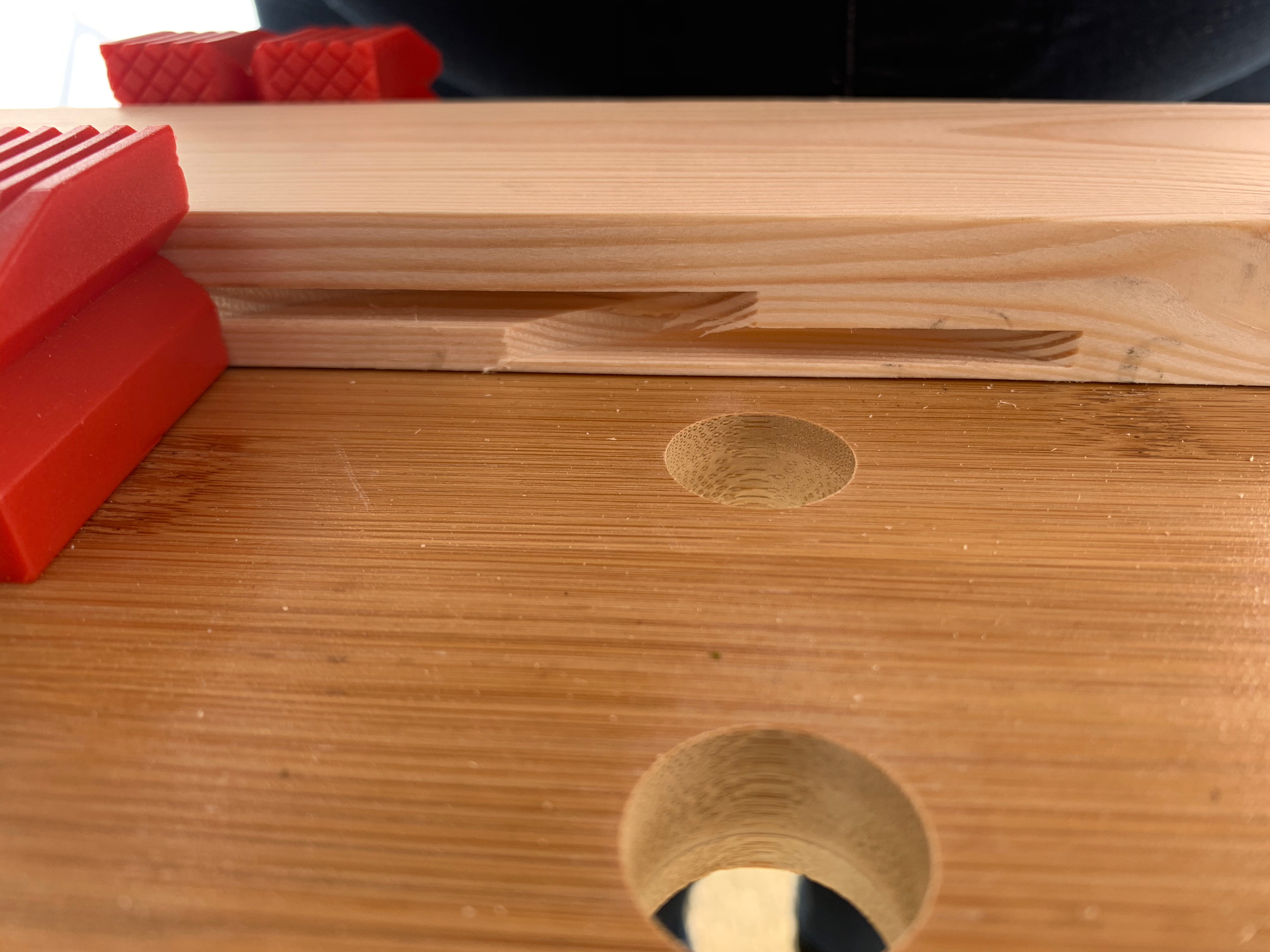
BISCUIT JOINTS
>I had an induction on how to use a biscuit jointer. However due to the current national crisis I do not have access to the workshops and equipment.
>I am going to use this as an opportunity to build my own supplies and equipment for when I eventually leave the university and need to find a way to produce my own work.
>The biscuit joint is relatively straight forward. The cutter can be adjusted so the size of the biscuit as well as being set to alternate angles to allow for more complex joints
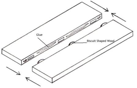
Diagram showing the joint.
Example of angles.
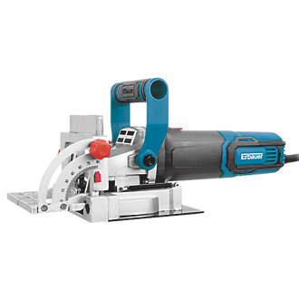
Model of joiner purchased.
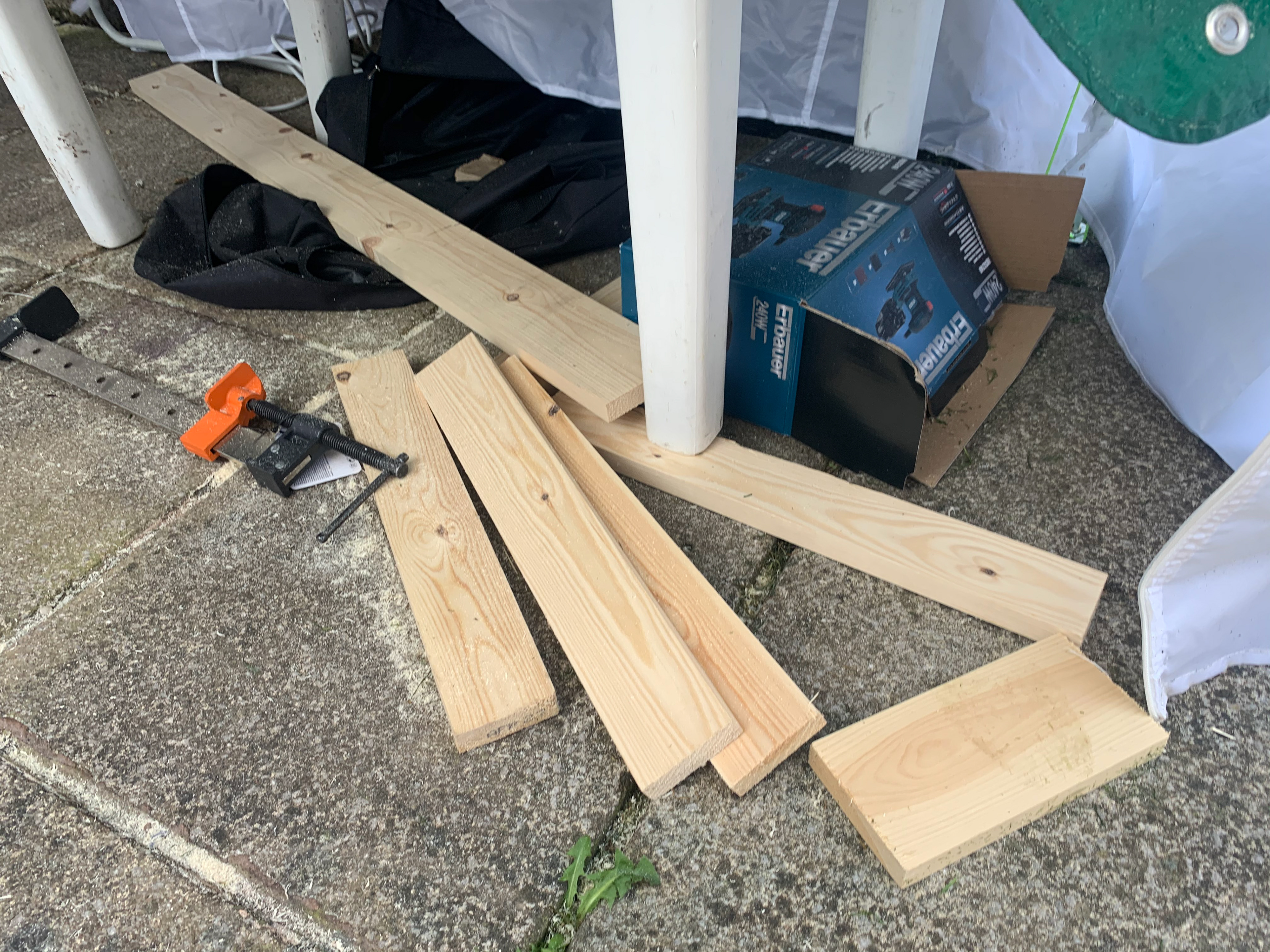
WOOD SOURCING
Due to the COVID-19 situation, I had to find an alternate source of wood. Previously I have gotten materials from Hales of Drybrook, they however closed before I could place my order. This led to a slight panic; however, I found an alternative source. They were slightly further away but other than that I didn’t see any problems. It wasn’t until I started to measure up the wood that I noticed a few imperfections in the wood. There were several knots that had fallen out, as well as inconsistent planing and cracks in the wood. This led to multiple trips and a delay in my plan/schedule. I was surprised that there was a lack of quality control throughout the selection since I had specifically stated that it was a furniture project. This may mean that I am firmer for any future projects or consider my previous suppliers.


ACQUIRING EQUIPMENT
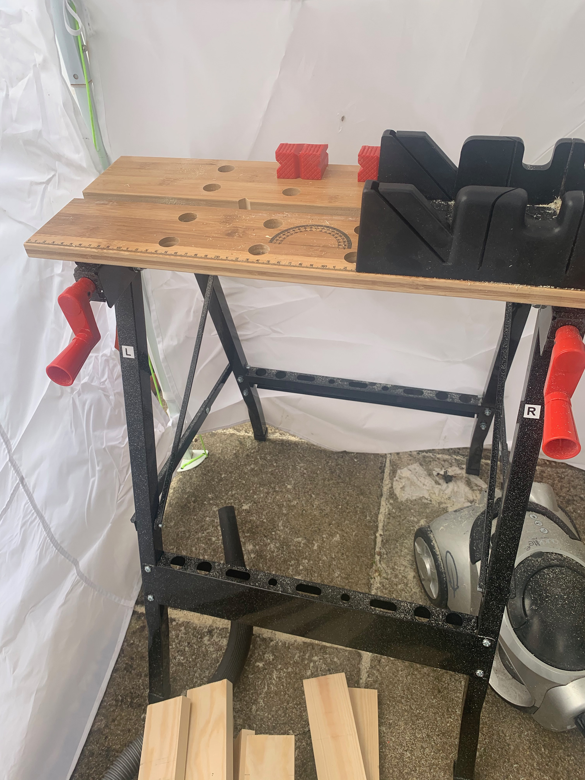
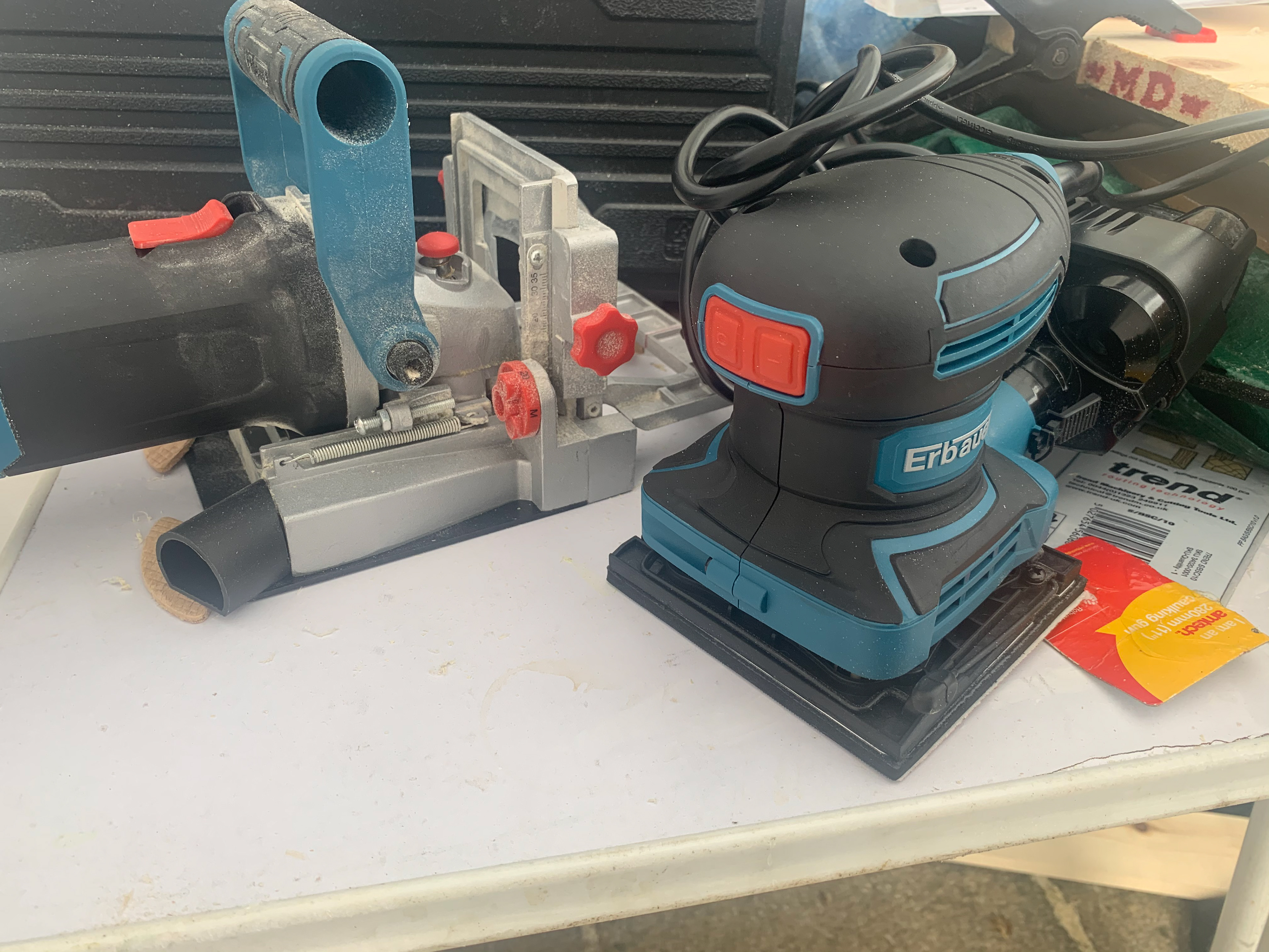
Like the wood I needed to source my own equipment. I knew that I would most likely be able to hire the equipment however after some thinking I realised that it would make sense to buy the equipment to start my ‘business’. I looked at lots of different sites and models, rationalising the price point with the reviews and models. In the end I think I have started to build a strong equipment base.
MAKING
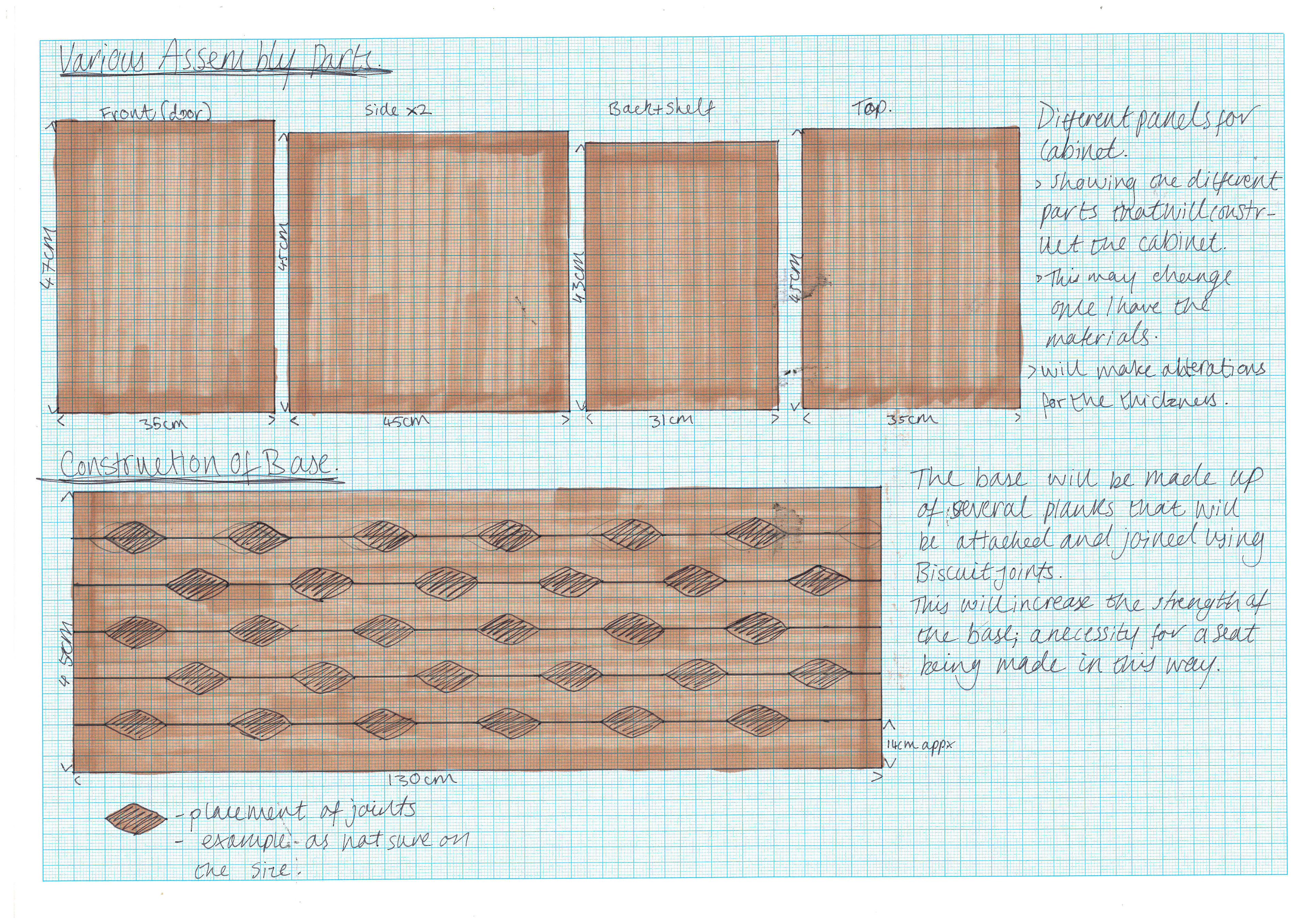
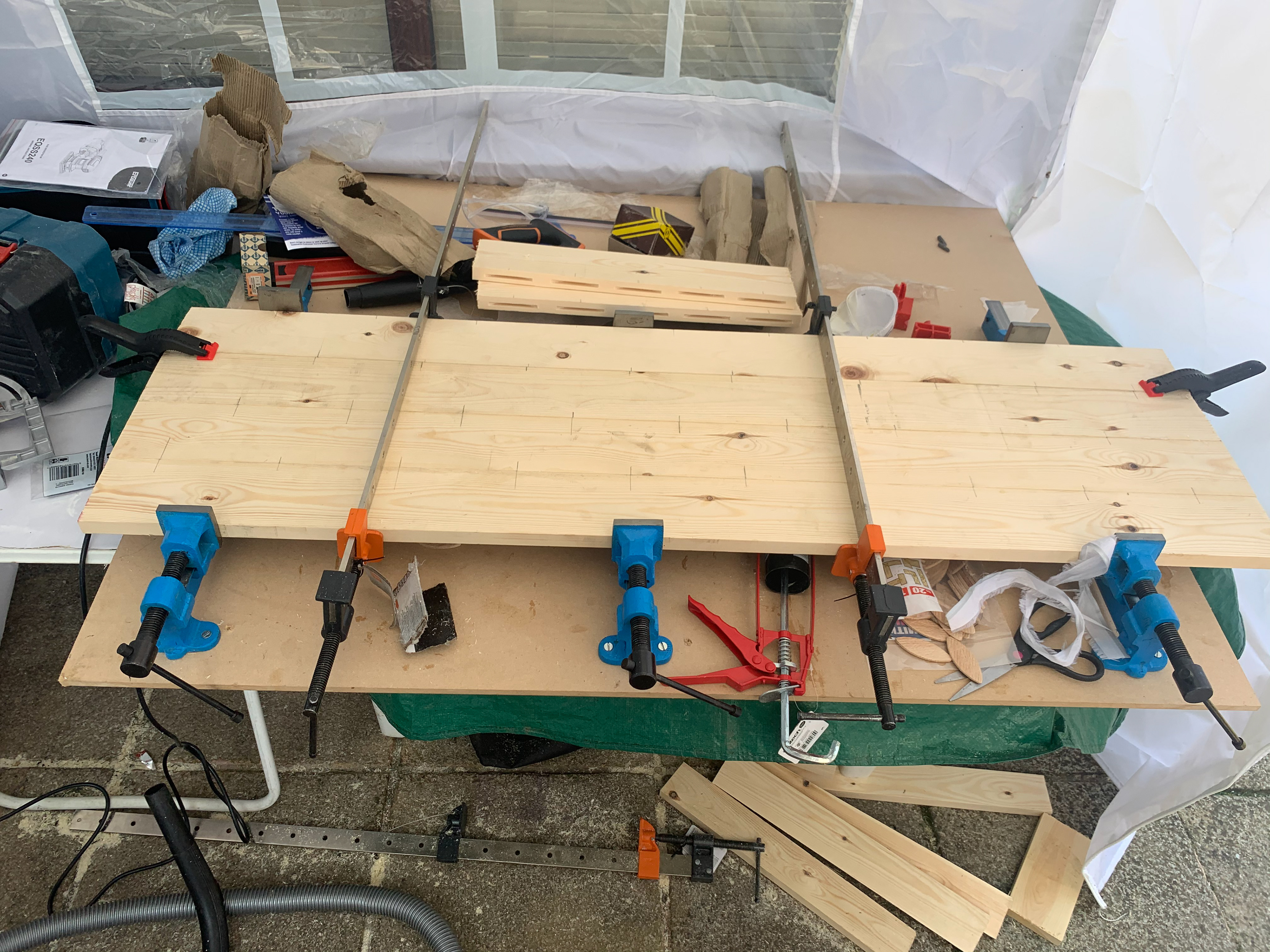
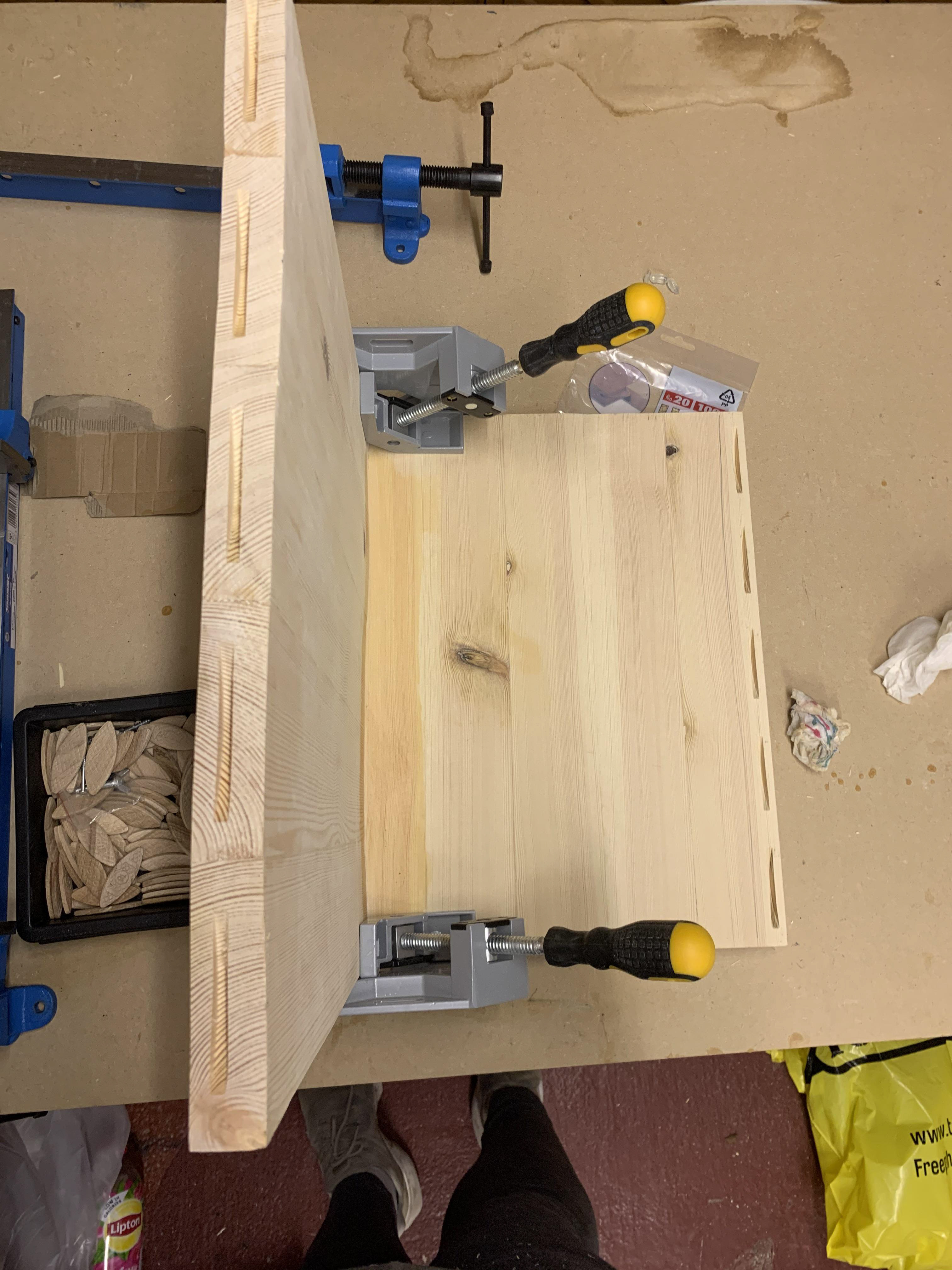
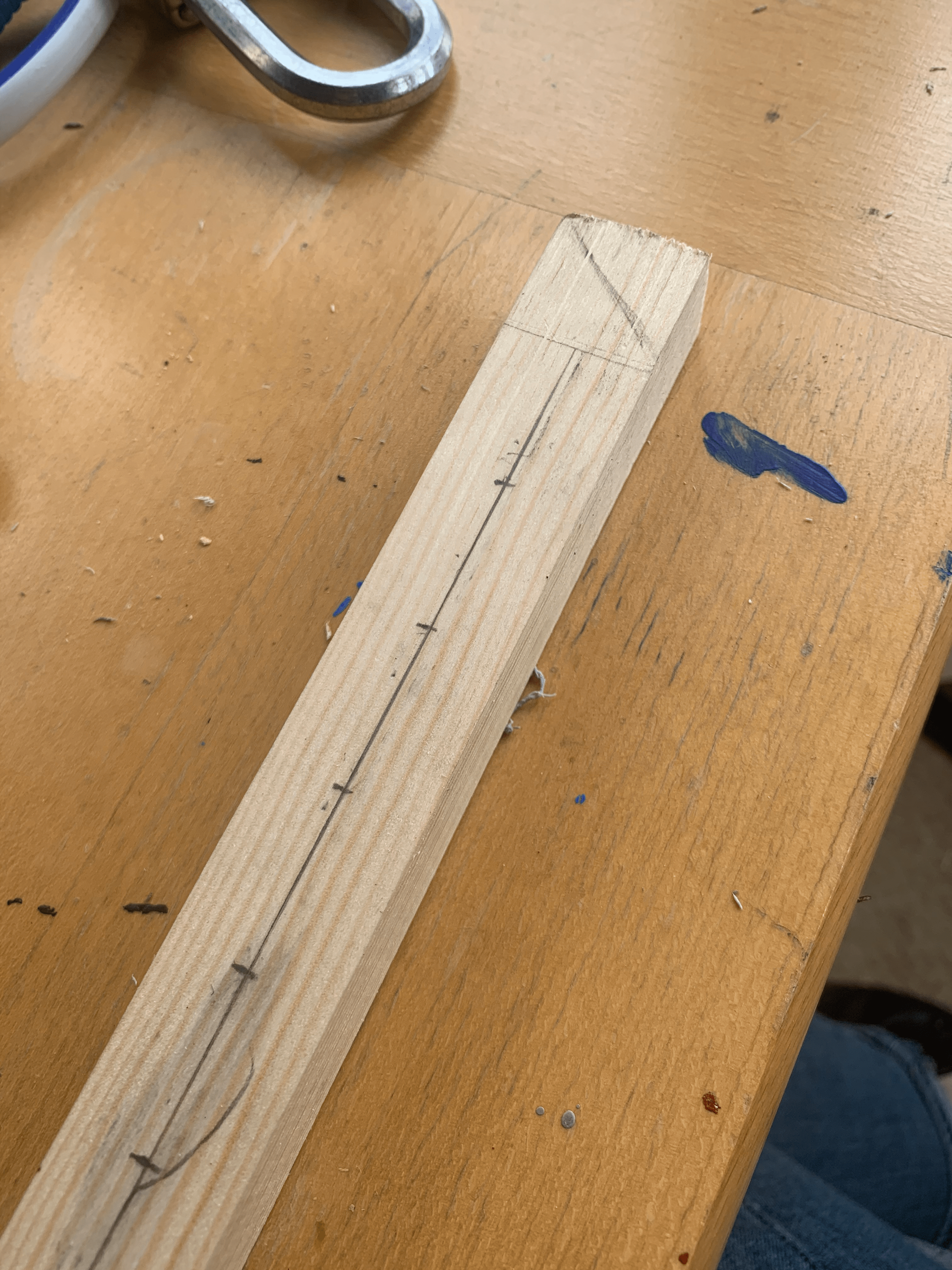
I marked up the wood in a way that I thought would be the most supportive. I thought that alternating the joints in the base would be the best way to handle weight distribution. The side panels, top, and door I did all the joints parallel.

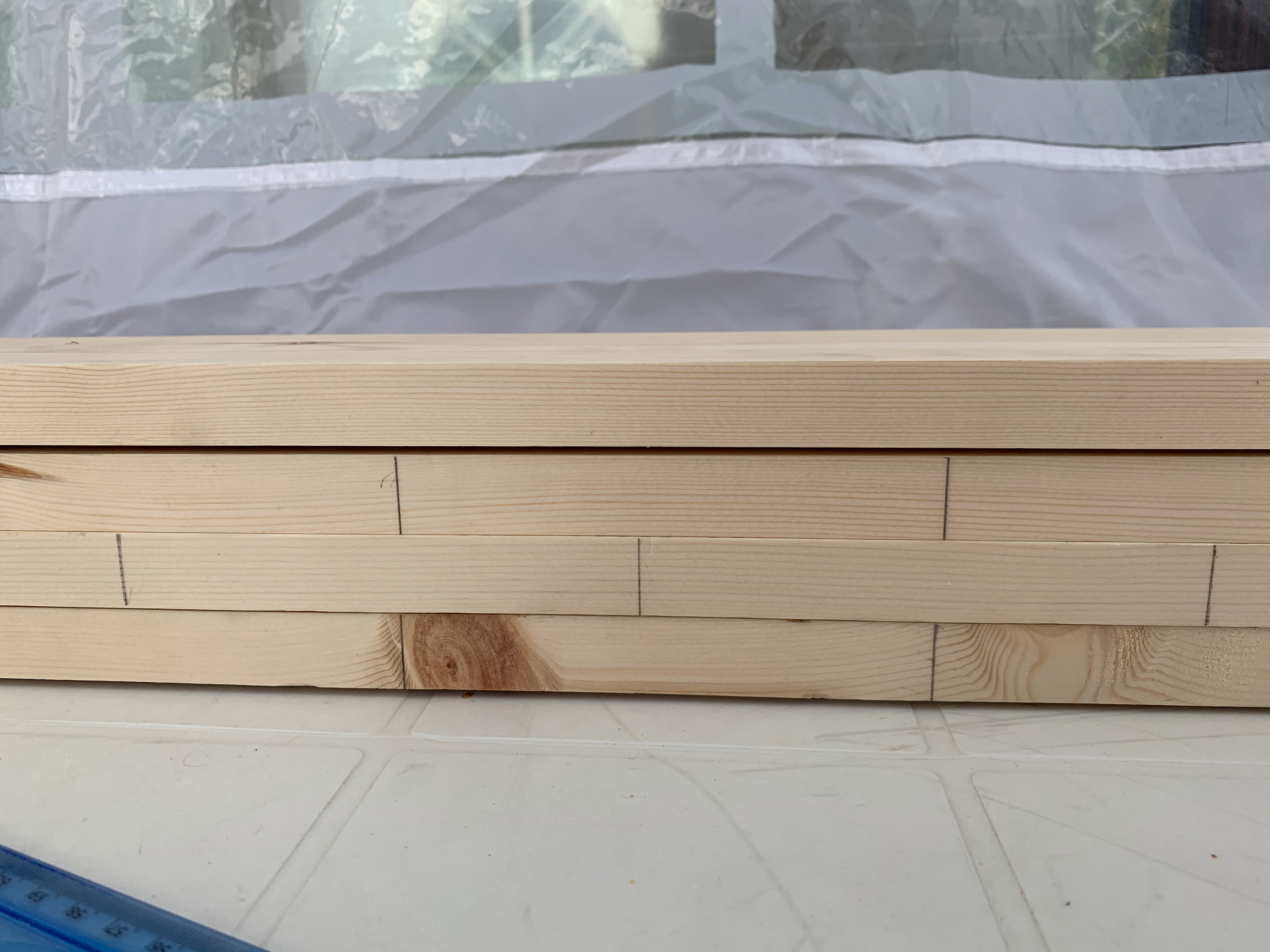
I started by getting to grips with the equipment. I hadn't used a biscuit cutter before and so wanted to make sure I understood the tool before I started the actual piece. I had been told that there was a bit of a kick to the tool when you first turned it on, and so was prepared for this, what I wasn’t prepared for was the amount of movement there was when you are trying to cut into the wood. If you don’t put enough pressure behind it to keep it in place there is a big chance that it will move, increasing the size of the cut.
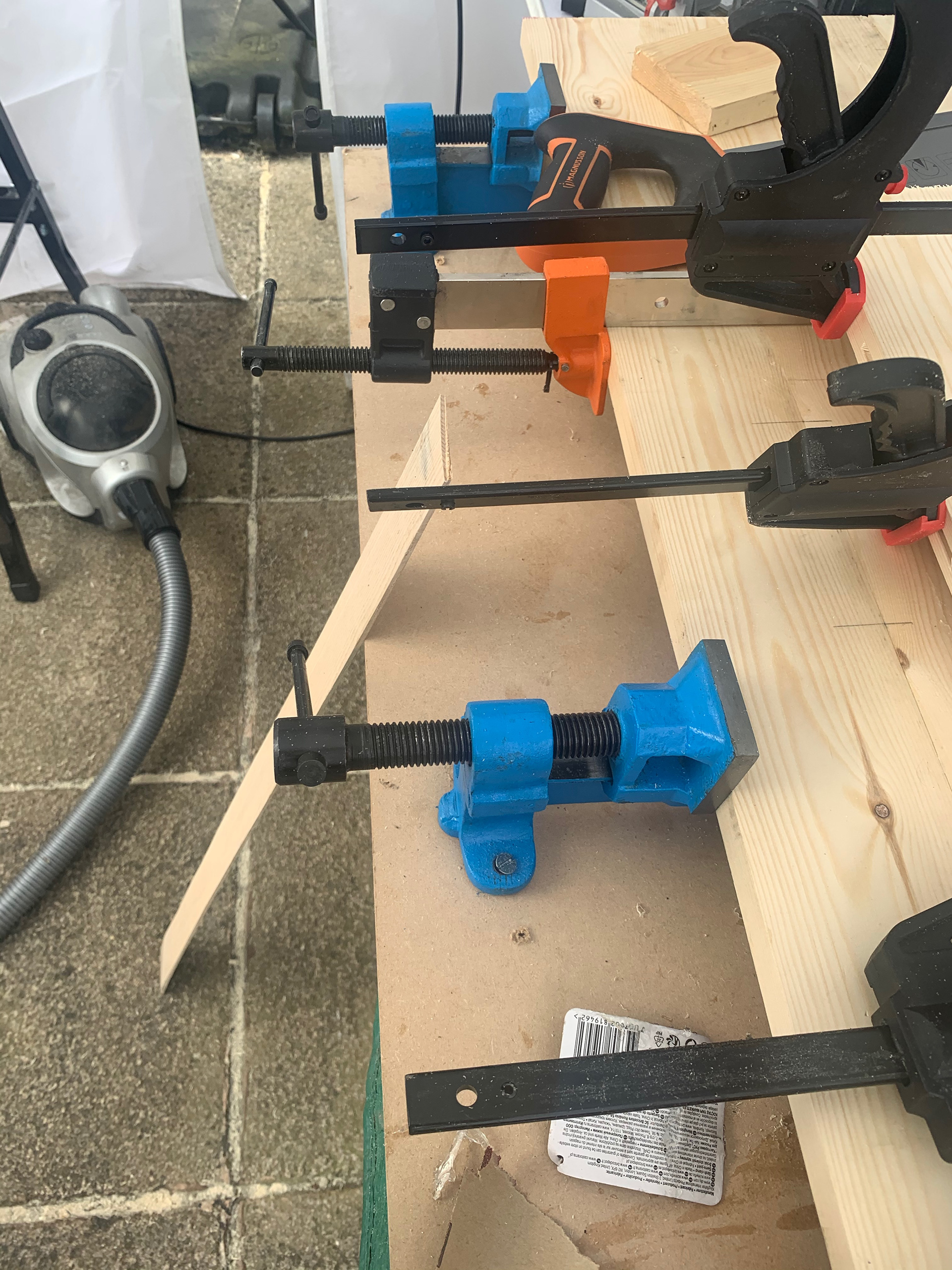
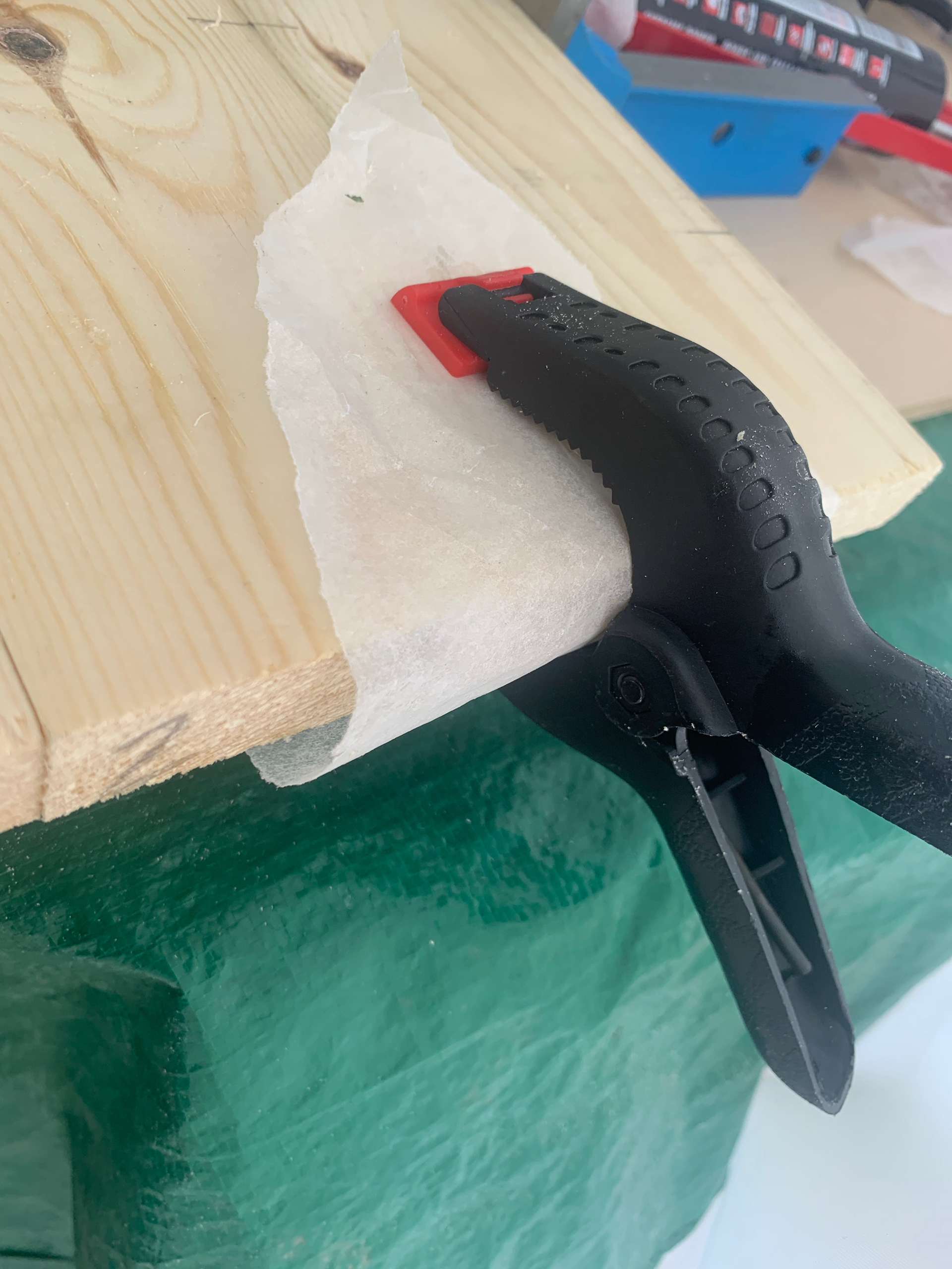
As I started to glue the planks together, I realised that it can be tricky the keep them level. To counteract it I tried to use several clamps; the ones on the bottom have a larger flat surface for the planks to rest on, this would give the best opportunity for them to lay flat whilst drying. The upper clamps can keep the same pressure and level from the top, whilst the two on either end will help to keep it from twisting.

-UPDATE ON MAKING 4/5/2020-
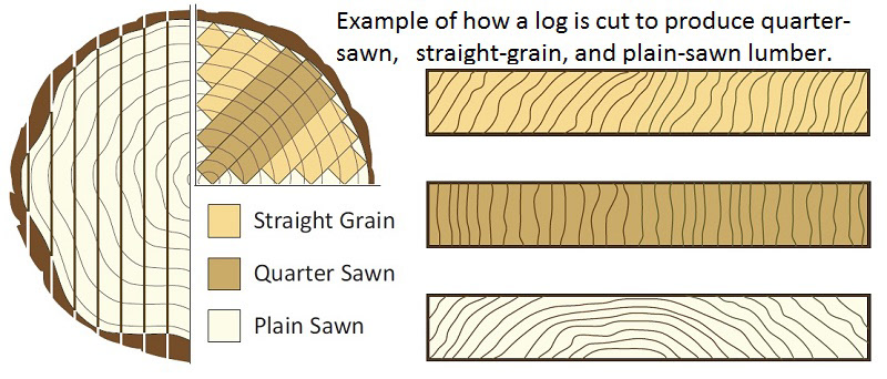
After a few weeks of trying to produce this piece I was really struggling with the supplier that I have been using. The wood was of poor quality with only small amount useable with each order. I then learned that a supplier I have used before was open for delivery and collection of smaller orders. The new wood was thicker with fewer knots and imperfections. The planks also seemed to come from a different section of the log, this was potentially the cause of the better quality. By finding a new supplier it does mean that I have had to start again which will give me less time. From the diagram below it seems that the new timber is quarter sawn whereas the original was plain.
ASSEMBLY
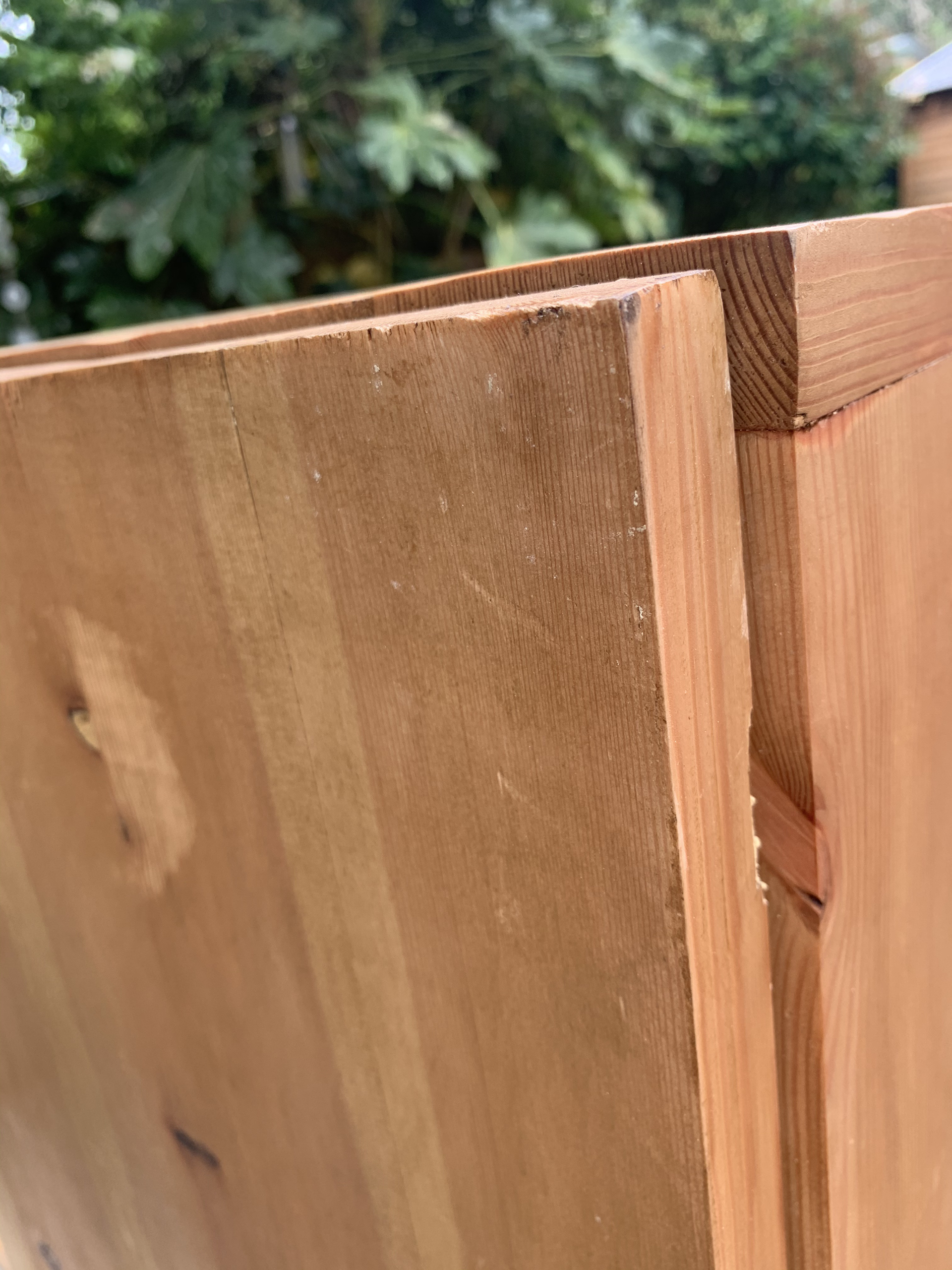
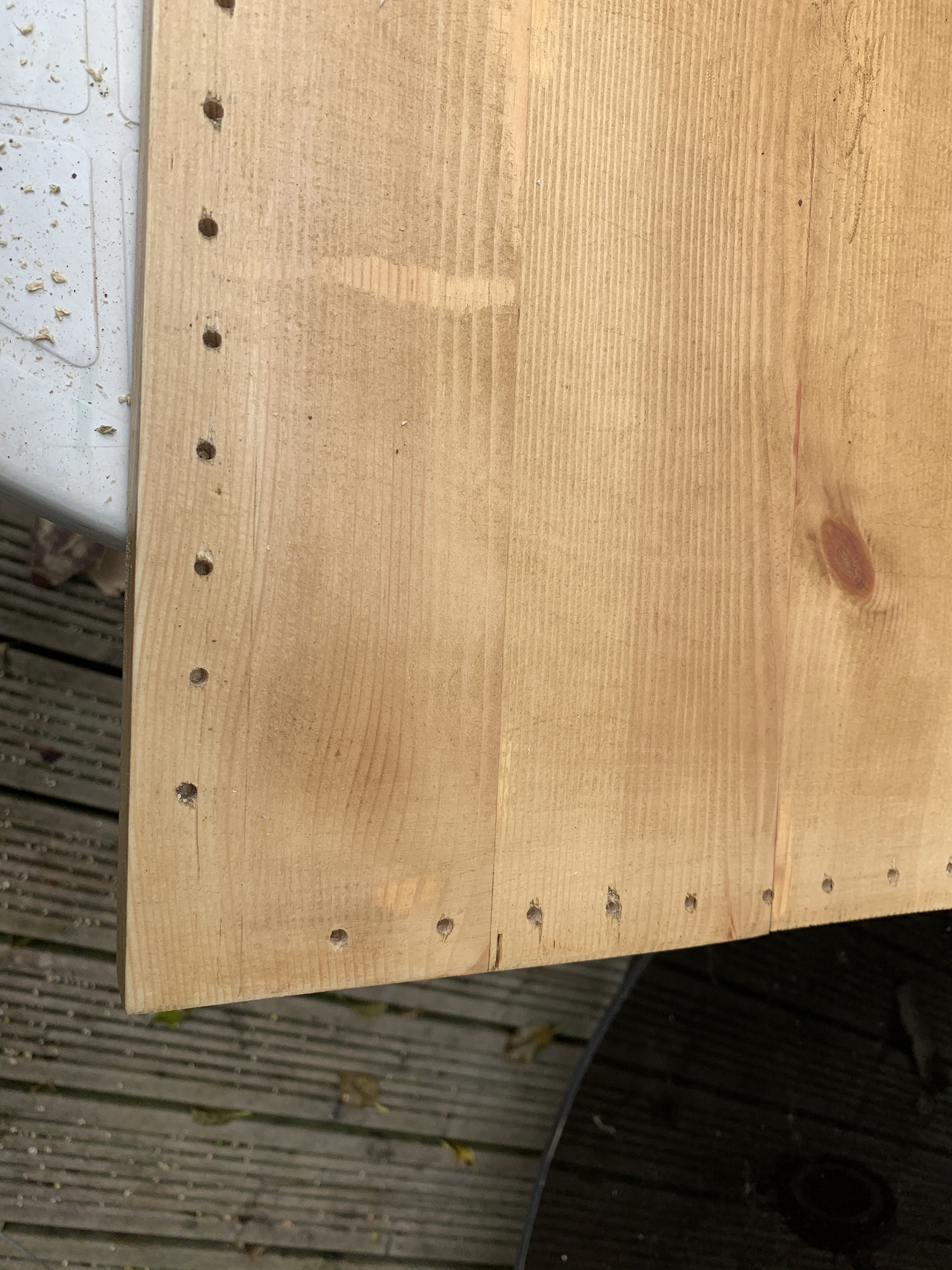
I will admit I hadn't given much thought to this section of the process. I didn’t want to use screws as this would ruin the aesthetics of the piece. It was then I realised that the biscuits that I had used for the construction of the boards can also be used for this. All I had to do was adjust the plate on the cutter to allow me to cut vertically, I then matched this with the corresponding cut on the side panel. I had purchased some corner clamps to keep the pieces steady whilst they dry. Once dry I can sand them down to the point where they are flush with each other.
I will then repeat this on the base of the piece to attach the cupboard section. The biscuit joint seems to be a very versatile and adaptable joint. As well as being straight forward and easy to create. I have next to no experience with wood joint techniques and so I am very glad that I was introduced to the technique. This has given me a good base for my work and I hope to explore the world of wood joints further to create for more sophisticated designs.
Below is an image of the two components setting. This was difficult to line up however I managed to get it altogether eventually.

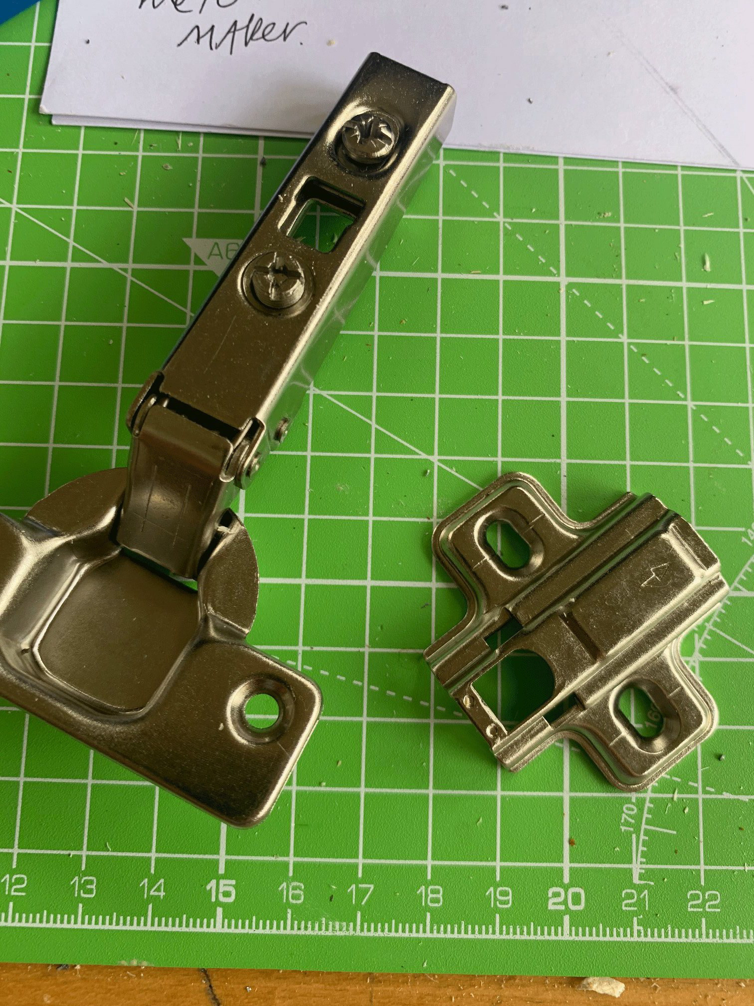
HINGE EXPLORATION
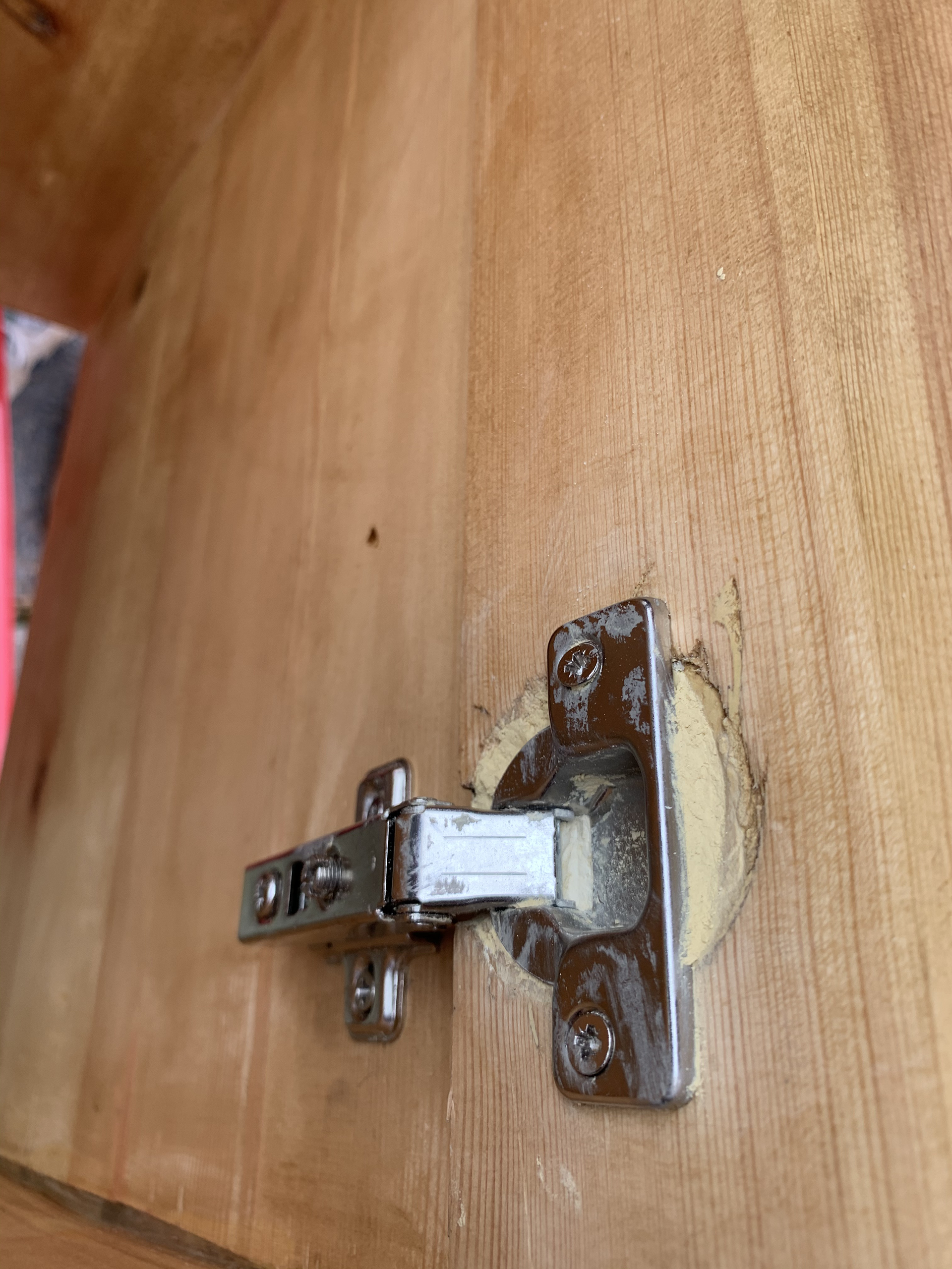
I have never had to install hinges before. And I couldn’t have chosen a trickier one. I purchased concealed hinges for this project as they wouldn’t disrupt the lines of the piece. When I bought them, I thought that I would have the support of the workshops and in turn the guidance on how to install them. However due to the current pandemic this isn't the case. Instead I have had to watch several tutorials online as well as gone off the advice of those around me. To reduce the chances of getting it wrong, I practiced on some spare pieces of wood. This was successful once I had gotten the hang of using the 35mm bit.
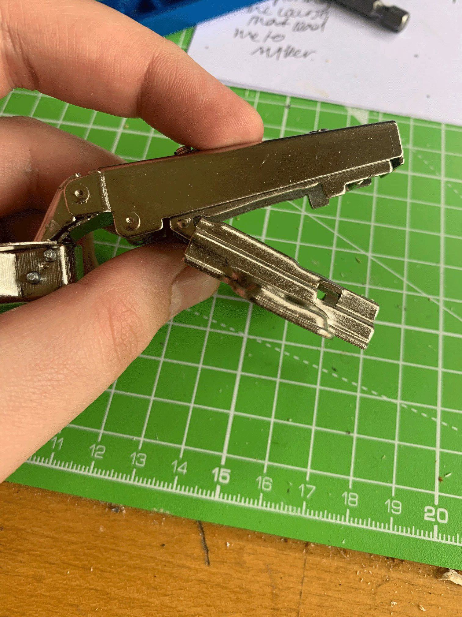


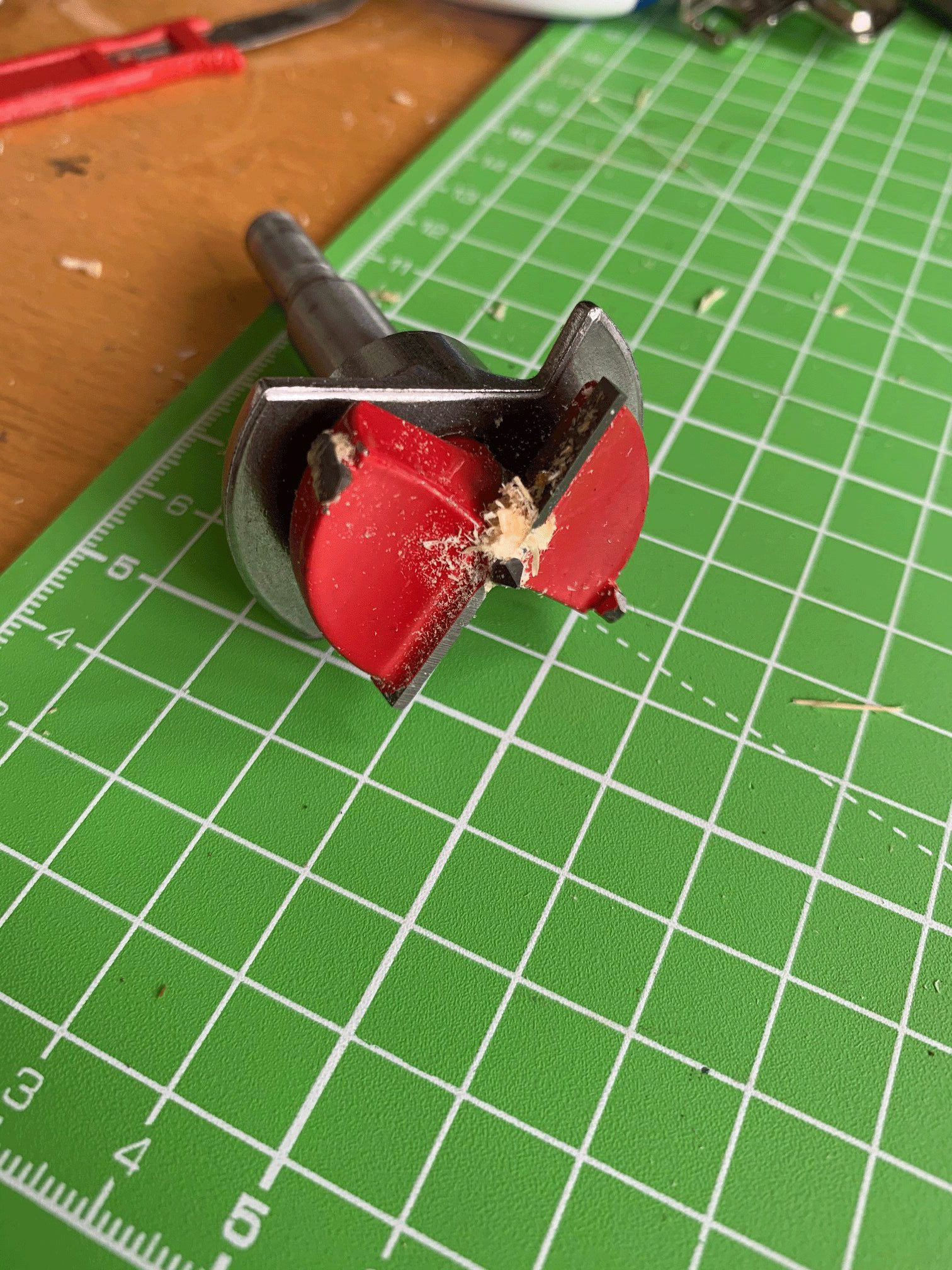
The drill bit came with a guard to get the correct depth for the hinge it rest in. This also took some figuring out. The next problem that I needed to understand was how to adjust the hinges so that they opened and closed smoothly. Once this was figured out, I moved on to start putting them on the piece.

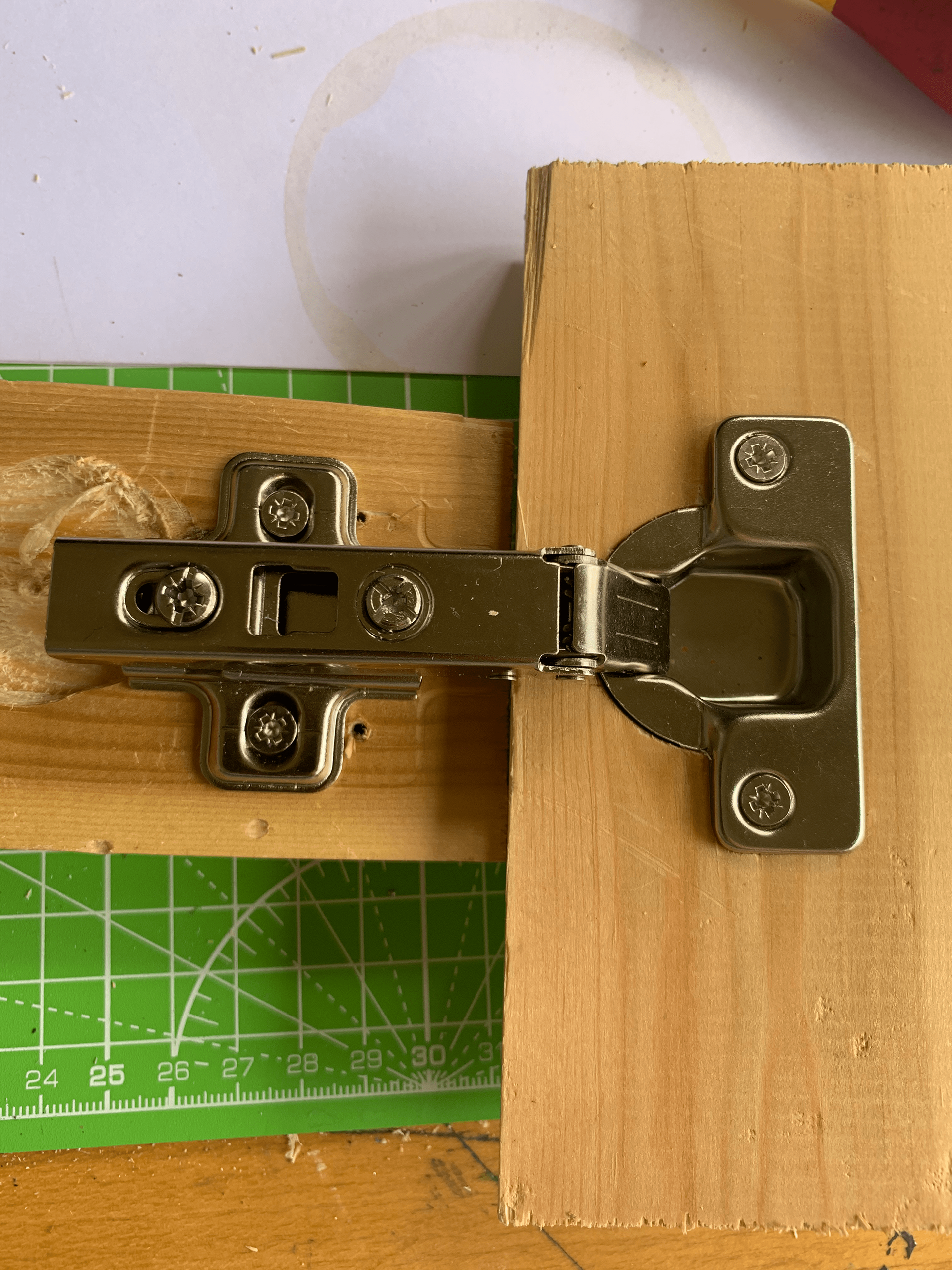
When it came to putting the hinges on the door, I followed the advice of the tutorials carefully, yet I still ran in to several problems. I got some advice from someone who had some experience with the hinges. It was discovered that I had sunk the hinges in the wrong place as well as the wood being potentially too thick for the hinges.
The only way that I seemed to get the hinges to open correctly would be if the placement of the door is slightly set back from the edge. This does mean however that there is an overhang on the other side. I am happy to tolerate the set back on one side but will need to trim down the door to remove the overhang; the overhang is on the side of the seat and so could lead to someone catching themselves on it when sat down.

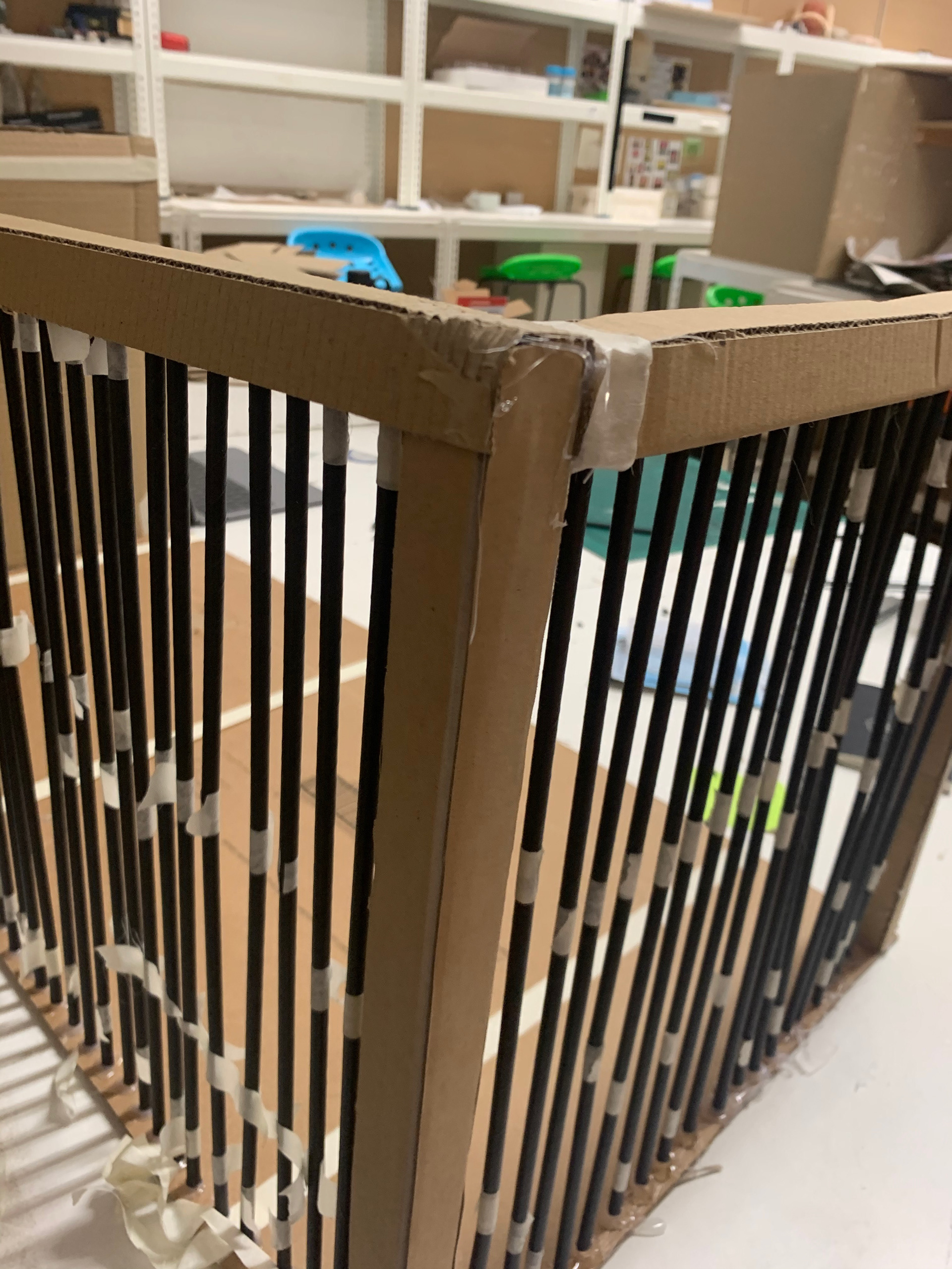
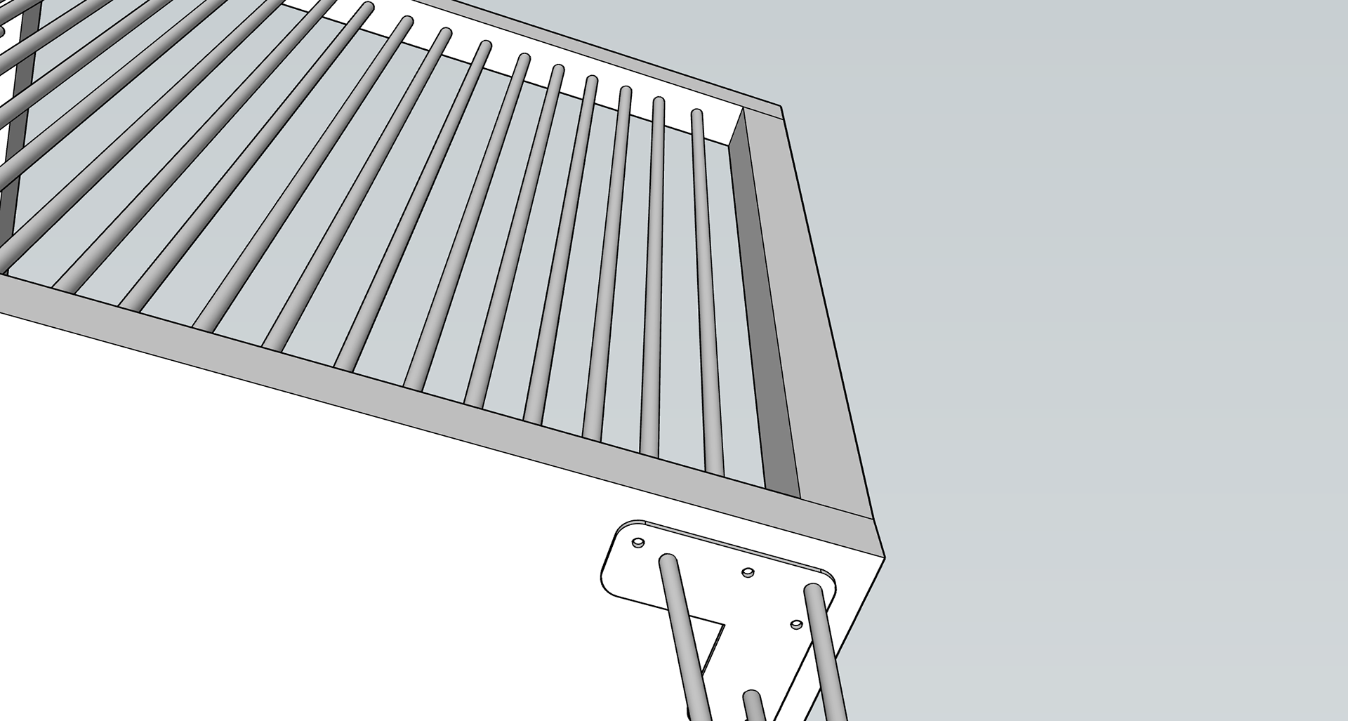
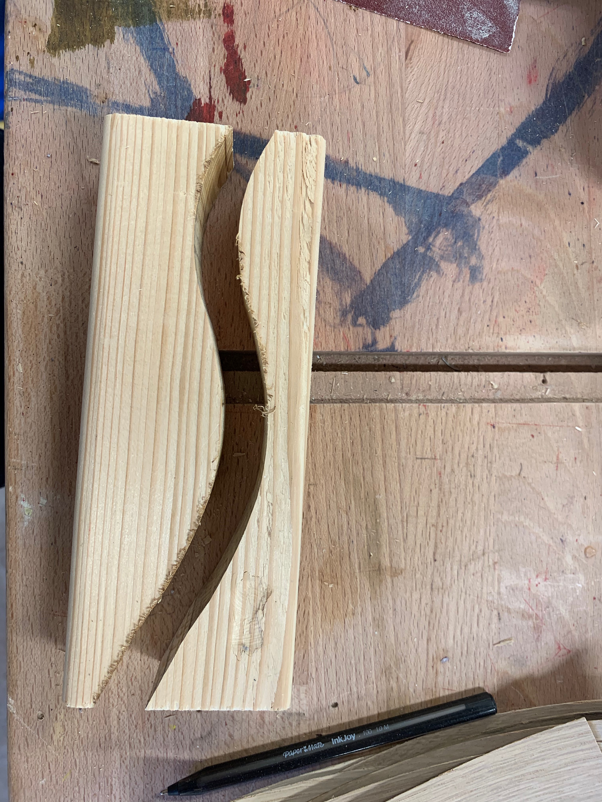
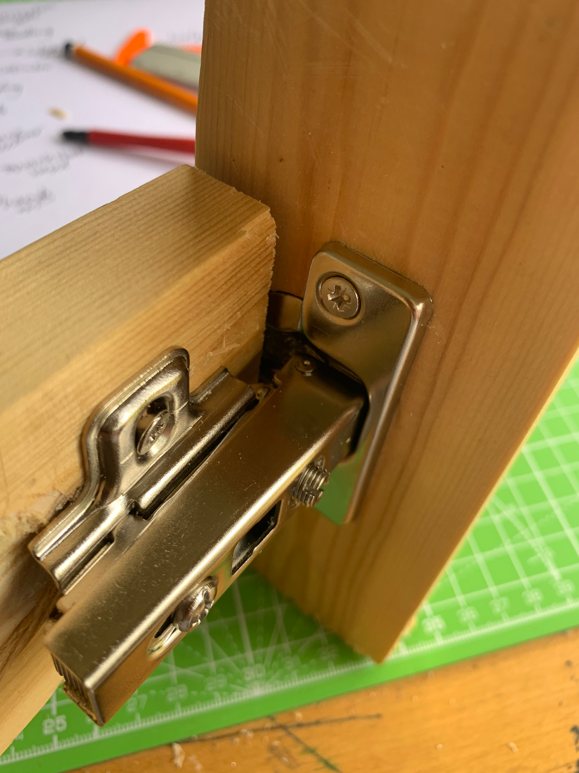
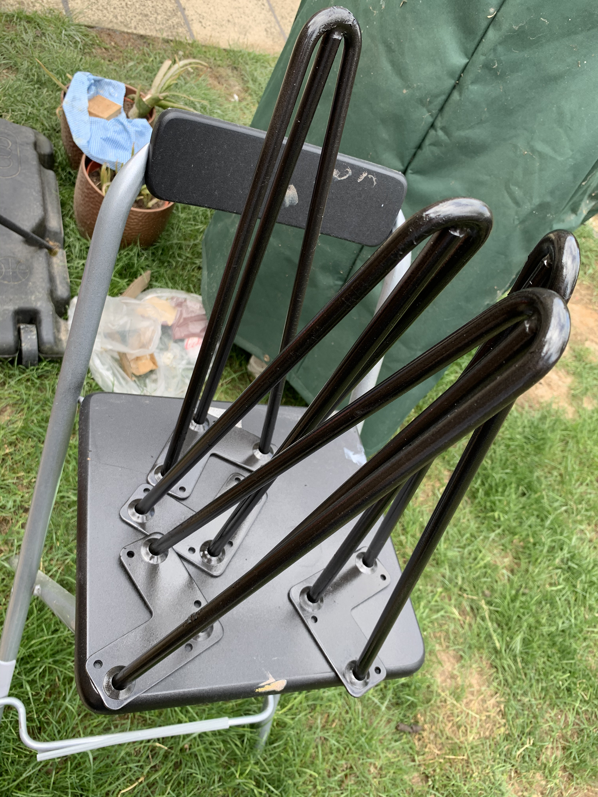
BACK REST
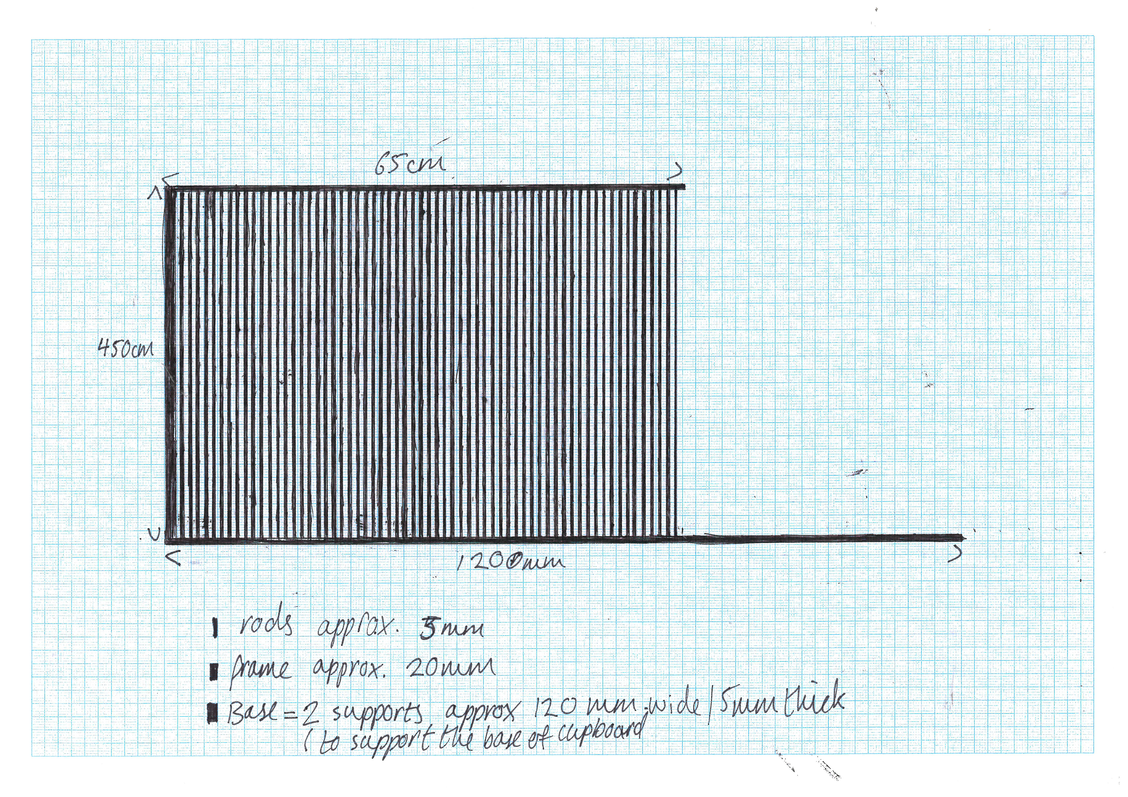
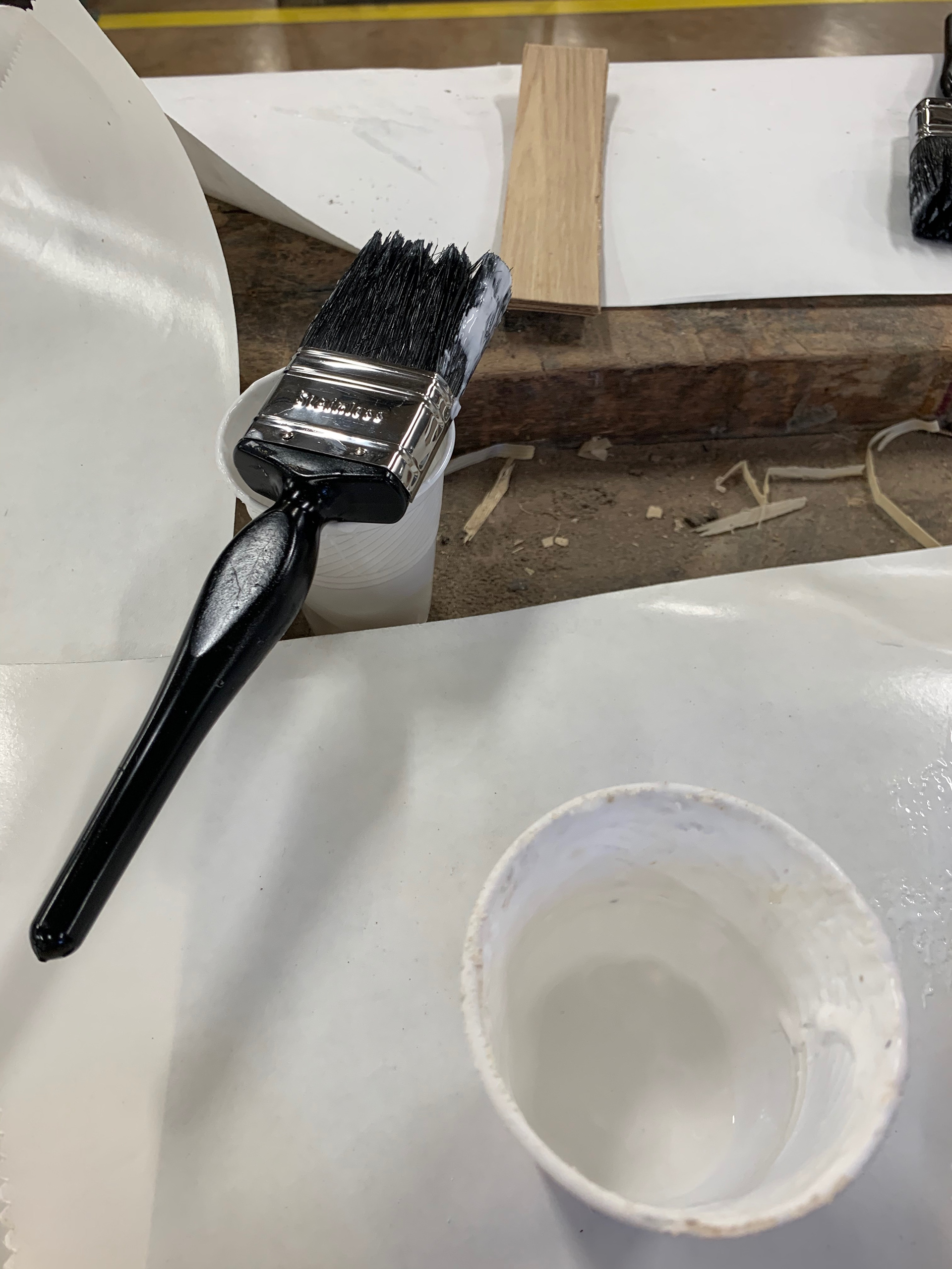
The biggest compromise on this design is the back rest. The original design had had an aluminium frame with 3mm steel rods. This aspect of the design is one I cannot replicate at home. Therefore, what I am doing is imitating the effect with wood that is painted the same colour. It won't be as strong as the original concept but will allow people to see what was intended for the piece.
Instead of the steel rods I am using 3mm dowels. These are very fragile, which means that whilst the imitation frame is there the piece may not be useable. However, once the facilities of the workshops are available I will able to make the full realised design. For the purpose of this module I will have to use the dowels.
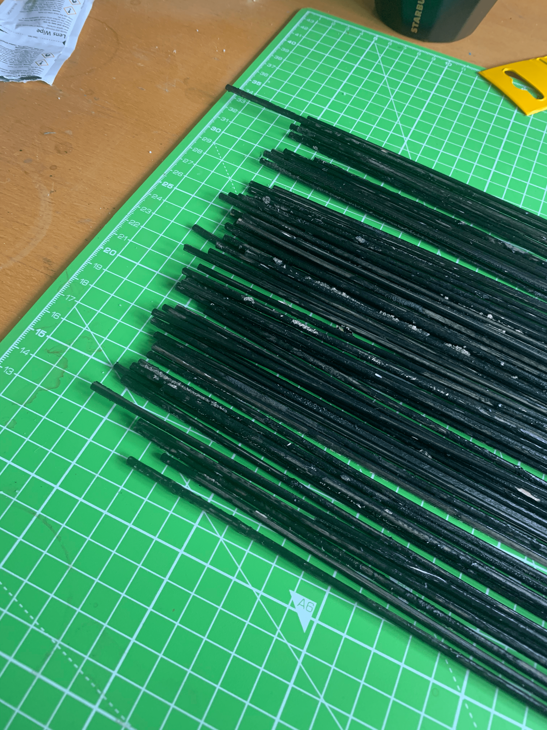
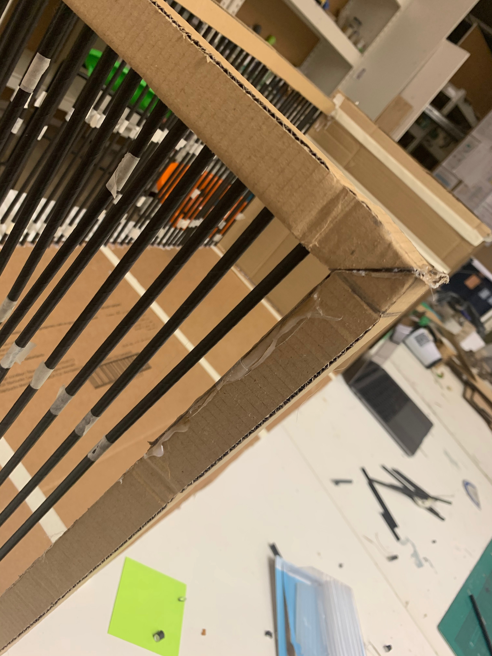
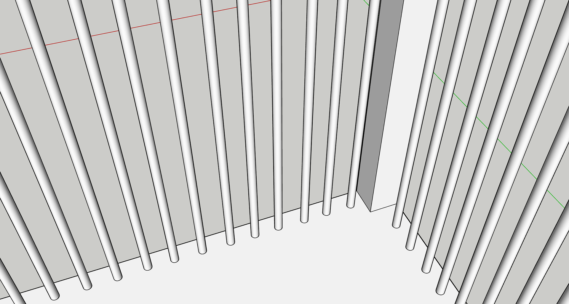
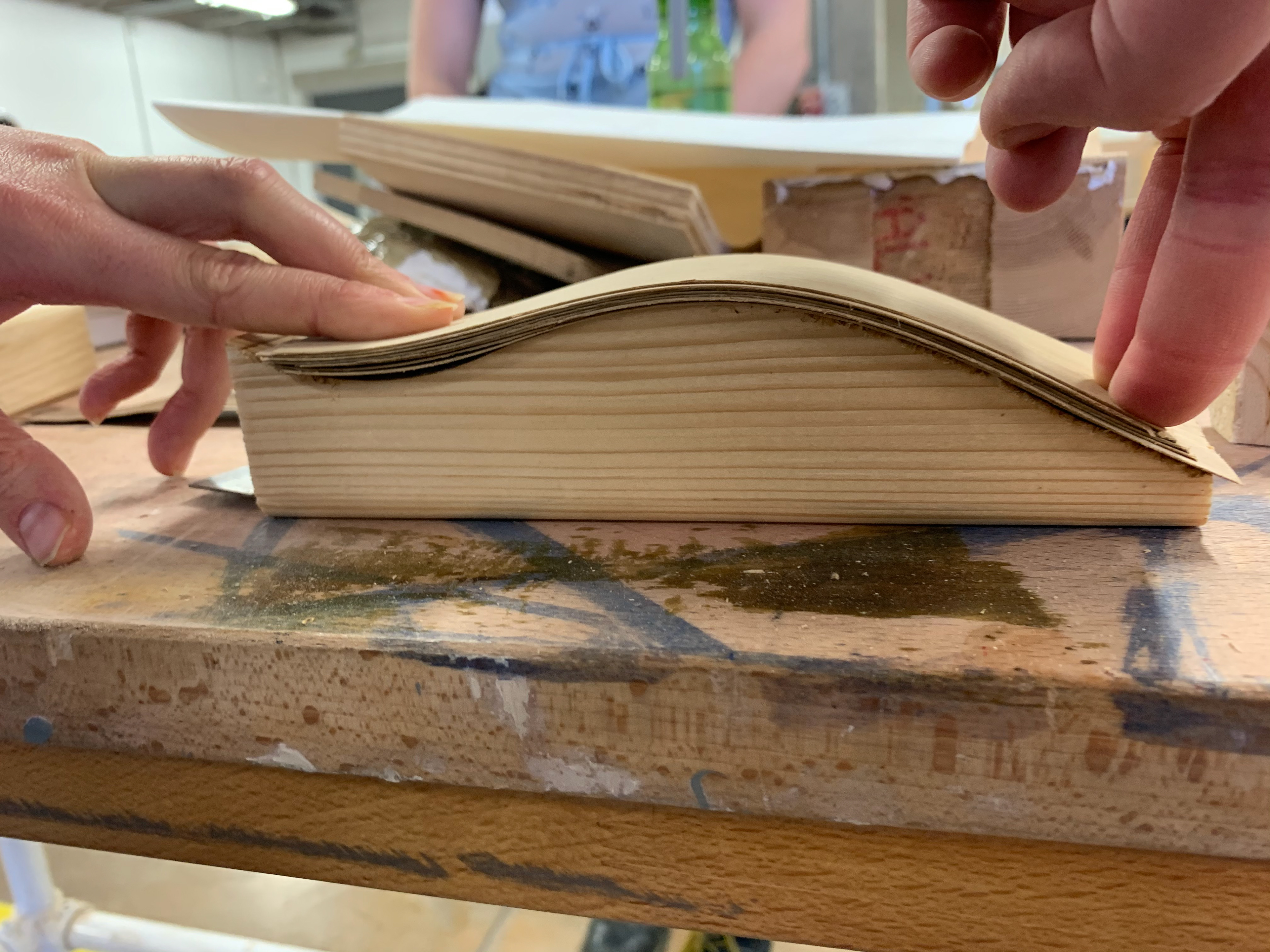
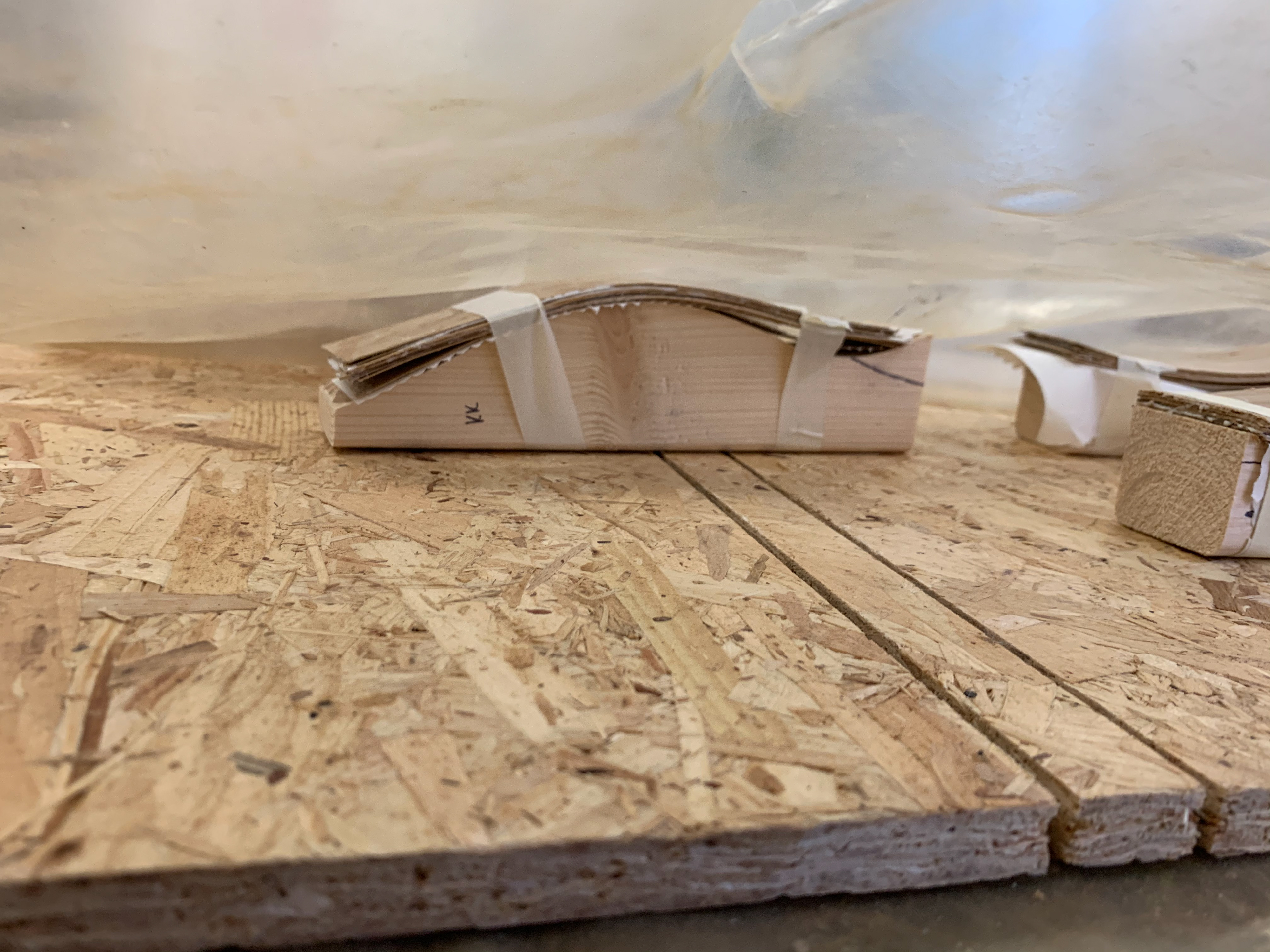
For the frame I cut the separate parts at an angle so that they would form a right angle. This will hopefully create a sturdy frame that is accurately measured. The frame will also have holes that line up with the base of the piece, these are where the dowels will be placed. The next challenge will be lining the dowels up at both ends whilst also attaching the frame, without snapping them.

Once the frame was constructed, I realised that it wasn’t the strongest and so the next bit was going to be even more challenging. To start with I placed the dowels in the frame to then line it up with the corresponding holes; but when I flipped it, most of them fell out and the frame fell apart....
…. so, I quickly stuck it back together and rethought my approach.
I decided to attach the frame completely and then gently manipulate the dowels into the slots. I had to put 52 rods into the frame and the base, and I had 55 chances to get it right. I had a little bit of help to get them all inserted, and it was very close to being a bit of a disaster. I had no spare rods by the time we finished. However, we managed it with only a little bit of a tantrum!


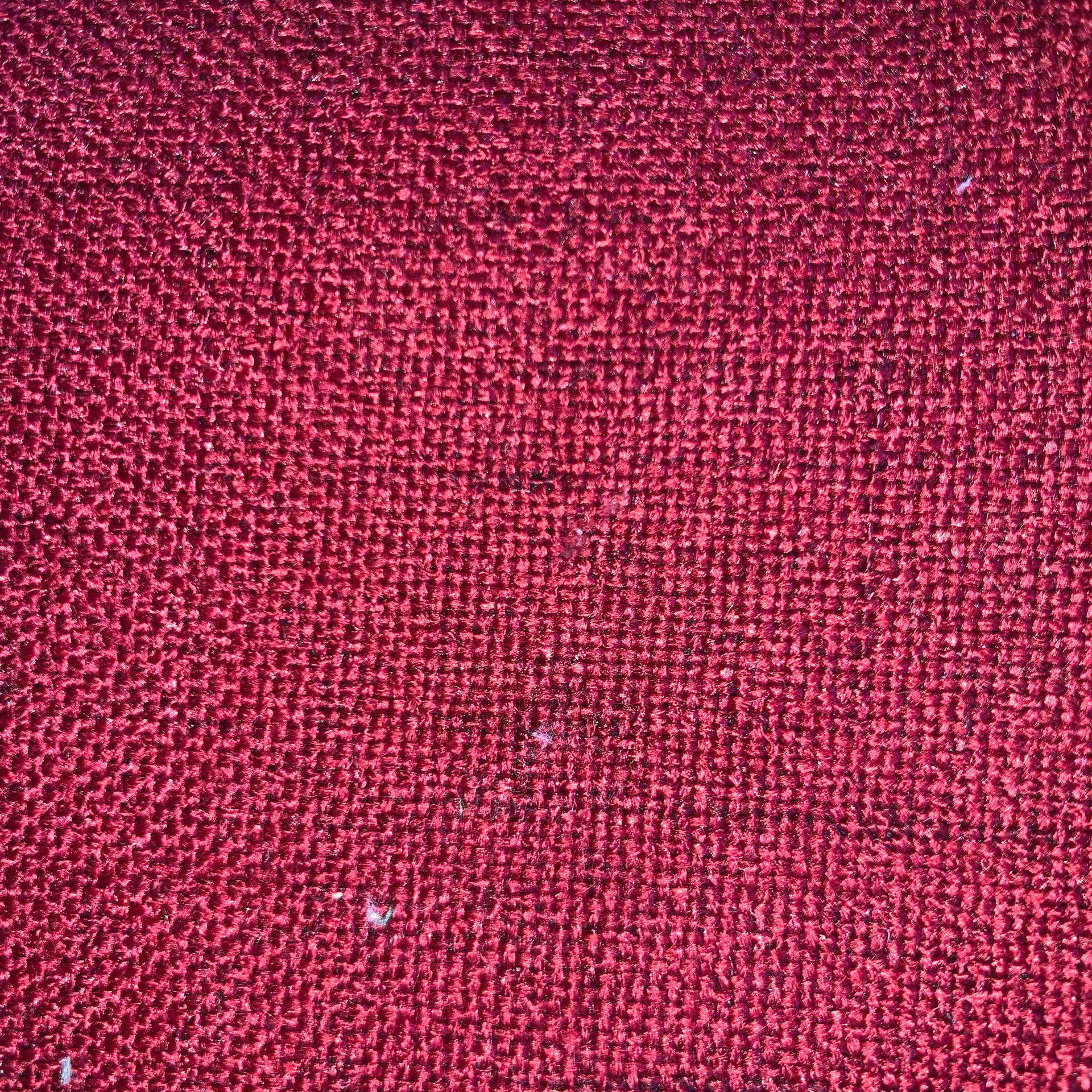
YUCA UPHOLSTERY FABRIC – RASPBERRY (Art-No. 170_yuca_59_M)

UPHOLSTERY FABRIC ARNE – PEPPERMINT (Art-No. 170_arne_71_M)
UPHOLSTERY FABRIC PRADO – ROYAL BLUE (Art-No. 170_prado_57_M)
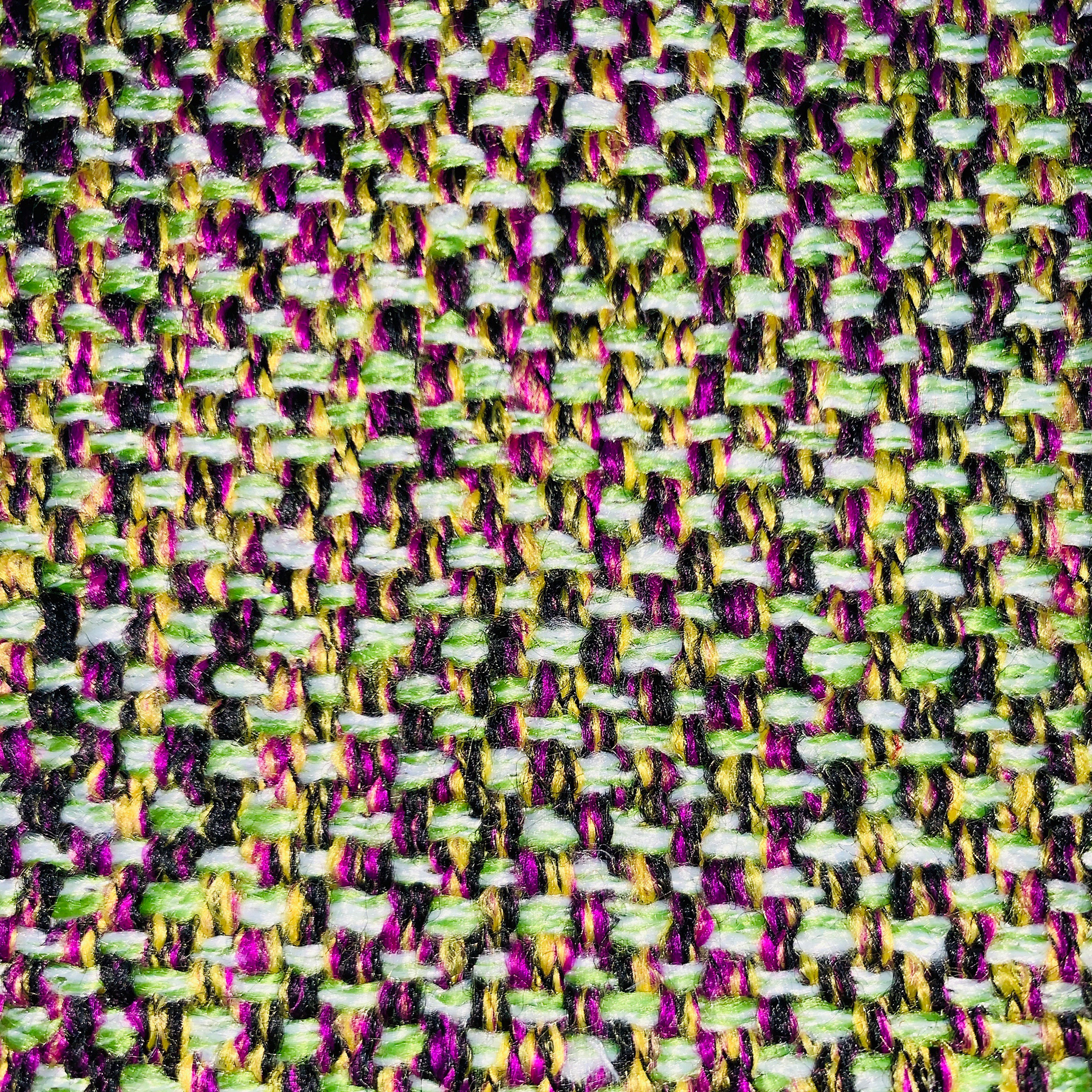
UPHOLSTERY FABRIC PRADO – APPLE GREEN (Art-No. 170_prado_69_M)
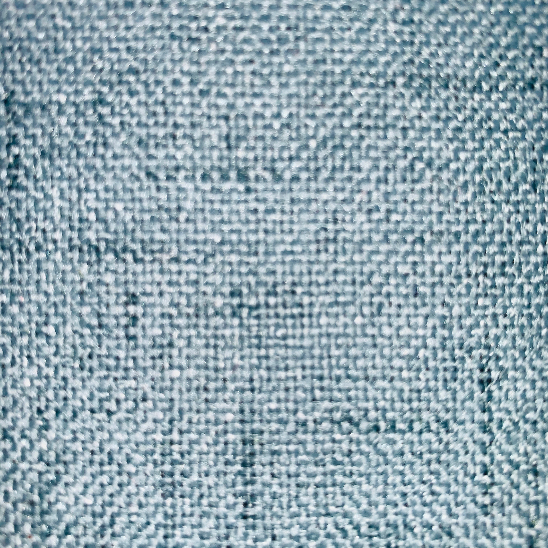
YUCA UPHOLSTERY FABRIC – PEPPERMINT (Art-No. 170_yuca_82_M)
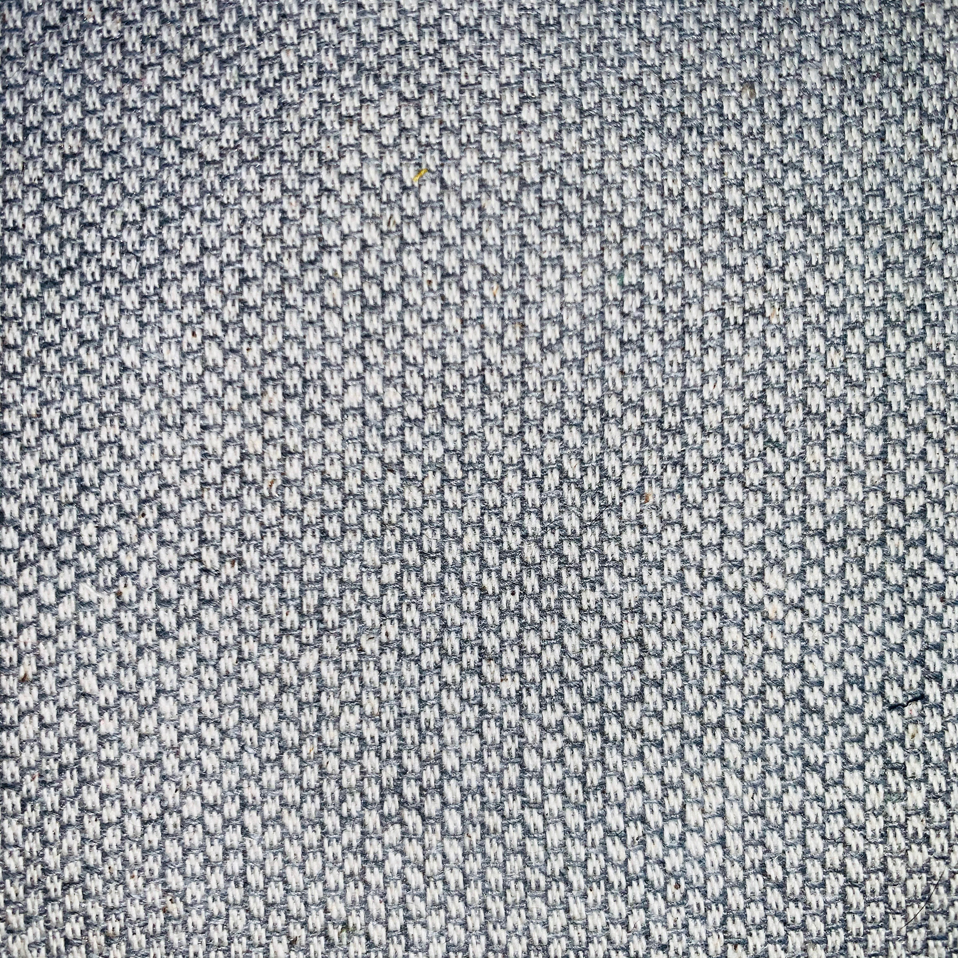
MINI POINTS JACQUARD FURNISHING FABRIC – LIGHT GREY (Art-No. 16_06841_04_M)

YUCA UPHOLSTERY FABRIC – PETROL (Art-No. 170_yuca_87_M)
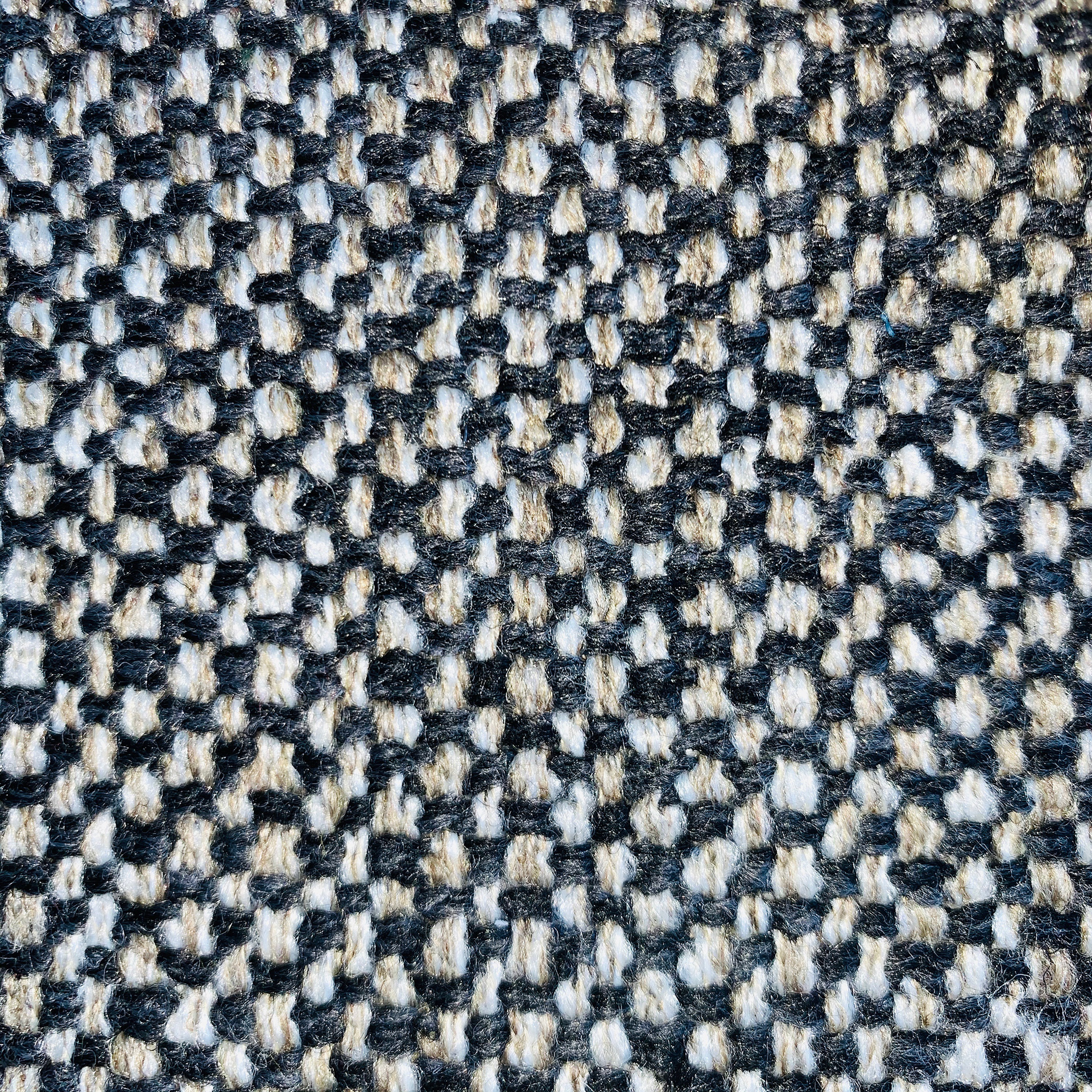

UPHOLSTERY FABRIC AZAR – MUD (Art-No. 170_azar_13_M)
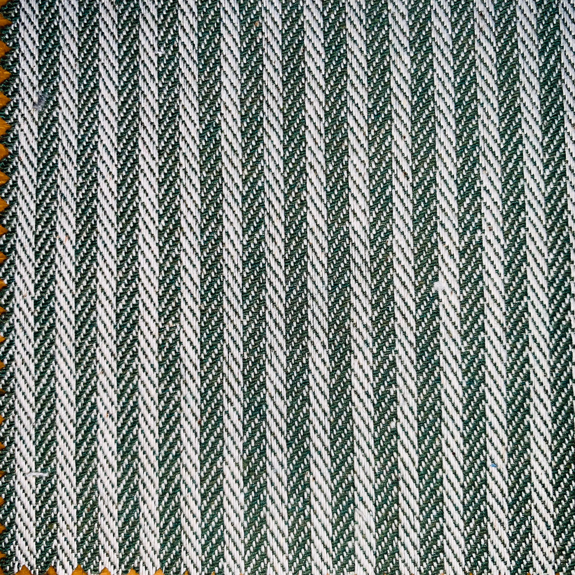
STRIPE JACQUARD FURNISHING FABRIC (Art-No. 16_06842_14_M)
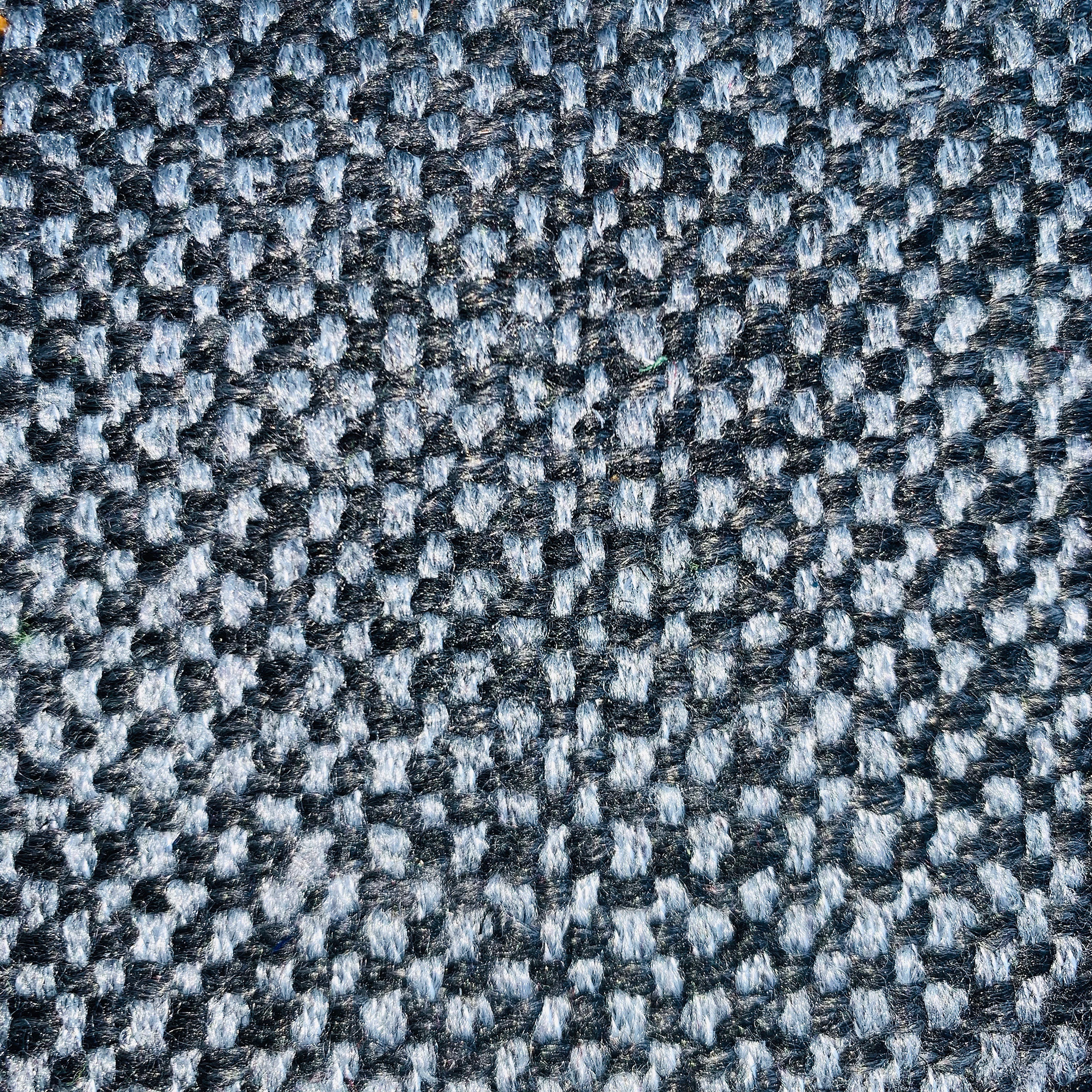
UPHOLSTERY FABRIC PRADO – ANTHRACITE (Art-No. 170_prado_16_M)
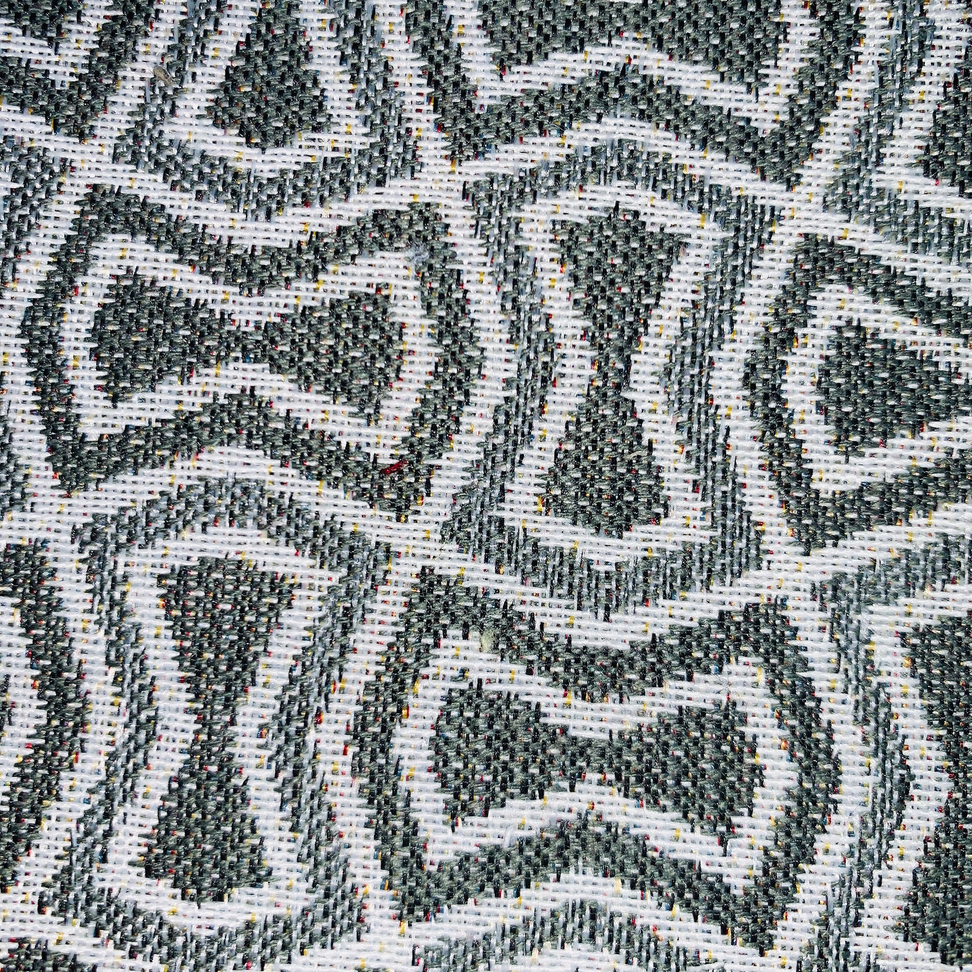
JACQUARD DECOR AND FURNISHING FABRIC ABSTRACT – GREY/CREAM (Art-No. 140_4031_01_M)
MINIRUTE JACQUARD FURNISHING FABRIC – BEIGE (Art-No. 16_06843_02_M)
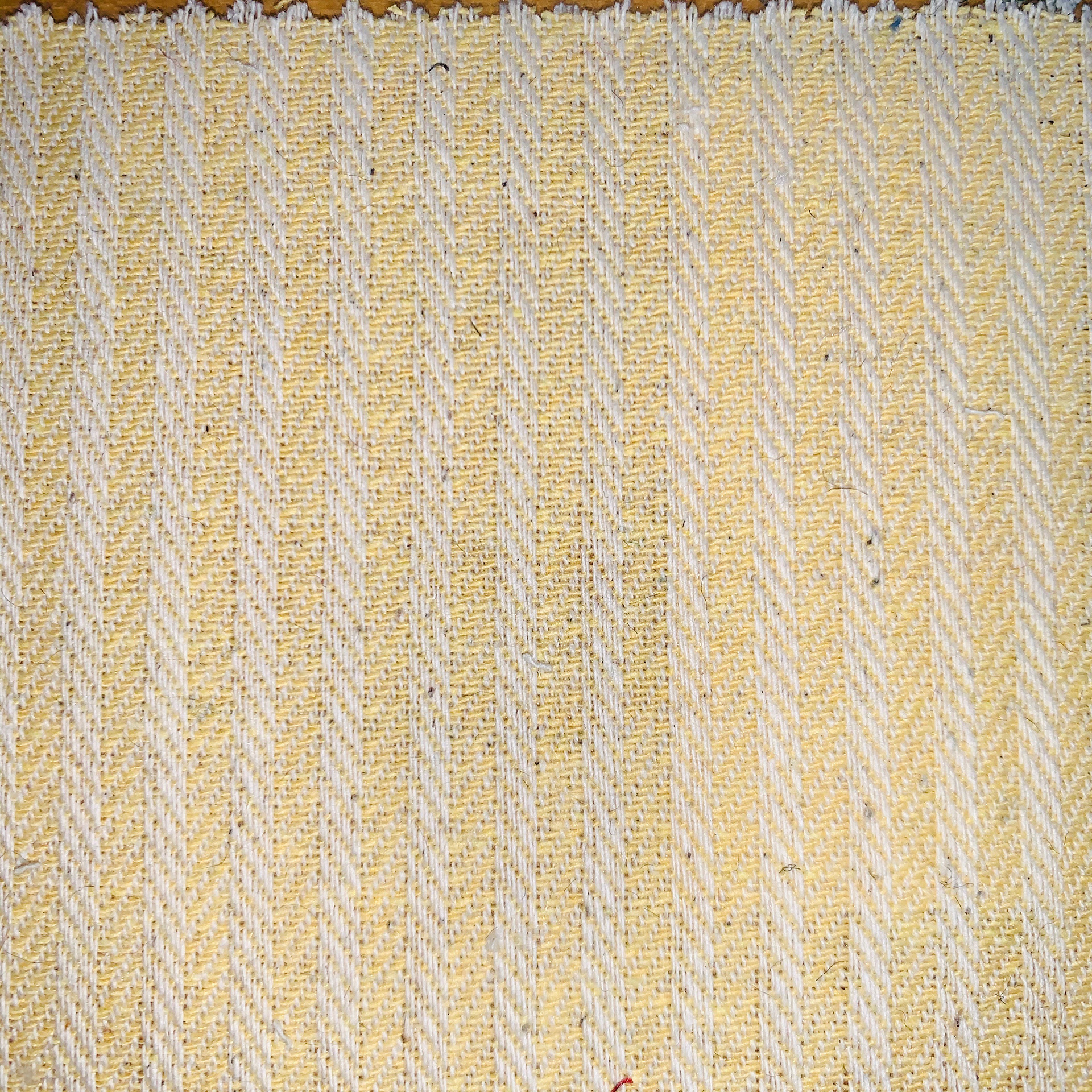
STRIPE JACQUARD FURNISHING FABRIC – YELLOW (Art-No. 16_06842_10_M)
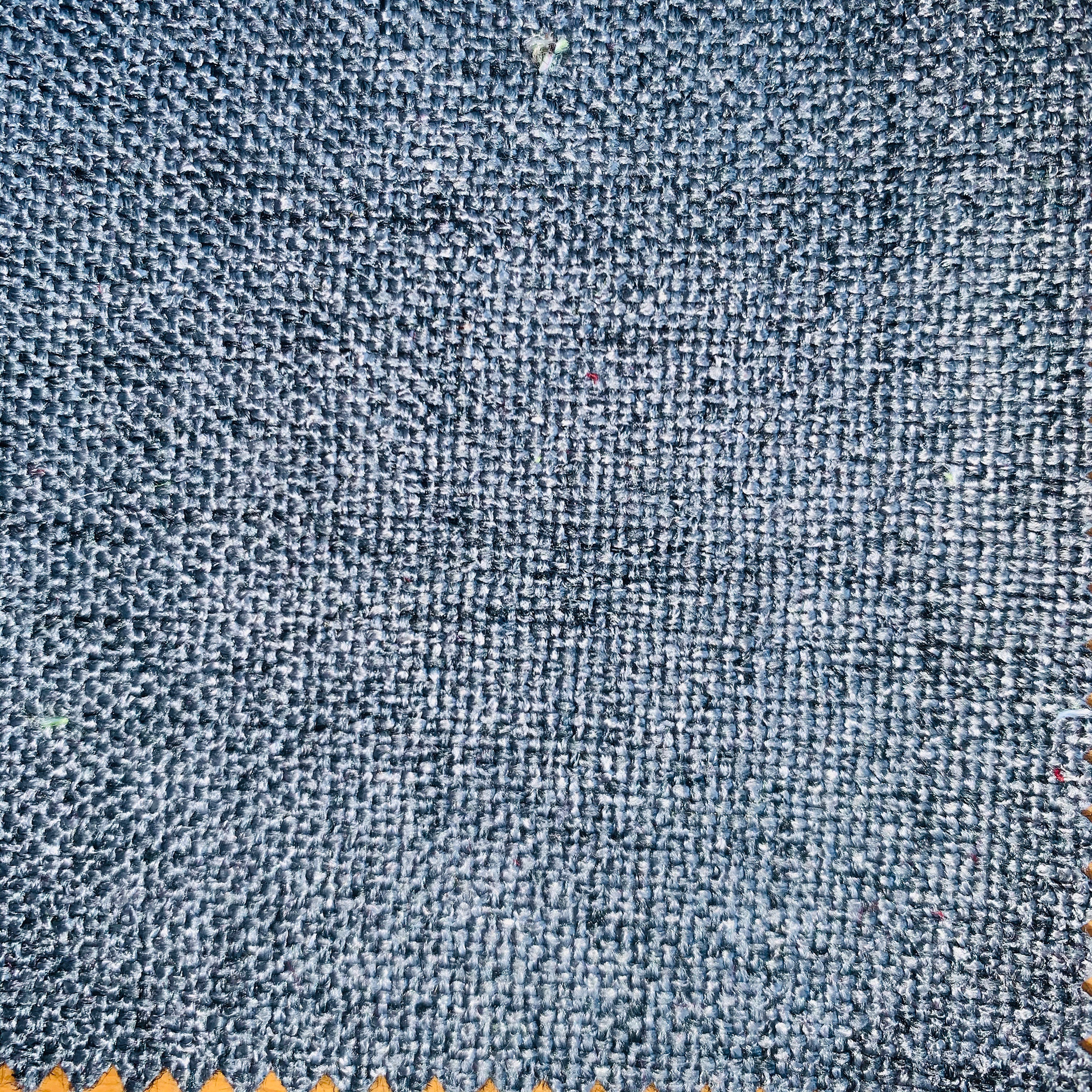
YUCA UPHOLSTERY FABRIC – SLATE GREY (Art-No. 170_yuca_14_M)
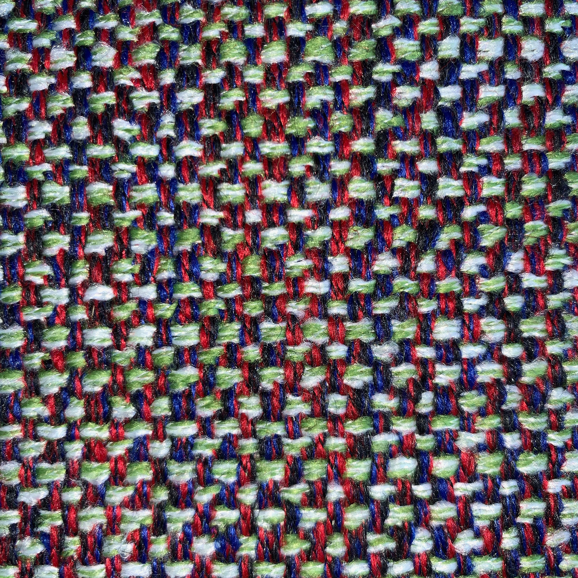
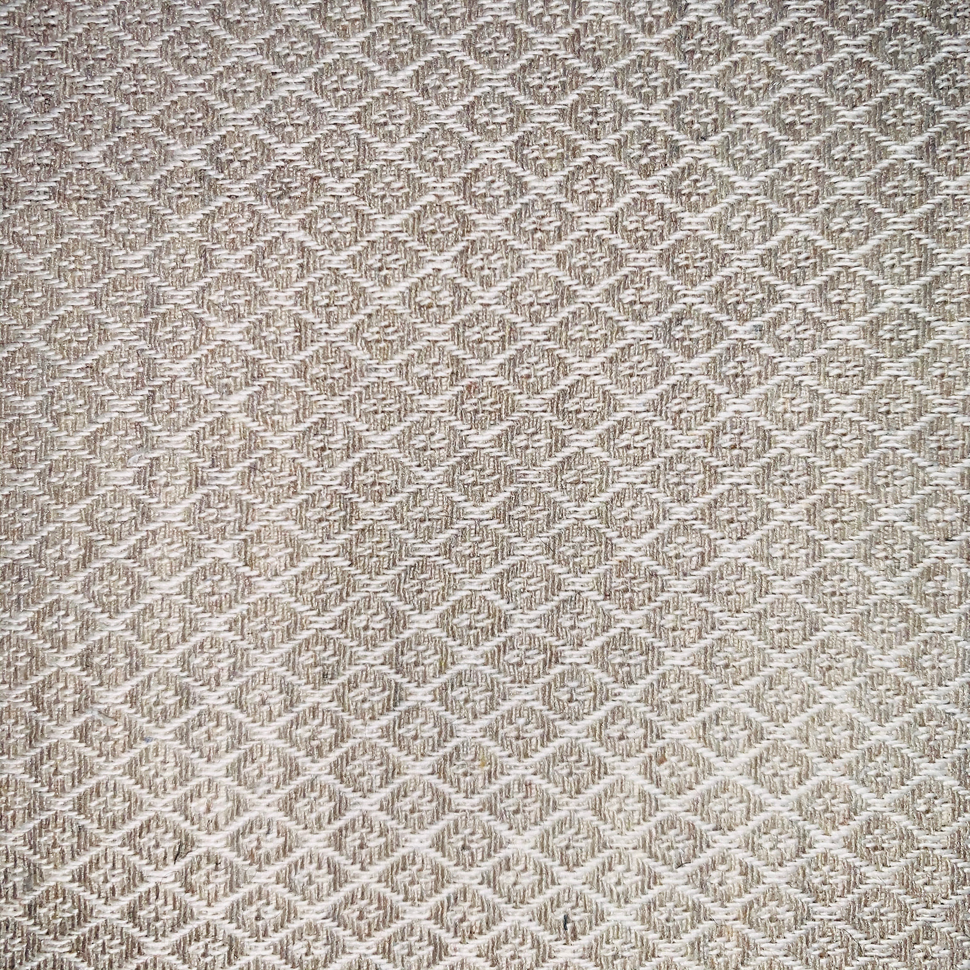
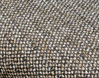
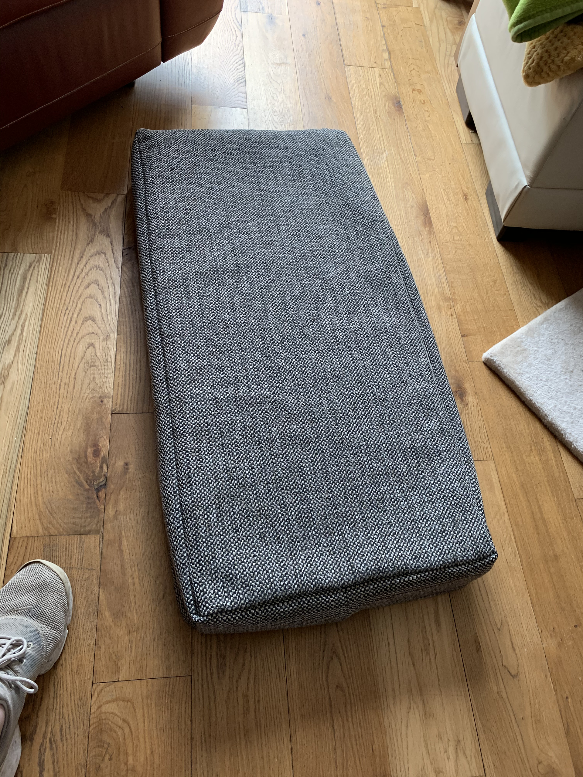
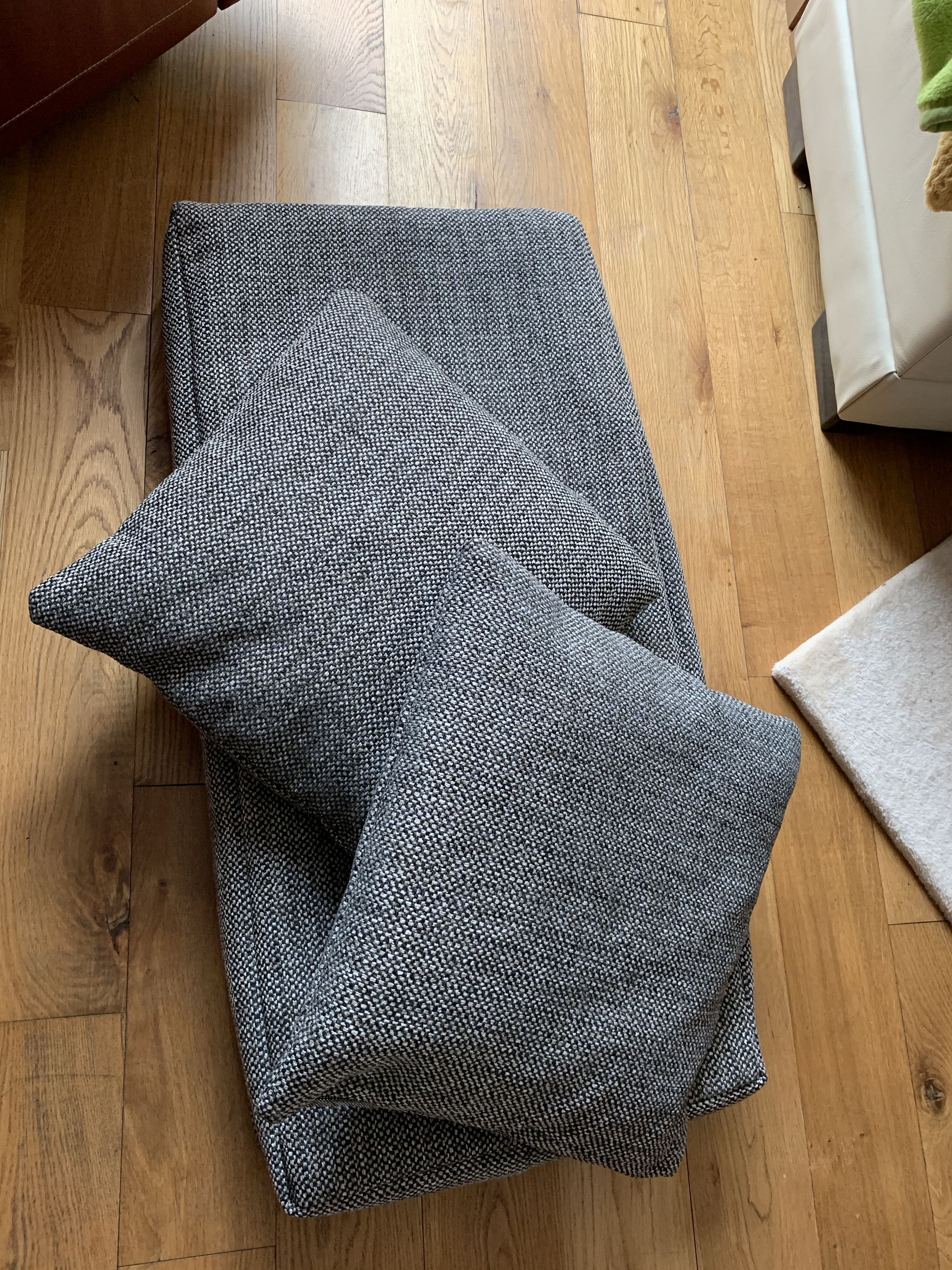
The choice of fabric for this project falls to my mother. The plan is for this piece to be placed in our home, and so it seems only fair that she decides which kind of fabric is used for the seat. Her final choice was a two-tone dense weave design for upholstery use. The colour combinations make it a neutral look that will work well for many colour schemes and home environments. it is displayed below.
The cushion is going to be made from specially cut foam that will fit the seat perfectly. This seemed like the best option to keep the lines of the piece. A cushion that is stuffed as opposed a solid foam base will potentially become lumpy and miss shaped over time.
I ordered extra of the fabric in case I made a mistake, however in the end I had enough to make two cushions. The plan was to put a zip on the cover so that it could be easily removed for cleaning, however, it didn’t arrive in time for the deadline.
FINISHING DETAILS
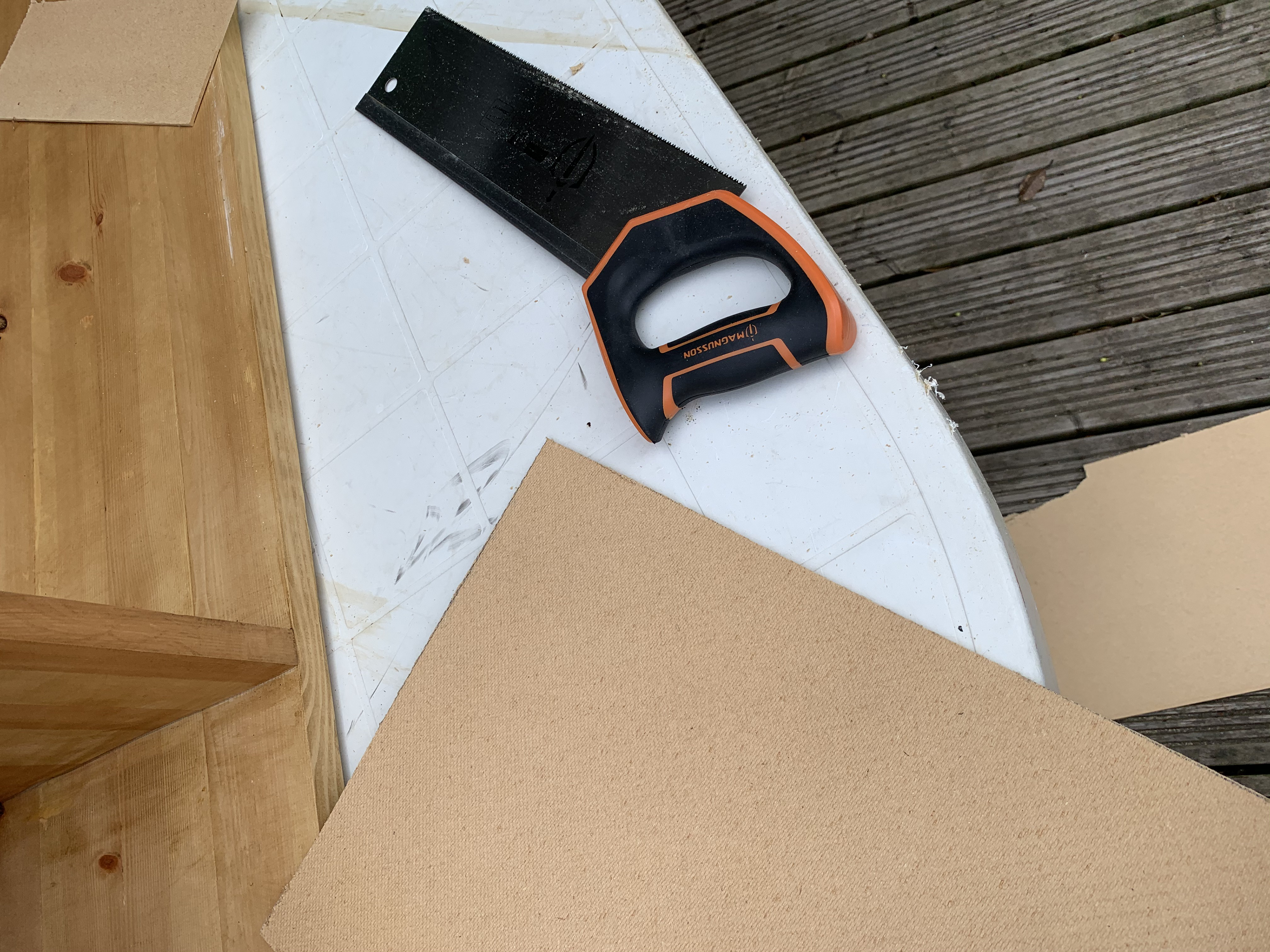
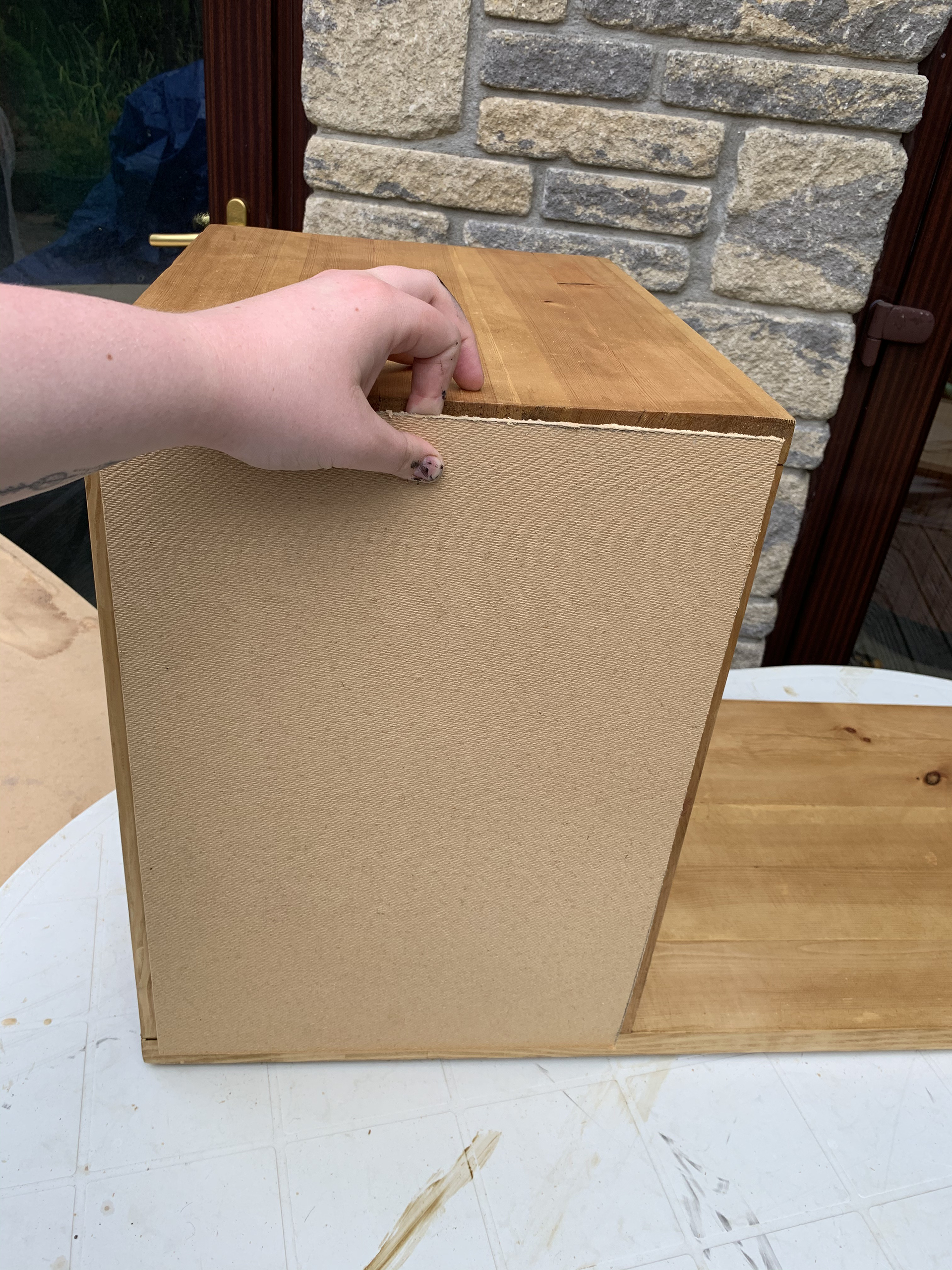
There are a few smaller details on the piece that take less time and making processes. The table legs are a favourite of mine I love the minimalistic style that still provides plenty of support. There other smaller details such as the cupboard magnet and back were easy fixes that are things that aren't completely necessary. My original plan was to cut channels into the side boards to create a resting spot for the shelf and then apply the back to it to close it in. However, this changed due to the lack of facilities available to me. For the purpose of this deadline I haven't included the shelf.
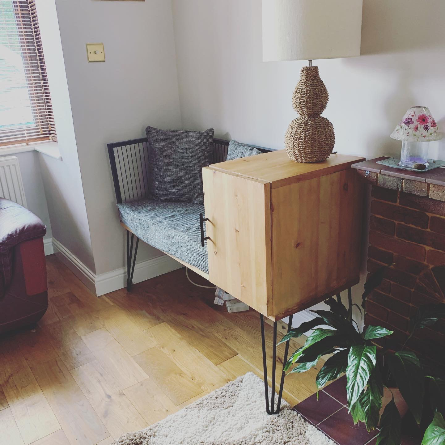
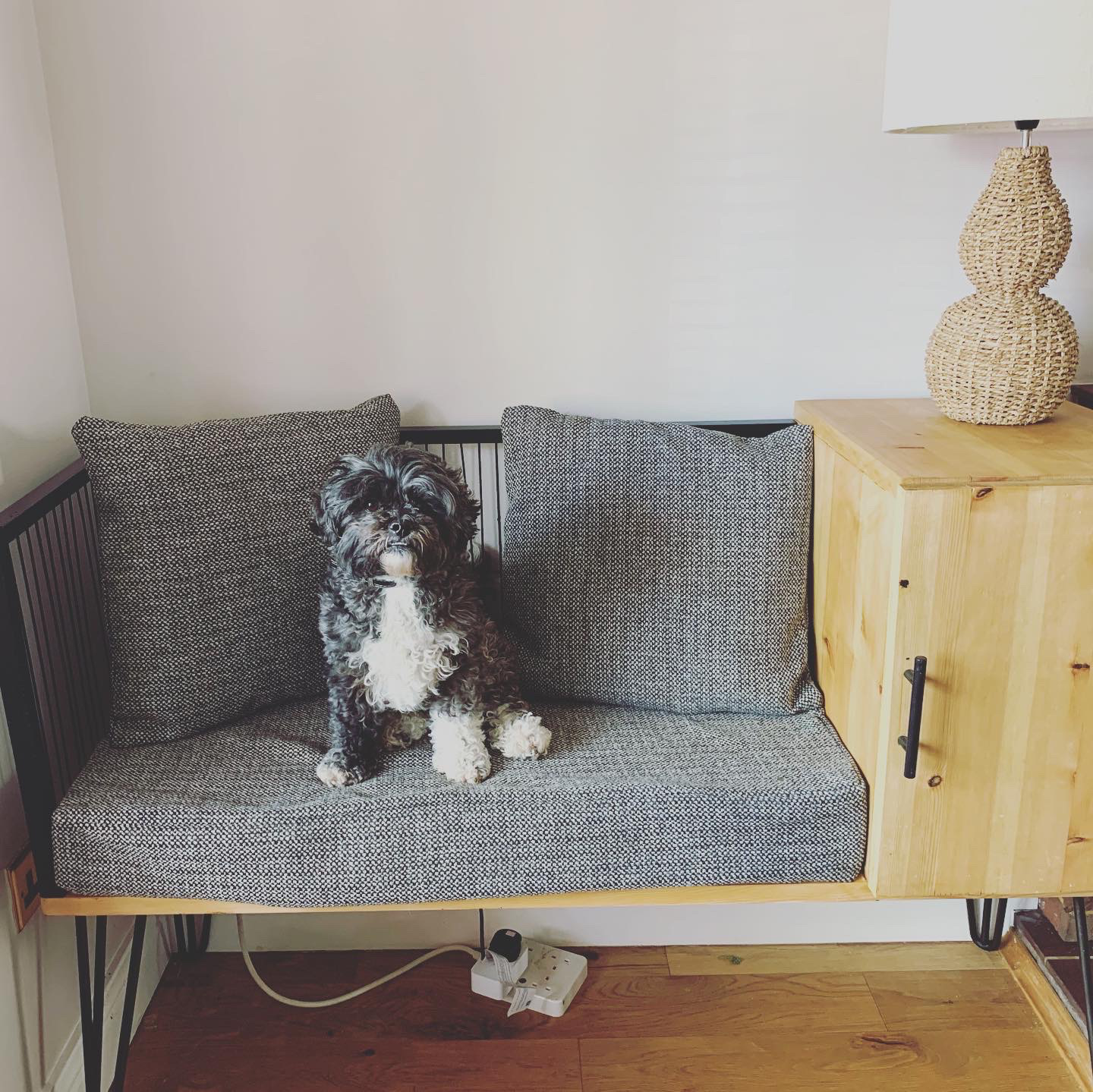
FINISHED PIECE
I have had massive doubts about this piece. Several times I have wanted to give up and not bother. There are imperfections that may not be so noticeable to others but are there plain for me to see. I am a perfectionist, and having these flaws make the piece seem not worthwhile to me. However, this was when I was looking at the piece in its individual components. When the piece finally came together including its placement in the room as well as the lamp and pillows; it changed. It seemed to be an actual finished piece that looked like it belonged there. I have had some amazing feedback from friends, family, and others that makes all the hard work and frustration worth it. I know that the piece doesn’t include all the aspects of the original design, and perhaps therefore I was even more critical of it and my own skills. But given the current situation, I feel like I have finished this piece to the best of my ability.
Will I do something like this again? Yes, I think I would. Probably with more understanding of time scale and material limitations I feel that I could complete this design again. Hopefully next time I do this piece I will have the full benefits of an equipped workshop that will allow me to build upon the problems I have faced, which will then eradicate the imperfections that I see.
REFLECTIONS
At the start of this project I set myself a few individual targets. These were things that I knew I could do with focusing on more from past comments on assessments. I have tried to keep all of these in mind as I have worked through this process.
>Developing my CAD skills- this is a vital skill for me to have in the modern industry.
I have had this in mind as I worked through this project. I have tried several different software's for this project including AutoCAD, SketchUp, and Fusion 360. I feel that I have reached this target and truly developed some skill. Even though my designs are not overly complicated, I can improve on my skills as I become even more confident with the software.
>Photography- I want to be able to showcase my work through professional looking photography and graphic work.
I have not had the opportunity that would've had with the university resources. I would've been able to use the studios to take photographs. But my graphic skills have improved in the form of the zine I have designed. It made me consider the different aspects of what makes a good design.
>Market research- I need to create a stronger understanding for how my work should be priced and how this is reflected through material choices and how the work is finished.
I have done a lot of exploration of different furniture companies, ranging from high to low end. This exploration I feel has given me a good understanding of where my work will be placed in the market.
>Material sourcing- I want to explore and expand my options when it comes to sourcing my materials. I am also going to consider how I can repurpose old furniture as part of my work.
The situation of this pandemic has meant that I have had the opportunity to look at several different suppliers. Have found a local supplier of green wood, though not appropriate for this project it may be useful for steam bending work. There was a supplier that I had used in the past which I hoped to use but they closed before I could place my order, I had decided to go with them because I knew they stocked good quality wood so was rather frustrated when the shut. I did manage to find an alternative to fit the order, but the quality was poor in comparison. Before the university shut, I also ordered from a steel supplier, however those materials are at the university and I also do not have the tools to work them. It has been an experience though, to work with so many different suppliers.
>Digital design sheets- improve how I showcase my ideas and designs when it comes to presentations. A professional looking design sheet can make a difference in how a design is received.
When it comes to the design sheet aspect of projects I have always struggled with the balance between aesthetics and information. The sheets tend to become overcrowded which distracts from what I am trying to show. This time I tried to focus on delivering all aspects in a professional minimal style that is easy to follow. I feel like I have achieved this though the use of images as well as colour schemes.
>Model making- create models that fully conceptualise what I am trying to achieve.
I have made more models for this project than I have for any other. I had used a range of different materials and techniques which provided different scales of the model. The full-sized model works to show the size of the final piece and works as a way of understanding the visuals.